The best rebrands of 2020s (so far)

Branding of the 2020s aims to be conscious, community-building and disruptive, so we’re already seeing new systems, new design languages and new ways to tap audiences' attention. As some brands draw upon their heritage, others are making unconventional choices. Could this be the golden era of redesign?
Here, in no particular order, these are the best rebrands of the decade so far. Take a look back at some of the best branding in history in our logos of the decade series and also don't miss our best logos of all time piece.
01. Channel 4
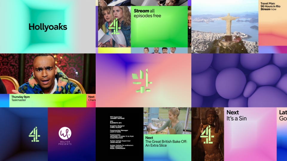
“If you're old enough to remember only having four channels to pick from then you’ll know that Channel 4 was the one to go to for experimental formats and eye-catching content. This rebrand re-injected some of this longstanding rebellious personality and unapologetic tone that Channel 4 is known for,” says Gaby Watson, senior creative at creative agency syn., of this 2023 overhaul from Pentagram for all the Channel 4 brands, content and streaming service.
“It brings all the sub-brands together under a distinct acid green rework of the original Lambie-Nairn logo that we all know and love from 1982. This, combined with vivid gradients and abstract, surreal idents, produced a look and feel that, whether you loved it or hated it, meant you were talking about it. It's exactly what Channel 4 has been doing since the beginning – disrupting convention and creating conversations.”
“Being one of the most popular TV channels in the UK, it must be tricky to stay relevant to younger audiences and appeal to new ones, but Channel 4 seems to do it perfectly every decade or so with timely and considered branding,” says Jonny Aldrich, co-founder and managing director of London-based branding and packaging design agency Deuce Studio.
“It builds upon a previous identity that has been around for donkey's years and makes it feel new and exciting. It's full of life, colour and joy, while also feeling different for television, with interesting crops of programmes peaking into the sides of the screen. It’s alluring and makes you want to keep watching. Combine this with a clever use of tone of voice, iconography inspired by emojis and custom typography, it makes for a perfect refresh for a culturally important TV channel.”
02. Tiffany
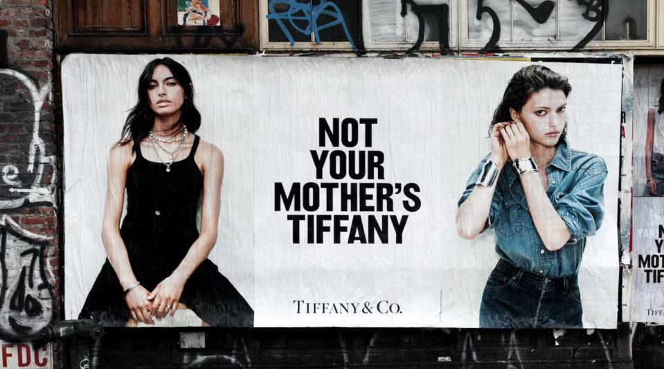
“Before its $16.2 billion acquisition by LVMH in January 2021, Tiffany & Co. was feeling a little stale,” says Sabrina Shim, writer at verbal branding agency Reed Words. “The LVMH rebrand was swift and shocking. In April 2021, rather than just brush away a few cobwebs, the new owners went after the sacred Tiffany Blue and announced (on Instagram) a new house colour: Tiffany Yellow. While it initially appeared to be an April Fool’s joke, the yellow was used for an entire pop-up store on Rodeo Drive and later confirmed as genuine, albeit not to replace the trademarked blue. Racking up nearly half a million likes, creating buzz was the first move of a strategy to bring the younger generation on board.”
However, for Sabrina, what really piqued her interest was the brands ‘Not Your Mother’s Tiffany’s’ campaign that followed a few months later in July, with its “guerilla-style footage of the fly posters”. Featuring lines such as 'Your mom called. She said, ‘I told you so’, and Uncool you say? Tell us more.'

“I think the campaign succeeded in calling out Tiffany’s past, but also created in people’s minds new possibilities. The confrontational tone was spot-on – both a rallying cry and a way to piss off ‘classic’ customers (even if the underlying subtext was that really, everyone who wears Tiffany’s is cool)," she says. "Beyond just modernising the brand image, was a real effort to create a self-aware and shameless voice to help erase the perception of Tiffany’s as a delicate and hyper-feminine brand. And without the words, the campaign would’ve felt totally superficial. Tiffany’s became aspirational again, a part of the luxury conversation, but also the cultural zeitgeist – and a sales success.”
03. San Francisco Symphony
“When thinking of the best work of the decade so far, one thing springs to my mind – the cripplingly envy-inducing rebrand of The San Francisco Symphony by Collins,” says Connor Edwards, a designer at Jack Renwick Studio of the 108-year-old cultural institution 2021 refresh, which won Best of Show at the 2021 Brand Impact Awards. “When looking at the logo, even in its static, soundless form, you can hear the orchestra and all its constituent components – brass stabs, the swell of strings, the thundering percussion – they’re all there, present in the wordmark. And then you add the music. The brand comes to life as an ever-responsive, evolving visual system showcasing the dynamic qualities of classical music itself.
“The type choice speaks to the heritage and gravitas of the art form, and the way it is used across the brand’s applications positions it as a contemporary institution for audiences of today,” Connor continues. “Not only is the branding expertly executed, it sets an example of how tech can be used creatively to expand the possibilities for brand creation. It’s also interesting to see how similar trends have emerged following this project – audio reactive visual identities seem to be everywhere you look at the moment.”
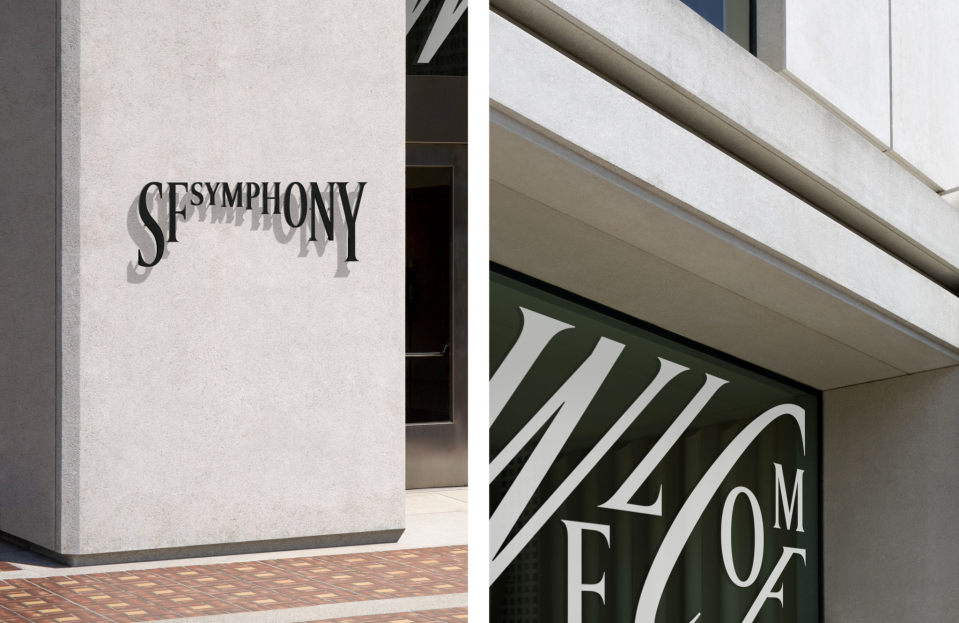
The rebrand was also top of the list for Stephanie Zabala, associate design director at brand strategy and design studio Team. "I love everything about this rebrand,” she says. “It’s dynamic and fresh, but still classic. The brand features a sense of typographic play and rhythm that feels very authentic for a symphony."
04. Kia
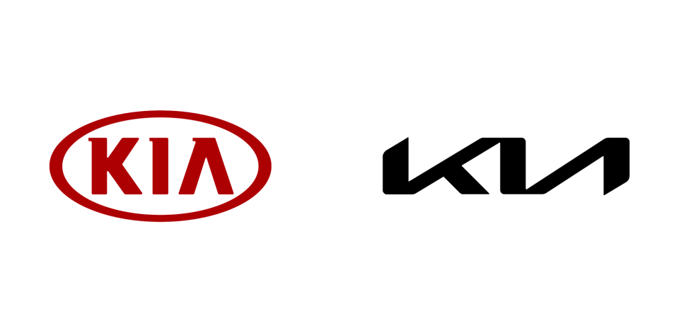
“Now this is an interesting one, and probably a very divisive one too. I’m sure plenty of folks think the Kia rebrand is a shot in the foot, and some say it doesn’t even read Kia anymore, but closer to KN,” says Jonny, of the 2021 rebrand, which led to a surge in people searching for 'KN car' online (alongside 'Kia' seeing a boost). “Personally, I think this is a great exercise in premiumisation. Kia isn’t exactly known as a luxury car brand, or particularly cool or modern, but they are reliable and affordable with plenty of features to match, and I think this new brand helps them compete with more established luxury brands or rising stars like Tesla. The logo is sleek, modern and angular, evoking a sense of futuristic vision for the company and looks miles better than the previous very approachable and quite boring logo.”
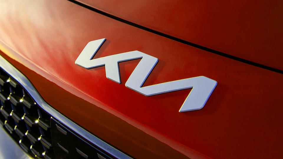
The creative team at Halo Design Associates (creative director Sarah Macpherson, lead designer Scott Chapman, and senior designer Adrianna Parsons) agree: “Kia went with a brave new logo, which included a total overhaul of its typography, shape and colour scheme. In the logo, the joined up type has a handwritten, personal feel with its continuous line. The new logo has symmetry, balance and the angles create a sense of movement, resulting in a prominent and memorable brand mark that remains current.”
05. Burberry
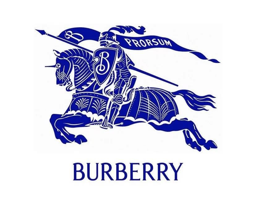
“Burberry rebranded itself in quick succession in 2018 and then in 2023. The 2018 design followed the minimalism trend, featuring capitalised sans-serif typography. Then, 2023 saw a complete reversal to an update of their original logo,” says Abigail Baldwin, creative director at Buttercrumble, a graphic design and illustration agency in Leeds.
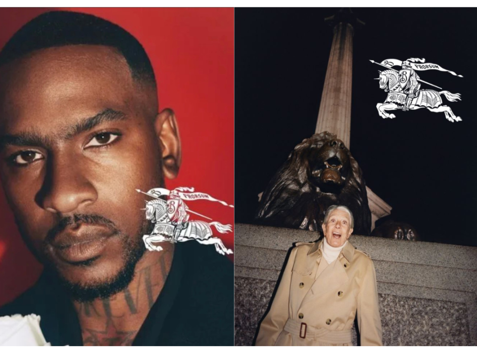
As Burberry’s new creative director Daniel Lee took over from Riccardo Tisci in February, the brand reverted to a version of its decorative equestrian knight design (circa 1901). “The recent design shows how the brand has stood the test of time, and celebrates their heritage. It reminds us to be proud of our roots.”
06. Burger King
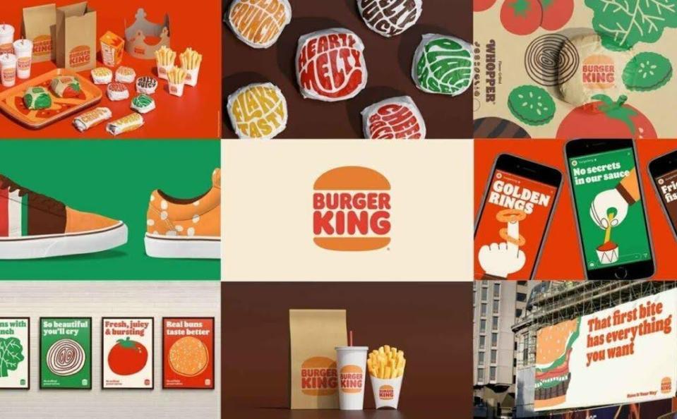
“A famous quote from P&G's CMO says that ‘fruits’ can often be found in the brand's ‘roots’. The Burger King rebranding in 2021 is an outstanding example of that principle. Burger King returned to its ‘whopper’ burger roots to reestablish its authenticity. After 20 years, the new logo builds on its visual identity from the '70s through the '90s with a retro, minimalist aesthetic,” says Allen Adamson, co-founder and managing partner of marketing agency Metaforce and author of Seeing The How.
“Most rebranding efforts try to add a bit of polish to a brand that is losing relevance in the marketplace. But more than just a fresh coat of paint, successful rebranding is about strengthening the brand 'story' – the unique narrative that sets your brand apart and matters to consumers or customers.”
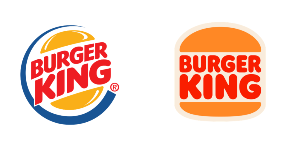
Jack Cox, senior creative at syn. agrees the brand has made a bold but effective choice to rework a familiar older logo, in what is its first global rebrand in two decades. "In an increasingly corporate world it’s important to have fun and it resonates when brands do the same. With BK not being the leading global brand in fast-food, this bold and retro approach feels much braver – like they are going back to their roots and presenting a truer version of themselves,” says Jack.
"On the other hand, the golden arches approach to fun has been gamifying their rewards system. A shiny new band-aid on a complex brand, which appeals to younger audiences. However, BK's light-hearted approach will be a clever nostalgic hit for older audiences while looking tastier trend-wise to younger ones too.”
“Jones Knowles Ritchie (JKR) has been killing it for years, often creating some of the best work in the industry, especially for the food and drink sector and it’s no different with this vintage-inspired rebrand,” says Jonny. “Everything from bringing back the old logo, redrawn of course, to combining it with some 60s-style typography and illustrations that feel tasty as much as they do feel youthful and full of life, it's a perfect project, full of nostalgia, and one of my favourite rebrands of the 2020s."
07. Nationwide
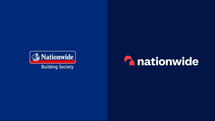
“In 2023, Nationwide rebranded after 36 years,” says Abigail. It has streamlined its previous design with a move to a lowercase ‘n’ and a reduced ‘rising sun’ motif. The new design feels humble and friendly. And it reflects their aims to be simple and accessible.”
The Halo Associates team agrees that the rebrand, designed by New Commercial Arts and also rolled out across its network of 605 branches, is helping set it apart from its traditional rivals. “Nationwide’s rebrand has been intentionally disruptive to stand out from others in the financial services industry. They wanted to move away from the traditional but stay true to the brand heritage. By using friendly and simple lowercase sans serif typography, the wordmark feels approachable, familiar and clean. The stripped back icon creates more of a statement as it’s stronger and bolder with a lovely use of negative shape.”
08. Velveeta
For Lisa Franck, strategy director at design and advertising agency Tavern, cheese company Valveeta’s refresh, which reimagined the long out-dated, traditionally overlooked brand, helped it become “fun, desirable and modern – fit for social, experiential and everything else a 21st century brand has to tackle”.
“Growing up in suburban America, the squidgy block of Velveeta ‘cheese product’ was just one of many cheap, mass-market pantry staples that faded into the background of our lives. Like so many of these products, the design was functional and devoid of personality. For decades the brand got by on its cheap price point but as competition intensified and consumers turned away from processed foods Velveeta needed an actual brand, not just a logo lockup,” says Lisa.
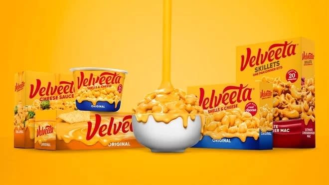
“In its 2021 redesign, Kraft-Heinz retained the essence of the old Velveeta but gave the product, for the first time, a brand. Unapologetically decadent and delightful, it serves up gooey goodness at every touchpoint. Melty cheese became Velveeta’s calling card and a key brand attributes (KBAs) in its own right, baked into everything from product photography to graphics and even the logo itself. The new design system brings the brand into the 21st century, with a few simple KBAs that can be mixed and matched in endless creative combinations across social, experiential and beyond.”
09. Pepsi
“Pepsi's long-term positioning has always centred around being ‘the choice of the next generation’, while Coke focused on timeless authenticity. The challenge from a branding perspective was that the Pepsi design looked like the choice of the last generation, and was 14 years old,” says Allen. “The lowercase Nasa-style typeface and smiling ball had been around for too long to deliver on this core promise. Ironically, I led that Pepsi effort at Landor back in 2000. Additionally, beverages and packaged goods brands must compete 365 days a year on beverage shelves, screaming at consumers and saying, ‘Hey, look over here and buy me!’”
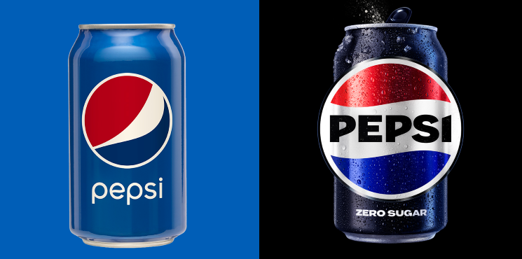
Drawing on its 1990s design, and returning to the globe design, the new Pepsi design was launched to mark the brand’s 125th anniversary. “The new identity in all caps taps into the brand's heritage and unites the Pepsi globe and wordmark," Allen adds. "An electric blue and black colour pallet helps strengthen the brand and its ability to stand out on the shelf.”
10. Google G Suite
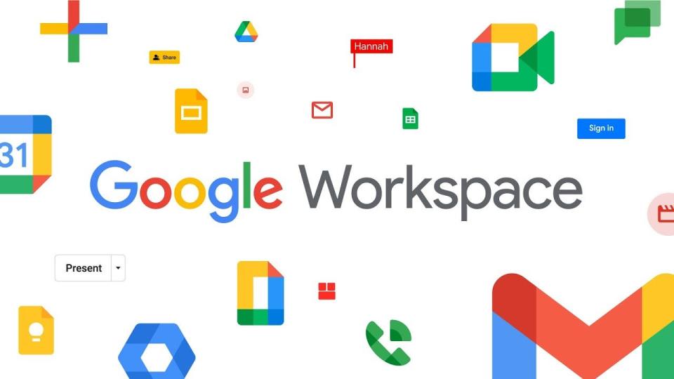
“The bigger the brand, the more challenging the rebranding. It’s the difference between changing direction in a speed boat versus an aircraft carrier,” says Abigail. “And it’s not just for one product but 15+ products here. At the corporate level, Google needs to compete as an ecosystem. Customers don't buy single products; they buy a cohesive solution.”
The 2020 G-Suite rebrand was challenging for several reasons (people were very angry about changes to the Gmail logo, for example). “Users were accustomed to the G-Suite interface and logos," explains Abigail. "Changing established visual elements can lead to initial confusion and resistance. The rebranding needed seamless execution to avoid impacting user experience and functionality within the Workspace apps.
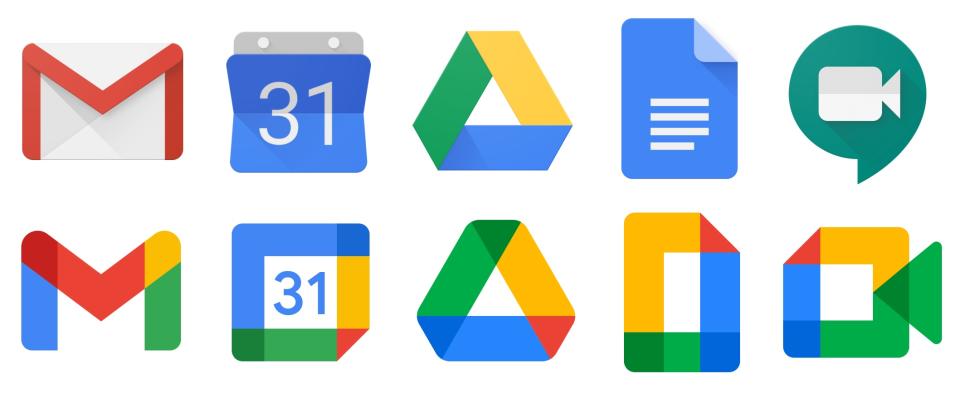
"Even changing the name from Suite to Workspace, while simple, is strategically smart and powerful, reinforcing the brand in the market in which they are competing. The new brand language can easily be extended into several tools in the future, which will be universally recognisable over time. The general buy-in into the Google brand will lend equity to any new product launched under this umbrella.”
11. MadeForMed

“One redesign that really struck me when I first saw it was the rebrand for MadeForMed, designed by the Paris-based agency, Graphéine,” says Ian of the unconventional 2023 rebrand for the French tech firm.
“If there were such a thing as rules for logo design, one of them would be to ensure that the design is legible so that when a potential customer sees the logo, they not only recognise it but – and more importantly – can read the company name itself. This is a prime example of a logo that knows when and how to break the rules! Inspired by the unreadable writing of doctor prescriptions, the MadeForMed logo is completely illegible, with a star at the end to reference translation. It’s clever, distinct and memorable.”
Want more on rebrands? See our pieces on outstanding uses of colour in branding and the best branding books available now.

