Sonos users to get free app upgrade everyone will love – its 5 best new features
It was only a couple of weeks ago that a T3 colleague was reporting on an incoming Sonos app overhaul. Well, those leaks were true, as I've now been extensively briefed on the new Sonos S2 app, which is officially landing worldwide on 7 May.
It'll bring a raft of changes the whole family will love, thanks to better controls, greater personalisation, and the ability to setup individual layouts per device –whether you're an Apple or Android user. It's an all-new app, built from the ground up.
If you typically use neither and instead default to Windows or Mac to control your system, that's changing too: a new universal web browser-based app will roll out on the same date, allowing Chromebook, Linux and other operating system users to have an easy control base. This will in time replace standalone Mac and Windows apps.
Do note, however, this new app update is for Sonos S2 kit. Legacy Sonos S1 speakers won't be affected or benefit from the associated changes. But if you're using the latest Sonos kit – and, just as a personal thought, I suspect this new app is a necessary pre-cursor to rumoured Sonos Headphones – just what can you expect from the new app? Here's a breakdown of the five biggest new features.
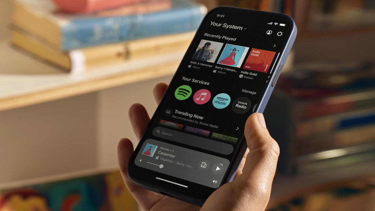
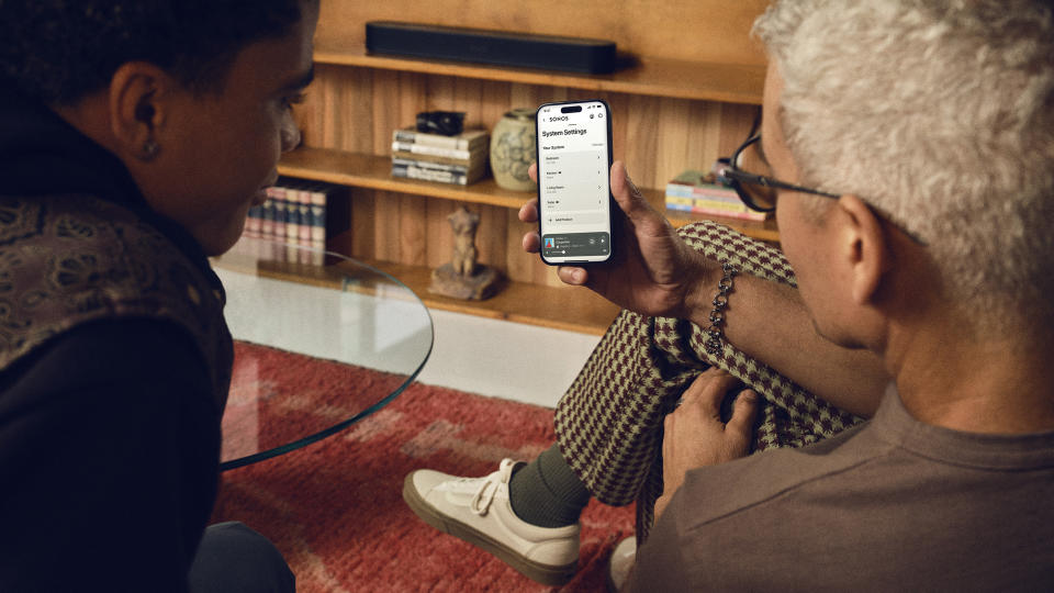
1. New design, more on display
Gone is the brown app icon. Gone is the mid-grey in-app backgrounds. Now it's all beautifully black and white, an echo of all Sonos products available today, and it looks much cleaner.
Not only that, a lot more fits into the app's home screen, so your Recently Played, Albums, etcetera, will show you much more at a glance, for quicker selection and quicker access to your favourites.
2. 'Your Services', your preference
There are also more 'swim lanes' of content, including 'Your Services', which allows you to select your preferred service so that it can 'sticky' into the leftmost corner or any swim lane and will affect search preferences in relation to your choice.
The previous app certainly had access to all your preferred services within the app, but it wasn't laid out so quickly accessible. You can also add additions from within Your Services, whether that's 'Fresh Finds' from Spotify, or 'New Releases' from Audible.
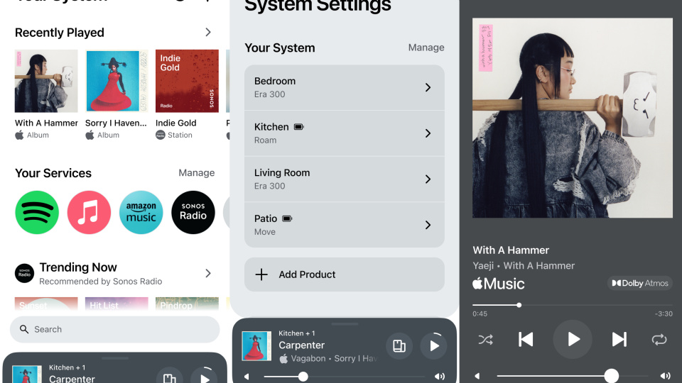
3. Customisable layout per device
Perhaps the biggest change of all, however, is that you can choose your home screen layout. Perhaps you don't like seeing 'Albums' so far up the page. Now you can simply move it (or remove it) – as all different 'blocks' of content that make up the home screen's swim lanes can be re-ordered to your preference.
Furthermore, this happens on a device-by-device basis. This is big news for a number of reasons: one, other family members can adjust and preference their own devices differently; two, you may want a different layout on your personal tablet to your personal or work phone – the choice is now fully yours.
4. Universal search bar
Much like the lingering Google search bar on display on Android phones' home screens, the Sonos app now also has a universal search bar. Clicking into it will permit you to search through all content associated to Your Services.
The search will take into account your preferences, however, so if you're keener on Apple Music than Spotify, or vice versa, then your 'sticky' preference will affect the search results to be better for you.
5. Better volume control

There's also better volume control: the 'mini player', present at the bottom of the app, now has a quick-adjust volume slider, so you no longer need to click into this first to make adjustments.
The same grouping controls and related volume controls remain, as per the previous app – but the new design of Your Sources and quick-adjustable volume controls per group/room provides quicker and better-looking multiroom adjustability.

