The real meaning of the BMW logo still surprises people today
The BMW logo is one of the best car logos, and certainly one of the most recognised. But it's also one that's fairly unusual and abstract when you think about it. What does it actually represent, other than the brand? People have all sorts of theories, but many are still surprised when they learn the true inspiration.
The Sun newspaper reckons that the blue and white segments of BMW logo represent a spinning propeller, a supposed hangover from the company's predecessor Rapp, which built aircraft engines for the Luftwaffe. But as with many things, The Sun has it wrong. It's much simpler than that, and the clue's in the company's name: Bayerische Motoren Werke, or Bavarian Motor Works.
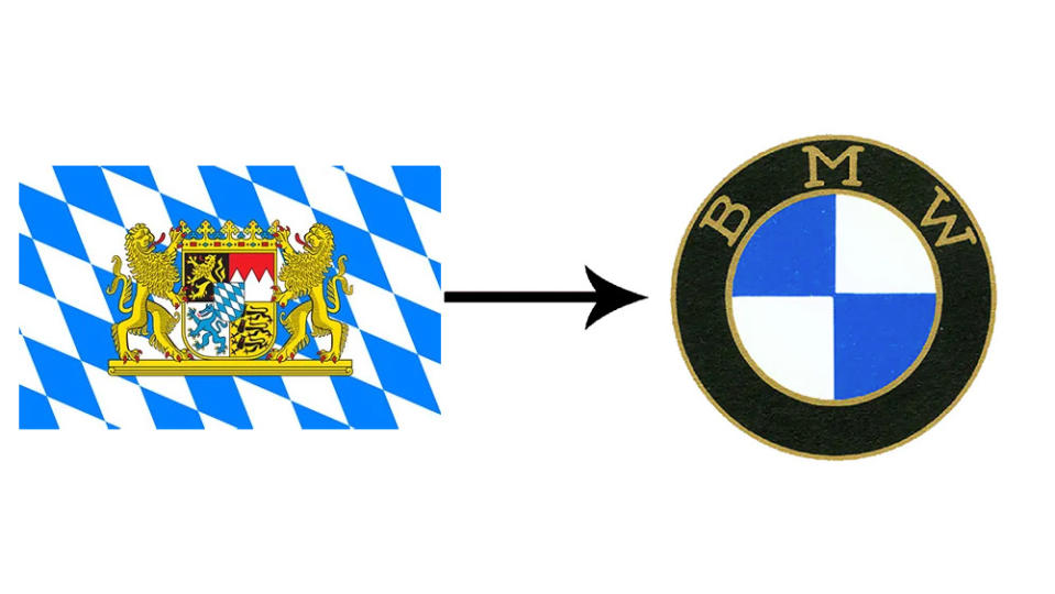
The logo design was inspired by the flag and crest of the carmaker's native Bavaria, in southeast Germany. At the time of BMW's creation, there was a popular movement for Bavarian independence from Germany, so it makes sense that it would adopt the state colours.
Taking inspiration from regional iconography is not hugely unusual in car branding. The Porsche logo features a black horse from the coat of arms of Stuttgart, the Alfa Romeo logo features a man-eating snake from the coat of arms of Milan, the Cadillac logo shows the invented family crest of French explorer and fake noble Antoine de la Mothe Cadillac, who founded the city of Detroit, and the Kia logo... no, only joking. The Kia logo is just the Kia logo.
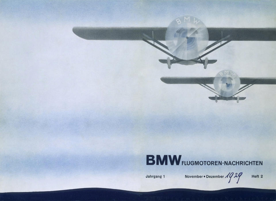
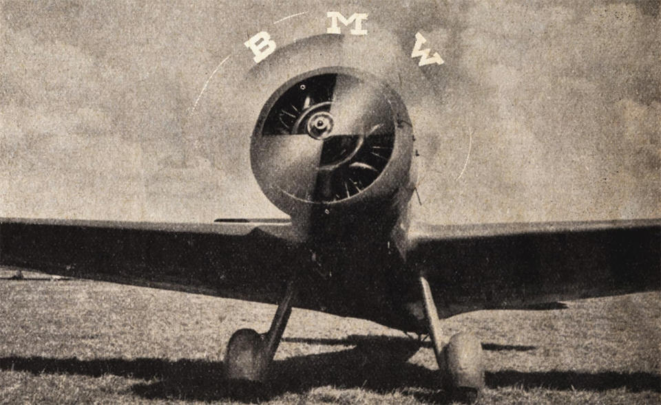
So where did The Sun's get its propeller idea from? The urban myth owes a lot to the BMW's own advertising in the first half of the 20th century. Rapp Motor became Bayerische Motoren Werke GmbH in 1917, but it continued to make aircraft motors for some time. In the late 1920s, BMW produced a clever advertising campaign that placed the brand logo over the spinning propellers of aircraft to promote the association. It revived the idea in the 1940s. If the campaign intended to create a powerful association in people's minds, it certainly worked, since the idea that the logo shows a propeller persists to the present day.
For more logo design news, see the controversy over the Portugal logo.

