The most annoying design trends according to graphic designers
Design trends can be a tricky thing to handle well. When a trend gets popular every company wants to hop on the bandwagon, but in most cases, it slowly becomes too much of a good thing. Unfortunately, in today's lightspeed trend cycle, the birth of a design trend also marks its untimely death.
In the wake of this ever-changing design plague, graphic designers took to Reddit to share their design trend pet peeves – from illegible typography to cringy retro revivals – but don't take it too much to heart. As we've seen with the resuscitation of design aesthetics like Frutiger Aero, just because your favourite design trend has met its demise doesn't mean it won't come back stronger than ever.
The most common design pet peeve shared on the r/graphic_design subreddit was the influx of soulless minimalism. Naturally, as graphic designers, there's a compulsion to explore the creative possibilities of a project – something that the minimalism trend has destroyed.
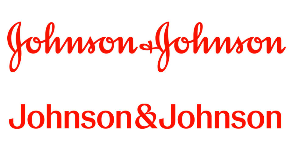
"It has its place just like every other style, but everybody can't have a minimalist logo and branding," user u/thegreenstars says. Pointing to recent examples like the new Johnson and Johnson logo and the X rebrand, they question why brands are no longer trying to stand out against the competition. "Why are y'all ruining your brand identity and ditching your whole personality to conform to this "need" for minimalist design?" they add.
Others cited the return of 80s/90s logo design as a creative pet peeve (check out our best logos by decade series for more retro design). User u/LunaTheLouche commented, "The 90s trend of replacing letters with numbers in a logo," was their biggest design gripe. "It’s coming back and it needs to stop. Or maybe it never went away," they add.
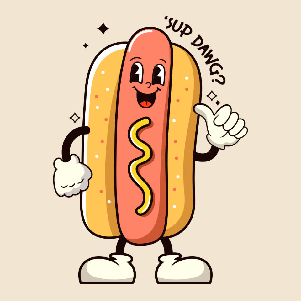
Also shunning the retro revival was user u/Deficon112 who highlighted the return of 1920s style anthropomorphised "mascot type hot dog/burger/pizza/sun with the big smiley face with arms & legs." Its return to modern design has become oversaturated, taking the hand-drawn animated charm out of the aesthetic. Honourable mentions also include illegible logos, forced "dual meaning" design, corporate blues, 3D balloon text effect, glass morphism, variable font widths and the dreaded Corporate Memphis.
Increasingly we're seeing overplayed design trends popping up all over the place, like the "more" billboard marketing trend plaguing underground stations across London. While trends can help us gauge the current design climate, it's good to remind ourselves that unique creativity will always triumph over safe 'trendy' design.

