Mark Woods: "See Jacksonville" posters pay tribute to local parks in WPA-era style
It’s National Park Week. So I’m continuing my tradition of using this as an excuse to write about our national parks, spend a few hours in a local park, and dream about visiting some faraway ones.
OK, the latter isn’t just a National Park Week activity. I’m perpetually dreaming of hitting the road, making it to some distant park.
And even with all of the technology of 2024, from stunning high-definition videos to livecams across the country, few things evoke that sense of wanderlust like some old-fashioned art — the park posters created by Works Progress Administration artists in the late 1930s and early 1940s.
Most of us don’t have personal memories of that era. And yet you probably can picture those posters, or at least their style, with an iconic simplicity in design and typography, inviting people to “See America” — including some of the parks in the relatively new National Park System.
The New Deal program led to 14 posters that depicted national park landscapes, like Old Faithful erupting in Yellowstone, and used distinctive all-caps lettering to tout what visitors could do in the parks. Natural talks, campfire programs, all day hikes.
After basically disappearing for decades, the WPA-era posters have had quite the second life — more on how that happened later — leading to a new generation of artists using the vintage style to celebrate parks all over America. Including the ones in our backyard.
'See Jacksonville'
“I’ve always thought those posters were really beautiful,” Kathy Stark said. “As an artist, I appreciated how they captured an iconic scene. So I wanted to do them for our area.”
I was walking with Stark, her husband, Rick, and their dog, Talbot, in the Theodore Roosevelt Area.
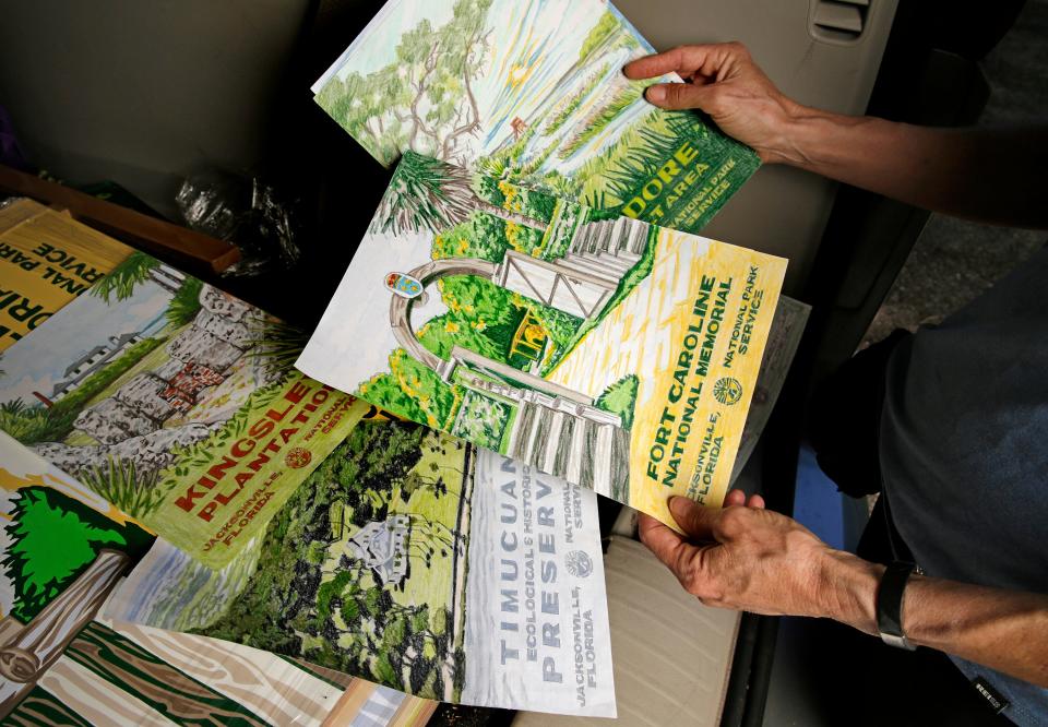
We met there, partly because it’s one of my favorite parts of our local piece of the National Park System, the Timucuan and Ecological Historic Preserve — but mainly because it’s one of seven places Stark chose to turn into a poster for a series she titled “See Jacksonville.”
The seven posters depict Timucuan Preserve, Fort Caroline National Memorial, Theodore Roosevelt Area, Kingsley Plantation, Big Talbot Island State Park, Little Talbot Island State Park and 7 Creeks Recreation Area. She also did posters for three local nonprofits: Timucuan Parks Foundation, North Florida Land Trust and St. Johns Riverkeeper.
“See Jacksonville” first opened as an exhibit at MOSH last December. It’s now at the visitors center at Fort Caroline National Memorial. The art will be there for the next three months. And Saturday, Stark will also be there for a “Meet the Artist” event as the park celebrates World Migratory Bird Day.
(I’ve never been a birder, but I’ve found myself paying more attention to birds lately. Am I turning into my parents? I’ll save that for another column. But if you’re interested in World Migratory Bird Day events, head to Fort Caroline from 10 a.m. to 2 p.m. Saturday. Duval Audubon will lead hikes at 10:30 a.m. and 1 p.m.)
Walking on the Willie Browne trail, heading to Round Marsh, Stark talked about what makes the WPA-era posters memorable — and how she created her own “See Jacksonville” pieces.
“It’s more graphic design than what I typically do,” she said.
She usually works in oils and watercolors, creating what she describes on her website as “monumental paintings which I can get into literally and figuratively.” Those paintings are large and full of countless mixes of colors. It’s the kind of work that led to her book and exhibit titled, “The Wilderness of North Florida’s Parks.”
For this project not only are the original paintings smaller — and reduced to 14-by-20-inch prints to replicate the size of the historic WPA work — but she limited her palette to about eight or nine colors for each one. She used flat artist paint to capture the look of the original silk screens. And she didn’t blend the colors. Having those distinct colors, along with that familiar lettering, gives these pieces the look and feel of the WPA posters.
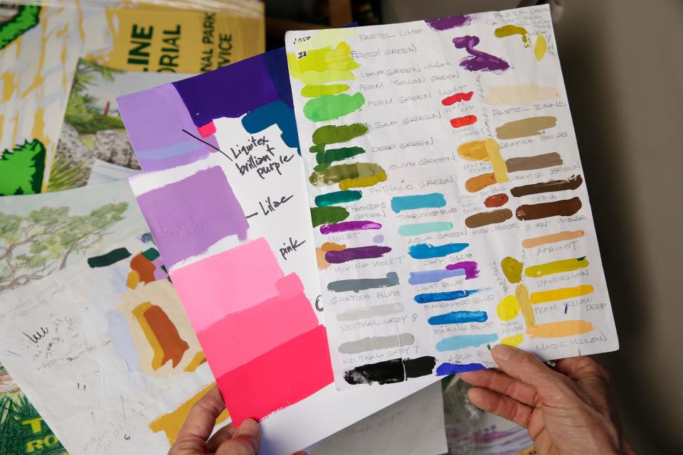
For instance, for the Theodore Roosevelt Area piece, she used nine colors — sap green, dark green, fresh green, sky blue, aqua blue, burnt sienna, yellow, dark gray brown and light gray brown.
She also used some artistic license.
There isn’t any one place in the Theodore Roosevelt Area that looks exactly like her poster for it. It’s a compilation of its features. A trail winding past oyster middens and palmettos, toward Round Marsh and the wooden observation deck where we stopped to take in the scene.
“You try to create an image that is indicative of that park,” she said.
Her best-selling ones (they’re for sale on her website, kathystark.com, and at REI) have been of the beaches of Big Talbot and Little Talbot. But her favorite park in the collection might be Fort George Island.
When she was a Girl Scout in the 1970s, they loaded bicycles onto a U-Haul, parked on the Mayport side of the river, took the ferry across, then rode their bikes down the tree-lined road leading to Kingsley Plantation.
“That made a big impression on me,” she said.
Five years ago, she and Rick got married on Fort George Island at Port Isabel — a spot that in the Roaring Twenties was the yacht basin for wealthy visitors to the Ribault Club. Today, the National Park Service says, it provides a “beautiful view captured by classic artists and Instagram influencers alike.”
And now the island has been captured by Stark in a style that pays tribute to the parks — and the park posters that a former ranger, who now calls himself the “Ranger of the Lost Art,” recovered and revived.
'Ranger of the Lost Art'
Go into national park gift shops all over America today and you can find posters, postcards and refrigerator magnets with the vintage style. Look closely at most of them and you’ll likely see they came from “Ranger Doug’s Enterprises.”
As Doug Leen explains on the Ranger Doug website, he began the company as a hobby in 1993 to fundraise for Grand Teton National Park. A retired dentist, he spent seven years as a seasonal ranger there.
In the early 1970s, he was working at the park’s Jenny Lake Ranger Station. During an annual cleanup day, he spotted a poster on the wall of a bar. It was faded, stained and headed to the dump with all kinds of other junk. He asked his boss if he could have it.
“Nobody thought anything of it in 1970,” he told the National Parks Traveler website in 2016, the NPS centennial year. “This thing was 30 years old. It was just an old piece of paper.”
He took it home and didn’t think much about it for decades. Then in the 1990s, the bookstore manager at Grand Teton asked if he had any ideas for a poster to commemorate the Jenny Lake Museum. He thought of the old poster he still had.
That sparked what turned into a mission to track down other original posters — only 1,400 prints were made — and ultimately led to Ranger Doug’s Enterprises, a book (“Ranger of the Lost Art: Rediscovering the WPA Poster Art”) and all kinds of modern-day “See America” posters out there.
Some are quite good. Others are little more than a photo manipulated with a filter, creating a look that, Stark says in her opinion, aren’t as artistic or eye-catching.
Beyond that, most tend to be of the national parks that already are the most recognized — not NPS sites like the Timcucuan Preserve, Fort Caroline and Kingsley Plantation.
That’s one of the reasons I like Stark’s “See Jacksonville” pieces.
They not only represent a fitting homage to the WPA posters, they’re reminders that we don’t have to travel far to find beautiful, historic places.
mwoods@jacksonville.com, (904) 359-4212
This article originally appeared on Florida Times-Union: Jacksonville artist's tribute to WPA-era national park posters

