A Bevy of Bold Patterns Upgrade This 614-Square-Foot Kraków Apartment

When a Ukrainian couple’s daughter moved to Kraków for university, they decided to join her—part time, at least. They purchased a small pied-à-terre so they could frequently visit her and enjoy the rich culture of the historical Polish city. All they needed to do was update the compact home to accommodate their family trips.
Located in a sprawling urban complex on the site of a former vodka factory, the two-bedroom unit was spare and industrial, so the owners brought in Kyiv-based interior designer Yana Molodykh to infuse it with life and color. They also requested that she incorporate an additional bed and an office without changing the floor plan. And that she stay on a tight budget, of course.
“At first, they did not want to spend a lot of money,” Yana explains. “They had said it should be like IKEA style, very simple. But after they got involved in the process, they became open to spending more than they expected before.”
This flexibility on the financial constraints allowed Yana to accomplish the clients’ aesthetic and functional goals. She opted for a midcentury-inspired look with a warm, bold palette of reds and pinks. “I saturated the interior with thick, intense colors to create a special retro vibe that makes you feel like uncorking a bottle of wine and relaxing after a long drive,” she describes.
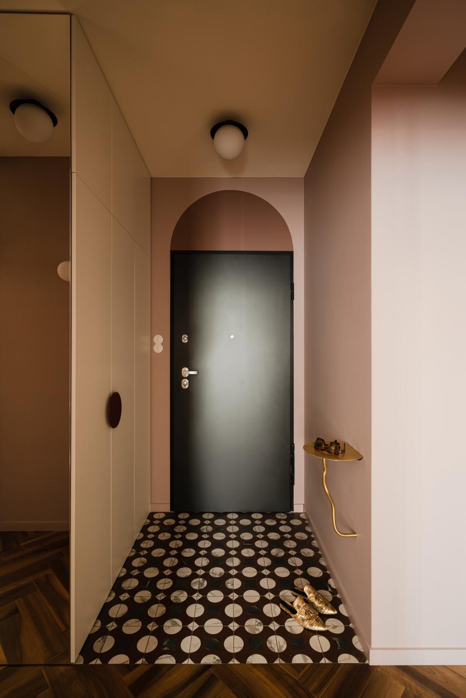
Yana’s most daring design choice, however, was her liberal use of graphic patterns. It begins in the little foyer, where an arched doorway is paired with black-and-white polka-dot tiles. “I always try to make an impression at the entrance,” she explains. “I like to create some playful space. When you come inside of the apartment, I like to make a wow effect.”
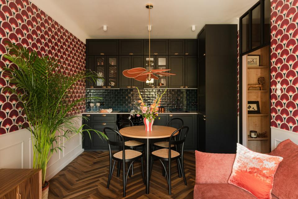
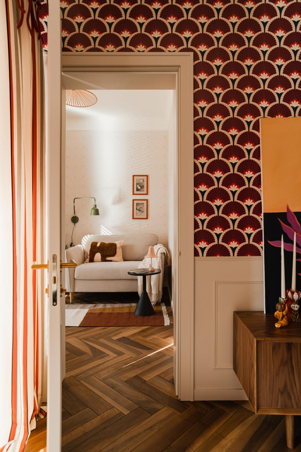
Herringbone walnut floors lead into the open living-dining-kitchen area, which is covered in a shock of burgundy fan wallpaper. The vivid, geometric print is balanced out by the black Shaker-style cabinetry and the ivory picture frame molding that Yana installed for architectural charm. She furnished the eating zone with bentwood bistro chairs and a flower-like pendant, then outfitted the lounging section with a rose-hued velvet sofa and a vintage gilded mirror.
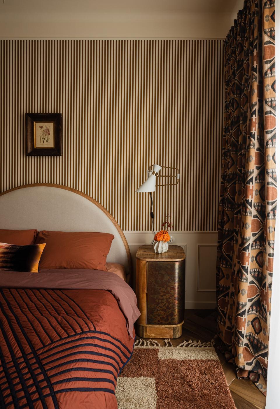
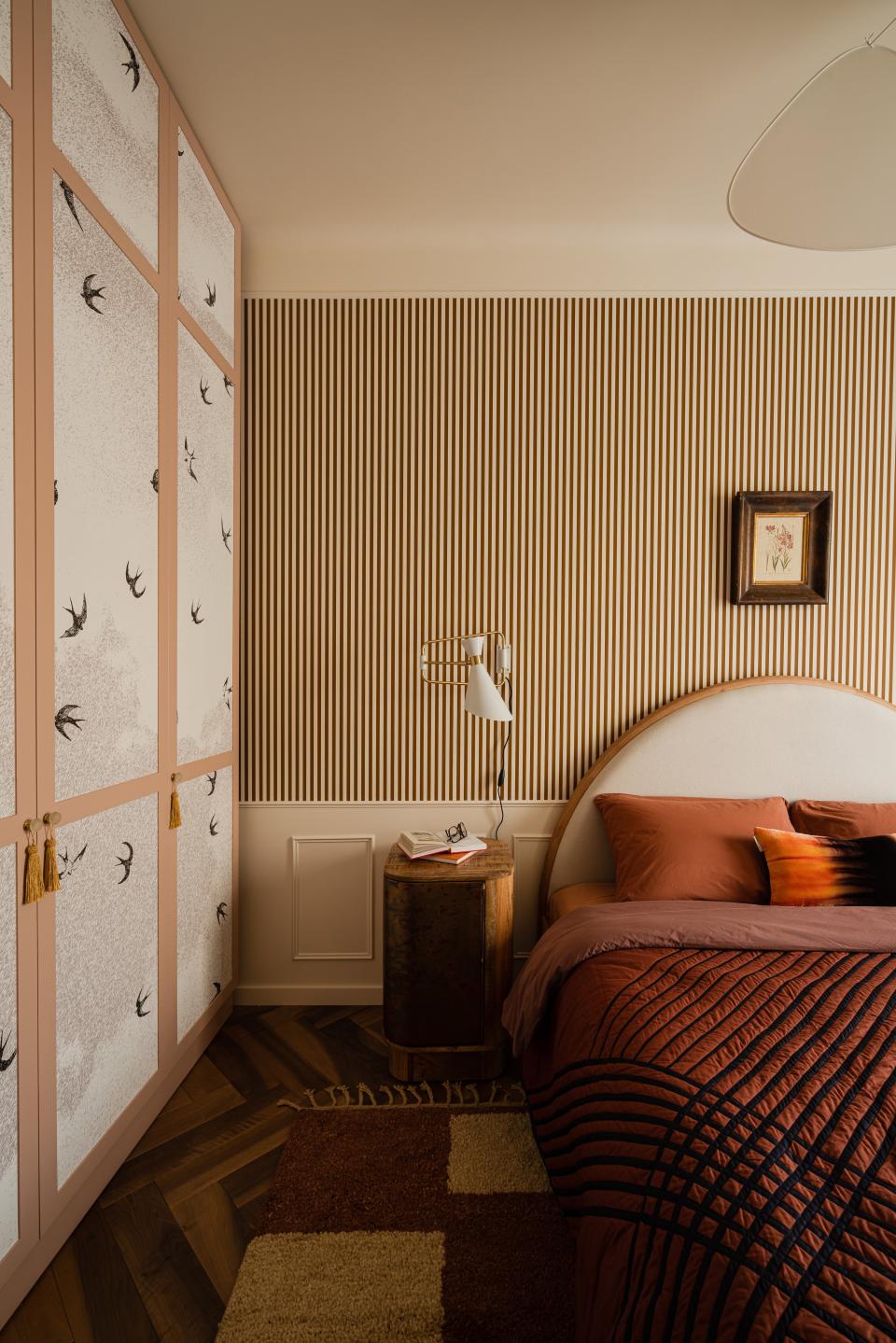
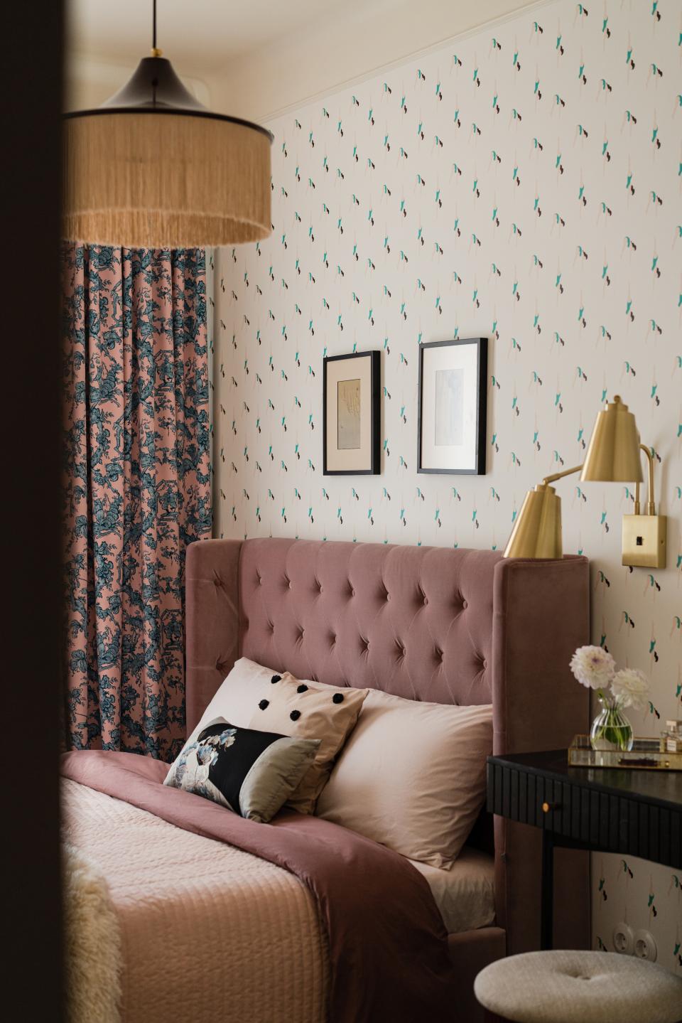
In the primary bedroom, terra-cotta-and-white vertical striped wallpaper mingles with earthy tribal patterned curtains and a custom wardrobe with bird-motif panels. Meanwhile, the daughter’s bedroom mixes a whimsical gymnastics-girl wallpaper with peach-and-blue floral drapes and a tufted mauve velvet headboard. “All the prints do not match very well, but they work together,” Yana says. “I don’t know how.”
While Yana would’ve preferred to build out a pantry or walk-in closet in the tiny third room, she followed the homeowners’ wishes and curated an office with a pullout couch for their son to sleep on. The small space features a dainty Art Deco wallpaper, burnt orange botanical window treatments, and a neutral, color-block rug.
Yana went even bolder in the bathroom, where she combined minty blue and ruby red tiles for a vibrant vintage look. The pastel squares serve as a backdrop for the jewel-toned ones, which create a thick horizontal stripe across the walls and cover the base of the tub and the vanity. She chose a matching scarlet shower curtain for extra drama. In this apartment, more is more.

Originally Appeared on Architectural Digest
More Great Stories From Clever
The Very Best Sectional Sofas, Tested and Reviewed by Our Editors
In Coastal Maine, a Writer-Carpenter’s Restored Home Is a Vision in Yellow
Korean Minimalism Is Inspiring a New Generation of Creatives
Color Drenching: Everything You Need to Know About This Monochromatic Trend
Browse the AD PRO Directory to find an AD-approved design expert for your next project.
Not a subscriber? Join AD for print and digital access now.

