"The Atari logo has become a container for peoples' feelings" - new creative director Tim Lapetino defines Atari's legacy
Few game brands have as much instant recognition as Atari. The US games publisher and developer holds a unique place in pop culture, a heritage brand that's also an icon it can instantly take many gamers and non-gamers back to a place and time. Few brands hold this influence, perhaps only the likes of Apple, Sega and Nike can claim to have influenced the broader pop culture of a time.
Atari has passed through many hands over the years, often becoming a licensed brand to support others, its uniqueness capable of lending authority to other brands. In 2024 Atari is having a renaissance; it's back to being a game developer as well as a publisher, is making new hardware in unique retro consoles like the Atari 2600+ and now owns acclaimed developers Digital Eclipse and Nightdive Studios. Times are looking up for the iconic US brand.
Atari has renowned for bringing back the master of bringing back the best retro game consoles, and has even found a gap to release a replica of niche retro home computer the Atari 400 Mini, and has new games releasing on the best games consoles like PlayStation 5 and Xbox Series X.
So why the resurgent success? The newly hired creative director Tim Lapetino says, firstly, we need to recognise Atari made great games. He tells me: "We wouldn't be having this conversation today if Atari didn't make amazing games; in the '70s, '80s, and even into the '90s. Right? So you've got to have a great product and I think Atari was a pioneer, and it really captured something of the zeitgeist of those eras."
Atari logo is great but the games matter
He's correct of course, many associate Atari with their childhoods; my first games console was an Atari 2600, and I have fond memories of fighting my brother for games of Space Invaders and Combat on a black and white CRT TV. It's also the style of game, says Tim, that makes Atari feel unique in the mind's-eye. The "easy to learn, difficult to master" idea is core to the Atari brand pinpoints Tim.
"I think also, there's the idea that Atari was never just a video game company," begins Tim. "It was always speaking to the larger culture, always pushing the boundaries of being cemented in video games and entertainment; it felt in fashion."
This is how Atari is beginning to grow again, but exploring how the brand can be harnessed outside of just being known for games - though this side of the brand is now, possibly, more important than ever with internally-developed, self-published new Atari games on the horizon. Atari X, for example the publishers popular Blockchain experiment with artist Butcher Billy, while new versions of iconic games and new games like Jeff Minter's Akka Arrh continue to broaden Atari's fanbase.
In recent years Atari has played up to its heritage, becoming a new icon of the rise in retro gaming. Over the years Atari as a brand has adopted a new meaning in a cultural context, it's become synonymous with a particular kind of nostalgic clamour for simpler but perhaps more innovative games.
"Atari has a connection to all things retro, that really transcends the games that we made in the 70s and 80s and 90s," says Tim. "But it's also an association for something that is cool and hip, and multiple generations of gamers and even pop culture folks know Atari as a heritage brand."


Steve Jobs, Steve Wozniak and Atari's start-up
There's something very American and celebratory Californian about Atari. When you think of Atari you imagine casual plaid shirts, lazy sunshine beer Fridays and groundbreaking tech; it conjures images of risk taking and tech dreamers. It's not a surprise that Atari can name-drop the likes of Steve Jobs as early, foundational hired hands. Steve Wozniak on hit Atari game Breakout. As Tim tells me, "Atari in the '70s was a startup before startup culture existed”.
A major part of making this cannonball of a new studio land was, of course, that logo. (Naturally, games like PONG helped.) But Atari was a new kind of game developer with one eye on marketing, and after all this was the decade of t-shirt movies like Jaws and Star Wars.
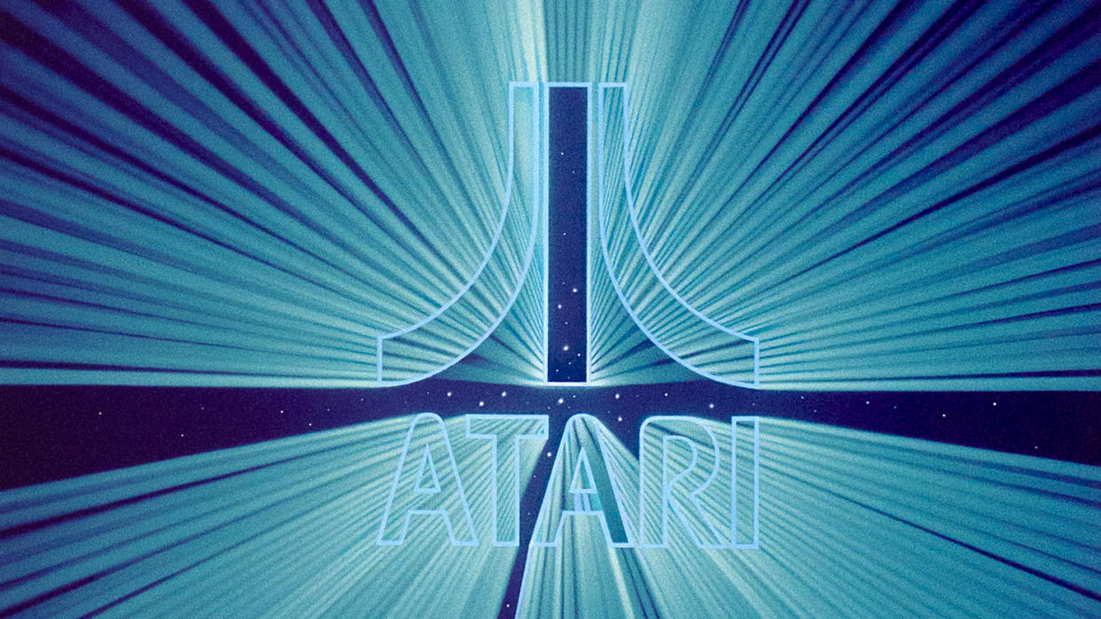
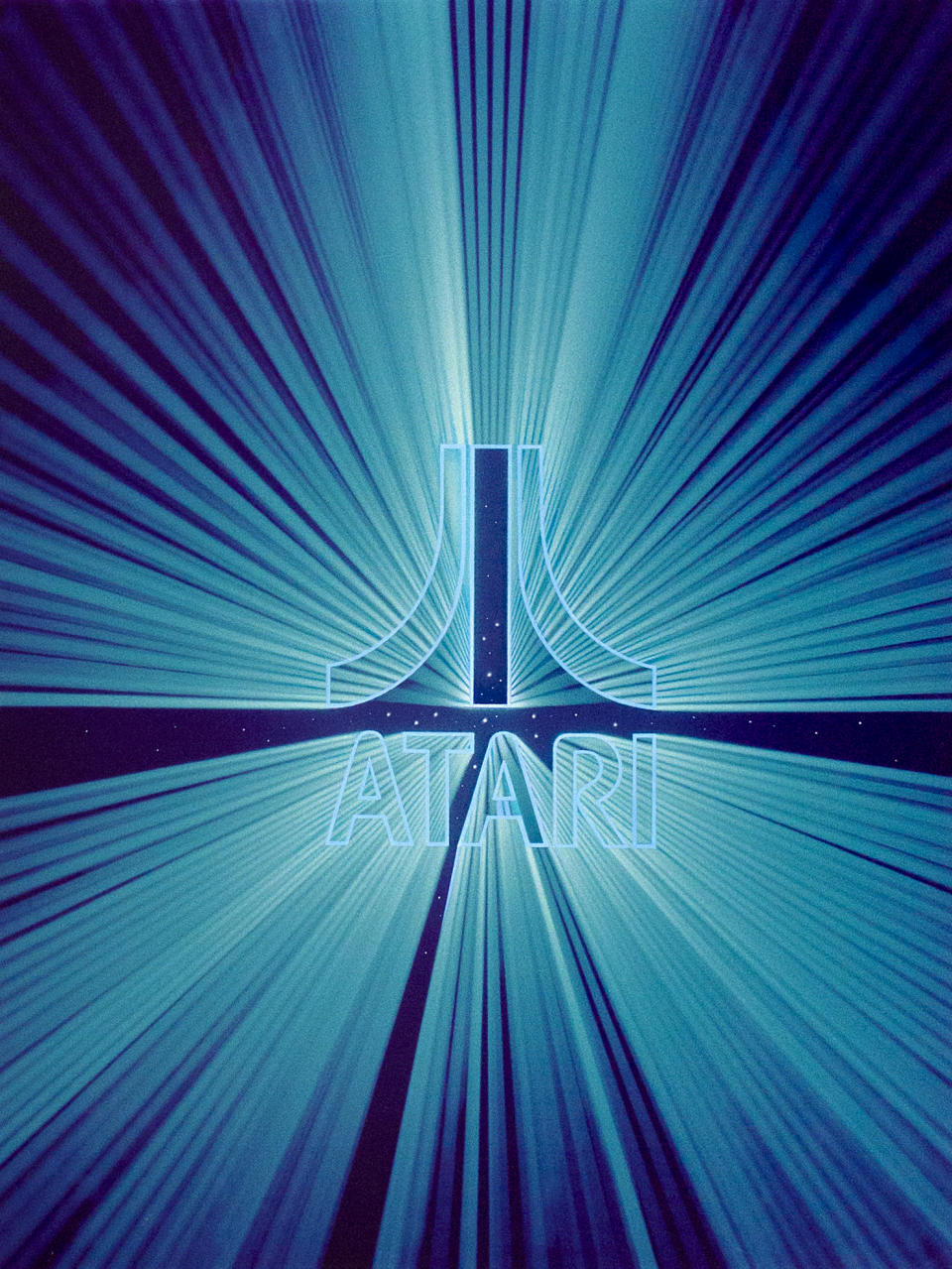
"The logo is just a great design," begins Tim. "It's an iconic design, and that helps us stand the test of time. It doesn't feel dated. It feels like it could have been created yesterday and it still doesn't feel so stuck in the past that it feels like a relic."
The Atari logo has gathered its own history over the years, and differs depending on who you listen to. In Tim's own book Art of Atari he shares some competing tales of how the logo came about.
Designer George Opperman once said, in a 1983 interview in Video Games magazine, the logo was influenced by the 'force' of PONG's ball hitting its pixel bats, in other interviews Atari creative director George Faraco called this nonsense, while co-founder Nolan Bushnell has commented in the past how he felt George Opperman would create playful narratives to tease why the Atari logo looks the way it does. This grew over the years, with many believing the very American games brand owed its logo design to Mount Fuji.
"Brands acquire meaning over time, that's what we do, as brand designers, logo designers, creative people, we create something, but then it's up to both the brand and the people who care about it to fill it with meaning," says Tim.
The creative director then says, thoughtfully: "I think the Atari logo has become a container for peoples' feelings about those eras and their childhoods, and great games and the idea of innovative electronics, like all of all of those things get poured into that logo and so now that logo stamp says something much more than when it was created by George Opperman in the '70s."
Recalling Atari's iconic box art and illustration
Fascinatingly, the Atari logo has rarely changed in over the 50 years since its launch. Save for a few minor tweaks or cosmetic changes the Atari logo has stayed the same as it did in 1973 when it adorned the side of an arcade cabinet for the game Space Race.
"Like everything, logo design is subject to fashion and fads," reflects Tim when I joke how strange it is for a logo to never really change. He explains: "There's always a thought that simple is better, and distilling logos down to their basic elements is always going to make something that you know will not only stand the sense of time but also just really feels timeless. It can sit above trends and fashion and it can rise above changing styles, those will come and go and all brands need to pay attention to that, but you need a brand identity that can sort of transcend it all."
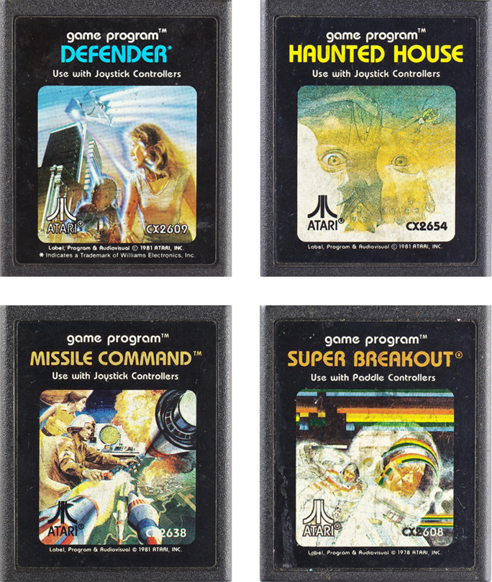
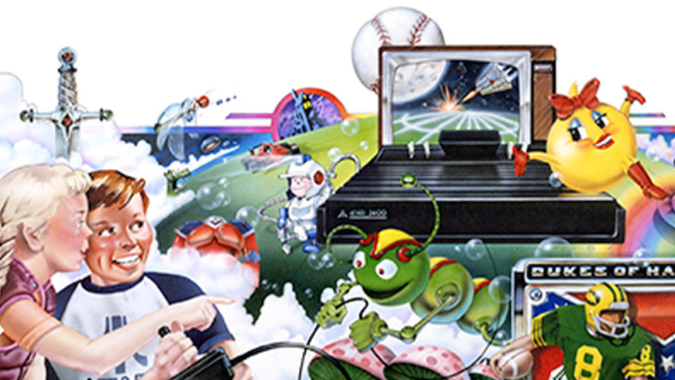
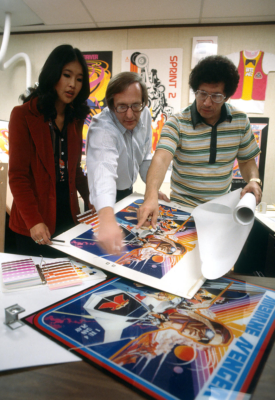
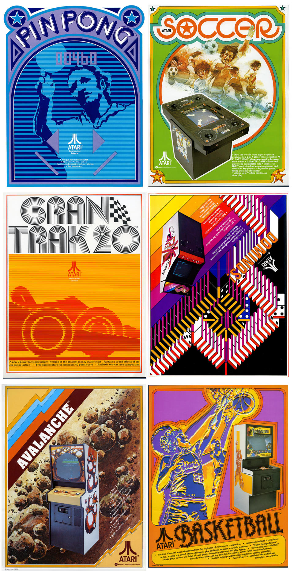
Just as the logo has proved iconic, so has the Atari box art. Illustrators such as Steve Hendricks and Cliff Spohn were hired to create energetic, hand-painted and sophisticated art for each game's box cover. These artists came from the print tradition and transferred that high-end look into Atari's games packaging.
These days Atari's box art, which comprises vivid montages of action more reminiscent of blockbuster movie posters, even when the 'action' was chess, can feel as if Atari was overselling its games. But remember, Atari was delivering bleeding edge technology into homes, and as someone who owned Space Invaders, Breakout and Missile Command I can attest any perceived disconnect between art and game never existed (apart, perhaps, Video Chess, which looks epic).
"The truth is those games were innovative and really interesting. It wasn't like they were trying to make simple, unsophisticated games," says Tim. "That was the state of the art at the time. But the thinking on the artwork was very much about capturing the feeling and the emotion and the energy of playing those games. Because don't forget, sitting in your living room playing a game on your television was still a really new idea."
Setting a new standard for game art
Tim explains how the Atari artists and creative directors of the time were focused on finding the "touch point" for often abstract games like Super Breakout and Missile Command. The aim was to prime players for the experience they're going to have and create a real world, relatable connection. "It was very much about capturing that energy in that experience and preparing people for what they were going to see when they plug that cartridge into the console and turn it on," says Tim.
This was the 8-bit era when a game's protagonist was defined by two or three pixels and the art needed to fill in the gaps. Atari's approach to its illustrative box art formed a world players could immerse themselves in, it told stories and became an integral part of the gameplay experience. In a similar way music fans would sit and listen to a record while pouring over an album sleeve, Atari's commitment to illustrative art filled in the gaps between gameplay and imagination that three pixels couldn't reach.
"A lot of it comes back to the original creative director, George Opperman, who was also an illustrator and a designer and a creative director," considers Tim. "If you look at some of the other video game companies at the time, they didn't have Atari's strong editorial style of art direction that came from corporate design, or magazine design or magazine illustration, which is the place where George came from, and he really brought this sophisticated art style from things like movie posters and paperback novels; they appropriated that and brought it into the world of video games and that was a huge renovation."

Everything ties together with Tim at the helm as Atari's new creative director. His passion for the brand, its legacy of art, design and games, is unavoidable, and that runs through this new incarnation of Atari.
The release of the acclaimed Atari 50: The Anniversary Celebration for all the best games consoles brought together five decades of branding, marketing and game design into one games collection. It beautifully highlighted the impact Atari has made over the decades on game design, but also on pop culture more broadly.
"Digital Eclipse just killed it with that, they really did an incredible job on that game," says Tim excitedly. Seeing 100 Atari games in one collection supported by interviews, art and behind the scene insights brought the brand's legacy to life in a visceral way. "I think you can look at any of those individual games and say, 'Oh, I really liked this or this is really hard or challenging, or maybe that's not my thing', but taken as a whole I think they really provide a bigger story that I think people can get wrapped in and see these games as different steps stones and different stories along the way of this larger brand story," comments Tim.
The 'tension' of Atari's legacy
More recently the Atari 2600+ launched to rave reviews, demonstrating the unique position of the Atari brand for modern audiences. This new full-size console enables old Atari cartridges to be played on a modern TV, the console is a replica of the same machine that was released in 1977. It's both a celebration of the past and taps into the modern zeitgeist for indie game design innovation over graphics and retro revivals.
Tim refers to this as the brand's "wonderful tension", its ability to remain relevant and while having something to say from a brand perspective, in 2024 and beyond, while also continuing to hold, nurture and talk about Atari's rich history.
"Those two things are intertwined," he says. "It's what all really good brands do, and I think it is an amazing opportunity to come to a brand like Atari, that has such a rich history that the company is not only not afraid of, but actively embraces.
"You know, and I've worked with so many different companies over the years in my role as a design consultant and with different clients and different companies have a different relationship with their past, some of them want to start fresh, they want to blow it up or they want to minimise it or they want to just strip mine it.
"But Atari has a different way, the team and everybody else who's involved really gets a sense that this is valuable. We want to continue that Atari story and we want to make sure that we keep telling that story."
Visit the Atari website to discover what this retro game brand has coming in 2024.

