30 Door Painting Ideas for Inside Your Home and Out
More than just a functional feature of the home, doors can be a major design element with the right paint. Of course, you don’t have to go all out—even a subtle splash of color can make a world of difference.
If it seems like your doors are having an identity crisis and desperately need a facelift, you’ve come to the right place.
Keep scrolling for 30 door painting ideas that will make any space look fresh and personal. From the never-failing classics (that aren’t white) to artsy designs, we’ve included something for everyone. Because who says doors have to be ordinary?
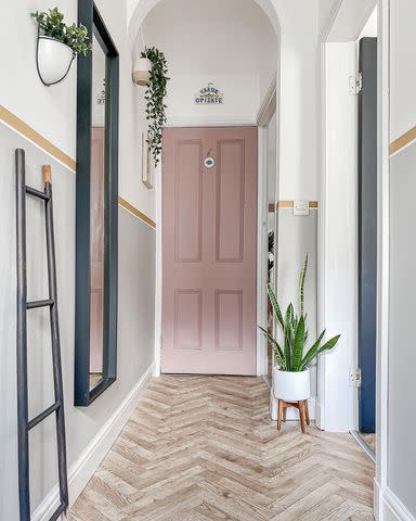
Baby Pink
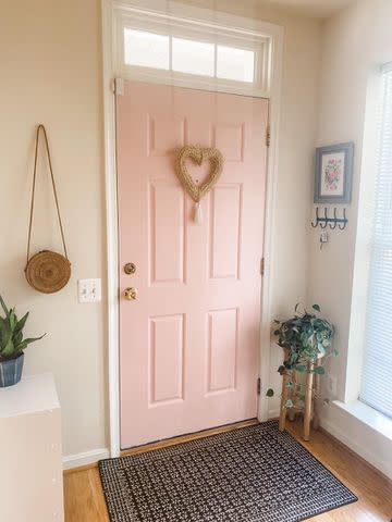
@kristengaraffo / Instagram
Pink lovers, we found the perfect door paint for you. A pale pink hue, like the one shown here, brings a nice pop of color without screaming “Hey, look at me, I’m PINK!”. Instead, it’s soft and quietly inviting—appearing almost as a neutral next to the cream walls.
Paint used: Sherwin-Williams Coral Perfection SW 1077
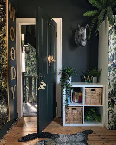
Rich Emerald
@pompeohome / Instagram
Classy, luxe, and attention-grabbing are just a few words to describe @Pompeohome’s entryway. We all know the glossy, green doors run the show here.
Give emerald a go if you want a look that’s equal parts dramatic and sophisticated. And don’t forget to introduce a few gold accents to further elevate the space.
Paint used: Behr Dark Everglade
Jet Black
Have an old door that has seen better days? Don’t give up on it just yet. A lick of black paint is all that’s needed to hide decades' worth of wear and tear. Not to mention, this bold neutral looks quite modern on doors yet has a timeless appeal to it. This makes it an easy fit with any decor scheme.
Paint suggestion: Sherwin-Williams Black Magic SW 6991
Scalloped Walls + Door
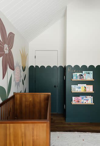
Design by @illustrious_interiors / Photo by @sharon_litchfield
There’s something about scalloped walls that makes our hearts sing. Maybe it’s the playful character or that it softens up the space. Either way, don’t forget you can deck the door, too, when painting scallops on the walls.
Paint used: Benjamin Moore Crisp Romaine 686
Scalloped Door Frame
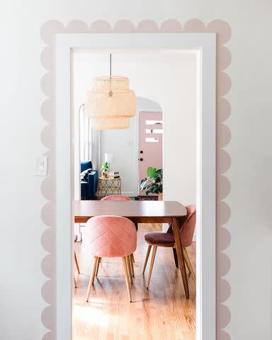
@rosedoorhome / Instagram
Here’s another example of a scalloped door, but this time painted around the door frame for a small but impactful change. This idea is great for those who can’t (or don’t want to) paint their doors—and also proof that scallops aren’t only reserved for children’s rooms.
Paint suggestion: Farrow & Ball Calamine 230.
Faint Gray
@estherbschmidt / Instagram
Here’s a lovely option for those who don’t want to stray too far from the white color palette. This soft shade of gray is neither too showy nor too bland and is also incredibly versatile. It’ll work on any door you like, be it the entrance to your home, bedroom, or all of your doors together.
Paint suggestion: Sherwin-Williams Repose Gray SW 7015
Candy Colors
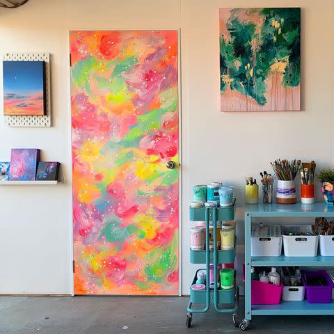
@danielle.monique.art / Instagram
This artist's studio door is what dreams are made of. Follow her lead and use your door as a blank canvas. The only rule: Let your imagination roam free.
Dusty Rose
@homebypolly / Instagram
If you love pink but prefer a more grown-up approach, look no further. This color oozes subtlety and vintage glamor, yet feels right at home in more contemporary spaces.
Take notes from this entryway, which embraces a neutral palette, except for the dusty rose door and gold wall trim for a chic contrast.
Paint used: Frenchic Dusky Blush Al Fresco
Tangerine Orange
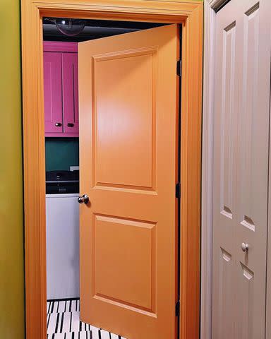
@designaddictmom / Instagram
Sure, orange may not be the first color we reach for when it comes to door paint, but maybe it should.
Notice how the bright orange door instantly livens up the space—and it goes well with more colors than you’d think. Leave it to @designaddictmom to pull off a colorful laundry room that speaks in fun, energetic hues!
Paint suggestion: Sherwin-Williams Calypso Orange 2015-30
Shale Gray
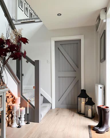
@thebarnatmanorfarm / Instagram
Behold, the perfect complement to farmhouse and country interiors. We especially love how this color isn’t too gloomy or cold like most dark grays. More points to you if you use it on barn or Dutch doors!
Paint used: Neptune Shale Paint
Mural on a Door
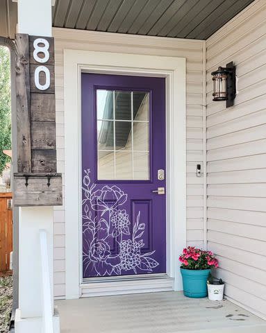
@illustrious_interiors / Instagram
Why stop at a different paint color when you can dress it up even further? This mural artist does just that, creating the prettiest of doors with flowers, trees, and grass drawings. From the rich purple paint to the contrasting line art, this door truly speaks for itself!
Paint suggestion: Benjamin Moore Ultra Violet 1372
Dusty Plaster Pink
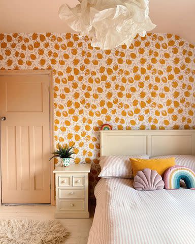
@twentyfourcentral / Instagram
If you have patterned walls, coat your door in a complementary hue to artfully tie the room together. In this bedroom, interior stylist Kelly Anderson went ahead and matched the door and ceiling to the lemon stems on the walls.
The result? A stunning bedroom that feels warm and complete, while celebrating dusty pink.
Paint used: Farrow & Ball Setting Plaster 231
Turquoise
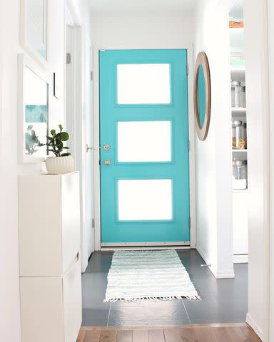
@danslelakehouse / Instagram
Craving something light, airy, and refreshing? This vibrant blue will have you dreaming of tropical beaches—just what you need to create a sense of blissful escapism in your home. All-white walls further set the beachy mood, allowing the turquoise door to stand out ever so brightly.
Paint suggestion: Benjamin Moore Mexicali Turquoise 662
Joyful Yellow
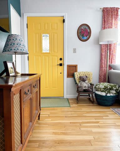
@annieslovelythings / Instagram
Paired with a teal accent wall and lots of patterned furnishings, this living room has us saying yes to yellow doors. When inside, a yellow-painted door helps start the day off on the right foot with its cheery presence. Outside, it makes a happy first impression, hinting at the positive energy that awaits inside.
Paint used: Diamond Vogel Dandy Lion 0829
Color Blocking
@iamhayleystuart / Instagram
It’s all about the details in this blogger’s house—no wonder she outlined every part of her door, including the knob! Color blocking is such a fun way to show off paneled details and make a door the star of the show.
Paint used: Salmon, Coral, and Dijon by @makeitrustoleum
Muted Green
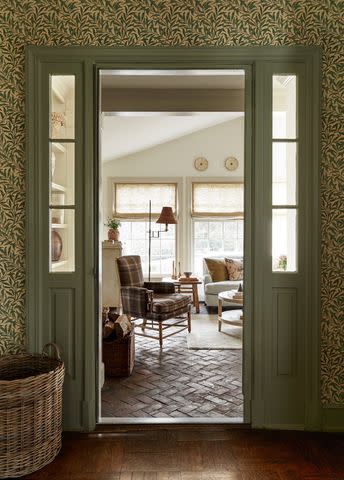
If you’re looking for something a bit more serene, try a muted green. This color exudes a grounded, earthy feel—making it the ultimate choice for bringing the outdoors in.
Here, it’s coordinated with leaf-print wallpaper, though it would look just as gorgeous against a white backdrop.
Paint suggestion: Benjamin Moore Land of Liberty 440
Old World Blue
@candidlydeena / Instagram
Speaking of nature-inspired colors, we can’t resist a classic blue and white combo. Notice how the blue is toned down, just like a gloomy afternoon. Instead of giving off nautical seaside vibes, it feels more tranquil and peaceful; hence perfect for anywhere that could do with a calm touch.
Paint used: Benjamin Moore Water’s Edge 1635
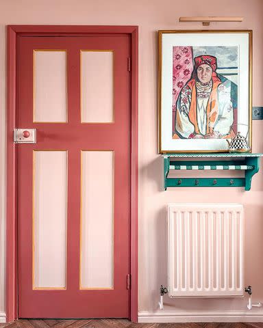
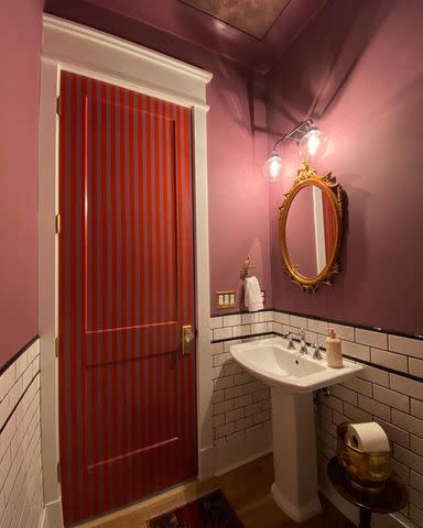
Burnt Red
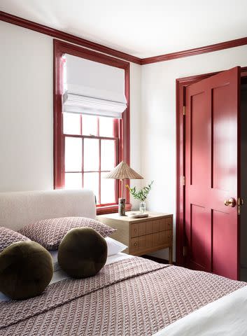
Design by D Burns Interiors / Photo by Tamara Lundgren
Bold? Check. Seductive? Check. Warm, inviting, and timeless? Check, check, check. Yet, burnt red rarely makes it to the top of door color lists. Luckily, this bedroom proves that painting your door a rich, plummy red color can really add pizazz.
We’re also obsessed with the way the window frame, crown molding, and baseboards are highlighted for a cohesive design scheme.
Paint suggestion: Farrow & Ball Incarnadine 248
Lilac Purple
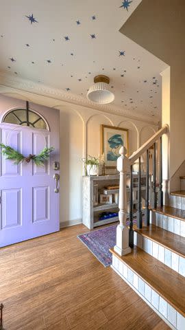
@cottageoncanecreek / Instagram
For some reason, purple is often overlooked as a door color—but not in this dreamy entryway. As with any color, the key is to pick the right shade. Dark violet has a mysterious, gothic quality while paler purples impart a soothing yet playful ambiance.
If you’re worried that a purple door might look out of place in your home, find a rug that pulls it all together!
Paint used: Benjamin Moore Hazy Lilac 2116-40
Happy Shapes
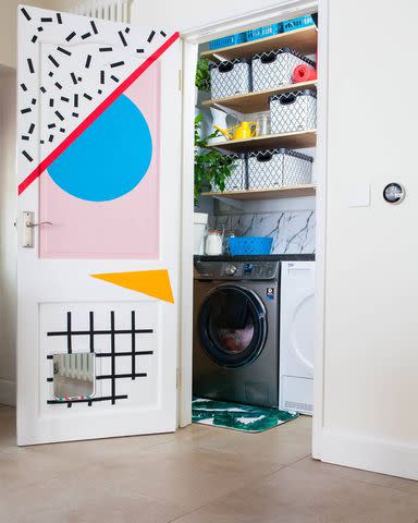
@oxfordone / Instagram
Who knew door painting could make chores less boring? Here, interior blogger Lissi of @oxfordone got creative with what she had on hand—basically, leftover paint samples and electrical tape—to make over her bare utility room door. Her inspiration? The colorful world of Memphis design!
Moody Blue-Black
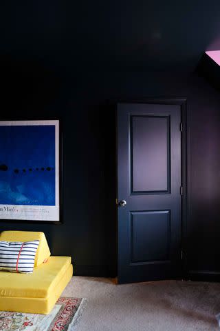
@designaddictmom / Instagram
This one’s for team dark and moody. An almost black with a blue tinge is a classy choice for a front door but also adds drama and depth when used indoors. Feeling daring?
Drench your space—including the ceiling, baseboards, and door—in this dominant shade to establish an intimate mood. Only proceed if the room gets ample natural light to prevent a cave-like effect.
Paint used: Benjamin Moore Soot 2129-20
Subtle Beige
@ourhappyharderhome / Instagram
When in doubt, ditch white doors for something a little warmer. Beige is always a safe bet no matter your decorating style. And while this color has a reputation for being boring, we like to think of it as clean, understated, and effortlessly chic.
It delivers just enough visual interest against flat white walls and seamlessly blends into the space at the same time.
Paint used: Sherwin-Williams Accessible Gray SW 7036
Striped Door
@ourfifthhouse / Instagram
Guess what packs a bigger punch than a bold paint color? Two of them! This blogger originally painted her powder room door the same color as the walls, until she decided to take the paint job a step further with stripes.
For this DIY project, you’ll need lots of painter’s tape and free time. But the finished result makes for a fun, unexpected surprise.
Paint used: Sherwin-Williams Plum Dandy SW 6284 and Sherwin-Williams Chinese Red SW 0057
Chalky Blue-Gray
@becs_bakers_abode / Instagram
Speaking of color combinations, here’s a pick that seems rather apropos for both minimalists and maximalists.
We love that this “duck egg blue meets gray” adds visual impact without overpowering the room. And as you can tell, it looks just as charming on the door as it does on the walls.
Paint used: Superfresco Easy Vacay Mode
Hot Pink
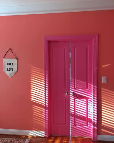
@designaddictmom / Instagram
Hot pink isn't for everyone, but it sure pops! If you aren’t afraid of veering into Barbiecore territory, go ahead and slap the boldest of pinks on your doors. This audacious color would be fabulous in a bedroom or bathroom—or better yet, right on your front door if you don’t mind being the talk of the neighborhood.
Paint used: Benjamin Moore Pink Ladies 1347
Color Outside the Lines
@banyanbridges / Instagram
If you’re feeling extra creative, paint a mural on both your walls and door. Using the power of paint, this muralist transformed her once lifeless entryway into the most cheerful spot in her house.
The overlapping shapes in sunny colors make this space so a-door-able! How can you not smile when you come across such a sight?
Paint used: Behr Cupcake Pink M160-1 and Behr Smiley Face P260-6
Teal
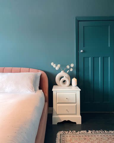
@twentyfourcentral / Instagram
Even if blue isn’t your favorite color, it’s hard not to swoon over this tone-on-tone bedroom.
Again, painting your doors and walls a similar shade can drastically enhance the room’s ambiance. And this saturated teal is a go-to for creating a calming oasis, inspired by the deep sea on a sunny day.
Paint suggestion: Benjamin Moore Teal Ocean 2049-30
Deep, Dark Green
@haighyshomeinyorkshire / Instagram
A black door can sometimes appear too serious and a bright green door too garish. But what if we tell you, there’s a paint color out there that combines the intensity of black with the freshness of green? You can’t beat this combo if you want to make an adventurous statement on your doors!
Paint used: Farrow & Ball Studio Green 93
Matte Brown
@thisborrowedhome / Instagram
We don’t often see brown paint used on doors, (or all four walls for that matter), but when we do, it's beautiful. As an earthy hue, brown has a grounding effect that cocoons the space.
This makes it a solid choice for color drenching, though you can start small by just painting the doors. For a more inviting and warm look, you can’t go wrong with a matte finish.
Paint used: Sherwin-Williams Bateau Brown SW 6033
Mustard Yellow
@wellnestedhome / Instagram
If your heart is set on a feel-good color, but find primary yellow to be too intense for your liking, consider a deep mustardy one. This hue errs on the cautious side, and more importantly, isn’t blinding when the sun’s out.
Mustard yellow looks even better with natural elements, such as wood, brick, and stone. It also unexpectedly goes with every season, which is a big plus.
Paint used: Benjamin Moore Leap of Faith 210
Frequently Asked Questions
What color paint is best for doors?
This depends on the look and feel you want to achieve. Black, gray, and deep blues are popular choices for their timeless appeal and versatility—these colors virtually go with every home style and hide dirt best. If you want to go bolder, a bright shade like red, yellow, or orange will stand out. And in cases where you want to create a calming atmosphere, stick to soft, muted colors.
Should doors be lighter or darker than the walls?
If you have light walls, a darker door can add depth and interest. If you have dark walls, a lighter door will bring a pop of brightness to the space. Whatever the case, a contrasting color allows the door to stand out as a feature/focal point. Then again, you can also match your doors with your walls (or paint them a slightly different shade) to make them less noticeable for a nice visual flow.
Should doors and trim be painted the same color?
You don’t have to paint your doors and trim the same color, but doing this can make your space look more cohesive and complete since there’s less visible contrast. Another option is to paint the trim in a completely different color to make it pop. Or play it safe with white trim. The choice is up to you!
Read Next: How to Paint a Front Door: Exterior Painting Tips
Read the original article on The Spruce.

