21 Porch Paint Colors Southern Designers Are Loving This Season
Spruce up your outdoor space with a fresh coat.
Laurey W. Glenn, Styling: Buffy Hargett Miller
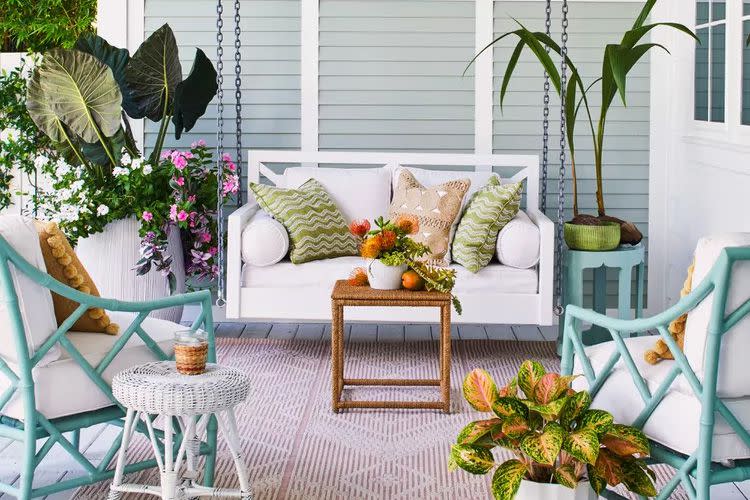
Regardless of whether you gravitate towards bolder colors or more neutral tones, it’s important that any accent paint colors still feel cohesive with the rest of your home. “The porch color should ultimately complement the overall color scheme of your house,” says Palm Beach interior designer Ellen Kavanaugh. You might consider a more traditional selection for a front porch while a screened-in space leaves more room for playful paint.
“It’s also important to take into consideration climate and light exposure; light colors tend to reflect sunlight, keeping the area cooler, which can be beneficial in hot climates like Southern states,” adds Kavanaugh. From classic whites and haint blues to deep greens and peachy pinks, these are the 21 porch paint colors that Southern designers are head-over-heels for this season.
Related: Decorating Mistakes That Make Your Porch Look Unfinished, According To A Designer
Nature-Inspired Shades of Greens
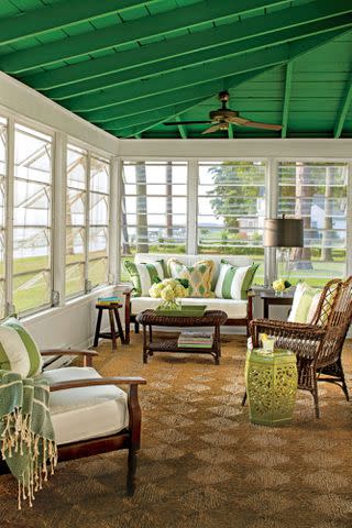
Pull inspiration for your color palette from the home’s surroundings. “From sage to olive to verdigris, we love any shade of green for the porch,” says Anna Still and Marguerite Johnson of Still Johnson Interiors in Birmingham, Alabama. “Using green paint creates a seamless transition from indoors to out and visually connects the porch to its surroundings. Luckily for us, homes in the South almost always have something evergreen in the yard.”
Farrow & Ball Bancha, No. 298
“Screened porches that are their own little spaces can depart from the details of the main house,” note the Birmingham-based designers. “We like to paint the interior walls, ceiling, and any trim work detail. And for a screened porch washed in green, we love to go bold with Farrow & Ball’s Bancha which is one of our favorite colors in general!”
Farrow & Ball Lichen, No. 19
“For front porches, we would suggest keeping the walls, ceiling, and flooring in the same style as the rest of the house and bringing that pop of green at the front door and windows or shutters (but not both windows and shutters),” says Still Johnson Interiors. “If you’re going the front door and windows route, we like something soft like Farrow & Ball’s Lichen.”
Benjamin Moore Peale Green, HC-121
South Carolina designer Caroline Brackett loves muted sage and olive greens like Benjamin Moore’s Peale Green. “The key is to select colors that create a welcoming, inviting atmosphere while complementing the architectural style and natural surroundings of the home,” she says.
Farrow & Ball Green Ground, No. 206
This soft green is a current favorite for Emily Wyatt of Wyatt Designs in Atlanta, Georgia. Its refreshing hue is beautiful indoors and out, but Wyatt loves it as a pop of color against a white home for a front door or shutters.
ALISON GOOTEE; Styling by Dakota Willimon
Calming Blues
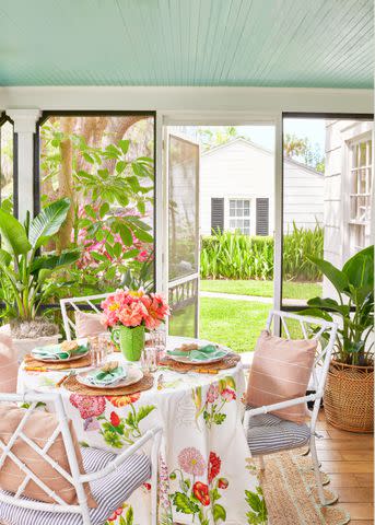
In the South, a touch of blue paint on the porch is nothing new. “Southerners have been painting their porch ceilings a pale blue green, or haint blue, for hundreds of years, and it’s a tradition we still love today,” says Knoxville, Tennessee, interior designer Caroline Levenson. The tradition stems from the Gullah Geechee communities of coastal Georgia and South Carolina who believed the color would ward off “haints”, or spirits of the dead, away from the home. "The blue ceiling is also thought to confuse and draw mosquitos up toward the blue "sky" and away from folks sitting on the porch," adds the designer.
Valspar Blue Cashmere (M339)
As a slight departure from the traditional hue, try this gray-blue shade from Valspar on your porch ceiling. "We prefer a more muted, earthy blue like Blue Cashmere, but it seems to do the trick," says Levenson.
Sherwin-Williams Upward, SW 6239
"We often keep the wall color on an outdoor porch constant with the exterior color of the house and then love to accent the ceiling with soft colors that you would see in the landscape,” says Schilling and Company in Atlanta, Georgia, who notes Sherwin-Williams Color of the Year 2024 (Upward) is perfect for this.
Farrow & Ball Borrowed Light, No. 235
Stick to tradition. “I try to paint the porch ceiling light blue in a nod to classic Southern Porches,” says Atlanta designer Laura Jenkins. “I love Farrow & Ball's Borrowed Light which not only is the perfect light blue, but is a great color name for a porch!” Jenkins also loves the shade for painted porch floors and indoor wood flooring too.
Pretty Peaches
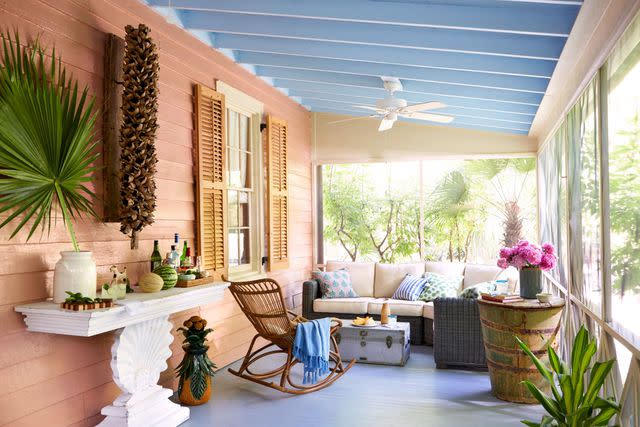
This season, Ellen Kavanaugh is loving a classic peach palette. “If your home has a neutral color palette, you should consider a porch color that adds a pop of color without clashing with the existing scheme, like Benjamin Moore’s Daytona Peach, 079.” she says. “For houses with bold or dark colors, a lighter shade for the porch can create a balanced look.”
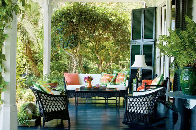
Charleston Green
The almost-black shade of a Charleston Green provides a great focal point for any porch whether it’s splashed on the furniture or front door. "Freshening up antique wicker furniture with Charleston Green paint looks fresh and hides dirt," says Levenson. "We also love a joggling board—a combination bench and rocking chair that dates back to the early 1800s and the rich color really makes the sculptural lines of these charming bouncy benches pop." Get the look with Benjamin Moore Black Forest Green, HC-187, Sherwin-Williams Jasper, SW 6216, or Sherwin-Williams Greenblack, SW 6994.
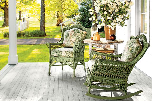
Laurey W. Glenn
Muddy-Toned Neutrals
“When it comes to choosing a paint color for your porch floor, muddy earth tones strike the perfect balance," says Levenson. "These colors hide the dirt and dust that inevitably settle on your porch, but aren't so dark that they absorb heat and burn your feet."
Related: 7 Reasons Southern Designers Avoid Using Dark Paint Colors On The Porch
Sherwin-Williams Mushroom, SW 9587
For a more neutral palette, Levenson loves the warm blend of cream, brown, and gray of this shade which is subtle yet versatile enough to add a little contrast.
Benjamin Moore Harwood Putty, CW-5
Another favorite of Levenson’s is this shade which mimics the effect of whitewash with its slight blue tint. Use as a primary exterior color or for small details for slight variation.
Benjamin Moore Stone, 2112-40
For a moodier look, Levenson reaches for this brownish gray hue.
Benjamin Moore Grant Beige, HC-83
Neutral doesn’t have to mean boring. According to Atlanta, Georgia, interior designer Katie Wolf, this is the perfect neutral—not too pink and not too yellow. “It’s beautiful on decking and rails and it plays equally well with a red brick exterior or a white wood exterior.”
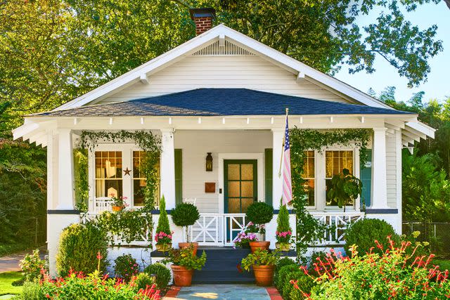
JAMES RANSOM; STYLING: Veronica Olson
Like the interiors, the front yard tells a story with roadside-rescue boxwoods and flowers inspired by Hendersonâs childhood garden.Moodier Greens and Blues
Lean into deeper tones for contrast. “Dark green paint colors make for beautiful outdoor rooms and complement natural wood tones and copper exterior lighting,” says Wolf while Bracket gravitates towards traditional navy hues.
Farrow & Ball Studio Green, No. 93
This extra deep, dark green is like a chameleon as the light shifts. “I like to paint the walls and ceiling in a dark green that blends with the landscape,” says Wolf. “Farrow & Ball Studio Green is an even darker hue that creates the same effect.”
Benjamin Moore Deep River, 1582
This gray-green can easily be used in a multitude of ways. “Benjamin Moore’s Deep River is a handsome dark green that provides a cozy cocoon in the winter and a shady retreat from the summer sun,” says Wolf.
Farrow & Ball Drawing Room Blue, No. 253
This rich blue feels equally timeless and energetic. Its intense hue makes a statement while also serving as a backdrop to even bolder accents. Contrast against silky whites or pair with complimentary colors.
Benjamin Moore Hale Navy, HC-154
Looking for a navy that can do it all? Look no further than Benjamin Moore’s Hale Navy that truly looks good anywhere from screen porches to painted floors.
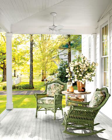
Soothing Whites and Creams
“Southern designers typically prefer to stick to traditional and classic color palettes for exterior porch spaces, avoiding overly trendy or bold hues,” says Brackett, who loves Benjamin Moore Baby’s Breath, OC-62 and Benjamin Moore White Dove, OC-17. “We gravitate towards softer, more muted colors that evoke a sense of tradition and timelessness.”
For more Southern Living news, make sure to sign up for our newsletter!
Read the original article on Southern Living.

