15 Pro-Approved Dark Blue Paint Colors for Any Interior

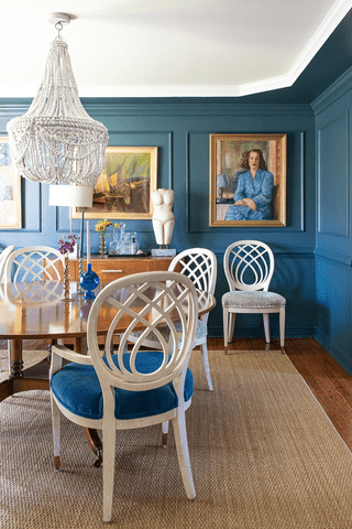
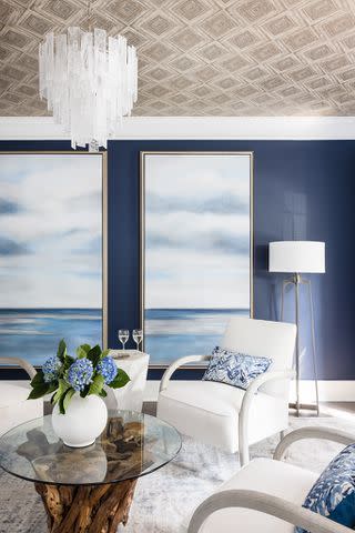
K Kong Designs / Photo by Mali Azima
When it comes to interior paint colors, you can’t go wrong with dark blue. This universally beloved color is versatile and available in various shades and tones. Plus, depending on its application, dark blue can have a calming effect on interiors, which makes it a popular option for spaces like bedrooms and bathrooms.
Look no further if you’re looking for the perfect dark blue for your space. Here are 15 of the best dark blue paint colors for any interior.
Want more design inspiration? Sign up for our free daily newsletter for the latest decor ideas, designer tips, and more!
Benjamin Moore Hale Navy
Julia Adele Design / Photo by Sara Liggoria-Tramp
Benjamin Moore’s Hale Navy is a smoky navy blue that is perfect for anyone looking for a calming and muted shade of dark blue. It has gray undertones and appears nearly black in some lighting. It’s a great choice for coastal designs and modern, elegant aesthetics alike.
Benjamin Moore Polo Blue
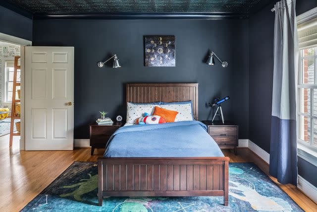
Design by LP + Co / Angela Newton Roy Photography
Polo Blue by Benjamin Moore is an almost-black shade of navy that screams sophistication. This bedroom by LP + Co utilizes the shade for a cool color-washed look, acting as a neutral backdrop for some fun space-themed decor.
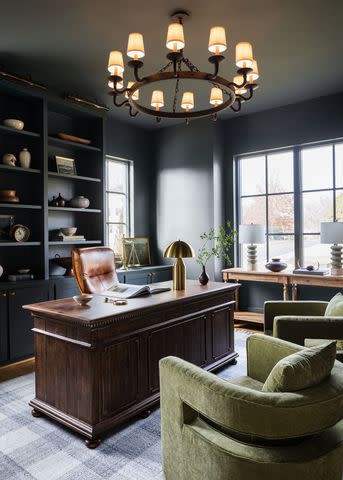
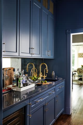
Benjamin Moore Gentleman’s Gray
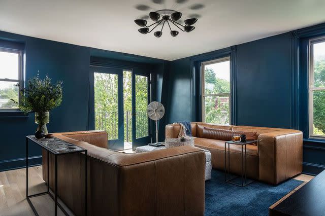
Third Street Architecture / Photo by Christy Kosnic
This moody shade of blue may look navy at first glance, but it’s more of a dark teal blue. This makes it an ideal choice for modern interiors and those looking for a pop of eclectic color. This warm shade pairs well with other warm-toned colors and materials, such as leather furniture.
Benjamin Moore Narragansett Green
Alice Lane Interior Design / Photo by Rebekah Westover
Another teal-leaning shade by Benjamin Moore is Narragansett Green. Also known as Navy Masterpiece (1652), this deep teal-blue color certainly totes the line between green and blue—appearing more green in direct morning or afternoon light and blue in ambient light.
Benjamin Moore Van Deusen Blue
Erin Myers Design / Photo by Laura Visioni
Listed as one of Benjamin Moore’s best-selling colors, Van Deusen Blue is a bit lighter than some of the other dark blue colors on this list. This makes it perfect for smaller, darker rooms where you want a bold color without shrinking the space. It has warm gray undertones with a slightly muted hue.
Benjamin Moore Temptation
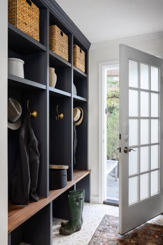
Design by Third Street Architecture / Photo by Christy Kosnic
Temptation by Benjamin Moore is technically categorized as dark gray, but its solid blue undertones also land it firmly on this list. This is the perfect dark blue if you are looking for a bold neutral that provides a touch of color. It pairs beautifully with brass finishes, warm wood tones, and warm neutrals like beige, off-white, and cream, as demonstrated in this mudroom project.
Benjamin Moore Kensington Blue
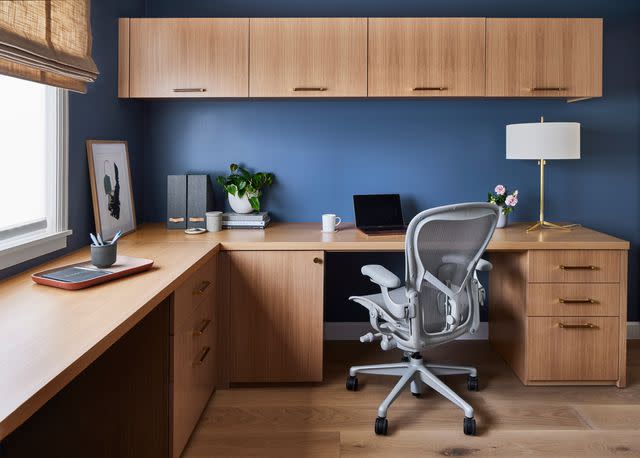
Memmo Interiors / Photo by Laura Flippen
Kensington Blue is a truly versatile shade of navy that looks great in any area of the home. It’s vibrant yet not too bright, bringing a touch of energy along with navy’s signature sense of calm. This makes it a great choice for home offices, bathrooms, bedrooms, and living spaces alike.
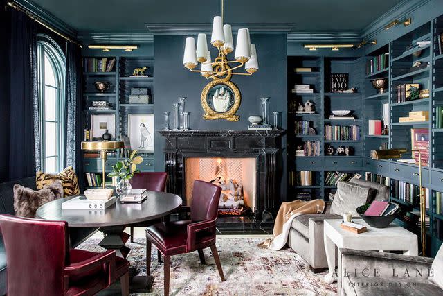
Farrow & Ball Hague Blue
Design by LP + Co / Angela Newton Roy Photography
Hague Blue by Farrow & Ball is a deep, dark blue shade with green undertones. This timeless shade looks beautiful in both traditional and modern settings. Pair it with an off-white for the trim and ceiling, or opt for a color-drenched look to lean into this color’s inherent drama.
Farrow & Ball Down Pipe
Looking to add drama? Down Pipe is another excellent choice. This deep shade by Farrow & Ball is another example of a dark gray that leans blue thanks to its undertones. It is described as “lead gray” on the Farrow & Ball website and was initially inspired by the color used to paint downpipes and guttering.
Farrow & Ball Inchyra Blue
Mason Luxe Interiors / Photo by Jim Henkens
Inject a hint of color into a neutral space with Inchyra Blue by Farrow & Ball. This dark and moody shade leans dark teal in the right light, although Farrow & Ball describe it as an aged blue-gray.
Farrow & Ball Stiffkey Blue
Anna Rae Design / Photo by Jenny Siegwart
If you’re looking for a dark and inky navy blue, look no further than Stiffkey Blue by Farrow & Ball. You truly can’t go wrong with this deep and rich shade of blue. It looks great in traditional, modern, and coastal spaces alike.
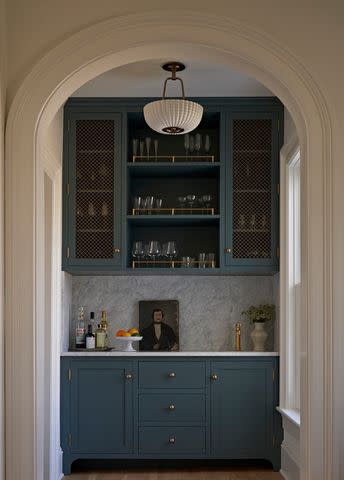
Sherwin Williams Grays Harbor
Sherwin Williams’ Grays Harbor is a deep, moody gray-blue reminiscent of the skies before a storm. It has cool undertones and is described by Sherwin Williams as slate blue. This pantry by Bungalow 10 Interiors features a color-drenched look using the shade for a sophisticated and tranquil finish.
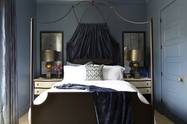
Sherwin Williams Naval
Grey Hunt Interiors / Photo by Christy Kosnic
A rich navy blue with gray-green undertones, Naval is the perfect choice for creating a calming yet sophisticated space. It’s a popular choice for living rooms, home offices, and bedrooms alike.
Sherwin Williams Waterloo
Erika Bonnell Interiors / Photo by Stacy Zarin Goldberg
Sherwin Williams describes Waterloo as a deep, rain-soaked blue. This rich shade of dark blue with gray-green undertones evokes feelings of serenity and sophistication in your space. It is an excellent choice if you want something a little edgier than a traditional navy blue.
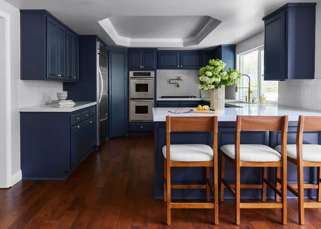
Sherwin Williams Smoky Blue
K Kong Designs / Photo by Mali Azima
Chic and velvety, Smoky Blue by Sherwin Williams is a medium-dark shade of blue with gray undertones. It’s an excellent choice for color-drenching, as demonstrated in this bedroom by K Kong Designs, but it looks equally gorgeous on an accent wall or feature.
Frequently Asked Questions
What is the most popular shade of blue?
When it comes to interior paint colors, there are plenty of different shades of blue that are popular. Among the most popular options include light blue colors such as pastel blue and rich, dark shades like navy blue.
What is the most calming shade of blue?
Navy blue is one of the most relaxing and calming shade of blue you can use in an interior. This is particularly true if you choose a darker, muted shade of navy.
What is the complementary color of dark blue?
The complementary color of dark blue can be found directly across the color wheel. It is dark orange—think a muted, burnt shade of orange.
Read Next: 52 Blue Bedroom Ideas for a Calming Retreat
Read the original article on The Spruce.

