14 Common Interior Design Mistakes—and What the Pros Say You Should Do Instead
From awkwardly placed art to inadequate lighting, interior designers reveal the most common décor blunders they see.
KatarzynaBialasiewicz / Getty Images
We all want a home that’s beautiful, comfortable, and inviting. But all too often, we start decorating without taking enough time to think about how we need our rooms to function. Or we start decorating without a plan, which can be a recipe for décor chaos.
Meanwhile, there are so many nuances in interior design that many of us have simply never considered—like area rug size or curtain length. Not getting these right can lead to a room that looks off, when the goal is a space that is harmonious and welcoming.
To learn more about common décor mistakes like these, we spoke with design pros to find out the missteps they see most often. Ahead, learn what they say to avoid and what to do instead.
Related: 9 Home Décor Trends on Their Way Out, According to Design Insiders
Furniture Lined Up Against the Walls
When professionals plan interiors, they rely on principles of good interior design, such as visible weight, proportion, scale, balance, and symmetry. The biggest mistake people make when arranging furniture is to push the largest pieces back against the walls, creating a big space in the middle. “When you push furniture against walls, it actually makes your spaces far less functional, and you’re creating disruption in your space,” says interior designer David Samuel Ko, principal at Maison Ko. “Furniture should be paired with other pieces to create a pleasant and habitable space.”
Think about how you use your room and group furnishings to create zones. For example, in a living room, you might have a conversation zone, a game-table zone, and a movie-watching zone. Ko suggests taping out on the floor exactly where your furniture pieces are going to sit to get an idea. Or if you’re working with a professional, he says to ask for renderings of your space with everything to scale.
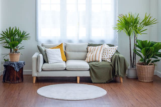
Too-Small Rugs
athima tongloom / Getty Images
Area rugs aren’t only a great way to bring in texture and color; they also help ground the furniture and create zones. But designers say it's very common to see a rug that is either too large or too small. The size of a rug should be determined by the size of the zone you’re creating and where the furniture will be placed on it, according to Laura Williams of ATX Interior Design. “Area rugs should not cover an entire space of a home. In the living room, for instance, it is best to have the rug just underneath half the sofa and accent chairs,” she says.
Related: Martha's Tried-and-True Tips for Arranging Area Rugs in Every Room of Your Home
Inadequate Lighting
Lighting is often an afterthought. One common error is to rely on just that single light fixture in the center of the ceiling to light your whole room. This can make a room seem smaller, darker, and uninviting—and never provides enough light for tasks. Professionals say lighting should be layered—a good mix of recessed ceiling lights, gimbals or spotlights, ceiling fixtures, sconces, and floor and table lamps.
Related: 6 Outdated Lighting Trends to Skip in 2024, According to Designers
Non-Complementary Paint Colors
Choosing paint colors is one of the most impactful design decisions you can make. Not only do you want to choose from a palette that flows well from room to room, but you also want to choose coordinating trim colors. Too often, homeowners default to bright white for trim, which might feel safe but is not always right.
Designers notice it right away. “When trim throughout a house is all painted the same color white, especially in non-white rooms, there was a missed opportunity,” says Andrew Pharis, architect and interior design expert at Vertical Arts Architecture. “When picking paint colors, select a trim color that is complementary to the wall color or go tone on tone. This will add a layer of sophistication and help the room feel more thoughtful.”
Related: Color Drenching Is the Latest Must-Try Paint Trend, According to Interior Designers
Too-Small Light Fixtures
John Keeble / Getty Images
Fixtures that aren’t the right size and proportion is another common problem. “Choosing appropriately sized fixtures is crucial to the overall look and feel of a space,” says Williams, noting that when light fixtures are too small, they provide inadequate lighting—and they look puny. “You lose an opportunity for a beautiful, impactful moment,” she says. “Light fixtures create an amazing ambiance.”
Mixing Lighting Temperatures
And then there are the more technical aspects of lighting, such as color temperature. Did you know that mixing temperatures in a room can be a problem? “Walking into a room with light fixtures that do not have the same color temperature can be jarring and feel uncomfortable,” explains Pharis. “Measured in degrees of Kelvin (K), the higher the number, the cooler the light (aka more blue). Typically, 2700 K for a residential space feels warm and inviting. Anything above 3000 K, and you’ll feel like you’re in a dentist’s office.”
Related: The Difference Between Soft White and Daylight Light Bulbs—and Where to Use Each
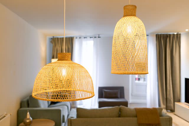
Pendants Hung Too High or Low
Getty Images
If you’ve ever toured a home for sale, you’ve probably seen a ceiling pendant that looks laughably low in an empty room. But if it had been recently hanging above a dining table, it was probably just right.
When hanging a dining pendant, the bottom of the fixture should be about eye level when seated. This translates to roughly 30 to 36 inches above the surface of the table. There is a similar rule of thumb for countertop pendants. “We like to hang kitchen pendants around 32 to 36 inches above the countertop,” says Barrett Oswald, principal at Barrett Oswald Designs. “For kitchens with standard eight-foot ceilings, it should be closer to 32 inches, while greater ceiling height allows for more clearance under the pendant. That being said, it's also important to keep the client's height in mind.”
Not Mixing and Matching Furniture
Another mistake that is easy to make is to purchase furniture in sets or all from the same place. Often, the rooms we love the most in our social media feeds reflect a lifetime of the homeowner collecting—or getting help from a design professional who will source furniture and objects from a multitude of shops and artfully mix furnishings from different eras. “Mixing and matching furniture is my preferred way to design a space,” says Ko. “It provides interest and feels much more custom and curated this way. It’s okay to have matching lounge chairs or matching stools. But complete sets end up feeling very boring and catalog.”
Overstyled Shelves
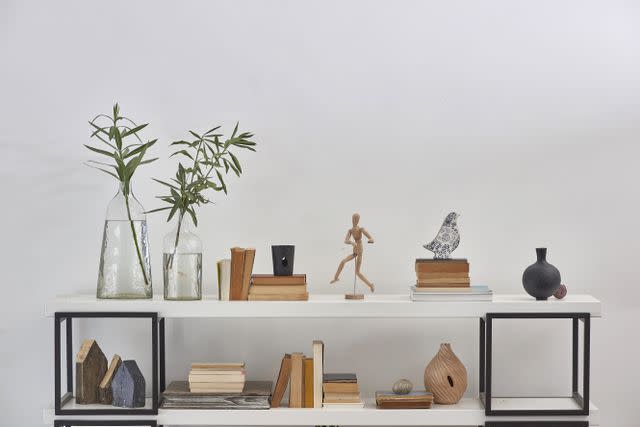
UnitedPhotoStudio1 / Getty Images
Beautifully curated shelves are a pleasure to behold, but getting it right takes finesse. Beyond just collecting tchotchkes, you have to employ design principles like symmetry, balance, and proportion—and be restrained from going overboard. “I love including meaningful pieces throughout the space to add a homey feeling; however, sometimes over-styling with knickknacks can make a space feel cluttered,” says Williams.
Related: Bookshelf Wealth Is the Ultimate Design Trend for Readers
Wallpaper That’s the Wrong Orientation
Wallpaper is having a heyday. You’ll see it now in every room of the house and on every surface—even overhead! While wallpaper on the ceiling can give a room great visual impact, you have to orient the wallcovering properly and choose your pattern wisely, according to Michelle Gage, founder and creative director at MichelleGage.co. “I love a wallpapered ceiling but hate to see a vertical pattern lay horizontally,” she says. Choose a multidirectional pattern.
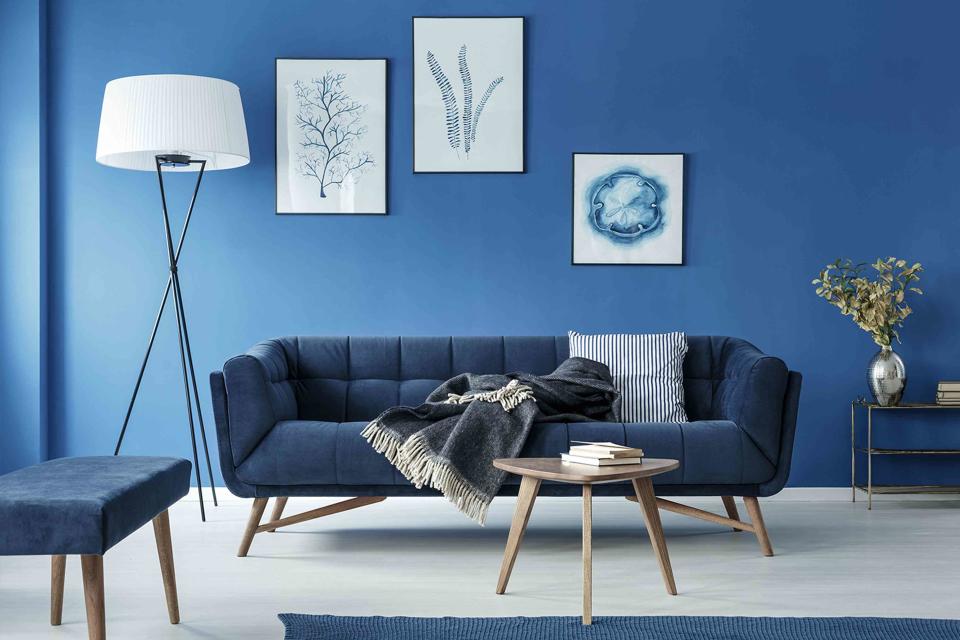
Art That’s Hung Too High
Art that is hung too high or too low can throw off a room’s proportions and leave a space feeling "off," says Pharis. The rule of thumb is that the center of the work should measure 60 inches from the floor (roughly eye level). He starts there and adjusts accordingly. That said, also, do what you like. “Like many things in interior design, there are no hard and fast rules that work every time. If the piece of art brings you joy, that’s all that matters,” he says.
Art That’s Not the Right Scale
Klaus Vedfelt / Getty Images
And then there’s the artwork that’s not quite the right size. Art doesn't look its best when it is the wrong scale for the space "unless it’s offset and intentional,” says Gage. For example, artwork hung over a sofa looks best if it’s rectangular and about two-thirds the width of the sofa.
“When sizing art above a piece of furniture I use the rule of thirds, where the piece is between a third to two-thirds the width of the furniture piece it is hanging above,” says Pharis. “Try using painter's tape to mock it out on the wall first to see if it feels right.”
Hanging Curtains Too Low
A common mistake is hanging curtains the height of the window box, but that’s often too low, making the ceilings feel low. “I like to have at least 6 inches above the window casing,” advises Michelle Yorke, principal at Michelle Yorke Interior Design. If it is a high ceiling, hang the curtains 10 to 12 inches above the casing. This brings height to the room and draws the eye up above the window.”
Hemming Curtains Too Short
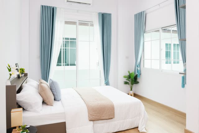
Kanok Sulaiman / Getty Images
When hanging curtains, there are three choices: The fabric can graze the floor, break at the floor and go on another inch, or be long enough to pool on the floor. While designers and homeowners may have different opinions on pooling, most agree that too long or too short is not great.
“Hang the curtain panels so the bottom of the fabric sits just above the flooring. So they hang nicely and can open and close without touching the floor,” says Yorke. Oswald agrees: “We prefer curtains that are just touching or ‘kissing’ the floor. That is usually achieved by stopping the length just shy of the floor, around 1/8" above.” Anything shorter looks unfinished. Exceptions include windowsill-skimming curtains for kitchens and bathrooms and cafe curtains at a dining nook.
Related: How to Choose the Right Curtain Length for Your Specific Windows
Read the original article on Martha Stewart.

