13 ways Harlequin’s Reflect collection curates colors for good
Partnership | May 2, 2024
At Harlequin, color is not just an art—it’s also a science. Driven by a passion for color from its beginnings as a boutique British wallpaper brand in the late 1980s, the present-day company now conducts intriguing experiments and research to better understand the highly individual relationships between humans and hues—with the aim of refining its palettes to have a positive impact. The current quintessence of this method: its Reflect collection of fabrics and wallcoverings. From sublime boucle neutrals to fresh cotton pastels to vibrant velvet jewel tones, the color combinations in each new pattern are curated to put you in a good mood.
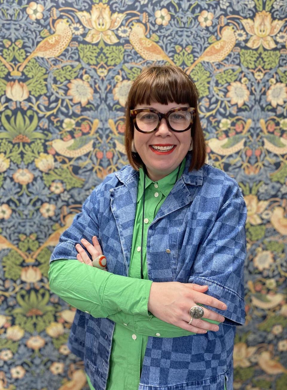
“I’ve always known that color makes me happy, but the fact that it resonates with different people in different ways was a bit of a revelation,” says Claire Vallis, the long-standing design director for the Sanderson Design Group who oversees its portfolio of posh U.K. brands—not only Harlequin (“which is very close to my heart”) but also Clarke & Clarke, Morris & Co., Sanderson, Scion and Zoffany. “We’re all born with our own sense of color, and that sense evolves through our experiences,” she continues. “We can’t say, for example, that blue is calming for everybody, because if you had a negative formative experience in a blue environment, then it won’t be calming for you.” Exactly which blue brings up the bad vibes is very personal too. “How many blues are there? Like, 20,000, from pale to dark and warm to cool. And what other colors was it paired with? The answers to those questions might reveal a blue that works for you after all.”
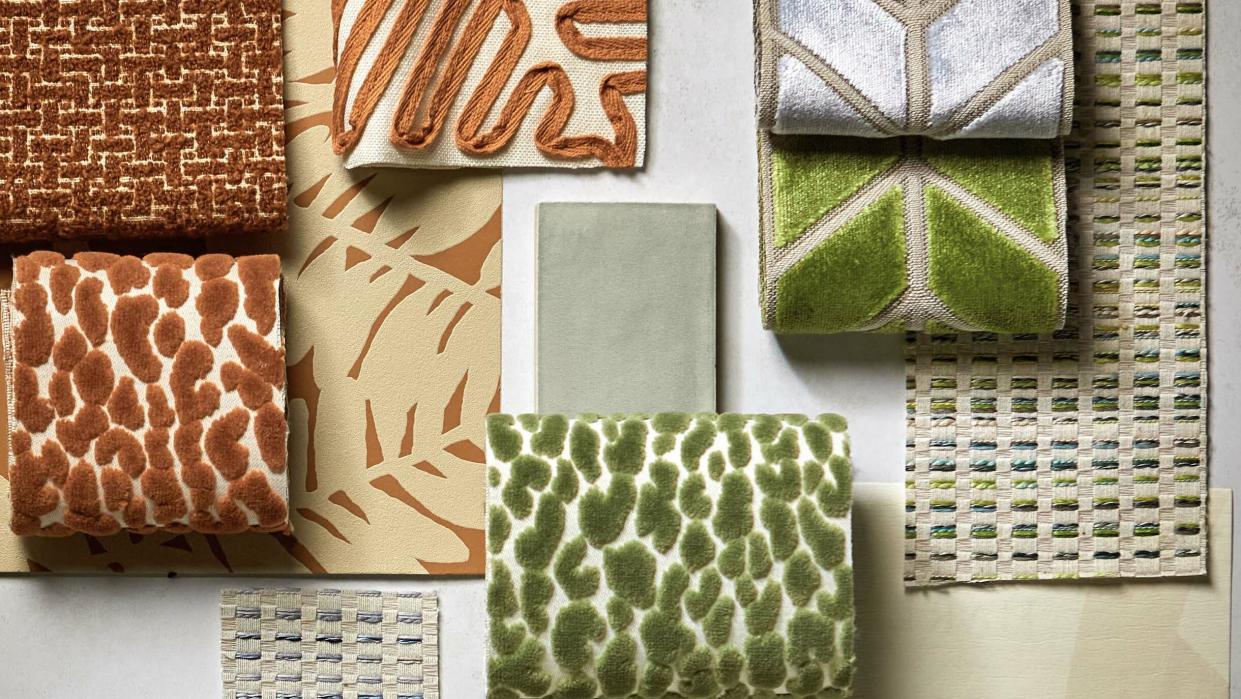
In the Reflect collection, which is a progression of Harlequin’s popular Momentum series, Vallis and her design studio tap into their obsession with color to create contemporary palettes that bolster confidence and well-being. Aptly for the spring season, the styles are intended to reawaken an innate love for color that may have been buried beneath the pursuit of the latest trends. “We’re much more interested in what color can do when you get it right,” she says. Featuring abstract compositions, plush animal prints, twisted boucles and hard-working performance fabrics, as well as more than 20 artful wallpaper patterns, the highly tactile collection combines geometric precision with organic motifs.
“There’s a wonderful depth to the designs. Reflect’s original roots were quite architectural, in a way quite masculine, and then the designers and myself started to feel that we needed to center a softer, more harmonious color story,” says Vallis of developing the line. “We’ve taken the edges off, so to speak, situating that architectural sensibility in nature rather than a city environment.” Here, she spotlights 13 favorite styles from the collection.
ARIA
“It’s a small-scale but super usable pattern in three wonderful color combinations that coordinate with everything,” says Vallis of the cotton-blend crisscross weave, which pairs neutral tones with multihued strands in equal measure in three colorways: Rosewood/Pistachio, Sky/Cornflower and Emerald/Grass. “It’s a jacquard, so the texture feels organic, but the fantastic palettes make it stand out.”
ENIGMATIC
“This wallpaper has got the most wonderful expression to it; it’s so strong. The artist who created it—one of the youngest members of our design studio—originally painted it in one big movement, outside in a field.” The modern, statement-making mural wallcovering finds inspiration in the midcentury trend of kinetic art, which emphasizes free-flowing, expressive gestures, its abstract markings swirling and spiraling across a ground of embossed vinyl. “It has a bit of a Japanese feel as well, almost calligraphic,” says Vallis. “It’s dramatic, yet soft.”
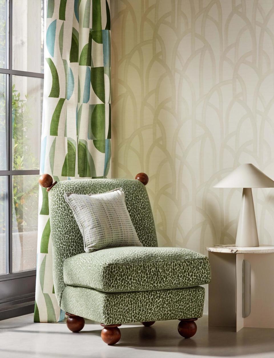
FAWN
“A brand-new animal print, Fawn takes a muted, natural palette and scatters it in sumptuous dapples across lots of white grounds,” says Vallis. The six colorways include Aqua, Ebony and Fossil. “I quite like the slightly funky look of Dalmatian. Olive is very beautiful, as is Tiger.” The freckled fabric’s dainty design is intriguingly deceptive at sample size: Upholstering a swivel chair or love seat, it has an irresistibly playful impact on a space. “And it’s a performance material, so it’s great for any furnishing you want to work hard.”
ISLAY
“Boucles are an absolute staple of the Harlequin portfolio, and this plain also has a performance component. Its carbon-zero finish is durable, stain-repellent, water-resistant and easy to clean, even in its palest shades,” says Vallis. Emphasizing nubby, cloud-soft texture, Islay’s array of harmonious neutrals ranges from fresh, light Chalk, Parchment and Sand to rich, dark Slate, Shadow and Black Earth, with new basics like Sea Glass green and Celestial blue further diversifying the options. “Some of them we’ve twisted as well, a base color with a contrasting tone on top, introducing a bit more color and movement, which is an effect designers asked for.”
LACUNA
“We do like an animal print! It’s a style Harlequin specializes in. But it’s not in-your-face; it’s much more organic,” says Vallis of this plush, elevated velvet. Epitomizing its name, which means “blank space or gap,” the pattern’s raised rivulets bring serious depth and texture to pillows, ottomans, armchairs and more. “The dimensionality is impressive, and the eight colorways include basics like Taupe alongside such bolder shades as Blush pink, Tiger orange and Cornflower blue.” Lacuna Stripe, the wallpaper variation of the pattern, drops a tonal stripe underneath the animal print for added visual interest.
LUSTRE
“It’s a bit like a Rothko painting. Did you see the recent retrospective at the Fondation Louis Vuitton in Paris? I think a lot of designers will be reflecting on Rothko going forward,” says Vallis about Harlequin’s painterly, impressionistic wallpaper, which prints raw-edged stripes in kaleidoscopic color combinations on a vinyl ground embossed for a crackle effect. “It’s fabulous, with a hand-painted look to it and a tiny little bit of sheen reflecting off a grasscloth texture.” The four colorways, which evoke minerals and gemstones—Pyrite/Aurelian, Topaz/Argent, Apatite/Hessian and Amazonite/Rose Quartz—can be hung vertically or horizontally.
ONBURU
“Stripes have always been something we love at Harlequin, and this new, wide-striped wallpaper, in two lovely, muted color combinations, is one of the main patterns in the Reflect collection,” says Vallis. Meaning “ombre” in Japanese, Onburu captures the influence the country had on the company’s latest offerings. “Japanism is an undercurrent running through the studio at the moment—that feeling of peace the aesthetic can call forth. It definitely influenced this ambiance of color.” The freehand brushstroke of the pattern’s broad stripes subtly blends shades found in nature, with Rosewood/Seaglass incorporating notes of earthy terracotta, stone and ochre, while Canopy/Diffused Light conveys a watercolor quality through hints of coastal blues and greens.
PALLA
“Palla is an embossed vinyl that mimics the look and feel of a woven fabric. We have our own factory in the U.K. where we like to push the boundaries of texture in wallpaper, and for this style we wanted to experiment with the possibilities of color too,” says Vallis. The seven multitonal shades include relative neutrals like Linen and Bamboo alongside fresh French Blue, warm Blush pink and nuanced, contrasting Ochre/Paprika and Rosewood/Seaglass. “My particular favorite is probably the Emerald green.”
PERPLEX
“Perplex is one of those iconic Harlequin styles, one of our bestsellers, and now we’re reintroducing it in an expanded palette of much softer tones,” says Vallis of the chevron-patterned velvet fabric, which brings a subtly architectural, art deco touch to upholstery in five new colorways, including Pearl gray, Kelly green and Positano pink. “Before, it was a bit more severe, but now a contrasting edge outlines the angles of the repeating graphic motif, giving it an added layer of refinement.”
SUMI REFLECT
A large-scale geometric with midcentury-modern influences reminiscent of the abstract canvases of Kandinsky, Sumi Reflect reinterprets the classic Harlequin pattern in three tonal color-block combinations that ever so slightly soften the original’s clean-painted lines: Sky/Pebble/Canvas, Cornflower/Blush/Spice and Marine/Grass/Taupe, all in 100 percent cotton that’s suitable for upholstery. “It’s a significant pattern in our portfolio, and the new colorways keep the essence of the initial design while imbuing its architectural framework with expressive feeling,” says Vallis.
THALIA
“Absolutely one of my favorites. It’s a highly raised embroidery on a cotton-linen base, so it’s all about the exceptional texture. A strong look, but so adaptable: It could work equally as a layer in a space with either a more ethnic vibe or a contemporary, architectural atmosphere,” says Vallis. The pattern inspires different interpretations depending on the colorway and rotation, with Camel recalling sheaves of wheat, Black Earth suggesting a trail of arrow tails, and Kelly green alluding to a retro grove of alpine trees.
TORILLO
“When you’re putting together the color scheme for a space, it always helps to start with something that’s got a mix of shades you can pull from. The trios in Torillo, a casual printed cotton fabric, are great for that,” says Vallis. A cheerful collage of curves and arches set against a neutral ground, the pattern is geometric, organic and abstract all at once. “A particular favorite of mine is the Black Earth/Cornflower/Walnut combination, which has a refreshing blue accent.”
VIDI
A vibrant design of raised, small-scale velvet triangles in playful gradations of shades, Vidi comes in five multihued colorways that ramp up in intensity from subdued to rainbow bright. Lilac and Aubergine purple, Blush pink, Kelly green, Tiger orange and Sky blue are a few of the tantalizing pops in the palette, making the pattern an exciting choice for everything from curtains to cushions. “Vidi is another fabric that would serve well as a starting point to decorate a whole room,” says Vallis. “Like the Reflect collection as a whole, it’s got so many different color stories to tell.”
This story is a paid promotion and was created in partnership with Harlequin.
Want to stay informed? Sign up for our newsletter, which recaps the week’s stories, and get in-depth industry news and analysis each quarter by subscribing to our print magazine. Join BOH Insider for discounts, workshops and access to special events such as the Future of Home conference.

