Never forget these terrible X-Men posters existed

These days when you see a truly terrible piece of art or design, chances are an AI art generator was responsible. Perhaps that will become an easy way to pass the buck: 'it's not our fault, it's AI'.
But bad movie posters go back a long way before generative AI became mainstream, as these terrible X-Men: First Class posters demonstrate. They were so bad they're still worth analysing today, 13 years after the film's release.
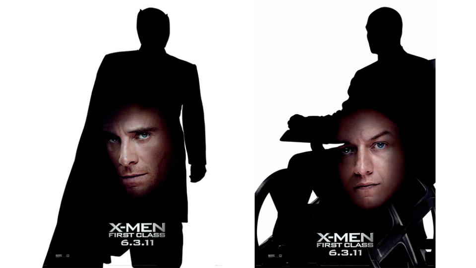
Perhaps two of the worst movie posters in history, the designs above featured the silhouettes of two of the 20211 film's main characters, Professor X and Magneto costumed up. That alone could have actually made for a decent poster – it would at least have stood out from the crowd.
And perhaps that's how the design actually began. I can totally imagine the designer submitting that as the concept only for someone from the studio to come back at the last minute and say: love it, but it's too abstract. People won't get it. How about we superimpose the actors' faces on the silhouettes in a way that's completely out of proportion and doesn't fit their shape.
Perhaps contractual reasons were to blame. That's often a cause of a bad movie poster, with contracts stating which actors must appear. But these weren't the main poster design. And if it really were necessary to include the actor's face, this is one case where more could be better, and it may have made more sense to pack more action into the silhouette.
I can see what 20th Century Studios was aiming for. We often complain about formulaic movie posters and the ubiquitous floating heads design, and many of the best film posters are minimalist designs that break the mould. These are certainly minimalist, but they're a great reminder that while simple designs are often the best, that only applies if they're well executed. Otherwise simple just feels cheap and basic.

