The best film posters of all time
Working in the movies doesn't just mean sitting behind or in front of a camera. Graphic designers, too, have a key role to play because often a film poster can make or break a movie. They serve a crucial role in creating intrigue around upcoming releases, and maintaining momentum once a film hits the big screen.
From early 20th century classics to the modern day, some film posters have stood the test of time as works of art in their own right. Although styles and trends have evolved over the decades, the best poster designs manage to encapsulate the tone and themes of a film into a single striking image.
We've asked experts from across the design industry to share their favourite film posters and explain what makes them work. Note: these aren't necessarily the best films (although most of them are pretty great). As works of graphic design, though, just like the best print ads, each of these posters has a lot to teach us today.
01. Jaws
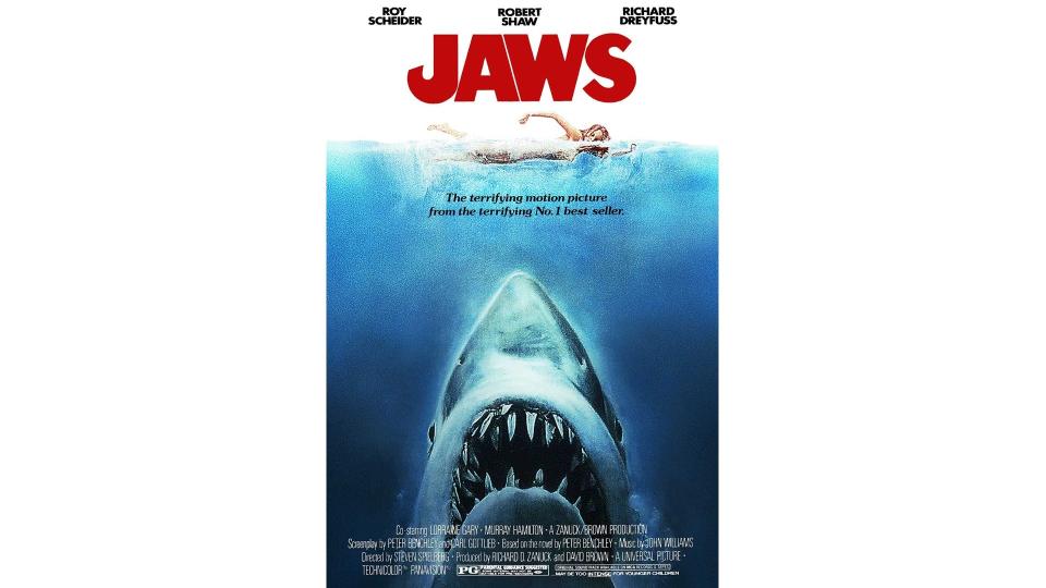
Jaws wasn't just a great movie, it was the first summer blockbuster. Previously, studios had tended to open their biggest films during the autumn and winter. But in 1975, director Steven Spielberg believed his disaster movie about a killer shark roaming crowded beaches could attract a big summer audience, and he couldn't have been more right. This led to an industry-wide switch to the hotter months, and the summer blockbuster has been the default mode ever since.
One of the reasons for its huge popularity was its dramatic poster. "Probably one of – if not the – most iconic poster of all time, and one of the best examples of visual marketing and story-telling," says Lauren Richardson, senior account executive at Marketing Signals. "Featuring the giant great white, rising to capture its victim as she swims, naked and vulnerable, across the top of the poster, it’s both captivating and utterly terrifying all at the same time.
"What makes it so effective? It’s instantly identifiable and tells you exactly what you can expect from the film. The designer is cleverly controlling your eye and instantly grabbing your attention with very little information."
"This may be the absolute best movie poster of all time," agrees Nile Hope, associate creative director at Pearlfisher. "The composition and image of the shark approaching the unsuspecting swimmer creates such drama and perfectly replicates the tension within the movie.
"The typography not only provides a bold contrast to the imagery but has a bit of irregularity that further adds to its charm. The composition continues to be parodied endlessly and is a testament to the timeless nature of the poster. "
Even if you haven't watched the film, Ruari McDowall, lead designer at Sticky Ideas and Advertising, sees as the Jaws poster as a model for designers everywhere. "Hierarchy, hierarchy, hierarchy," he enthuses. "Jaws, innocent swimmer, doom! Nothing says impending doom like a massive shark, but one in wait, ready to ambush, is terrifying. One where you can see scale that's humbling. One so fearsome it only needs four letters to understand the horror in wait.
"The form of the shark nose points directly up, so much so that the blue area ensures the viewer sees the title and then the narrative unfolds in their mind's eye. The power of this image and film had a notable effect on beach tourism in the US and I applaud anyone who can blank this image out of their mind while spending time in the sea."
Karim Salama, director at e-innovate, adds: "Its minimalistic design, with a lone swimmer being unaware of the shark below them, is a fantastic example of dramatic irony. The focus on the atmosphere and mood, as well as the use of negative space with treble ocean, imposes a sense of isolation and vulnerability. And, of course, there have been many films since that have tried to replicate this structure; only for them to fail to live up to the expectations set by this innovative poster design."
02. Trainspotting
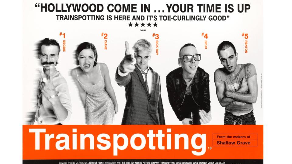
It's hard to convey to younger generations today just what a cultural impact Trainspotting made on its release in 1996. Ever since the 1970s, it had felt like Britain was in decline. Now, though, there was a spirit of cultural revival in the air, from football success in the Euros to the rise of Britpop.
But perhaps the most striking was the turnaround in UK film, which had largely become a watchword for low budgets and poor quality. New films like 1994's Shallow Grave, though, proved Brits were capable of making entertaining movies that weren't austere costume dramas or corny Carry Ons. And word on the street was its producers had made an even better one, based on Irvine Welsh's incendiary novel.
Indeed, before the reels even arrived at the cinemas, we were all enthralled by this attention grabbing poster popping up on billboards across the land.
As Diogo Tovar, senior art director at Cheil UK recalls: "The poster perfectly captured the energy and gritty nature of the film. With its minimal design using black and white photography, combined with a bright orange colour palette and Helvetica typography, it reminded you a bit of an album cover and really stood out amongst other film posters of the time. Almost like a warning sign to what you were about to watch. It’s a poster that has since become iconic and the fact it's been parodied countless times is testament to its cultural impact and timelessness."
Alice Lang, senior digital PR executive at Marketing Signals, couldn't agree more. "With its bold aesthetic, the imagery matched the movie's fresh, boundary-pushing vision," she says. "Personally, I love the vibrant orange background – which was actually inspired by prescription drug warnings – against the contrast of the black and white cast portraits. It's also interesting that they chose the Helvetica typeface, because of its similarity to that used on train timetables."
03. Vertigo
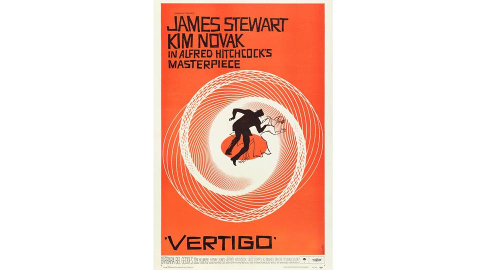
British director Alfred Hitchcock was the king of suspense in the 1950s. And 1958 psychological thriller Vertigo was one of his best, now considered one of the greatest films of all time. So it's fitting that it also boasts one of the best regarded film posters of all time, designed by pioneering movie artist Saul Bass.
"This is one of very few original minimal movie posters, with clean composition and simple layout typical of Bass’s work," says Ruari. "It’s strikingly obvious. The mid-century modernist illustration style has a handmade quality, depicting a sense of unease and jauntiness. Yet the craft of the lettering masters the difference between 'I could do that' and controlled and characterful.
"The black contrasts dramatically," he adds, "and the white spirograph creates movement and a rotating zooming sensation, drawing the eye in and around. It’s not for everyone as an aesthetic, but it is undeniably striking. How can you forget this image?"
04. 2001: A Space Odyssey
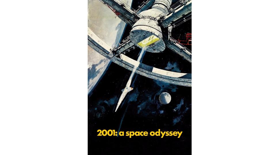
Directed by Stanley Kubrick and based on a story by Arthur C Clarke, 2001: A Space Odyssey is one of the most celebrated films in science fiction history. And as Paul LaFleur, design director at Hook, puts it: "One of the greatest films of all time deserves a poster of similar quality."
He notes that the galactic epic, released in 1968, has some of the most striking and future-forward visuals for a movie of its time. "So one would think that a movie poster would match that. But while the subject matter – Space Station V – does, the style in which the poster was created in – vintage illustration – stands out, for all the right reasons.
"This mixing of style and subject perfectly harkens back to the space-race era of the 50s and 60s," he continues, "tapping into the imagination of the 'what ifs' of space travel, the advancement of mankind and the role that technology would play. The poster is almost more art than design in a way, and is memorable because of the striking imagery created."
05. Breakfast at Tiffany's
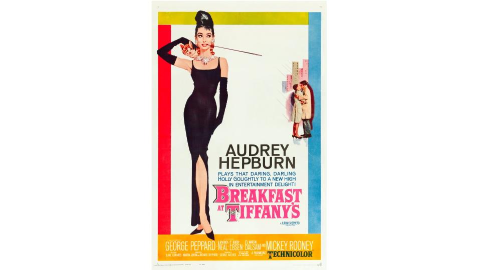
1961's Breakfast at Tiffany's is one of the great romantic comedies. Following a naïve, eccentric café society girl who falls in love with a struggling writer while attempting to marry for money, it established Audrey Hepburn as both a great comedy actress and a style icon to boot. And although lightweight, the film also resonated surprisingly deeply with audiences due to its intelligent focus on topics like love, independence, and finding one's place in the world.
The poster remains a stone-cold classic too, and continues to adorn the walls of successive generations today. "It's a timeless slice of glamour," enthuses Sammi Price, creative lead at Trinity Create.
"Audrey Hepburn, with that iconic Givenchy dress and pearls, is elegance personified. The colour palette is as chic as Audrey herself, with subtle hues that scream sophistication. Overall, it brilliantly captures the essence of the film's style and the lead actress's charisma. It has a visual identity that whispers, 'Timeless beauty and a dash of Audrey magic await you.'"
06. The Exorcist
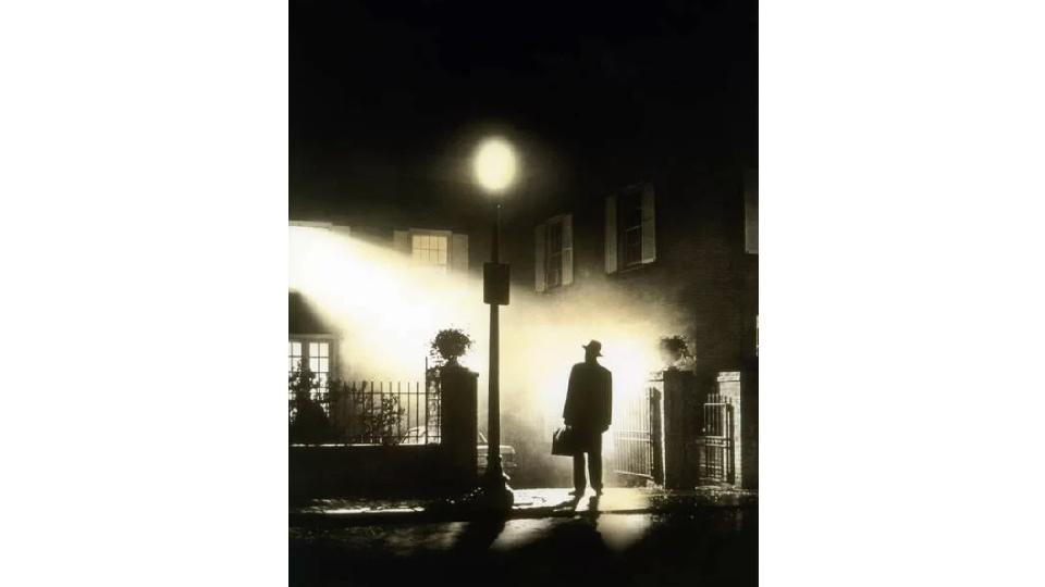
Even if you don't like horror movies, you'll at least have heard of The Exorcist. The 1973 film about the demonic possession of a young girl and her mother's attempt to rescue her was the first horror to be Oscar-nominated, and its creepy atmospherics still reverberate with modern audiences today.
Its poster, meanwhile, has become an iconic piece of design in its own right. "It’s just so ominous and evocative," says Gavin Finney, creative director at Maverick Media. "Plus it's instantly recognisable, even without the title. The use of high contrast, almost pure black and white gives you the sense of something primal and cosmically significant.
"There are stakes here," he continues. "It’s light versus dark, good versus evil. The whole composition of the shot is beautifully elegant; light floods out of a room, while a mysterious figure, an inverted beacon in the fog, stands expectedly; poised. It gives you the sense that something major is hanging in the balance and awaits resolution.
"Simple, iconic, powerful," he concludes. "Just some of the reasons the poster has graced millions of bedroom walls for more than 50 years now."
07. Metropolis
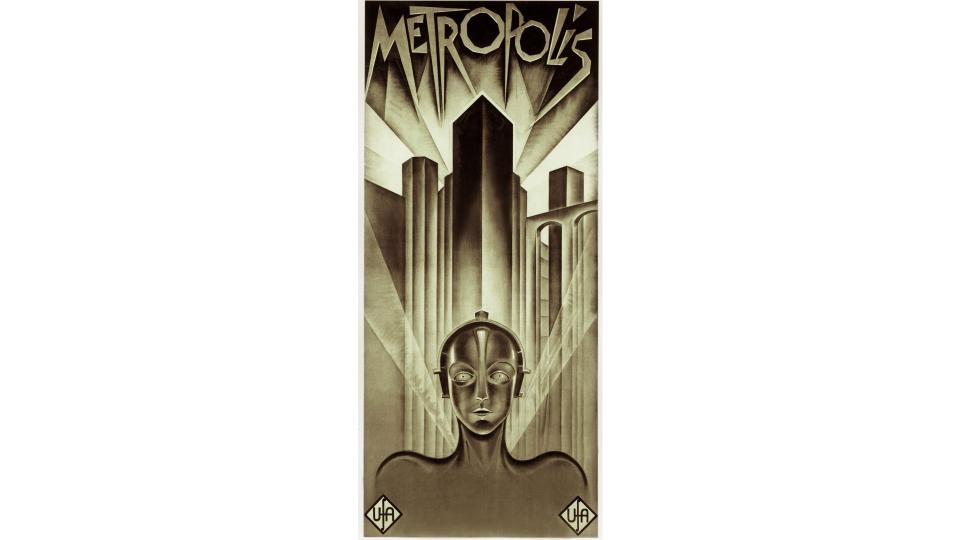
Released in 1927, Metropolis may be almost a century old, but its dystopian vision of the future continues to command respect and entertain audiences today. This German silent film showed a world where wealthy industrialists reigned over the city of Metropolis from colossal skyscrapers, while underground-dwelling workers toiled to operate the great machines that power it. All that is instantly summed up by this arresting poster, designed by Heinz Schulz-Neudamm.
Sam Polti, senior strategic copywriter at ICHI Worldwide, admits he's never seen the film but this poster is still his favourite. "Just looking at it takes me on a journey of wonder, intrigue, and atmosphere," he explains. "It also holds the record as the most expensive movie poster ever sold; reportedly to Leonardo DiCaprio for $690,000."
The highest bar for a movie poster to clear, Sam believes, is being an entertaining and engaging experience in itself. "And, to me, Metropolis makes it over with room to spare," he insists. "Who is that robot? Are they the mayor of the city? How far in the future are we? The poster gracefully blends Art Deco and German expressionism to create something new and unique. Maybe I’ll watch the movie one day, but I’m happy to just look at the poster in the meantime."
Ruari concurs. "One of the great movie posters, it has an immense sense of dramatic scale," he notes. "This design oozes 1920s Futuristic Art Deco, which lends itself perfectly to the film. The design makes use of a symmetrical composition, with the angled lines emanating from the machine man which is at the bottom of the city.
"The aesthetic is very similar to the film itself where every shot is perfect, and lighting and contrast is striking," he adds. "ASMR-like lines and tonality create a rich atmosphere. And the dynamic lettering is unlike anything of the time. It could have been sketched out for a modern piece, yet it's almost 100 years old!"
08. The Lobster
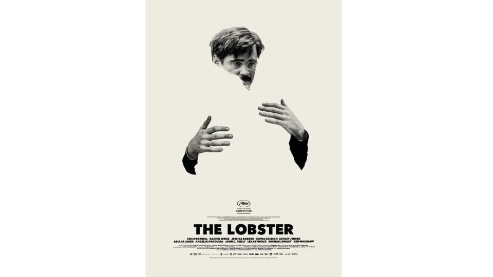
2015's The Lobster is one of the weirdest films ever to break into the mainstream, creating the space for 2024 Oscar nominee Poor Things among others. The absurdist dystopian comedy stars Colin Farrell as a newly single bachelor who moves into a hotel with other singletons. All of them have been told they must find a romantic partner in 45 days, or they will be transformed into animals. Yes, it's that odd.
Whether you love that sort of thing or hate it, though, you can't deny the brilliant of its poster, crafted by Greek designer Vasilis Marmatakis. As Indigo Price, designer at Poppins, puts it. "The poster beautifully utilises negative space to create a visual void that represents the loneliness that Colin Farrell’s single character feels, in a dystopian world where he must have a partner. I love the confidence of the negative space in the design. The poster says so much more by saying less."
Jessica Ardizzone, creative director at Rankin Creative, adores it too. “Of course, it is designed beautifully and every detail is impeccable," she begins. "But what I love most is that it’s a smart translation of the film into a poster, rather than a lazy 'mood image' or a snapshot of a still image resembling the film.
"It’s very obviously about loneliness and the lack of a 'someone'. But it’s done in such an elegant way through the negative space. And I bet it also stands the test of time, because it's aesthetically timeless.
"It’s also easy to understand it in hindsight once you watch the film," she adds. "But if you see it without knowing anything about the film it's simply intriguing, and conveys the feeling of the story, allowing enough space for the narrative to unfold on screen.”
09. Ghostbusters
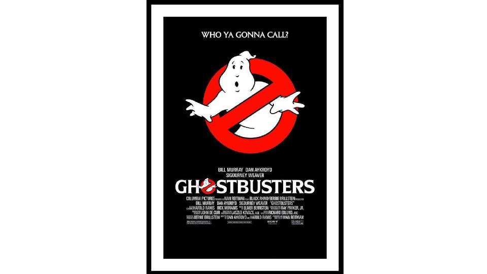
Released in 1984, Ghostbusters successfully blended comedy, sci-fi and horror in a way that few others have matched since. It was family friendly in the truest sense; mum and dad were as engaged and entertained as their kids. Its cast of Bill Murray, Dan Aykroyd and Harold Ramis was pure comedy gold. And from a designer's point of view, the in-movie Ghostbusters branding, which also worked as the movie's own branding, was brilliantly realised.
"I'm old enough to remember this poster coming out, which means I remember the impact it had when that symbol wasn't one of the most recognisable images in the world," recalls Moog Gravett, creative director at Big Farmer. "But even back then, there was no way that poster wasn't going to grab you, due to its clarity, incredible design and perfect execution."
In terms of layout, he notes, it was pure simplicity. "A giant popping logo right in the centre; a single, brilliant and mysterious strapline up top; and the usual text block down the bottom. As a result, it seemed like overnight, everyone knew there was this thing called Ghostbusters."
It is, though, the logo that really makes it. "What an incredible piece of production design by Michael C Gross, from an original idea dreamed up by Dan Ackroyd which apparently took several years of iteration to get right," says Moog. "And man, did they get it right. Here's a logo that is absolutely recognisable an any size, from any distance. There's no way you don't know what's going on. No Ghosts. Perfect.
"Fun fact," he adds, "the logo is occasionally seen horizontally flipped. But you didn't notice, did you? It's that good! The reason is that some countries 'prohibited' signs run in different ways, so they gave it a quick flip for those territories."
10. The Graduate
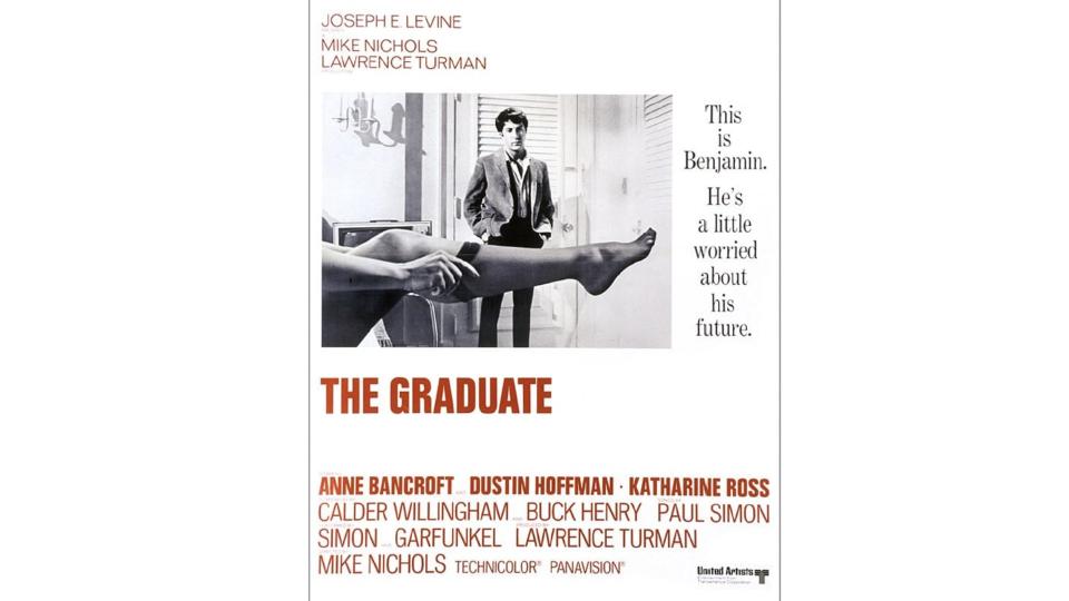
The Graduate became one of the most loved movies of the 20th century, but at the time, audiences might have been dubious about going to see it. A young graduate played by a then unknown Dustin Hoffman is first seduced by a much older friend of his parents, and then falls for her daughter. With the lead lacking classic movie-star looks, it was a potentially tough sell. But thankfully this superb movie poster did a lot of heavy lifting in that department.
"Great movie posters needed to communicate so much back in 1967," explains Stephen Haggarty, executive partner, creative at Yonder. "As a window into a movie, viewed while standing in line waiting to buy a ticket, posters became a way to sell." And selling was important. "You always had to have options going to the cinema," Stephen points out. "If the movie sold out before you got to the front of the queue, then you had to select another one. So storytelling through great poster design was critical."
And this one nails it, thanks in part to its hidden depths. "On the face of it, things look fairly simple," says Stephen. "It’s a story about a recent graduate who has some difficult choices to make about his future. But there’s something in the way the story on the right is written. Is it sarcastically alluding to things that are not what they seem? Look at the colours. Black, white: simple and straightforward. But then red, the colour of lust, for the collegiate slab serif font. Is this the first sign of the transition to adulthood?
"When we move to the image, it looks like it’s been taken quickly, perhaps from a bed. But was it taken by someone else? Consider the position, size and composition of the photograph: it’s set off to the left, small in relation to the poster frame. Not so confident, it’s unsure, just like Dustin Hoffman’s character Benjamin, who's caught between two worlds of boyhood and manhood. It isn’t taking centre stage; it’s hesitant."
Finally, Stephen walks us through the subject matter. "A stockinged leg: dressing or undressing? It cuts Benjamin, who is semi-dressed, in two across his crotch. More symbolism here, around adulthood again, and the journey he's on. He’s full of indecision, shown by the angle of his head. He has doubts. He doesn’t look aroused. It’s clearly daylight, so this is an afternoon scene, which brings even more frisson to the image. It’s just a brilliant poster!"
11. Fear and Loathing in Las Vegas
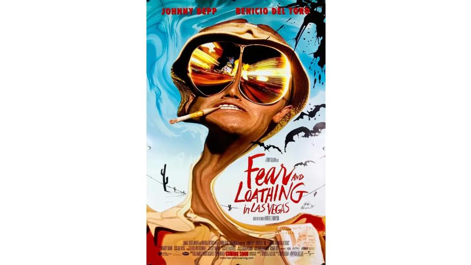
Based on gonzo journalist Hunter S. Thompson's 1971 novel, 1998's Fear and Loathing In Las Vegas is the thinking person's stoner comedy. Directed by Monty Python's Terry Gilliam, the story follows its protagonist, Raoul Duke, and his attorney, Doctor Gonzo, as they descend on Las Vegas to chase the American Dream through a drug-induced haze, all the while ruminating on the failure of the 1960s countercultural movement.
The poster sums up all these elements brilliantly, and it's a personal favourite of Jay Short, co-founder of Solarflare Studio. "The design was weird enough to make me want to find out more, and sufficiently representative of the film itself for me to then understand the aesthetic after watching it," he says. "In contrast, movie posters are either brazen adverts for the stars that they tease very little about the film or so obtuse that it only makes sense after; think the bar of soap in the Fight Club poster.”
12. Moon
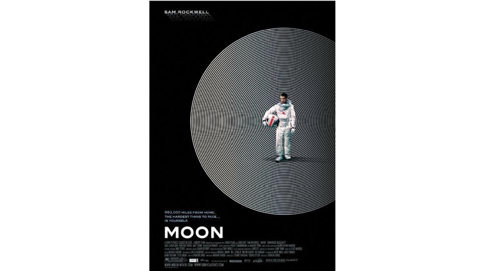
Directed by Duncan Jones, 2009's Moon came along at just the right time. Movies had taken a turn towards heavy use of CG, bringing lots of spectacular action but often a lack of story, character development and plot. In contrast, this simple story of a lonely man living on the Moon was a breath of fresh air… metaphorically speaking of course.
"The film poster accurately depicts a sense of isolation in the film, with a very minimal, striking, and bold execution," says James Lunn, senior designer at Wonderhood Studios. "The graphic device of simplifying the image of the moon down to concentric circles does a great job of drawing you in. It's only after viewing the film that you realise that it also alludes to the boundaries the main character is placed under. As does the detail of only having the starring role listed. Monochromatic colour is also truthful to its setting. What's not to love?"
13. Akira
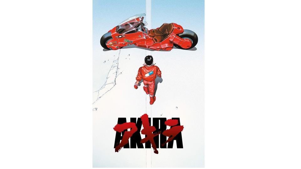
In 1988, Akira brought Japanese animation to cinema audiences around the world, and changed Westerners' perceptions of what hand-drawn animation could do, thanks to its fluid motion and intricate backgrounds. And with its roots in a 1982 comic, it's maybe not surprising that its posters were so instantly evocative and engaging .
"This version of the Akira poster, where Kaneda is walking away from the viewer toward the coolest possible bike, is now one of the most iconic and reproduced images in the world of anime," says Maciek Strychalski, digital designer at Cheil UK. "Just search ‘Barbie Akira’ as an example of how it still resonates."
Its centred layout with three strong elements reminds him of the simplicity of the Jaws poster, he adds. "The seemingly naïve use of an Impact-like font, overlaid with katakana characters, is a precursor to how Japanese sensibility in western font use is becoming more understood and used now; especially in movements like Acid Design. And the clean reds backed by the stark, almost luminescent white of the concrete really pop.
"It was the Rule of Cool, though, that led to it being the only movie poster up on my teenage wall. The way our hero is turned away from you, as if he just doesn’t care, is great. And the way the design pulls all our focus toward that unbelievably slick bike is genius. I had no idea what the film was going to be about, but I knew it was going to be one hell of a ride."
14. Little Miss Sunshine
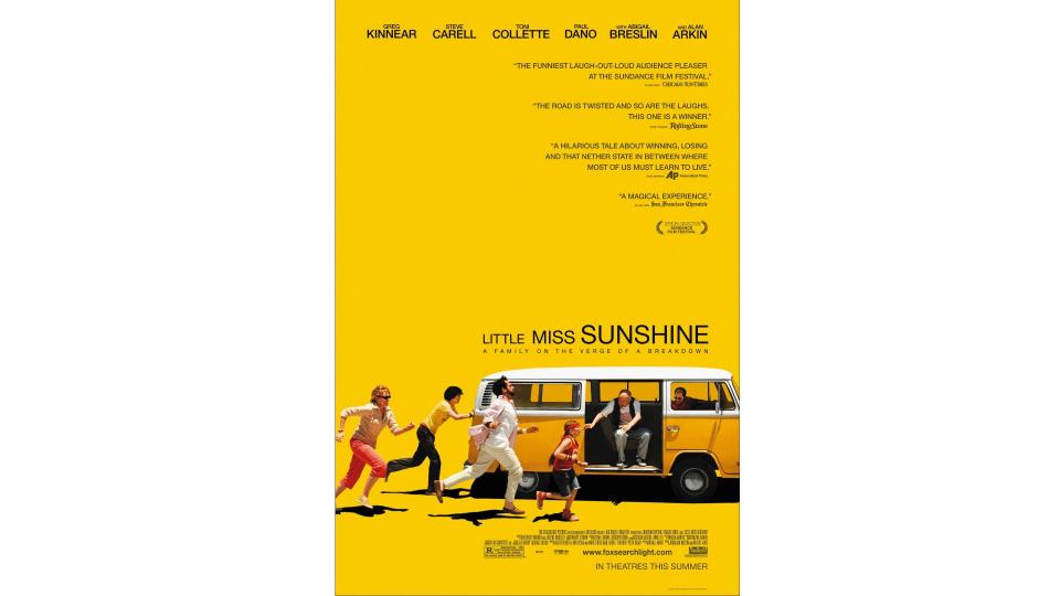
In an era when superhero films were starting to get budgets in the hundreds of millions of dollars, 2006's Little Miss Sunshine, which cost a modest $8million, was a breath of fresh air. The tragicomedy road movie saw members of a dysfunctional family taking their youngest, played by Amber Breslin, to compete in a child beauty pageant. It wasn't the kind of movie people usually flocked to see, and so its success was all the more heartening for the future of cinema.
The poster arguably played a significant part in that, and it's the colour palette here that makes it another personal favourite for Indigo. "Like The Lobster, it is not afraid to leave negative space, which boldens the sunny bright yellow of the backdrop," she explains. "The happiness of the yellow contrasts with the chaotic scene of a family chasing after their van. The yellow allows for the shadows of the family to be emphasised, which for me summarises the whole premise of the film; that there is no light without dark."
15. Jurassic Park
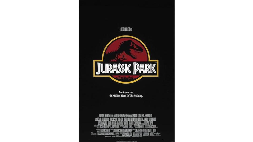
Every child loves dinosaurs, especially when viewed on the big screen. And 1993's Jurassic Park hit just as CG had become sophisticated enough to convince you that Tyrannosaurus Rex was actually real. Not to mention the brilliant direction, acting and script writing that made it hands-down one of the best movies of the 1990s.
Jurassic Park didn't just spawn numerous sequels but one of the decade's best film posters too. As Mariusz Kucharczyk, art director at UNIT9, puts it: "Simply focusing on the Park’s logo and its skeletal T-Rex silhouetted against a black and red background, it keeps things mysterious yet foreboding, setting the tone for the whole franchise."
Ruari loves the way that, as with Ghostbusters, the branding worked both within and without the world of the movie. "In the film, it’s an emblem for a theme park – a dinosaur entertainment park where it’s all going to be great," he says. "Even the African/Tiki style typography hints that this is all going to be fun… but the bright red background suggests otherwise. It makes sure we see the striking T-Rex skeleton, a powerful image in its own right, taken directly from Chip Kidd’s original book cover."
16. Star Wars: The Phantom Menace
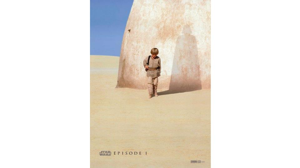
1991's The Phantom Menace might seem a strange choice for this list, because if you believe people on Reddit, it's the one Star Wars installment everyone hates. Which is kind of odd, because at the time it was hugely popular, especially with the then-younger generation for whom it was "their" Star Wars.
Either way, we can't deny that this is one of the coolest movie posters we've ever seen. "It's iconic for its powerful visual storytelling and foreshadowing," enthuses Dipti Bramhandkar, executive strategy director, North America for Iris. "The design is centred around a young Anakin Skywalker, whose shadow forms the silhouette of Darth Vader on a Tatooine building, subtly hinting at his dark future." It's a detail that's easy to miss at first glance, which means it makes all the more dramatic impact when you realise the trick.
"This clever use of imagery captures the central theme of the film: the genesis of one of cinema's most infamous villains," she adds. "Its simplicity, coupled with the emotional weight of the character's destiny, makes it a memorable and impactful film poster, resonating deeply with Star Wars fans and movie enthusiasts alike."
Matt Crump, creative director at Atomic London, had a similar reaction to it. "The film's teaser poster managed to summarise the whole trilogy in a single image," he recalls. "It’s simple, tragic, and got 12-year-old me insanely excited to experience a new Star Wars film for the first time in my lifetime," he recalls. "Ultimately, the poster was better than the film – three words: Jar Jar Binks – but the poster did set an incredibly high bar."
17. Midnight Cowboy (Poland)
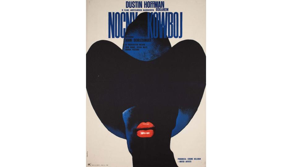
When we think of movie posters we generally think of American designs. But lots of countries have traditionally made bespoke posters for foreign imports, designed for their own national markets. Many of these are hidden gems for designers, and Poland is no exception.
"There are hundreds of inventive and fantastically creative Polish film posters that offer a completely original perspective to their English language counterparts for posters of the same films," explains Joel Pearce, production artist at Coley Porter Bell. "And the most acclaimed is Waldemar Swierzy’s iconic design for the 1969 Oscar winning US movie, Midnight Cowboy."
Set in New York City, the film depicts the unlikely friendship between two hustlers: a naïve prostitute (Jon Voight) and an ailing con man (Dustin Hoffman). The original American poster features a black and white photo of the two, and does a good job conveying the mood and content of the film. "But for me, it pales in comparison to the sheer beauty and graphic simplicity of Swierzy’s design," says Joel. "I really enjoy the boldness of covering some of the title type with the hat illustration."
It's become one of the most sought after and valuable Polish posters of all time and secured Swierzy’s place as a legend of the genre. Most recently, indie band Young Fathers paid homage to it on the cover of their album Cocoa Sugar. To learn more about Polish posters, check out the brilliant website of vintage art store Projekt 26.
18. Logan
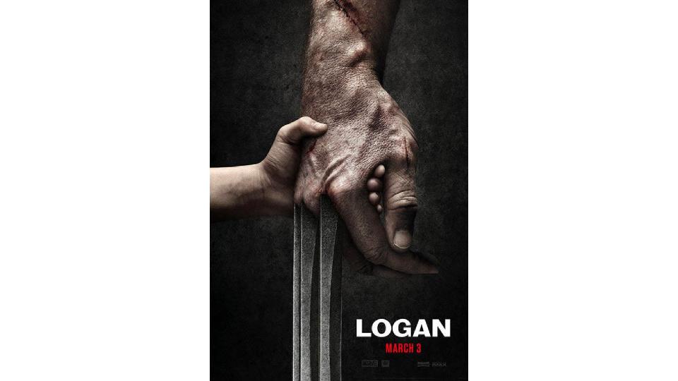
If you're a parent whose child loves the Marvel Universe, be warned. While most of it is very youngster-friendly, 2017's Logan is a different kettle of fish. More like an adult Western than a superhero film, its violence is realistic, relentless and brutal. It's a fantastic film, but send any under-12s to bed before watching it.
One of the reasons Logan is so revered, though, is that underneath the gore beats a very human heart. And this is perfectly encapsulated in the poster, says Diego Andrade, SVP, executive creative director at Orci.
"I’m a superhero movie maniac but quite frankly, a lot of their posters are floating-head monstrosities meant to show off their sprawling ensemble casts, rather than an exercise in good design," he argues. "This Logan poster, though, really struck me.
"It’s an incredible 'less is more' visual: the simple idea of probably the most violent character in Marvel’s roster holding a child’s hand," he explains. "We’ve seen those claws cut through people over and over, and here they’re paired with this vulnerable, almost nurturing moment. It tells you everything you need to know about the premise of this film, without spoiling anything."
19. The Green Knight
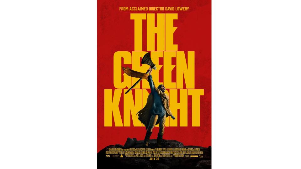
An epic fantasy adventure based on Arthurian legend, 2021's The Green Knight was beautifully shot, breathlessly atmospheric and brilliantly acted by Dev Patel. And not only that, but it brought back classic movie poster style in an era of generic blandness.
As Marina Suprunova, senior visual designer at House 337 puts it: "Many promotional film posters today are overly complicated, blending into one noisy 'sea of sameness'. The Saul Bass era appears long gone, overshadowed by an abundance of decision-makers, fear of risk-taking, and the weight of legal and commercial obligations. However, significant work remains achievable, as shown by this poster.
"It’s not often that we witness such impactful, typography-led designs," she explains. "Minimalist at its core, the key art maintains a clear information hierarchy. I love the details of the custom type, set over a dramatic textured backdrop – it creates a striking and inspiring atmosphere. Gawain’s pose masks the type just enough to create visual intrigue and emphasises the lead character’s quest of self-discovery without giving away too much of the plot."
20. Harakiri
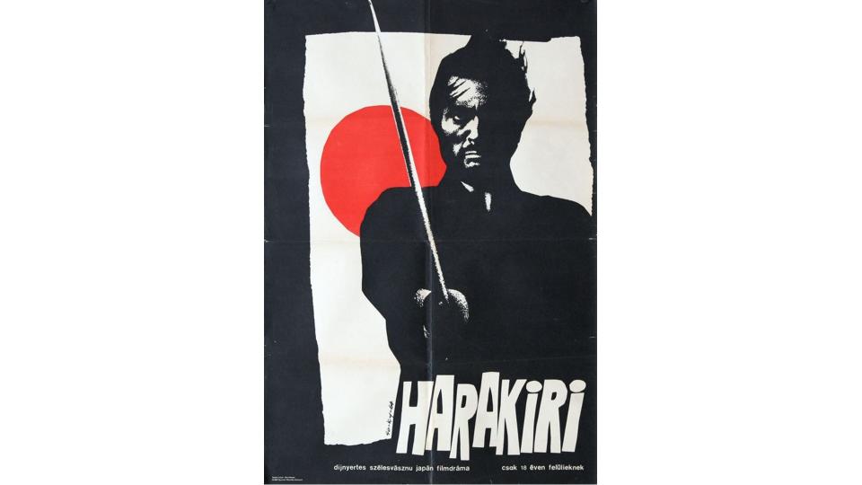
Samurai films are the Westerns of Japan, and one of the most beloved is 1962's Harakiri. The story takes place between 1619 and 1630, and focuses on a man requesting to commit ritual suicide, and using the opportunity to explain the events that drove him to ask for death. Grim stuff, but it remains utterly compelling a full 62 years after its creation.
Ruari loves its poster too. "Red focal points always command attention and force the viewer to focus their gaze," he explains. "In this case the rising red sun is unavoidable and as we’re drawn into it, we must stare at the fearsome Ronin, past his sword into his cold hard gaze."
The image is both threatening and bold, he adds. "The simple composition is even more enjoyable as we notice that the irregular lines of the white background hint at the form of a crumpled flag. And the typography shouts the title, almost helping us hear nuances of the language."
21. The Thing
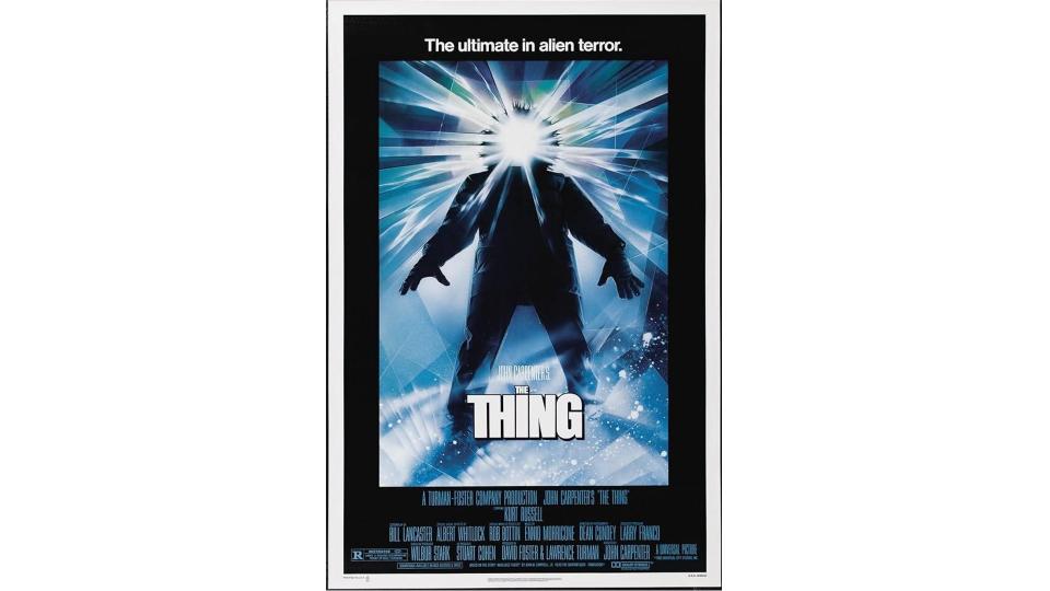
1982's The Thing tells the story of a group of American researchers in Antarctica who encounter an alien life-form that assimilates, then imitates, other organisms. Not necessarily the easiest concept to explain in a single image, but this poster manages it effortlessly.
In the words of Paul: "A body-horror film about a shapeshifting, telepathic, otherworldly creature is almost too vague to make work in one visual. Yet designer Drew Struzan used it to create one of the most recognised movie posters in history."
Shockingly, the legendary artist was given just one day to create this iconic piece. "Due to the timing," Paul explains, "he went with his gut instincts and created what he felt would work best: a foreboding and unknown humanoid form with an obscured face and ominous light emanating from it.
"With a high-fidelity of craftsmanship, Drew painted the poster in the short timespan and perfectly captured the sense of paranoia, dread and suspenseful mystery that this movie entails."
21. Vamp
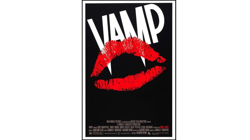
Vamp, the 1986 black comedy horror featuring Grace Jones as a vampire stripper is, as you can imagine, not a great movie. But Neale Horrigan, executive creative director at elvis, believes that doesn't stop this being a great movie poster.
"Yes, you'd expect me to pick the poster for Jaws, The Exorcist, or another movie classic," he says. "But instead I thought I’d venture off the beaten track a little and take you into the dark, dingy, low-budget backstreets of 80s filmmaking, and fly the flag for a real underdog.
"It's dark, simple and iconic," he explains. "And I love that there is a beautifully simple idea that uses the typography to pierce the lipstick to create the fangs. And so for me it is an absolute thing of beauty. Unlike the movie itself."
22. Der Film
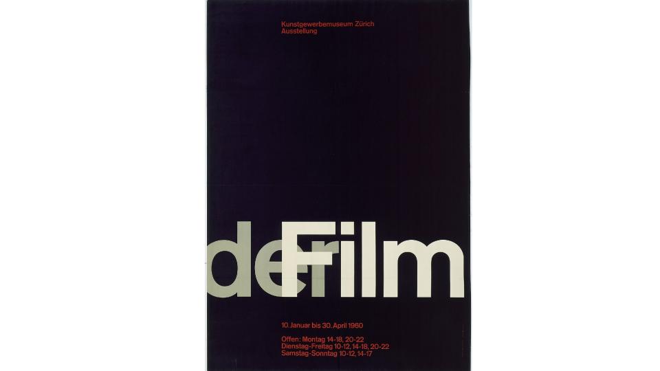
You might think the phrase "film poster" means one thing, but Tom Munckton, head of design at Fold7, had something else in mind when contributing to this list. "It’s near impossible to pick a favourite film poster, but it is easier to pick a poster that sums up the epic grandiose of the film world itself," he explains.
And so, with an element of contrariness, he's opted for Der Film by Swiss graphic designer Josef Müller-Brockmann, an artwork in the Museum of Modern Art that was inspired by film itself.
"Der Film transports us through colour and composition to the absorbing feeling of the movie theatre," he explains. "A simple typographic splice alludes to the depth and drama of film, but also its functional workings. Although designed in 1960, before so many great films, it sums up the atmosphere of film perfectly. In the spirit of the Swiss modernist rational approach, it does so in such a singular and iconic style."
23. John Wick: Chapter 3 – Parabellum
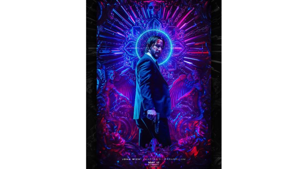
The John Wick series, centred around a hitman played by Keanu Reeves, has been running for nine years now. And with the release of the fourth installment last year, it officially became a billion-dollar franchise.
For the uninitiated, Andy Cooke, head of design at BBH London, explains the appeal. "The John Wick films are ridiculous, over the top and slick as hell," he says. "The unrealism is one of the factors that draws you into the franchise — pure escapism."
And the poster for the third instalment, by 3D artist Billelis, takes this dynamic and runs with it. "The incredible craft and attention to detail mirrors the lead character’s precise approach to his own craft," says Andy, "and references the ever-increasing death toll in the movie with unadulterated, weapon-inspired maximalism.
"This is all balanced with angelic undertones and symbolism that makes John look more empathetic, framing him as the angel of death. There’s a visual continuity between the poster and movie that’s cognisant of the film art direction, giving the audience a flavour of what’s to come. And essentially...it’s cool as fuck."
24. The Grand Budapest Hotel
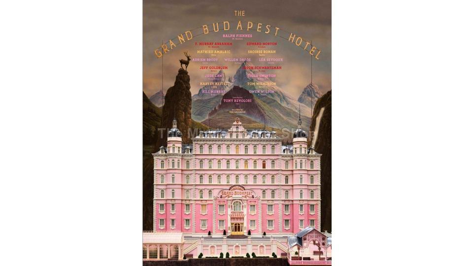
Whether you love or loathe the films of Wes Anderson, it's undeniable that his work is highly distinctive and immediately recognisable. 2014's The Grand Budapest Hotel was arguable the most Wes Anderson of Wes Anderson films, dialling up the quirkiness to 11. And the poster made it abundantly clear what cinemagoers were in for.
"It’s the whimsical story book quality of The Grand Budapest Hotel’s poster that draws me in," enthuses Indigo. "With a surreally detailed alpine landscape behind and pastel tones that position the scene as otherworldly.
"Annie Atkins' graphic design plays such a huge role in building the fictional world within this film and I feel the way the title is approached nods to this," she adds. "The title is part of the scene itself, held up on poles and towering over the building." To learn more about Atkins' work on the film, read this interview she gave to Creative Bloq at the time.

