Guy Calls Out Beauty-Product Packaging in Hilarious Viral Video
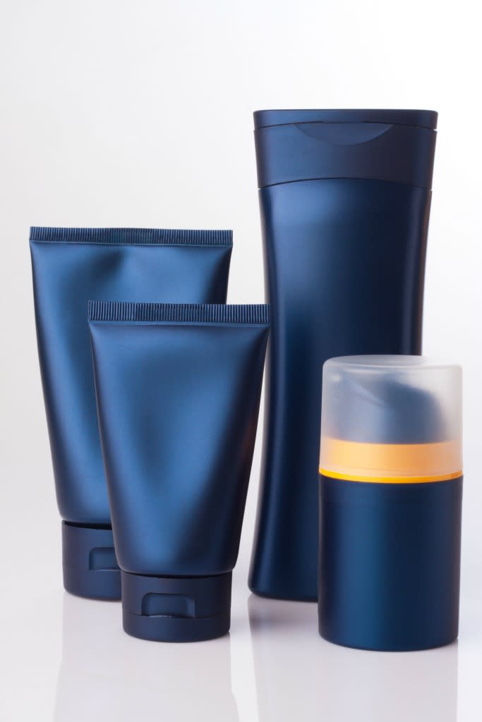
A 22-year-old man with mischievous sense of humor decided to make a satirical video about the curious way men’s beauty products and toiletries are marketed. Lucky Turner of Richmond, Va., was just wandering around a local store minding his own business, he told Buzzfeed, when he noticed something curious: Almost every beauty product geared toward men comes in black or dark-colored packaging. And now that we think of it, it’s so true.
Turner was on a mission to pick up some Shea Moisture, he told the site, “because I was out, and my hair deserved another blessing from them.” That’s when he picked up on the curious product packaging. So he pulled out his smartphone and decided to do what any reasonable (or silly) person would do: video it and share the results on social media. Now his video, which he posted to Twitter, has gone viral with more than 51,000 retweets and more than 74,000 likes.
I would call this a video I can’t explain, but I can. #masculinitysofragile pic.twitter.com/TyLsa7wan3
— Litty Kitty. (@estLucky) December 18, 2016
“Want to get some Vaseline lotion? How ’bout we get one for men, in a darker color, cuz men don’t like green,” he says cheekily at the beginning of the video. But the pattern continues, as the man reveals that Palmer’s Cocoa Butter, Lubriderm lotion, Gold Bond cream, Nivea cream, and even Banana Boat sunscreen all use the same kind of packaging: black, silver, gray, or any color in those families. “I would call this a video I can’t explain, but I can,” he wrote in a description for the video.
When pressed by Buzzfeed to explain, Turner said, “I really just wanted to make a note of how items are marketed differently to men vs. women, but with some humor attached to it.”
Read This Next: Five Girls Tried Gray Lipstick and It Looked Surprisingly Awesome
People’s reactions were also priceless.
According to a website that analyzes the psychology behind product packaging, “Black is the color of power, authority and control. It tends to stand out when used as a packaging color as it makes products appear heavier and more expensive and transmits a higher perceived value.” The site suggests that companies might be playing it safe by using black’s cousin, gray, to package its products. “Gray is a safe color to use as a packaging color. It is neutral and serious and can be combined with almost any other color to impart different messages and to reach different target markets,” the site says.
Turner didn’t mean to dig so deep, though. According to Buzzfeed, he was just having a little fun with something silly he noticed. And while some people criticized his perceptive clip, others were more accepting and amused by the whole thing. “I will say that the majority of people got the point, laughed, and moved on with their lives,” Turner says, “so that was nice.”
Next stop: Ellen?
@TheEllenShow hey girl, we should sit and have some tea and a chit chat about this here video some time, luv da show, thx xoxo
— Litty Kitty. (@estLucky) December 21, 2016
Let’s keep in touch! Follow Yahoo Beauty on Facebook, Twitter, Instagram, and Pinterest.

