This Map Shows How Long You’ll Wait in Your Plane at Each Airport
To use the interactive map, click here. (Courtesy: Siemond Chan/Yahoo)
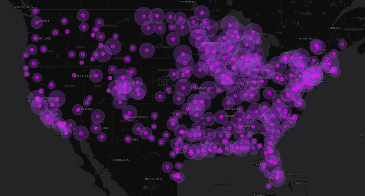
Are you thinking about which airport to fly out of or into, and not sure which one is faster? Now there’s a simple way to do that, thanks to an interactive map that crunches all the average gate times since 1995.
The map, created by Yahoo’s Siemond Chan, uses data recently reported by the Associated Press using information from the Bureau of Transportation Statistics. It calculates the average taxi time in and out of each American airport, including the Dominican Republic, since 1995 from January to September.
Related: Results Are In: Best and Worst U.S. Airports in 2015
So if you’re debating between, for instance, Los Angeles International Airport (LAX) and Bob Hope Airport in Burbank (BUR), you’ll see that the former has an average taxi time of 24.1 minutes while the latter averages 18.1 minutes.
The AP report found that the worst offender among major airports is Chicago’s averaging, 26.2 minutes. Also, this was the worst year for waiting in planes since the data began to be kept in 1995, with an average wait of 23 minutes and 32 seconds –a 50 second increase over 2014.
WATCH: The Worst Things You Can Do on a Plane
Let Yahoo Travel inspire you every day. Hang out with us on Facebook, Twitter, Instagram, and Pinterest. Check out our original adventure travel series A Broad Abroad.

