Whatsapp's UI redesign looks clean and fresh
WhatsApp has a new look for its UI design with a refreshed colour palette, updated icons and illustrations and playful new animations and chat wallpapers. It's super clean and makes better use of the brand's green colour.
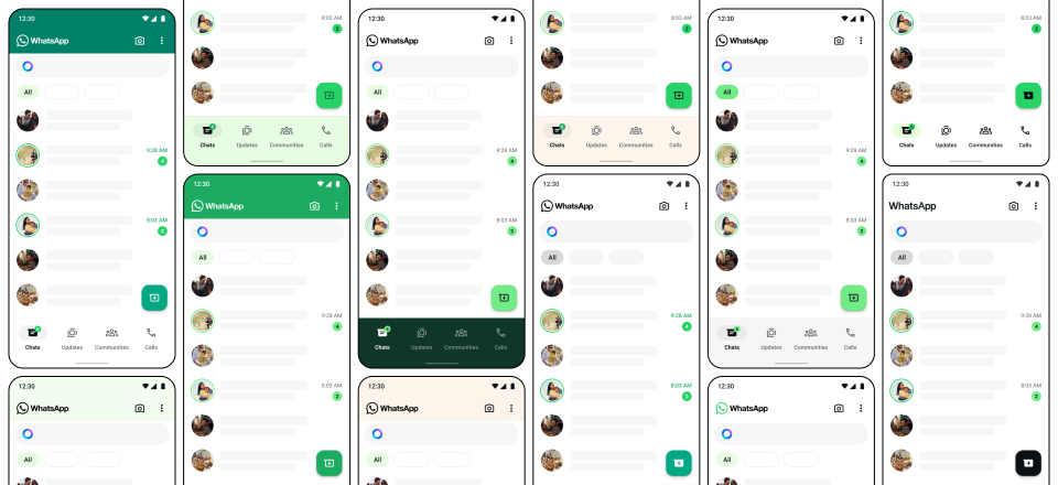
Notification badges and buttons have been given a splash of green, but it's used sparingly over a base of neutral tones. Meanwhile, icons and illustrations are more rounded.
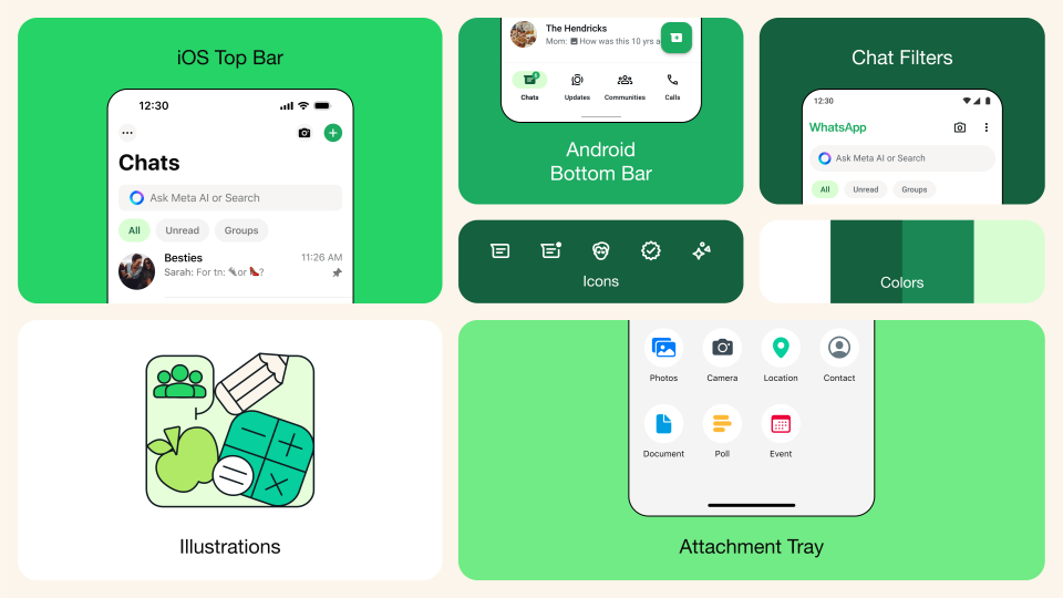
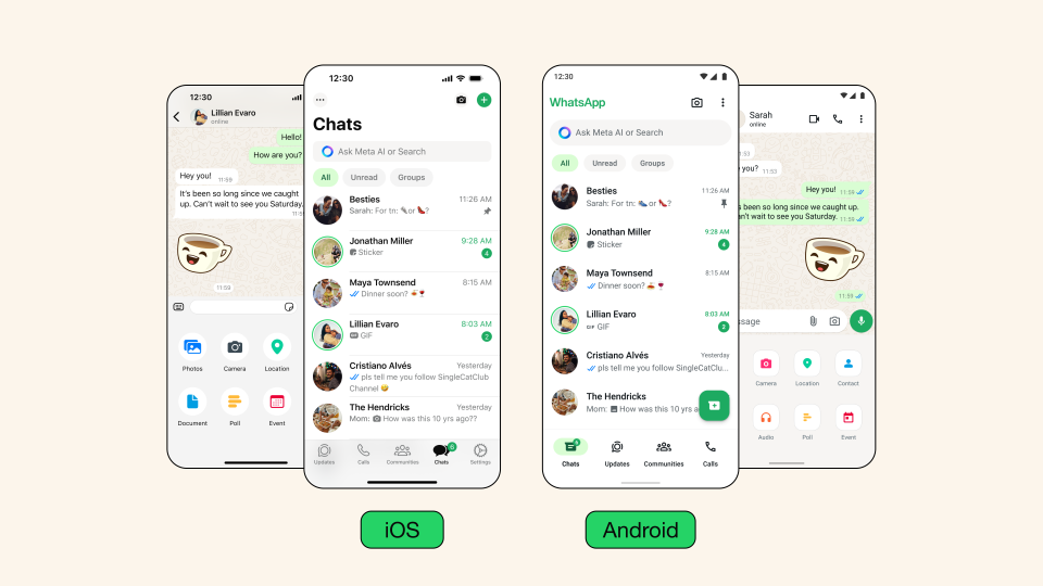
We first reported on the new Whatsapp UI when it was in beta testing. Now it's rolling out in a general release. Android users will see the navigation bar moved to bottom of the screen in line with the iPhone version, making Chats, Calls, and Status more easy to access with one hand
Meta says it tested over 35 different color iterations before settling on the palette for the new UI. Dark mode is a shade darker and has been given more contrast and "deeper tones to reduce eye strain in low-light environments. The search bar has been moved to the top of the Chats tab to improve the discoverability of messages and contacts, and some users have access to Meta AI.
The new look seems to be going down well with users judging by the responses on social media. People are saying it looks cleaner and more modern, although some are questioning the usefulness of having an AI chatbot in a messaging app.
For more UI news, see the controversy over the very brief YouTube redesign.

