Whatsapp's new UI design looks super sleek
While the messaging app Whatsapp has been adding new features, its user interface on Android has been looking fairly similar for years. But it seems that's set to radically change judging by the glimpses we've seen of a new beta version.
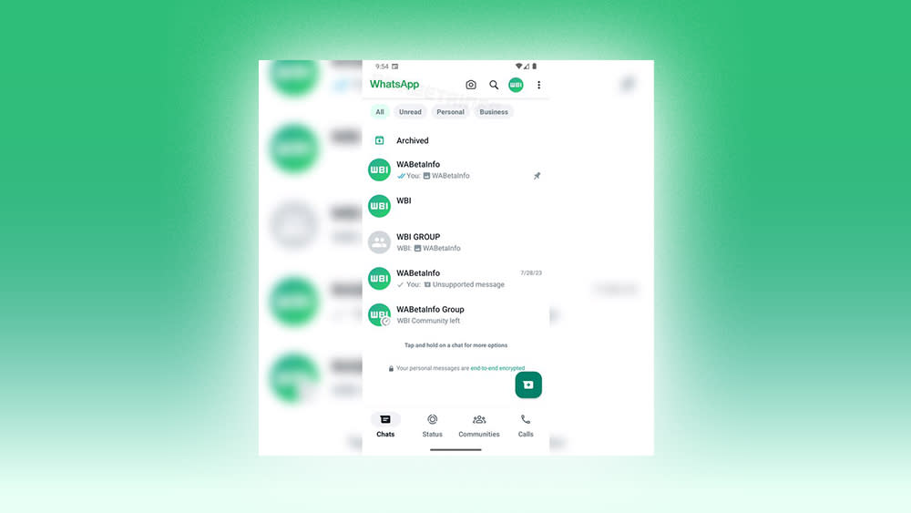
The new Whatsapp UI looks much sleeker, with the navigation bar moved to the bottom, chat filters in an entirely white top bar, and a new font for WhatsApp’s branding (see our guide to the best UI design tools for your own projects).
📝 WhatsApp beta for Android 2.23.18.18: what's new?WhatsApp is working on a new interface for the white top app bar with a green app name, and it will be available in a future update of the app!What are your thoughts about it? Share them below!https://t.co/KQA4c8u6pn pic.twitter.com/b18XcttHfDAugust 30, 2023
We got our first glimpse of the new WhatsApp UI in screenshots shared by WABetaInfo from a beta for Android 2.23.13.16 that's been rolled out among select testers. The new design seems intended to make it easier to find unread, personal or business messages, presumably in preparation for the roll-out of multi-account support, which is also in beta.
The three dots shown in the upper right in the image above will reportedly be removed in the final version, and other tweaks can also be expected before the update launches. The reaction from users so far seems to be almost entirely positive, with many people writing on Twitter describing the new UI as "beautiful" and "clean". "Finally, the interface that I always wanted to see," one person wrote.
Some say that the beta UI has an iOS look, but others are hoping for the introduction of iOS gestures and a similar amount of effort in updating dark mode. It's unknown when the update will enter into general beta or see a public launch.
For more recent UI updates, see the new Slack design. And to learn about UI and UX, don't miss our online UX design course.

