Why has the Disney Plus logo changed colour?
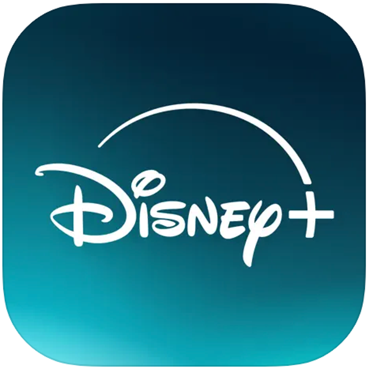
Disney Plus’s logo has received a makeover in the Apple app store and Microsoft Apps, where it has changed to teal and white in colour.
The colour palette of the app symbol for the streaming service operated by the Walt Disney Company has been dark blue since its November 12, 2019 launch.
Google Play is the only place where the app hasn’t received the teal-green update.
Disney has not yet provided an explanation for the most recent colour change on Disney Plus but there are a few speculations on why this has happened.
The primary cause of the colour shift is likely Disney Plus’s ongoing merge with Hulu, which started earlier this year. Since December, Disney Bundle users have had access to a beta version of the merged streams, which gives them use of the Disney Plus app to view Hulu content, which tends to appeal to an older age group than usual Disney entertainment. The new teal colour palette for Disney Plus, which combines Disney blue with Hulu green, is probably a prelude to the one-app experience that will launch later this month.
The colour change could possibly be a result of the Walt Disney Company's current messaging and Disney+'s transition from a family-friendly brand to one that caters to a wider range of consumers.
Another speculated reason is that other applications, such as Paramount+ and Max, similarly employ blue and white for their logos. They might be taking this action to make their app stand out among the many app logos.
Even while Disney+'s new teal-green look is merely cosmetic for the time being, it is clear that the Disney+ of 2019 is not the same streamer of 2024, and further changes are likely to come.

