The best rebrands of the 2010s, chosen by experts
A strong decade for rebrands, the 2010s saw many businesses reworking their identities to become digital first. Cutting through the noise of an increasingly busy online world called for communicating with consumers in new ways and choosing designs that stood out. Simple, flat, app icon-led logos were key to this, while many brands experimented with bold colour systems, quirky ads and even name changes.
Here, in no particular order, are the best rebrands of the decade, as picked by designers and industry experts. Check out more of the best rebrands by decade here, or our logos by decade series traces the top identities from the 1930s onwards.
01. Oatly
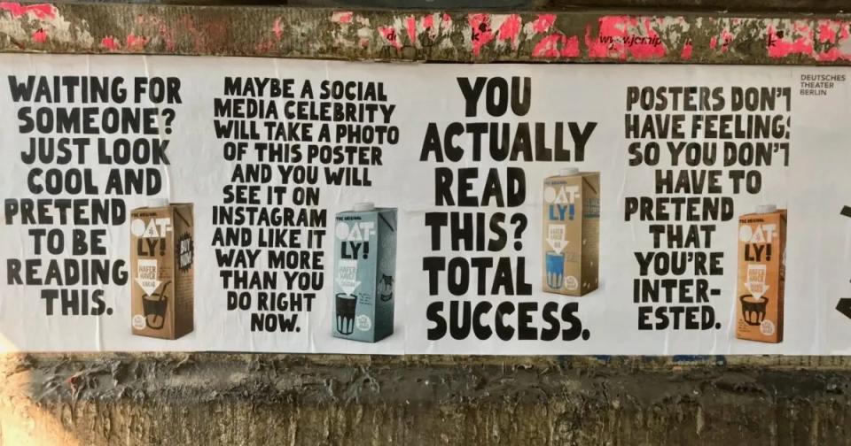
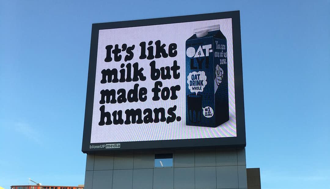
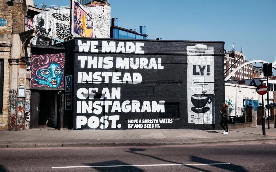
Despite being around since the 1990s, alt-dairy product producer Oatly and its branding really caught the attention of consumers in the 2010s, says Gemma Wilson is a senior writer at verbal branding agency Reed Words. “It was the perfect timing – with the rise in purpose-driven brands, plant-based products, and (sadly) ‘wackaging’. A new leadership team maximised the moment to catapult Oatly out of obscurity and into our precious fridge space. They had the bravery to make Oatly’s packaging genuinely interesting. To build a tone of voice that’s loud and punchy, full of weird jokes and inane rambling. And to use both to fill enormous street-art style ads,” she says.
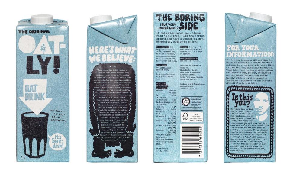
“They deliberately broke the ‘rules’ – from their irregular logo to being openly political towards the dairy industry. These moves turned Oatly from a product into a brand. The real difference is, it wasn’t rebellion for rebellion’s sake. The trend that Innocent started, with quirky, chatty on-pack voice, Oatly turned into something authentically challenging,” she continues. “They started the Swedish ‘Milk Wars’ – culminating in getting sued for the line ‘Milk, but made for humans’ [by LRF Mjölk, the Swedish dairy lobby], publishing the lawsuit, and becoming a mainstream brand as a result. Calling the back of the pack ‘The Boring Side’ and turning half pack into an appeal for a boyfriend: ‘My friend Sara is looking for a boyfriend. She’s 26 and really cool’. Never mind publicising the customer review 'It tastes like sh*t' on packs and in ads. It’s still rare to see a brand brave enough to be weird on main. Even more to do it in copy – and commit to keeping it up.”
By the end of the decade, the move had paid off, as sales doubled to $421 million. And not long after it won a landmark legal battle against trade association Dairy UK, after a judge ruled that its “Post-Milk Generation” slogan did not create consumer confusion.
“Oatly shouldn’t be likeable, but it is,” Gemma says. “The brand works because people can tell it’s real, and that authenticity lets us overlook its flaws. If the tactics seem tedious, it’s because of poor imitators since. Happily, Oatly is still pleasingly off-kilter today. The website has a ‘Brainwashing’ section, it riffs on brand-chat tropes 'So, let’s get started. (That was just a suggestion. You can start whenever you are ready.)' And for any outstanding critics, this year they launched FckOatly.com to share the hate. It’s a rare example of a brand that’s moved from challenger to mainstream without losing its edge.”
02. Old Spice
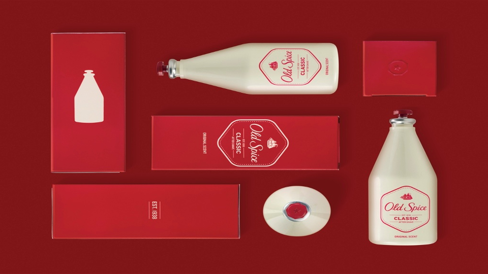
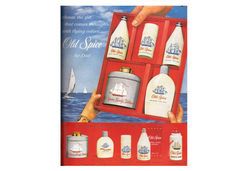
Dating back to 1937 and at risk of becoming obsolete, male grooming brand Old Spice was well overdue a refresh to attract new, younger consumers. The 2010 rebrand included a now legendary ad featuring a confident, suave male, while still managing to poke fun at traditional of masculinity in advertising.“Rather than follow the traditional branding playbook of updating the logo or design, P&G changed the brand's voice and character. The company focused on dramatically redefining the definition of ‘being and sounding like a man’,” says Allen Adamson, co-founder and managing partner of marketing agency Metaforce and author of Seeing The How. “The rebrand was launched with a commercial featuring Isaiah Mustafa, an actor and former football player, behind the theme ‘The Man Your Man Could Smell Like’. And the brand voice was snappy and quirky. ”
“P&G also supported the fresh brand voice with bold (red) packaging and went to market with a graphically impactful contemporary look,” he adds. “The results turned a dying business into a fast-growing multi-billion dollar global brand. It is one of the most dramatic and successful brand turnarounds ever.”“Rather than follow the traditional branding playbook of updating the logo or design, P&G changed the brand's voice and character. The company focused on dramatically redefining the definition of ‘being and sounding like a man’,” says Allen Adamson, co-founder and managing partner of marketing agency Metaforce and author of Seeing The How. “The rebrand was launched with a commercial featuring Isaiah Mustafa, an actor and former football player, behind the theme ‘The Man Your Man Could Smell Like’. And the brand voice was snappy and quirky. ”
“P&G also supported the fresh brand voice with bold (red) packaging and went to market with a graphically impactful contemporary look,” he adds. “The results turned a dying business into a fast-growing multi-billion dollar global brand. It is one of the most dramatic and successful brand turnarounds ever.”
“Rather than follow the traditional branding playbook of updating the logo or design, P&G changed the brand's voice and character. The company focused on dramatically redefining the definition of ‘being and sounding like a man’,” says Allen Adamson, co-founder and managing partner of marketing agency Metaforce and author of Seeing The How. “The rebrand was launched with a commercial featuring Isaiah Mustafa, an actor and former football player, behind the theme ‘The Man Your Man Could Smell Like’. And the brand voice was snappy and quirky. ”
“P&G also supported the fresh brand voice with bold (red) packaging and went to market with a graphically impactful contemporary look,” he adds. “The results turned a dying business into a fast-growing multi-billion dollar global brand. It is one of the most dramatic and successful brand turnarounds ever.”
03. Google
Next up in the best rebrands of the 2010s – despite the tech giant’s Workspace overhaul featuring in our list from the 2020s so far, too – is Google’s 2015 identity update, created by its in-house team. A simplified sans serif wordmark, new typeface and the blue “g” icon replaced with a four-colour “G” to match the logo. Plus, for the first time, it was animated, as the “Google Dots in Motion” graphic was introduced. “The Google dots are a dynamic and perpetually moving state of the logo. They represent Google’s intelligence at work and indicate when Google is working for you,” the design team said at the time. “We consider these unique, magic moments. A full range of expressions were developed including listening, thinking, replying, incomprehension, and confirmation.”

“Google saw its biggest redesign since 1999 in 2015,” says Abigail Baldwin, director of creative studio Buttercrumble. “They tidied up the lettering and distilled the essence of the brand [icon] into its main four colours. When you place blue, red, yellow and green together, you think of Google. This multi-colour sequence is instantly recognisable and shows how powerful branding can be.”
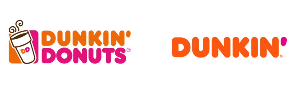
04. Dunkin' Donuts
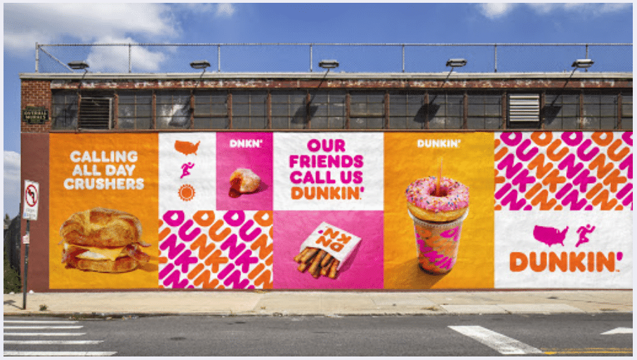
“It’s one of those brand evolutions that feels like everything and nothing changed simultaneously,” says Derek Koch, senior designer at brand strategy and design studio Team of the 2018 rebrand. “I love how Jones Knowles Ritchie used all of the beloved aspects of the existing brand – those fat, rounded letterforms and familiar pink and orange palette – to create a rich and visually expansive world that looks as familiar as it does fresh. The result is a brand that feels like an undoubtedly more confident version of its former self.”
Allen agrees that maintaining its unique and fun ”donut-like typeface and non-slick, down-to-earth look” keeps the brand relevant to its consumer base. However, the change in the name, from Dunkin Donuts to Dunkin’ was the most critical element, he says, given that the business had already expanded to other products.
“Successful rebrands don't just spruce up an image to make it more relevant and appealing; they deliver tangible business results,” Allen says. “Also, one doesn't have to be a brand expert to know that while donuts taste good, the health guilt associated with eating them has increased, especially since calorie counts must be prominently displayed on menu boards in many states. (The smallest donuts, the Munchkins, are 60 calories each, and many consumers eat three in 10 seconds.) This was similar to Kentucky Fried Chicken's rebranding, dropping ‘Fried’ to KFC and Federal Express to FedEx (when ‘federal’ implied government ownership and slow delivery, and they were a private company offering anything but slow delivery).”
“The shortened brand name also allows the brand to be easily woven into the conversation, and for many, like the FedEx rebranding, it was how consumers already used the name: ‘I’m going to Dunkin.’ Shorter is always better.”
05. Mastercard
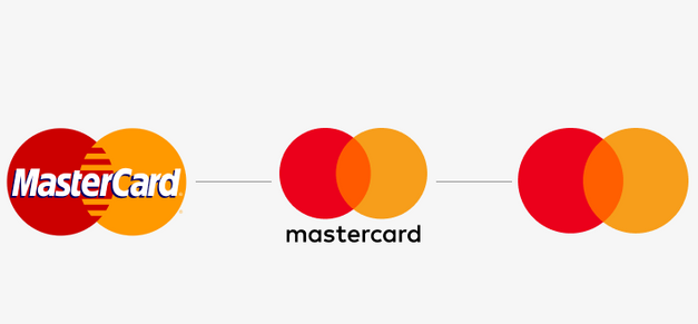
The creative team at Halo Associates (creative director Sarah Macpherson, lead designer Scott Chapman, and senior designer Adrianna Parsons) chose Mastercard's bold logo redesigns in 2016 and again in 2019, from Pentagram, as one of their top choices for the decade:
“The company’s refresh in 2016 replaced the iconic stripes with a solid block of colour and placed the company name beneath the logo – it was Mastercard’s first change in two decades. In 2019, it went even further by removing its name from the logo entirely, using only the red and yellow intersecting circles as its brand mark. This brave move was backed by research revealing that over three quarters of customers could identify the brand solely from the interlocking circles. Now, Mastercard’s logo is instantly recognisable and has a strong brand identity, proving the impact of a successful logo update.”
06. Airbnb
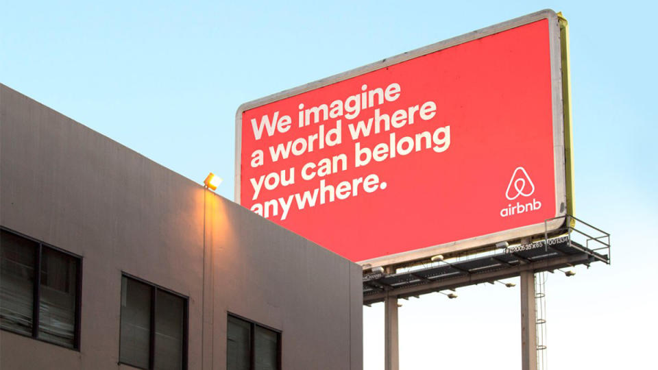
“Airbnb was definitely one of the biggest rebrand stories of the decade,” says Jonny of this 2014 identity update by Design Studio. “The brand did so many things right. The tagline ‘belong anywhere’ is a stroke of genius, short and snappy, like the best taglines, but also so easy to understand at a glance perfectly matching the spirit of the company. The logo, which could be drawn by anyone, feels welcoming and friendly, allowing Airbnb to further connect to its customers and settle their nerves, given that renting someone else’s home for a couple days is quite a quirky idea [and more novel back then]. Overall, the rebrand was a success for Airbnb, taking them to a whole new level and reaching millions of consumers worldwide to take the plunge on a different way to holiday.”
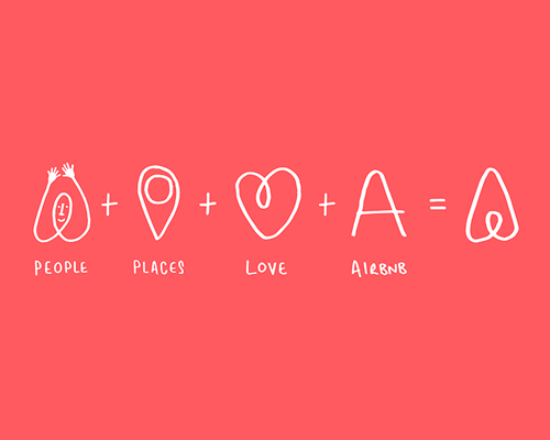
The creative team at Halo Associates agree that the logo mark was what helped it appeal to a wider audience as it abandoned its original name, logo and colour palette: “Airbnb's rebrand was a great success with the logo winning numerous design awards. Its refreshing, uncomplicated design has been accompanied by new typography making it strong, confident and clear to read. Photography and colour schemes have breathed life into its apps. The design hinges on the use of the Belò [a symbol of belonging], a clever device being a universal symbol which encapsulates ‘belonging’ to a community, amazing places you can visit and the astonishing people you can meet. A great example of uncomplicated design and great execution.”
07. Budweiser
“This bold rebrand is a shining example of successful modern heritage design, perfectly striking the delicate balance between rich heritage storytelling and contemporary design sensibilities – by embracing both. The design helped Budweiser survive and thrive in a time when the rise of social media was speeding up trend cycles like never before,” says Lisa Franck, strategy director at design and advertising agency Tavern, of the 2016 rebrand, which she says bucked design trends at the time.
“In the 1990s and early 2000s, tradition seemed to fall out of favour. In response to the hype around the new millennium and all of the design trends that came with it, brands began to put their heritage on the back burner in favour of a bolder, more ‘modern’ look. At the same time, craft breweries were growing in popularity, challenging the dominance of traditional beer brands like Budweiser,” she continues. “The 2016 redesign took the brand back to its roots while balancing traditional brand iconography with a bold undertone of modernity. The rebrand elevated and refreshed heritage design elements, which were recreated by hand to strip out the fluff while retaining a sense of craftsmanship that reflected the level of care Budweiser puts into the beer itself. The rich, red backdrop went full-bleed, stretching it beyond the pack into the rest of the brand’s visual world.”
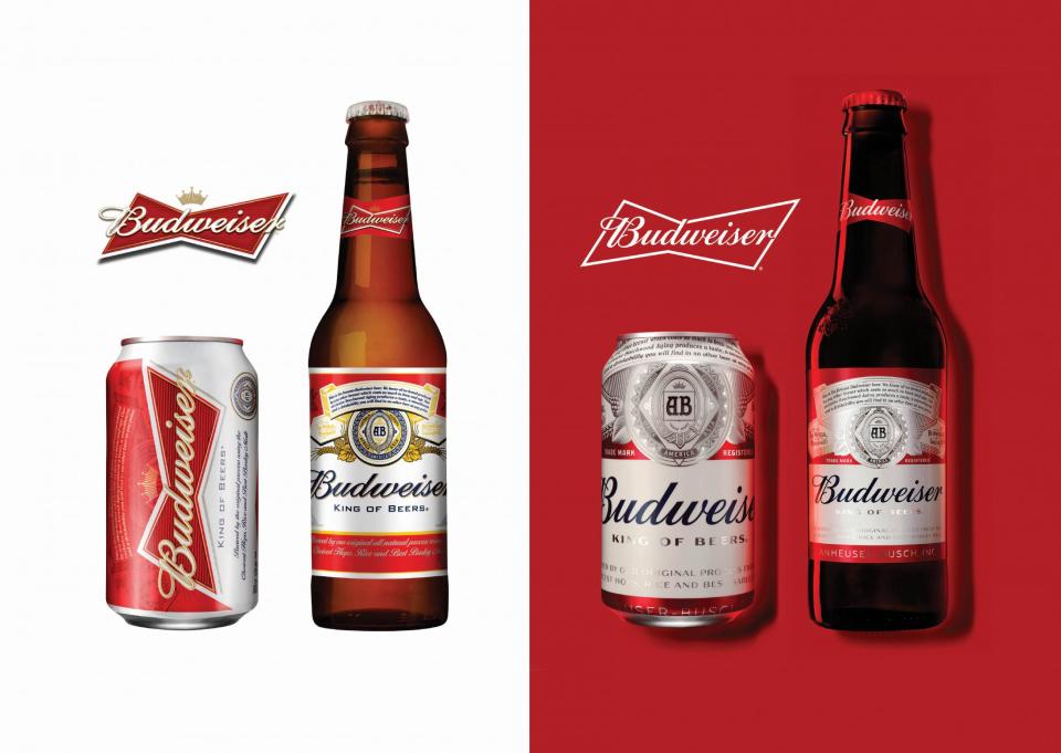
Jonny Aldrich, co-founder and managing director of London-based branding and packaging design agency Deuce agrees it was a powerful move that successfully utilised the brand’s heritage: “Creative agency Jones Knowles Ritchie did its very best to look back at history and bring back the nostalgia of their original cans while adding an overall contemporary look and feel for a modern world. The can is beautiful, it's still got the red, white and blue for a beer enriched in American culture, but it also has some beautiful crafted elements that belong in a different era, while still feeling fresh and modern at the same time being cropped off top and bottom. Overall a very clever rebrand.”
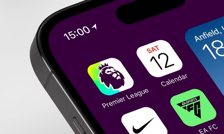
08. Premier League
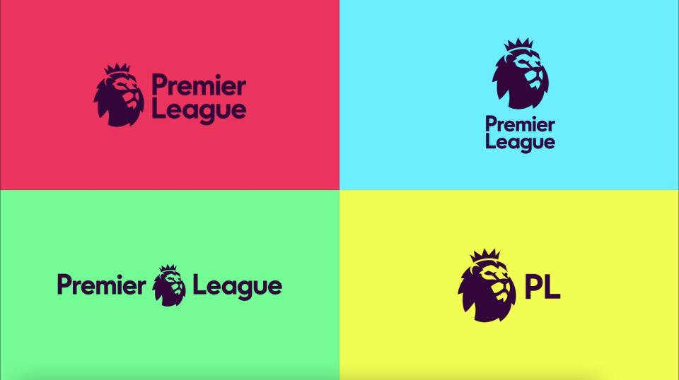
A new visual identity for the Premier League’s 2016/17 season included an updated lion icon for a “digital and broadcast-first approach”, created by DesignStudio in collaboration with Robin Brand Consultants. The title sponsorship had just been dropped, and the rebrand introduced vivid, impactful colours and an informal, flexible new system.
“This rebrand really changed up the mindset of sports event design,” says Dan Birds, senior creative artworker at syn.. “Going from brand logos where everything was bevelled, metallic and gradient heavy to a cleaned up, modern and crisp aesthetic. It was an evolutionary moment in visual brand design – especially for sport”.
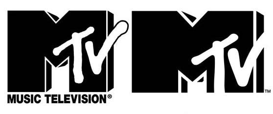
09. MTV
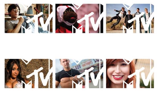
“MTV's 2010 brand refresh was a transformational moment for the ‘not-so-much-music-anymore’ channel. Embracing its shift in programming from music videos to TV shows. It kept its bold, culturally edgy form but went completely mono, showing up as a mark with framed content as a subtle nod to a TV set,” says Chris. The stripped-back, simple logo, from MTV’s in-house team, dropped the words “music television” from the logo aimed to stand out in a noisy media landscape to reach a new millennial audience.
“A pure example of an iconic brand reimagining itself for a new generation,” he adds, “with simple changes and a fluid graphic block brand system that looks to take inspiration from the’ M’ character form.”
10. Formula 1
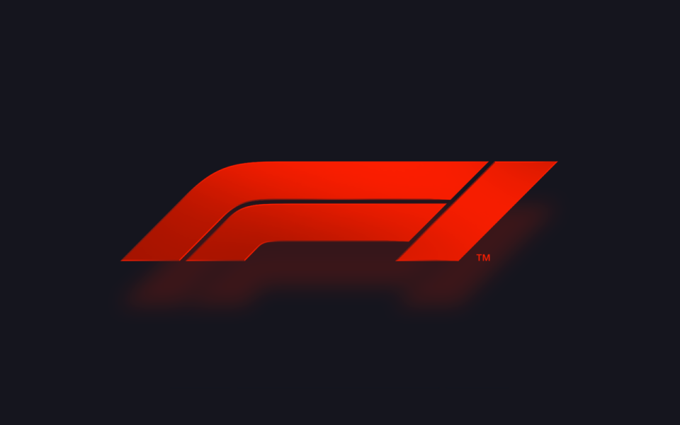
“The 2017 rebrand of F1 was a much-needed gear shift from the 1993 logo that had definitely outworn its welcome. The retro-influenced rebrand mark beautifully portrayed speed with the low profile design echoing the dynamic stance of the cars themselves,” says Chris Newell, creative partner at syn.. “A sleek and modern update that absolutely did the job to bring F1 into a modern space.”
With direction from Wieden+Kennedy design lead Richard Turley (known for the Bloomberg Businessweek redesign), the modern-retro identity was designed to work across a multitude of applications, with digital front of mind. ““The new mark embodies the core forces of Formula 1 racing: speed, attack, and control; while its sleek, sharp interlocking components celebrate the technical prowess of Formula 1 engineering teams,” said Turley at the time. “Its aesthetic is aspirational and leans into the future, but extends naturally from a rich heritage of motorsport graphics.”
And it’s not just the logo that catches the eye for this global sports icon, says Chris’s colleague and creative Ben Jones. “The most beautiful rebrand with outstanding typography to match,” he adds.
The rebrand was followed by a sixty-second film, Engineered Insanity, in 2018, as part of a big multi-channel campaign.
11. M&S
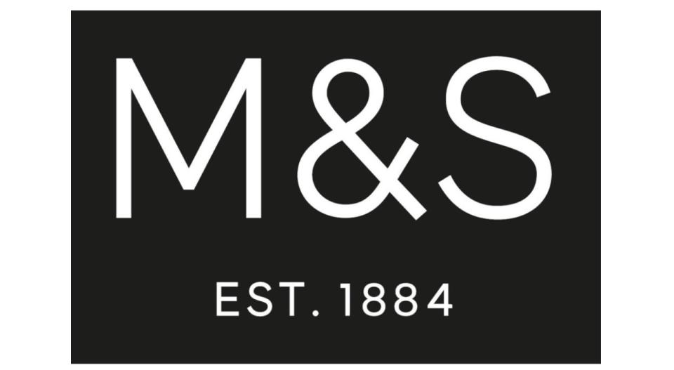
“[The 2010s] Marks & Spencer become M&S. It was introduced to ‘unify’ the retailer’s food and fashion offers which were advertised under different names. It’s timelessly simple. Like many retailers, M&S has faced challenges over the years, but their willingness to adapt has kept them as a British classic,” says Abigail.
As the new "Only M&S" identity of 2014 brought the clothing and homewares together with the brand’s food offering, the company also launched new ads alongside, including some of those classic M&S-style close-up food shots (though not quite on the food porn level as the ‘This is not just food’ campaign of 2004).
In 2015, the new M&S logo launched, with the lime green of the previous logo replaced with black, alongside a new typeface and the addition of “EST. 1884” giving the new design retro feel and highlighting the brand's heritage.
12. Juventus
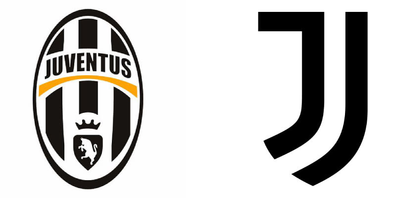
“Rebranding a football club must be one of the most difficult tasks in the world. The passion of fans can easily scupper any branding revamps with a simple chant or online forum. However, Juventus somehow pulled off one of the finest rebrands in history to create something very unique and never really seen in football before. It’s more than just a club, and more of a sports or lifestyle brand to rival the likes or Nike or Adidas,” says Jonny, of the 2017 redesign from brand consultancy Interbrand.
“Luckily for Juventus, they hadn’t swayed too much over the years from a striped badge and a word mark, therefore creating a striped J that picked the shape of a football crest feels like a no brainer. Its beauty and simplicity make it one of those projects a designer dreams of and the impact it has is clear, standing out in a sea of badges, crests and roundels. Combined with some simple but sporty feeling typography used in many different ways to create layouts and merch, it’s full of spirit and confidence.”
If you're enjoying looking back, try out best adverts of the decade series.

