It’s Official: These are the Best White Paint Colors
"Hearst Magazines and Yahoo may earn commission or revenue on some items through the links below."
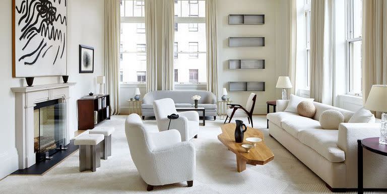
If the mere thought of choosing a paint color gives you immediate dread, just wait until you have to pick the perfect shade of white. To the uninitiated, white seems like a simple enough shade. (In fact, it’s arguably the most popular wall color around.) Problem is, it has so many nuances and undertones. Suddenly, white isn’t just white: it’s pure white, off-white, or simply white, to name a few. Of course, the design plot only thickens when you factor in different finishes, plus how the shade in question will fare with your room’s natural sunlight and artificial glow.
To save you from the headache of trying to decide between hues that seem nearly indistinguishable, we got the scoop from top designers on the best shades of white, and where to use them. Whether you want to swath your home office in a fresh coat, paint your ceiling, or turn your bedroom into a serene oasis, there’s something here for every room.
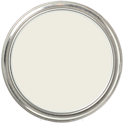
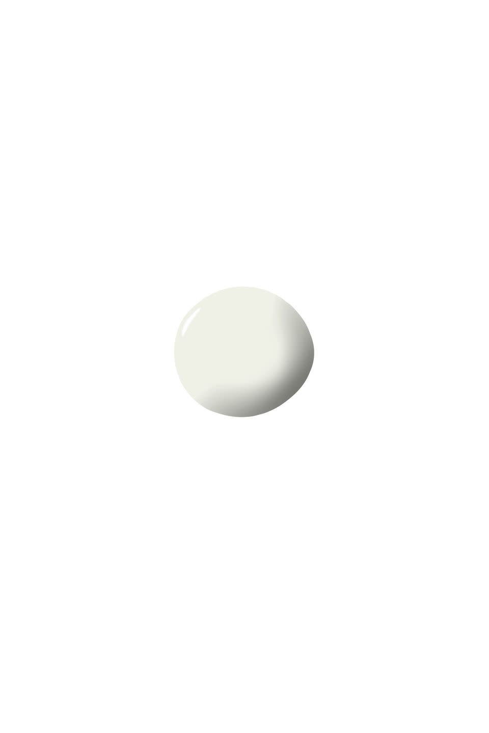
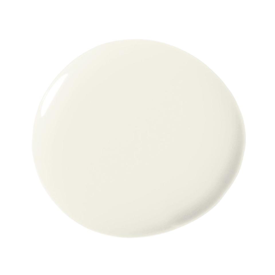
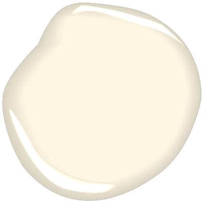
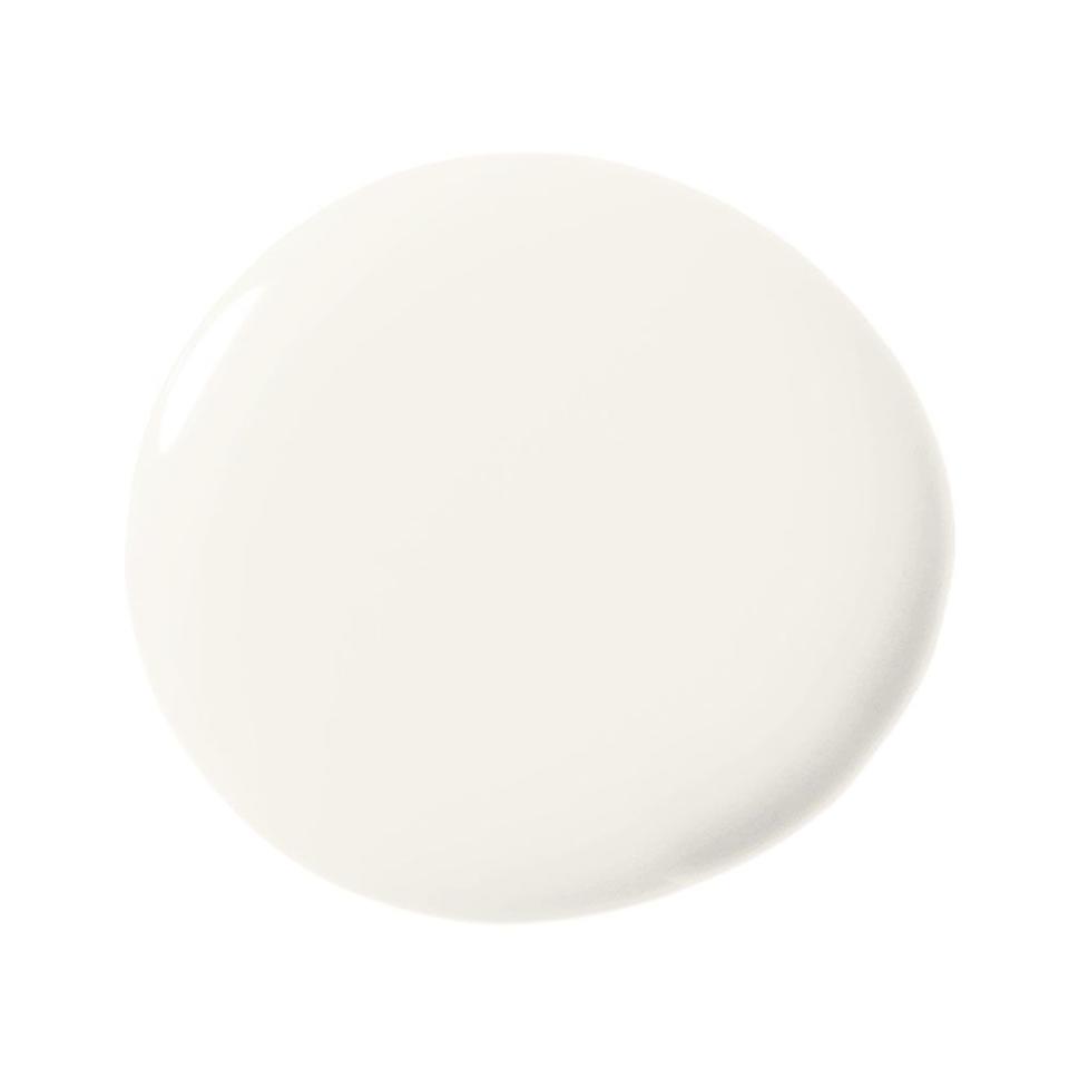
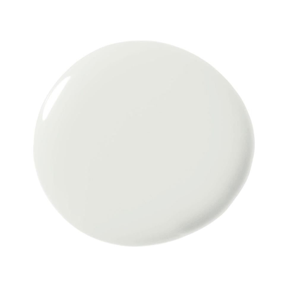
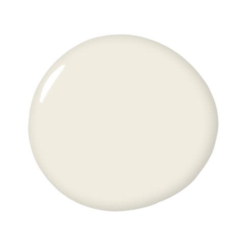
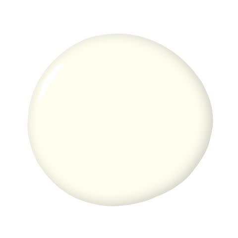
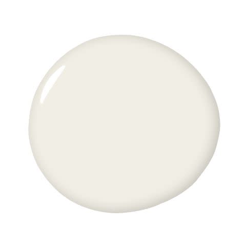
1) Benjamin Moore Atrium White OC-145
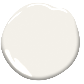
“White can be a warm or a cool color depending on which tone of white you pick. If you want your home to feel really calm and relaxing, I suggest using a white that has a creamy tone to it. Benjamin Moore’s Atrium White has a little bit of a peach tone.” — Michelle Gerson
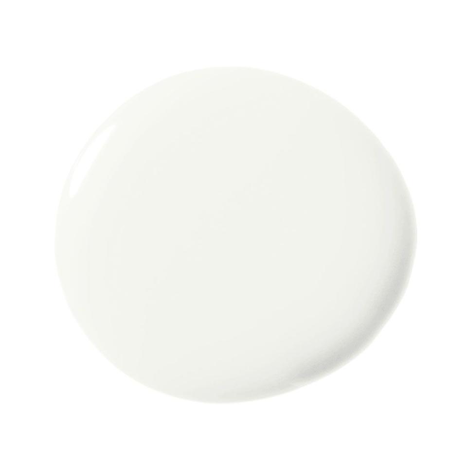
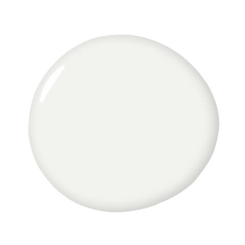
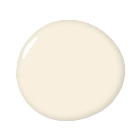
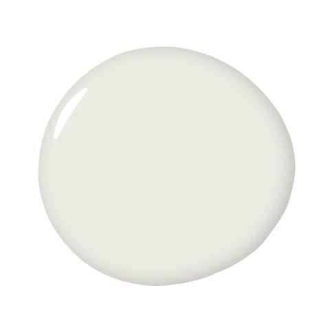
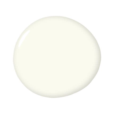
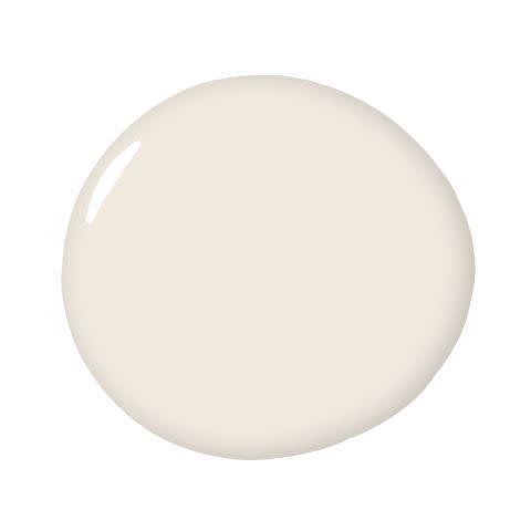
2) Benjamin Moore French Canvas OC-41
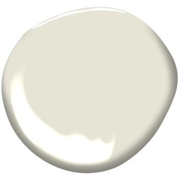
“Benjamin Moore’s French Canvas is a lovely off-white with bisque tones. I find it works especially well on ceilings where you may have a busy wallpaper or mural on the wall—and need a soft instead of a stark white that could potentially appear harsh in contrast to the pattern and color.” — Heather Hilliard
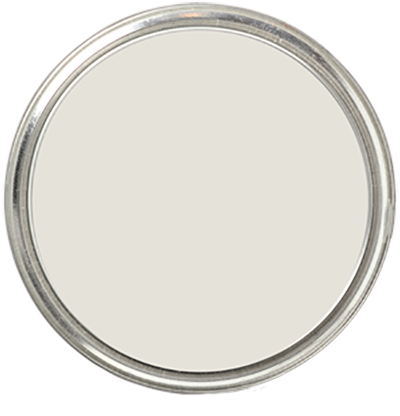
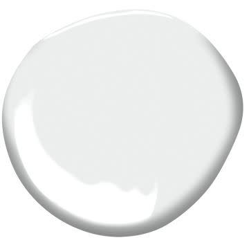
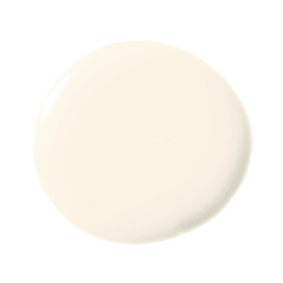
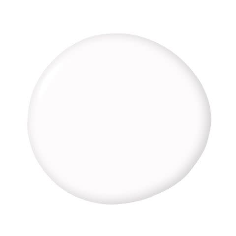
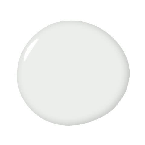
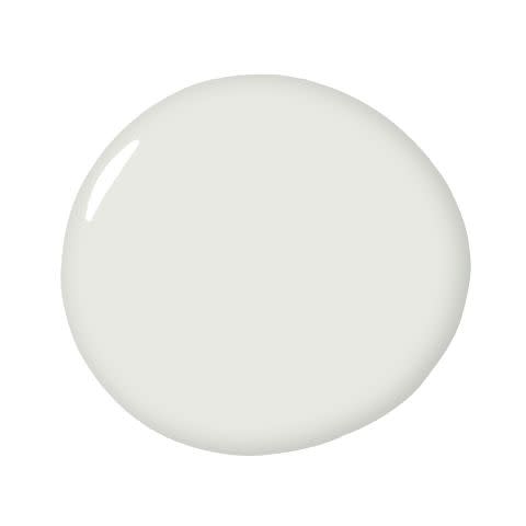
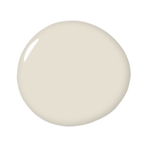
3) Benjamin Moore Distant Gray 2124-70
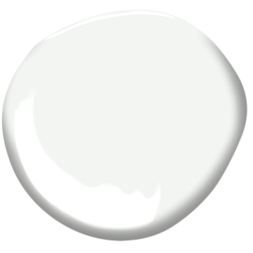
“Distant Gray is the perfect white, especially with contrasting trim. It has more depth than a pure white, but is still the perfect backdrop for a neutral interior.” — Miriam Verga, Mimi & Hill
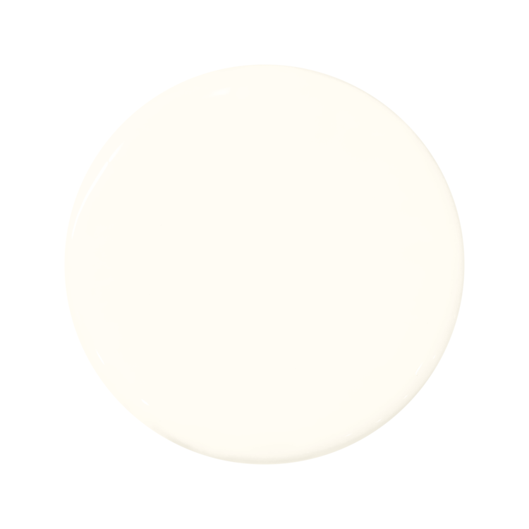
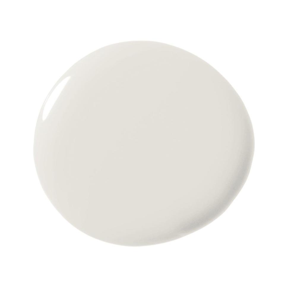
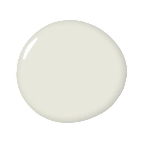
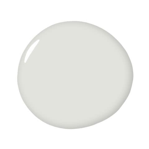
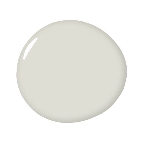
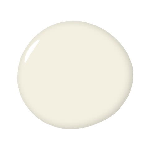
4) Dunn Edwards Cool December DEW383
“Cool December by Dunn Edwards has been a staple in my designs for over 10 years. It’s a cooler tone that seems to open up a space and add a tempered brightness. The wrong shade of white can feel clinical and stale, or even a bit too creamy. Cool December strikes the perfect balance and always seems to do the trick for me. Plus, it’s touch-up-friendly and works well with Magic Erasers, [which is] important for moms like myself who have active kids.” — Breegan Jane
5) Sherwin-Williams Moderne White SW 6168
“White in a kitchen is classic for a reason. Subconsciously, humans interpret white as clean and pure—that’s why it’s such a popular color for kitchens and bathrooms. We like to add a little twist to our mostly white kitchens, like with a burst of orange on a barstool or a boldly patterned backsplash.” — Beth Dotolo and Carolina Gentry, Pulp Design Studios
6) Benjamin Moore Ivory White 925
“Sometimes you need a creamy white, which can be tough to get right. It’s easy to veer too yellow. I really love Benjamin Moore’s Ivory White. This creamy white works best when you envelop the room completely and paint the trim, walls, and ceiling in it. It reminds me of lightly tanned skin. It’s particularly nice in a beach house and looks fantastic with light wood finishes.” — Christina Kim
7) Benjamin Moore Snowfall White 2144-70
“For the perfect, crisp, icy white, we used Benjamin Moore Snowfall throughout this sky-high pied à terre. When the signature San Franciscan fog rolls in, you feel like you are floating on a cloud.” — Kendall Wilkinson
8) Sherwin-Williams Alabaster SW 7008
“My go-to white paint color is Alabaster from Sherwin-Williams, and my favorite color to pair it with is Naval by Sherwin-Williams. The key to selecting the perfect white paint is to determine the mood you want to create, and then choose a white that is either warm or cool. I like warmer whites like Alabaster for living rooms. But if I am creating an ultramodern, minimalist space, cooler whites help to complement the clean lines.” — Joelle Smith
9) Benjamin Moore Oxford White CC-20
“Oxford White by Benjamin Moore is a color I often use. It reads beautifully on walls and trims. It has a crisp and soft feeling with both natural and applied light.” — Mona Hajj
“Oxford White is our go-to for crisp, bright interiors. It’s just the slightest bit softer than a pure white, and is super adaptable to all interiors, modern and traditional.” — Stephanie Brown
10) Sherwin-Williams Origami White SW 7636
“Origami White is a gentle off-white; perfect for taking the edge off of modern interiors. [Great] for a more organic or eclectic vibe.” — Stephanie Brown
11) Farrow & Ball School House White No. 291
“My no-fail, go-to white is Farrow & Ball’s Schoolhouse White. It’s a timeless off-white that promotes old-world warmth and is a solid foundation that marries architectural features, materials, and accent colors. The end result: a welcoming and comfortable home.” — Cortney Bishop
12) Benjamin Moore Cloud Nine OC-119
“As a colorist, white is seldom on my mind, but when I need a neutral gallery-esque background, I reach for Cloud Nine by Benjamin Moore. I painted the exterior of my office building in this particular shade and it’s the perfect contrast to the gloss black trim.”
— MA Allen
Buy Now
13) Clare Snow Day
“Snow Day is the perfect cool white that has just enough warmth to keep it from feeling sterile. This is a great option for a south-facing room or for a bright white to pair with cool colors.” — Nicole Gibbons
Buy Now
14) Sherwin-Williams Pure White 7005
“Finding the right white is always a tricky task. However, I’ve found that a successful shade of white is one that’s honest and bears no hidden undertones of blues, yellows or pinks. Pure White by Sherwin Williams is an elegant white, which grounds the space and creates a nice neutral background to allow your furniture to shine.” – Eileen Keshishian
Buy Now
15) Benjamin Moore White Dove OC-17
“Our go-to living room paint color, Benjamin Moore White Dove, is a warm white that perfectly complements the fresh pastel colors of this feminine space, creating a calm and welcoming room for entertaining. We typically opt for the wow color moments in the fabrics and accessories, rather than on the walls, to keep the living room a more transitional space and the formal center of the home.” — Christine Markatos
“White Dove has a creamy undertone that brings a lovely warmth to homes in urban environments or those in climates that often experience grey and overcast skies. Meanwhile, in more traditional settings, White Dove reads as a crisp white without being too cold or modern.” — Emilie Munroe
“I love to use White Dove by Benjamin Moore. It’s so versatile! Because I focus a lot on art and artists in my work, this color never fights with sculptures, street art or abstracts. My favorite thing to do is apply one coat of Wise Owl's Opalescent Pearl Glaze over the White Dove. It softly shimmers with directional lighting, and the walls 'slow dance' without fighting with the art, fabrics and rugs. It's clean, simple and timeless!” — Kari Whitman
Buy Now
16) Benjamin Moore Simply White OC-117
“Benjamin Moore Simply White is always a crowd-pleaser. It’s a warm, but true white, that looks both crisp and cozy in every space.” — Kristen Peña
“Benjamin Moore Simply White is my go-to for a kitchen. It just feels right–not too cool, not too warm.” — Victoria Hagan
“Benjamin Moore Natura Simply White has a slight warm undertone, which keeps it from feeling too sterile (no hospital vibes here). I have yet to come across a color scheme Simply White wouldn’t complement. It also really goes to work in those darker spaces with little to no natural light because the paint color itself simply radiates. Bonus, this is an eco-friendly zero VOC paint for the environmentally conscious!” — Meridith Baer
Buy Now
17) Benjamin Moore Chantilly Lace OC-65
“When I want a really clean, pure white like I used in every room of a Spanish Modern home in Los Angeles, my favorite shade is Benjamin Moore 'Chantilly Lace' OC-65. It has a subtle cool grey base as opposed to warm yellow undertones, which makes for a very clear and beautiful shade of white.” — Rosa Beltran
“The most universal paint color I've used is Chantilly Lace by Benjamin Moore. I find myself going back to it again and again in order to create a bright white space that is warm and welcoming rather than sterile and cold. In a sea of whites, this is my tried and true!” —Nicole Davis
"It feels clean and bright without being cold or ‘dormy’." — Melanie Burnstin
Buy Now
18) Benjamin Moore Chalk White 2126-70
“My favorite white paint color is Benjamin Moore 2126-70. It is appropriately named Chalk White–a grey-scale white, which works universally juxtaposed with cool and warm tones. I use this color for paint, stain finishes, custom color reverse painted glass and metal as a foil contrasting with other elements. Almost every paint schedule our firm issues includes this shade of white.” — Katherine Newman
Buy Now
19) Portola Snow Leopard
"My favorite choice for white is Snow Leopard by Portola. I am always in search of a white color with depth, but without other discernible tints. This color creates a beautiful backdrop for both modern and traditional projects. Best of all, it is truly white when it’s up but creates a beautiful, warm environment." — Kazuko Hoshino
Buy Now
20) Benjamin Moore Navajo White OC-05
“Think melted vanilla ice cream. Its cream undertone makes it the perfect white for a country house and warm, naturally-lit spaces. You can do a whole room in Navajo White and it stands alone and gives it a soul.” — Alexandra Champalimaud
Buy Now
21) Dunn-Edwards Whisper
“I must admit I have a sore spot for colors with whimsical names. This one especially ‘whispered’ to me when I was looking to paint my entire office and showroom in Guadalajara. This color is a very calm, soothing tone that mimics the shade of white found in nature. I love it because it's primitive but very organic.” — Erick Millan
Buy Now
22) Benjamin Moore Cloud White 967
"Cloud White by Benjamin Moore is ethereal and soft. It is a timeless shade of white that works to either modernize or pare down a space without making it seem too sterile." — Anne Hepfer
Buy Now
23) Sherwin-Williams Extra White SW 7006
"This color is crisp and clean, but not too stark. It complements all different interiors." — Robin Strickler
Buy Now
24) Benjamin Moore Dune White 968

"I am currently having a love affair with Benjamin Moore's Dune White. I veer away from whites that are too clear and absent of pigment. I like the knocked-down elements of Dune White. It's a warm, flattering color inside and outside. I tell my clients it's a true white with the dimmer switch dialed down." — Janie Molster
Buy Now
25) Farrow & Ball Wevet No. 273
“I love a good white with plenty of depth. Wevet by Farrow & Ball is one of my favorites for this reason. It has a beautiful hue of gray. It always looks brilliant and has great contrast that goes with many of my other favorites as well as looking beautiful on its own.” — Raquel Garcia
Buy Now
26) Benjamin Moore Super White PM-1
"It's the most pure expression of white with no color undertones. It reminds me of the galleries at the Gagosian Gallery. What I love about this color is that it makes your furnishings stand out like a piece of art." — Jon Call
“I love super white. I find it’s the cleanest and crispest and ALWAYS brightens my spaces. It's too cool for some people’s preferences. For me, it's spot on!” — Tali Roth
Buy Now
27) Benjamin Moore Crisp Linen CSP-305
"When it comes to white paint, I always prefer a warm undertone versus cool. Simply White by Benjamin Moore is my go-to, and for a slightly more historical lived-in feel, I warm it up a bit with Crisp Linen, also from Benjamin Moore." — Katie Hackworth
Buy Now
28) Benjamin Moore Calm OC-22
"My absolute favorite white of all time is Calm by Benjamin Moore. It has a softer and cozier feel thanks to a drop of warm gray in the hue, while establishing the background for crisp, clean, and timeless interiors. Calm is also particularly responsive to changes in lighting, whether natural or artificial. It is extremely versatile no matter what style, color scheme, or room you are working with." — Allison Babcock
"What could be more appropriate in one's bedroom retreat than the feeling of calm, promoting quiet, reflective and relaxing moments?" — Dayna Dabek
Buy Now
29) Benjamin Moore White Diamond 2121-60
"My old living room was painted this super cool white and I loved it for the space. I loved it because generally I’m more attracted to cool tones rather than warm tones. If you put it up to a true white, it looked a little blue. But in person, it just looked really white. So if you are looking for the perfect cool white, then this is a great option for you, as it doesn’t have any yellow or cream tones in it." — Emily Henderson
Buy Now
30) Benjamin Moore China White PM-20
"It seldom fails me, no matter where in the country I use it. It doesn't break green or pink. When held up against pure white, it has an off-white or greige appearance, but on its own, it holds up as true white—but with a little more body." — Eric Cohler
Buy Now
31) Farrow & Ball All White No. 2005
"My new favorite white is All White by Farrow & Ball. It’s described as 'a totally pure white,' and that’s just what it is. The biggest challenge with white paint is when it leans gray, or blue, or yellow and skews the look you were going for; All White is a gorgeous, pure white that doesn’t have an underlying tone." — Alessandra Wood, Modsy
"It's like a good friend. Easy to be around, dependable and it makes you and all the things around you look terrific. It stays consistent in any light, but in the afternoon, it can really make a room feel like it's glowing." — Brad Ford
Buy Now
32) C2 Cotton C2-836
"White is not a shy color—it makes everything placed in its path come forward. And Cotton by C2 is the softest of whites, with a touch of yellow as its undertone. It's the perfect backdrop to enhance wood and I especially love it in bedrooms. It makes skin sparkle." — Elizabeth Martin
33) Valspar Honeymilk 7003-4

"Getting white paint right can be a daunting proposition. Your best bet is a kinder, warmer white that has just a hint of grey or beige in it. Honeymilk is a soft white that's great for walls. I've used it in a gazillion rooms and have never been disappointed." —Elaine Griffin
Buy Now
34) Benjamin Moore Lily of the Valley 905
"This is a very creamy white, really warming up the space. If you try to use this in another brand, however, it will look baby-nursery yellow ... so stick to the Benjamin Moore original!" — Isabel Ladd
"I found this color more than 20 years ago when I wanted a really great, warm white for trim, and it has been my standby ever since. It works well in rooms that get a lot of light and also in those that need it." — Alessandra Branca
Buy Now
35) Farrow & Ball Great White
"It's a white with character, and it's anything but sterile. Great White works best in natural light, particularly in the morning when fresh, warm tones peek in. Throughout the day, it changes color ever so slightly—from white to not-quite-grey." — Kara Mann
Buy Now
36) Benjamin Moore Decorator's White CC-20
"I love this white for ceilings and woodwork, or in any room where I want a bright, clean white. It works well in all applications and with every kind of light source. Some whites can be cold and slightly blue, while others can have a creamy, yellow tone, but Decorator's White is a true white that is both warm and modern." — Jeff Andrews
"Nothing beats a clean crisp white wall and my go-to is Benjamin Moore Decorator's White. It is crisp and slightly cool, making it the the perfect backdrop to pop other colors used within a room." — Ohara Davies-Gaetano
Buy Now
37) Benjamin Moore Paper White OC-55
"Paper White [is great] for a lovely lighting grey white" — Highlyann Krasnow, The Design High
"I use Paper White in kitchens and bathrooms because it melds the grays of Carrara marble and the stark white of sinks and toilets." — Katie Ridder
Buy Now
38) Farrow & Ball Pointing No. 2003
"This is the perfect ivory for almost every setting—not too bright and not too creamy. We're all about striking that balance. It's proven itself in both a sun-drenched farmhouse living room and a one-windowed New York City bedroom." — Anne Maxwell Foster and Suysel dePedro Cunningham of Tilton Fenwick
Buy Now
39) Benjamin Moore White Wisp OC-54
"It's a tinted white with a hint of grey-green, but it reads as bright white. I like to use it on the trim for cool-colored walls. I use quite a bit of wall coverings in hemp cloth and other natural materials. White Wisp as a trim makes many of these papers look crisp." — Frank Roop
Buy Now
40) Farrow & Ball Wimborne White No. 239
"It has just a hair of yellow, but does not read too 'warm.’ It really just feels like a perfect, clean, white. Because of the depth of Farrow & Ball's formulas, it has a certain richness to it. It’s the white I tend to favor for more traditional interiors." — Amy Sklar
"What I love about the Farrow & Ball Wimborne White is that it is a beautiful shade of white that has depth and dimension. Using it in high-gloss achieves a very chic and modern look without using a real lacquer." — Suzanne Kasler
Buy Now
41) Benjamin Moore Winter Orchard 1555
"I love Winter Orchard because it has a super subtle tinge of grey in it, so it works with every color." — Taniya Nayak
Buy Now
42) Dunn Edwards Swiss Coffee DEW341
"There should be one cozy room, such as the living room, in every home. In this type of space, I like to use white paint as the backdrop for an amazing collection of art, which brings a pop of color. For me, the perfect shade of white, like this one from Dunn Edwards, isn't too yellow or too pink." — Trip Haenisch
Buy Now
43) Farrow & Ball Slipper Satin No. 2004
"Slipper Satin is my go to for 'fleshing up' more traditional rooms, as it is calming and gives a sense of ease and serenity. It is inviting and cozy, yet also works well on more architectural houses punctuating the accoutrements." — Jeffrey Alan Marks
Buy Now
44) Dunn Edwards Historic White DET653
"The classic warm white complements any interior then, now and forever. Ultra-premium paint from the DE Everest collection gives clients low-odor, zero-VOC finishes that are durable and contribute to good indoor air quality." — Sarah Barnard
Buy Now
45) Benjamin Moore Acadia White OC-38
"Acadia White by Benjamin Moore is my go-to Goldilocks. Not too warm, not too cool, but just right. It's the perfect creamy off-white." — Patrick Ediger
Buy Now
You Might Also Like

