"If you've got a logo that people recognise, never change it," Pentagram's Paula Scher shares how she designed some of the world's most famous logos
- Oops!Something went wrong.Please try again later.
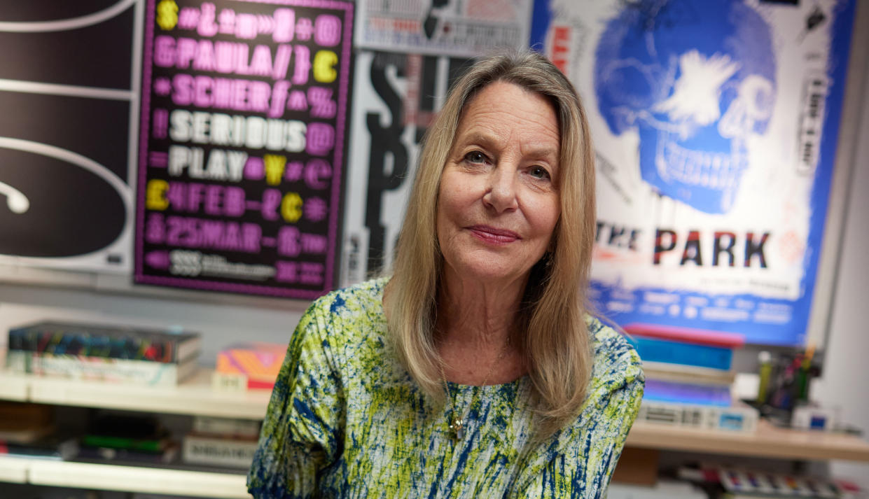
Paula Scher is one of the world's most celebrated graphic designers. Her career, which spans over 50 years, has seen her create identity and branding systems, environmental graphics, promotional materials and more for a huge list of big-name clients including Adobe, Coca-Cola, Citibank, Tiffany & Co and the Museum of Modern Art.
Scher has received hundreds of industry honours of awards, and has her own episode in the Netflix series Abstract: The Art of Design. She recently launched a new online course with BBC Maestro, which includes case studies on how she created some of her most famous identities, including Microsoft.
I sat down with her recently, to chat about her work past and present, muse on the state of design education today, and find out whether she still values mistakes as much as she did when we spoke to her back in 2009.
You've said before that many identities which we admire today took a long time to get to where they are. Which identities have been brilliant from the beginning?
Consider something like the Audi logo, which was a bunch of circles together, it was designed in 1891 or something like that, for the first car. [And other logos] that you see all the time, like the Bass logo for beer, which was designed in the 1800s. They don't look dated because they were just formalistically beautiful.
In the 20th century, things like Tom Geismar's Mobil logo will never go out of style, because it is so inherently recognisable, because the forms are so beautiful. And the one red 'O' makes you know it's Mobil and you don't need more than that. You recognise the fact that there's a capital letter and three letters behind the red one, and you can you can see it from miles away when you're driving, and you go, 'oh, oh good. There's a Mobil station'.
That's great, that is what the goal is. The goal in identity design is to be recognised and understood. And if you've got a logo where people do that, never change it. You can tweak it, but don't change it.
Have you worked on any heritage brands that started in the 1800s?
Well, I worked on Westinghouse, but that wasn't done in the 1800s. The business started up in the 1800s but Rand didn't design the memorable logo until the '60s/'70s, so they're brands that have been around that had a history of change and growth, that might be an attribute, but I don't really think I ever worked on one of those.
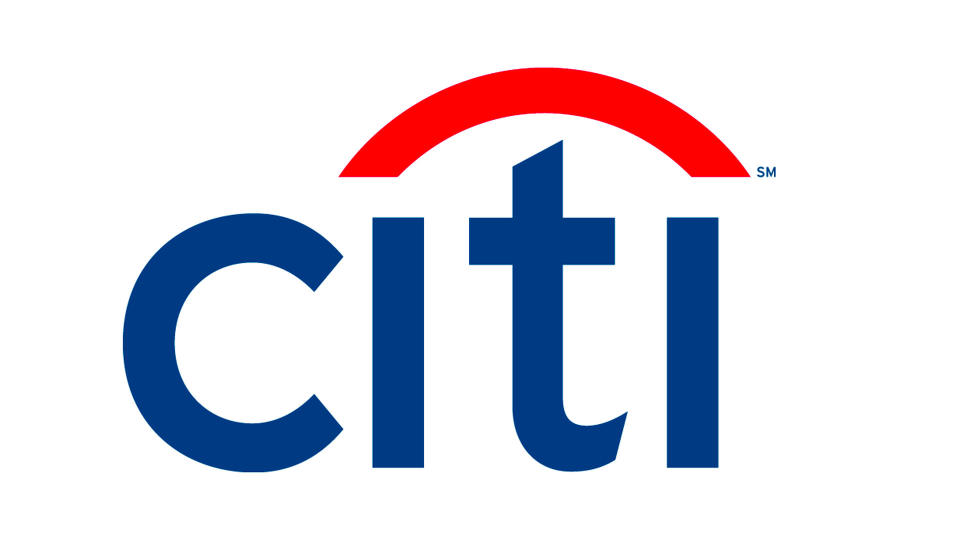
I have identities that are 20 and 30 years old. That started when I really began doing logos when I first joined Pentagram... I mean, the Citibank logo is still out there, everybody recognises it. They tried to tweak a 'C', they tried to make the 'C' a little rounder recently, but they didn't really change the logo very much because you recognise the logo, why would they do that? That would be dumb.
People also seem to get very upset when their favourite logo is changed
I think that it's disconcerting. Usually, logos are changed because there's either a new president who just wants to get rid of the past... and wants something fresher and feels like they inherited something that's sort of fusty and needs a breath of fresh air. Or, if they're changing the direction of the company – and then they really need a real makeover, a lot of other logos just need to be retooled.
How is design education different now to when you were starting out?
I think that there were pioneering days of design that were always driven by technologies. So when I began my career, there were no computers. You would order type from a typesetter and if you wanted to customise it, you redrew it by hand, and used black ink and White Out (that's sort of a white liquid paint) to recraft the letter forms. All of your energies went into developing your craft skills.
The goal was to begin to push the design, but it was harder to actually make changes or see things because things moved much more slowly because the craft was slow. What's different now is that you can see things instantaneously, and that's good and that bad. The instantaneous part is wonderful, because you can see what happens when you make a sudden change, say to a letter form, or you change an idea slightly and you can see the difference.
But you almost have too many options and it takes up time in a different direction because you don't know how to see... you can't make scale decisions rapidly or you don't have a strong idea and you're sort of moving around patterning. It can just take you forever and you don't really come up with anything. So some of it is learning how to see, some of it is disciplining yourself, some of it is educating yourself, but the craft skills are done by the computer, not by your own hand.
What about the younger designers that you work with now, are they missing 'how to see'?
I taught the people who work for me, I've been teaching in the School of Visual Arts for 39 years. So many people who have worked for me have been my former students and the people who are under them are people who are trained by both them and me. My team is always a classroom too.
I'm sure there's a lot to learn all the time...
All the time, because the technology keeps changing. Like what can we do now?... I mean, all identities are liquid, all identities move, all identities can change form, and the question is, how do you handle an identity that's going to change form and ensure that it's recognisable in every form? That's an interesting challenge.
How did you feel when you first learned there was a thing called graphic design?
I didn't really understand what it was when I was in art school. I had a to take a course called Basic Design and it was about seeing space. I had to move a black square that I cut out around a white page so I could see the difference in the way a black square broke up the white space. And I was sloppy and I didn't paste my black square down right and I never made much discovery with it and I didn't understand it. I didn't know what I was looking at and I was sloppy, and I hated it.
And then two years later, I took a course called Graphic Design and it wasn't about being neat, it wasn't so much about form, it was really about thinking and ideas. And that that was much more appealing to me. And as I began to think of ways of solving graphic problems, I became interested in typography, but I really started out as an illustrator. Because I liked drawing and I like to solve the idea with a drawing (they actually weren't very good). That was how I first began doing it and then I discovered the typography had form and then I was hooked.
When we interviewed you back in 2009, you said that you value making mistakes, is that still the case?
Mistakes are really important. I may be directing somebody on my team and we're looking at typography or form, and I may ask for something and it's misunderstood. Something else appears and it's better than what I asked for.
When I used to work by hand, I would be cutting up something and moving it around the page and looking at it and it would slip and all of a sudden I would go, 'oh, it's better over there'.
I have a general idea about the way I want to approach something and where I want it to go, and that will come from all the information that's fed to me, either through the client and also what's going on contemporarily or something I saw in something completely disrelated.
I'll have this general sense of whether we're making something very old or something very withholding or something very complicated. And within that there are a pile of choices I'm gonna make – I'm making them through experimenting, through trying things and looking at them. And sometimes I think I want to try this specific thing, and I make a mistake and the mistake is better than what I was trying to do. And that hasn't changed one iota, it's been the case my whole working life. Mistakes are great.
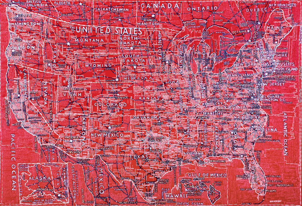
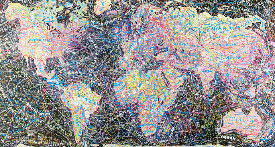
In 2009 we also talked about your maps project, where are you with it at the moment?
I still paint them and sometimes I'm commissioned. I was commissioned during Covid to paint a Porsche. There was a collector who collected cars and he called a person who had an advertising agency and asked him who would be good to paint a map, and they commissioned me to paint a map over his Porsche.
They sent me a 1977 Porsche... We painted it black with acrylics. First, I had to take it to a garage and have the finish scraped down so it was rough. I didn't know how to paint a car. I didn't know what kind of materials to use and I only paint in acrylics. So I called up a muralist that I work with who has painted walls for me... And he said I had to find a place that does art cars, that art cars are a thing. And I thought, 'well, how do you find such a place?' And he says, 'well, they're around. You'll find them in different different states'. I asked him if he could find one that's within under two hours from my house in the country where I have my studio. And he came back with two names, and one of them was the place that fixes my BMW. I knew the guy...
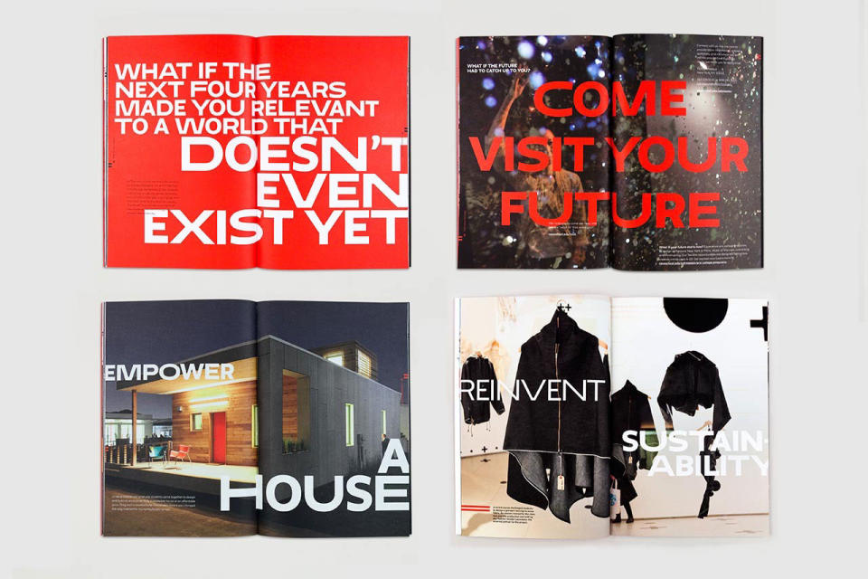
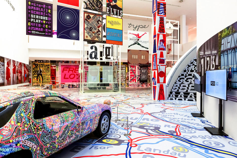
He got rid of the paint so there was a porous surface. Then I painted black acrylic on top of it, and then I painted the United States going around the car. So then the collector bought the car and it went to Germany... and they gave me a show where the car is on display in Germany until 22 September 2024. Then I painted a map, which was reproduced on a floor, and then there are a lot of posters and typographic things. It's called Type is Image. If you're in Germany, go see it.
It was great because it married all the things I like to do. It married my paintings, my drawings, my identity work, environmental graphics, because the show was 37 feet and the ceilings were 36 feet high. So there are constructions of posters that run up and down walls. There's a giant Public Theater wall that you walk around in the space. The images are kind of great.
Which of your projects has had the most impact?
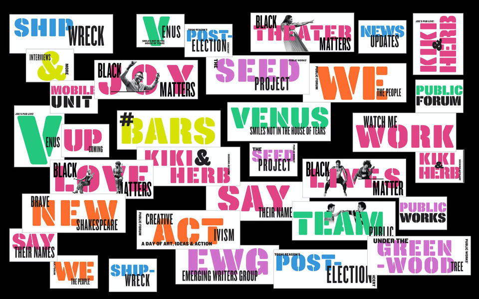
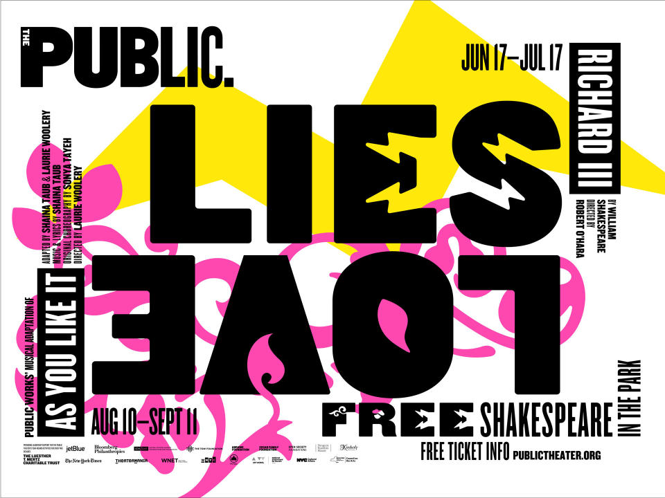
Stylistically The Public Theater, because I began working with an American wood type in a very specific way and I was elongating or widening letter forms and combining them, though they'd be in the same font. It became a style and it's still fairly prevalent, even though it's something I was developing in 1994-5.
I continue to do The Public, it's the language of the theater, but I also mess around with the form and the fonts each year. I've been designing for the Public Theater for 30 years.
Will you ever stop designing for the Public Theater?
No, it's absolutely a great thing. What's wonderful for me about it is within a parameter, I get to reinvent it every year, because I mess with the letterforms and do them in different ways. But you can always tell it's The Public, there's just something about it.
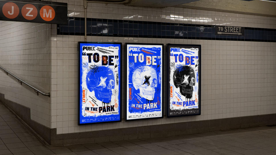
It's on the streets of New York and it is in the subways and in places where people are, so they see it and they recognise it. Now they have all these digital boxes on the street so I can make the theatre graphics in motion and create animations that are on the street, which is wonderful. I love doing it.
Is it true that your work is everywhere in New York?
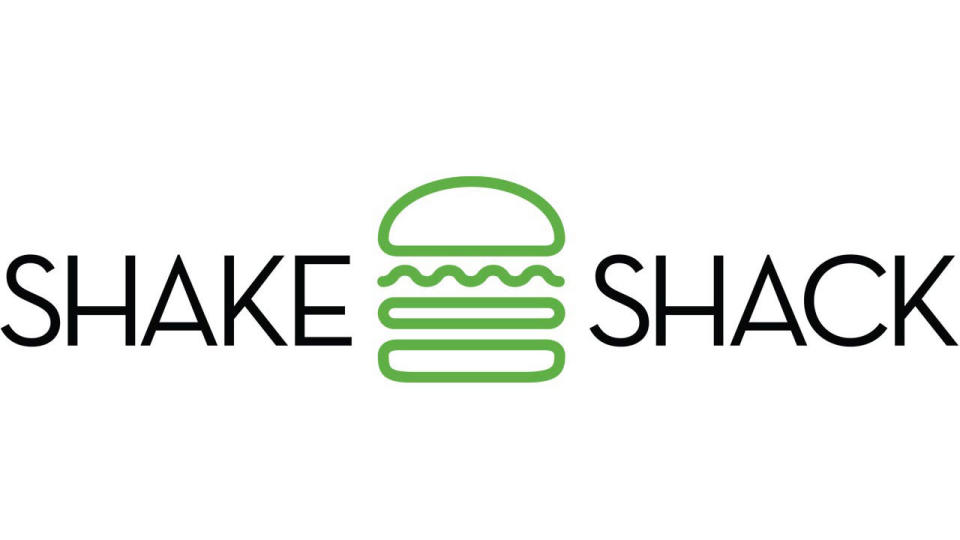
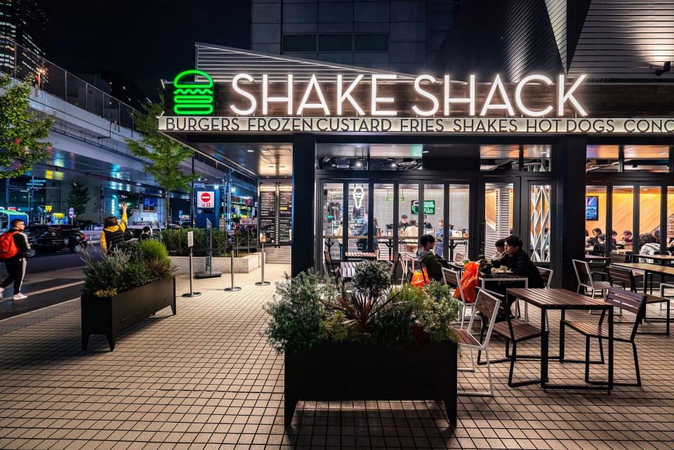
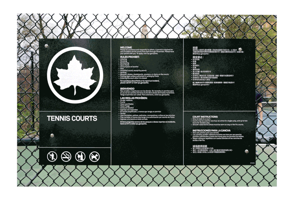
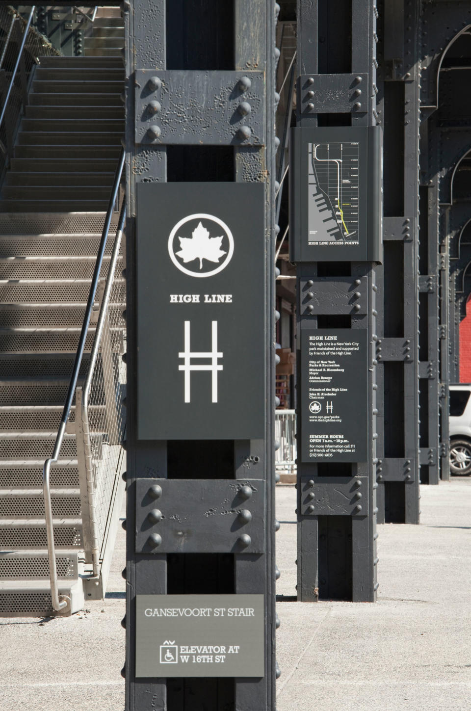
Well I did a lot of work for the Parks Department and The High Line and a park we live across the street from, called Madison Square Park, where there was this fast food place called Shake Shack. So if you walk into this one neighbourhood, that's true. But I also have designed a lot of theatres besides The Public, and I do three dimensional design. So sometimes it's in the building, sometimes it's on a poster, sometimes it's on a banner.
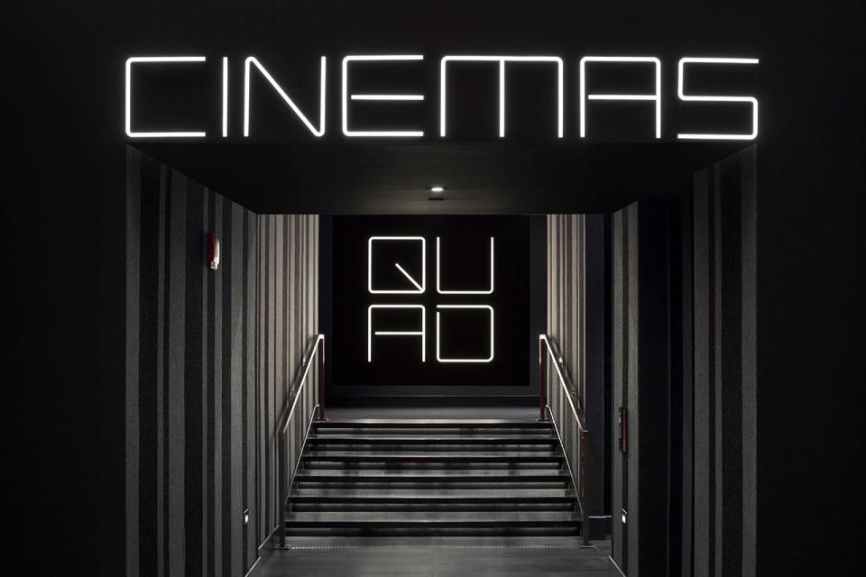
If you're on lower Fifth Avenue and you're going through The New School and Parsons it takes up a whole couple of blocks on lower Fifth Avenue. And then down the block from there is the Quad Cinema, which is also my design. And both of those things, The New School project and Quad Cinema are in the case studies in my new BBC Maestro course.
Do you still get a thrill when you see your work in the wild?
It depends on what it is. I mean, every 10 blocks there's a Citibank. I don't respond to the sort of mass of branding that way because you're supposed to forget about it, you're supposed to recognise it and move on.
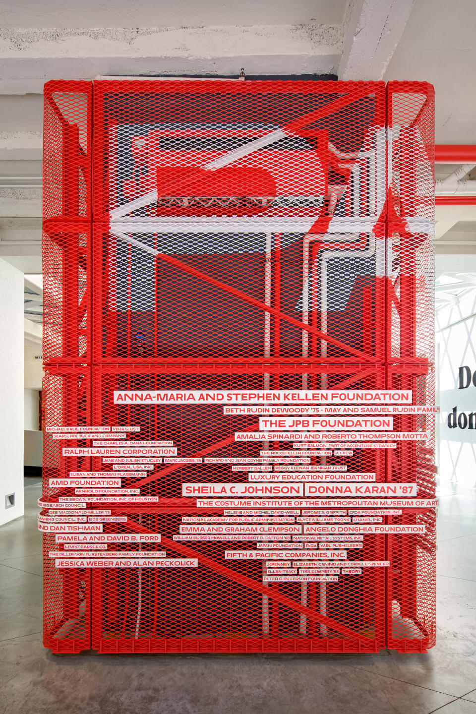
I love the environmental graphics, like in the Parsons building. We did a wall that sort of goes in and out and with the big Parsons logo over it – it's very sculptural. And then there's an elevator cage that has the donors names on it, it's all in red and white. And I love it when I see it because I like the piece, it's very eccentric, and there's just one of it.
But somehow the branding gets a little bland, simply because it's always the same. Shake Shack is interesting when I travel because the premise of Shake Shack is that the typography is the same – that's the brand – but you change the lighting or the scale of the type to suit the architecture. So they're all the same and they're all different. I went to one in Japan that I just thought was stunning. They just did a great job with it. It was a great big Shake Shack. I never saw one that big. And then you go to Covent Garden and they've got the type really small and that looks appropriate for Covent Garden, and I sort of enjoy that because they're all different.
Is there anything you'd like to do that you haven't done yet?
I'd like to do a real set of film titles, I've never done that. That'd be fun.
What advice would you give young designers?
I think that the first thing is to understand that everything is designed and that sometimes the design is just bad, but everything is designed – every chair you sit on, every door you open, every light switch you turn on, every every car on the street, everything that you look at all the time is designed and the world is full of it. What design is is a series of choices based on a few aesthetic principles and some understanding of the world and the subject matter that you're trying to express.
Is there anything specific you'd say to young female designers?
Love what you do, and do it. Don't feel that you can do it, especially because you're a woman, that's ridiculous. Do it.
Find out more about Paula Scher on the Pentagram website and sign up to her BBC Maestro Course for more insight into her working processes.

