X’s new home icon frustrates designers
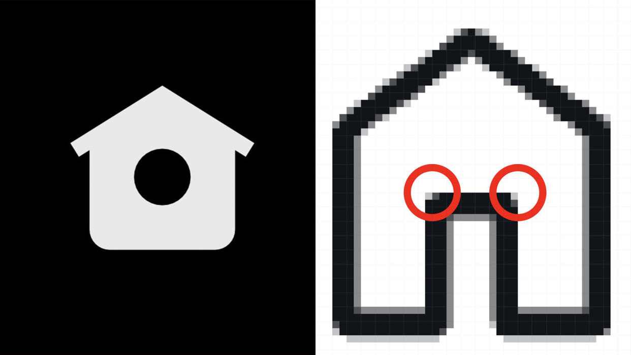
X (formerly known as Twitter) just doesn't feel like home since Musk took the reins, and the social media platform has certainly seen some controversial design updates since its rebrand. Adding to its extensive list of design fails, X has recently done away with the twee little birdbox home icon, replacing it with an infuriatingly off-centre house design.
As each day we wave goodbye to yet another remnant of old Twitter, this is a small but mighty change, to say the least – you might not even have noticed, but now you know, you won't be able to unsee it, sorry. (If you need some design inspiration that's a little less askew, check out the best logo designs of all time).
Taking to X, user Bonnie Kate Wolf shared her dismay at the redesigned home logo, stating that the new icon is "just ridiculous." "This one is a hideous insult to design. Not even symmetrical," she added, pointing to the haphazardly constructed design flaws.
Zooming into the logo, Wolf (who's an accomplished icon designer herself) noted that in its pixelated form, the corners of the image are not the same. "And that's for every corner and the top. Pixels don't lie," she added.
Twitter's original bird box home symbol, was made by Andreas Storm and Martin Davis of the iconography company Iconists and was a suitably charming nod to the app's previous namesake. While it obviously became unfitting for the X rebrand, the redesigned icon is quite the downgrade from the previous design, proving that Musk's haphazard X evolution is not going unnoticed, and is certainly unpopular with some users.
Dissecting the redesign further, Storm replied stating that the design was made completely without guidelines – hence its slapdash appearance. His creative partner, Davis, also interjected stating: "I believe it was a quick 'fix', quickly pulled an icon by a dev and off it went. Fast and furious."
X users were quick to share their distaste for the redesign, with one user stating: "The blurriness alone gives me chills," while another commented a simple yet effective "YIKES," in response to Wolf's post.
Commenting on the Juvenile quality of the icon, one user suggested that "Elon is learning Paint, give the man a break!" Another user was a little more sympathetic, claiming that the "asymmetrical aspects make everything look more natural but the nuance needs to be so small that it is barely recognizable unless you take a very close look (like the Google logo)."
Whether we like it or not, Twitter is no longer, which probably means that the design fails will keep rolling in. From the initial X rebrand to various trademark battles, it doesn't seem like X will be dipping out of the spotlight any time soon, but if you're feeling a little mournful, check out Twitter's logo history to relive those golden days.

