Wow, the original Nintendo logo was totally unrecognisable
The Nintendo logo oozes nostalgia for anyone who grew up with the NES or SNES. Despite constantly innovating, introducing radical consoles as the Wii and the Nintendo Switch, the company still sports that fun red 'racetrack' design.
But despite Nintendo being known today for video games and consoles, its history goes back almost a century before the launch of the Nintendo Entertainment System. And its first logo was a reference to a very different type of gaming (see the best Nintendo Switch deals for its latest gems).
relatedly: i've posted this before, but the japanese version of kirby's dream land 3 uses the original kanji version of the nintendo logo! as far as i'm aware they almost never use it in their games otherwise. they changed it to the usual english logo outside of japan https://t.co/oYslkdl60D pic.twitter.com/dsn1bBlBbrFebruary 2, 2023
Browsing Twitter recently, I noticed someone pointing out that the Nintendo logo on Kirby's Dream Land 3 uses its original kanji name, 任 天堂. I was intrigued because as far back as I can remember, the Nintendo logo has been the design introduced in the 1980s, despite a brief flirtation with changing the colour from red to grey.
But Nintendo was founded in Kyoto way back in 1889, and before it made video games, it made playing cards. Its first product was a pack of hanafuda cards. This is a Japanese style of playing card that was designed to replace the Portuguese-introduced European cards when Japan banned foreign influences in the 17th century. On this pack, the Nintendo logo appears as three kanji characters: nin, ten, do, under a red roof.
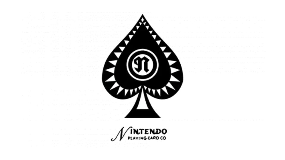
But the success of the venture led Nintendo to produce other playing cards and even its own card games. This included western playing cards. Thus, the first Nintendo log with the brand name written in the Roman alphabet appeared in 1950 as part of a classic ace of spades emblem (see above). There's an almost gothic 'n' on the space itself, while 'Nintendo Play Card Co.' appears below in a script-like font.
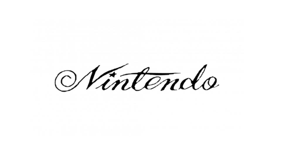
Several more Nintendo logo designs followed before video games were on the horizon. Script logos used in the 1960s include one with a star as the dot of the ‘i’ and another that looks like it could have been a badge on a car at the time. But as cards declined in popularity, Nintendo was already learning to innovate with different kinds of toys, such as its ball-firing Ultra Machine and beam guns, and by 1970, the Nintendo logo had reached a much more recognisable form, missing only the racetrack border.
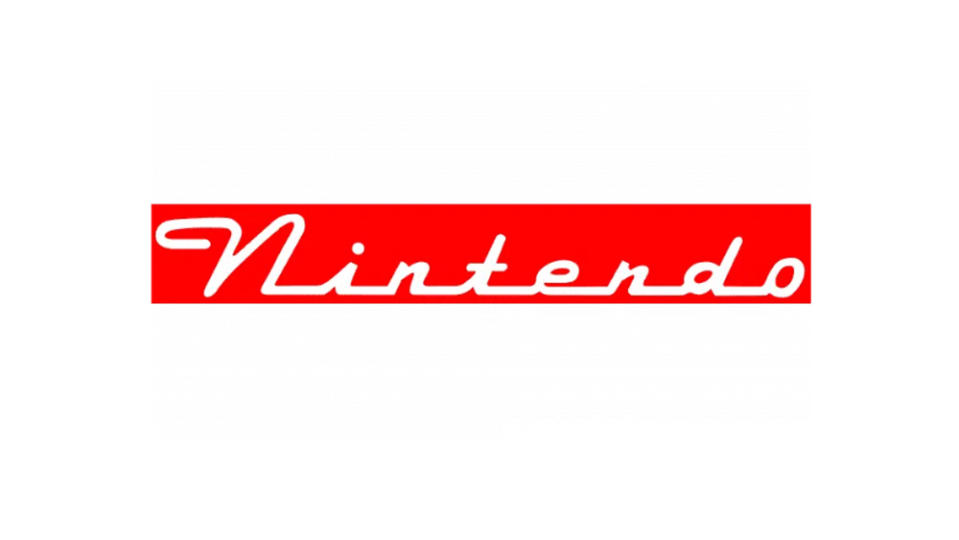
When Nintendo entered the video game arena with the Donkey Kong arcade game and then the Nintendo Entertainment System console in 1985, it kept the same Helvetica Black-like typography with the signature cropped 't' ’, only adding the pill-shaped border in 1987.
See below for the best current prices on Nintendo Switch consoles in your region. We also have a roundup of the best Nintendo Switch games.

