Why pink is the most divisive colour in history

- Oops!Something went wrong.Please try again later.
- Oops!Something went wrong.Please try again later.
Earlier this week, Edinburgh resident Miranda Dickson was forced to repaint her front door after the City Council received an anonymous complaint. The reason? Someone had taken exception to the fact that the door was bright pink, and thus not in keeping with the historic character of the neighbourhood.
Personally, I thought it looked great: a mark of individuality in an otherwise uniform area. The story also made me think that we have a tremendous problem with pink. Recently, friends of mine petitioned against a commercial premises opposite their flat being daubed in a rather delicate shade. I find all such controversy odd, given that pink is such an unthreatening colour, a symbol of childhood innocence.
Yet the fact is that pink has a long and contradictory history – one of tackiness, camp and sometimes transgression. And it’s because of this, I think, that the colour remains so divisive.
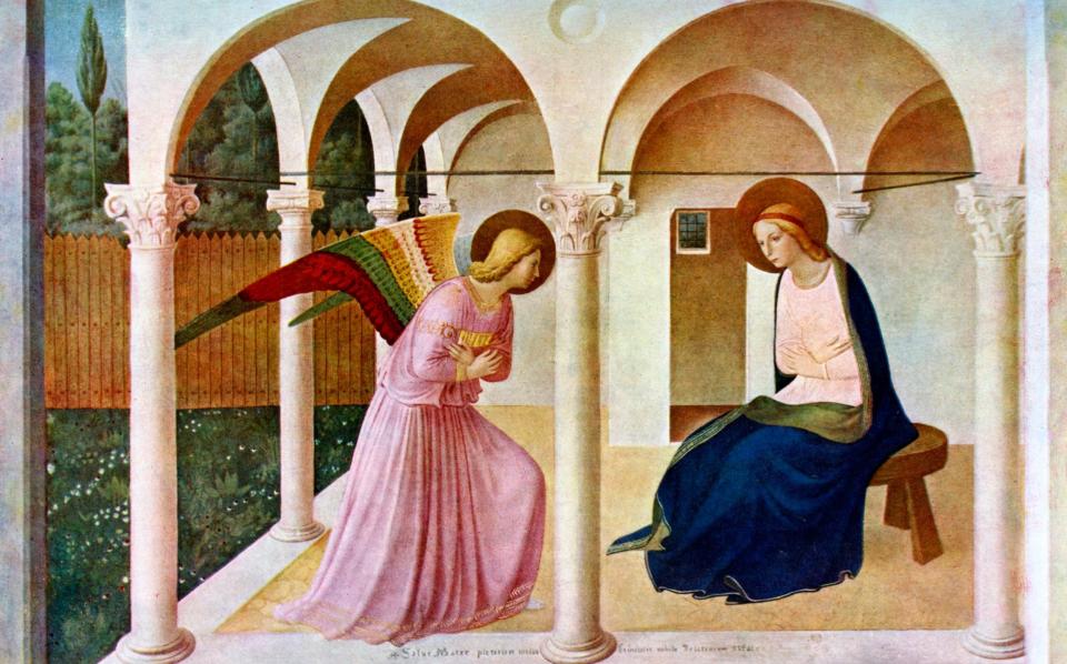
Early in art history, painters were quick to adopt it for skin tones, but the Renaissance, with its blurring of distinctions between Heaven and Earth, changed all of that – flesh and the Holy Spirit became one and the same. Artists such as Fra Angelico appropriated it for religious dress – hence his Archangel Gabriel being draped in pink robes.
Perhaps the seeds of conflict were planted a couple of centuries later, when pink both became a sign of luxury and a sign of scandal. The fact that pink fabric dyes were hard to produce meant that every aristocrat wanted to be decked out in the colour.

Madame de Pompadour loved it so much that in 1757 Sèvres, the porcelain company, created a soft pink especially for her, naming it Rose Pompadour.
But remember that she was the mistress of Louis XV – and so begins that connotation of something a little unsavoury. Mistresses such as Emma Hamilton, squeeze of Horatio Nelson, were often painted in pink, thus making it the colour of desire.
One thing worth noting is that pink was often associated with small boys, its red undertones believed to be the epitome of nascent masculinity, which is why we see many portraits of young gentlemen swathed in the very colour (before the interwar period, when blue became favoured).
In fact, I think the perceived “effeminacy” of the colour pink has a lot to do with its controversy. The Nazis used a pink triangle to identify homosexual men in the concentration camps, and although the symbol was later reclaimed with defiance by the LGBT community, it took many years for straight men – not completely confident of their masculinity – to feel comfortable about the colour.
The LGBT symbol is often misunderstood by those ignorant of its past, and the pink symbol seen as something flippant. It’s nonsense, of course, yet something about the idea of the colour as being something frivolous – which is equally part of its allure – tends to perpetuate.
Blame the advertisers: the post-war rise of pink as something cutesy and kitschy has been remarkably durable, with Barbie in all her synthetic loveliness proving the most enduring figure of all.
It’s a problem, obviously. Barbie is not only an emblem of unattainable beauty, but also something of a bimbo, while boyfriend Ken is the ultimate “himbo”, and, to my mind, makes his dead-behind-the-eyes girlfriend seem like Susan Sontag. It still remains to be seen how director Greta Gerwig, in her forthcoming film Barbie, will address the issues surrounding this weirdly resilient piece of polypropylene.
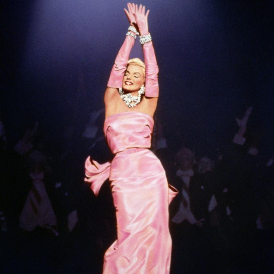
Nearly contemporary with the introduction of Barbie at the end of the 1950s was Marilyn Monroe’s outfit in Gentlemen Prefer Blondes. Looking now at Howard Hawks’s 1953 film, it is hard not to think of the colour pink as a figurative penitentiary for poor Marilyn, a trivialisation of a tragic figure whom we have obsessed over, but rarely ever been allowed to take that seriously.
Incidentally, when Madonna appropriated the look in the video for her 1985 hit Material Girl, this merely confirmed the colour pink as representing something brash and grasping – a commercial colour, perhaps, and the opposite of Monroe’s very human vulnerability.
Despite its issues, pink has had a more positive impact in the 21st century. The slightly disparaging remarks about women wearing pink has been subverted for good causes, notably in the fight against breast cancer.
In fact, the theme of defiance, which, of course, goes back to gay activism in the 1980s, continues. There is something feminist about the rise of so-called “millennial pink” – a slippery term to define: is it salmon, or a sort of rosé wine colour? – a retort to the helpless girliness of the past. Meanwhile Generation Z favours a much more aggressive shade that screams empowerment, and is also ungendered (a lot of male rappers are into it).
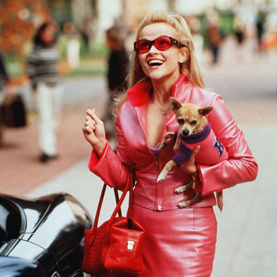
I would roll my eyes, but I have to confess that this pink is rather lovely. I think some of the shift in attitudes can be put down to Reese Witherspoon’s Elle Woods, bedecked in pink in the 2001 film Legally Blonde, which led to negative assumptions about her intellectual capability and was used as a symbol of soft power – but a kind of optimism, too.
For me, the optimism is what stands out. Even the softest shade of pink evokes a warmth, and can gradually raise the spirits.
So while I am generally conservative about architectural tastes, and believe that buildings of a certain age should be treated sensitively, I do think that Edinburgh City Council should hand Ms Dickson back her pot of Dulux Easycare paint (or whatever it was). Her pink may have looked like an act of transgression, but in reality it was anything but.

