Why the London Overground rebrand is more than just a pretty pattern
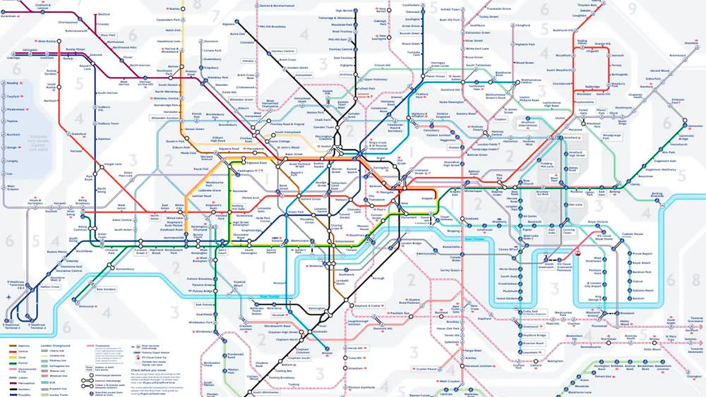
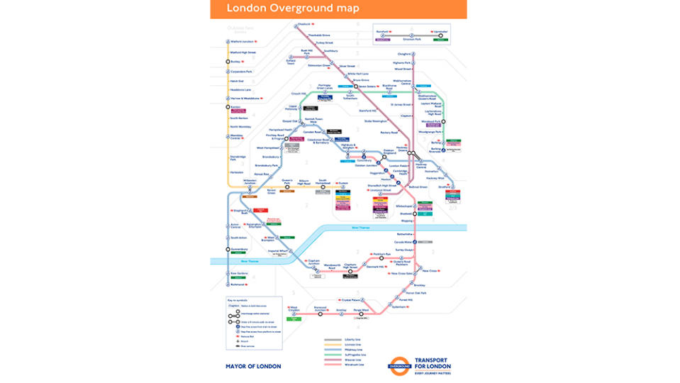
London's famous Tube map design is to get a major update. Transport for London (TfL) has announced new names and colours for the city's six Overland lines.
The Overland lines will be named the Lioness line, the Mildmay line, the Windrush line, the Weaver line, the Suffragette line and the Liberty line, and each will have its own colour. But it's more than just a superficial rebranding. This is an example of how design can aid usability (see our guide to UX theory)
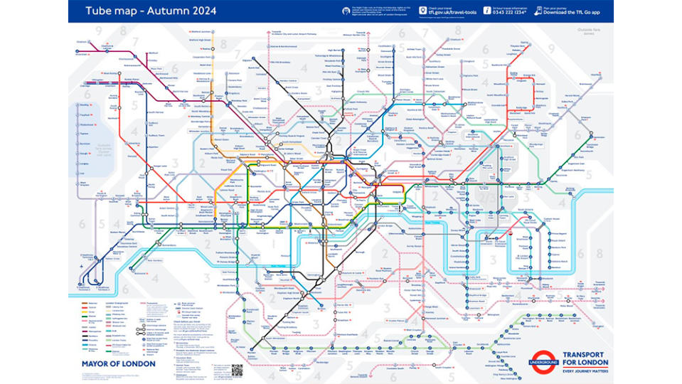
The six lines on the Overground are currently all identified on the Tube map with the same colour: orange-bordered lines that have earned the 113-station network the nickname of the Ginger Line. For anyone not familiar with the service, that's hardly an ideal user experience since the different lines are hard to distinguish and recall.
The new names and individual colours will simplify the map, making the network less confusing and easier to understand. It also brings the network in line with the London Underground, which is famous for its map with colours used to easily identify the different lines – an approach adopted by many underground and metro services around the world.
Certain sections of the press have voiced the obligatory indignation at the fact that the lines aren't all named after monarchs, but the new names are memorable and meaningful.
Lee Rolston, chief growth officer at branding experts JKR, said: "It’s only caused a reaction in the echo-chamber of certain British press titles. I think the regular users of the tube will feel the naming of the lines after Windrush or Suffragette movements just as valid as naming it after a monarch.
"I think it's great. The tube has always been a part of the rich cultural fabric of London - from being a refuge during wartime, to being referenced in song titles, and even playing a vital role in the pandemic. This new effort really demonstrates their dedication to weaving cultural and societal influences into the core of the brand."
The interior of Overground trains is not expected to change to match the line colour like Tube trains often too, and the orange roundel will still be used as the Overground logo.
For more recent branding wins, see the new Mubi Go logo. And for a big fail, see the response to the mess that is the Visa Cash App RB Formula One Team.

