Why Does Kim Kardashian's House Look Like...That?

On February 3, Kim Kardashian West tweeted two photos of the Hidden Hills mansion she shares with Kanye West. It’s a relatively normal thing to do for a celebrity whose fame rests partly on her family life, which is already a product for public consumption. But the two interior shots don’t look like any reality TV star spread that has come before.
The house’s interiors are perfectly empty, pristine spaces unsullied by a single painting, decoration, or loose piece of furniture. They’re entirely beige monochrome. You can only tell the difference between floor, wall, or door by the gradients of shadow. (In that way they resemble a series by the photographer Hiroshi Sugimoto.) Kim Kardashian, a symbol of American excess in all its forms, who has enough money to buy literally anything she wants, instead chooses nothing—and brags about it on social media. Kim described the style to Vogue as “minimal monastery.”
Such aggressive austerity was shocking. “Looks like a rich mental asylum,” one person tweeted back. “Pls put some things in ur house it freaks me out,” wrote another. There were photoshops of different possible decorating schemes, adding in kitschy objects to break up the vacuum.
pls put some things in ur house it freaks me out
— zack (@daly_zack) February 3, 2020
But this isn’t just a Marie Kondo cleaning binge gone out of control. Kardashian minimalism is ultimately a matter of taste. The emptiness is intentional, more aspirational even than owning expensive objects. It’s as if the measurement of riches is not what you can buy but what you can leave out. Not that putting nothing on the walls was cheap — the mansion interiors were a collaboration between West and the spartan architect and designer Axel Vervoordt.
To figure out how the aesthetic of emptiness became so popular as a symbol of wealth instead of actual simplicity, you have to go back through the 20th century, as I did when researching my book The Longing for Less: Living With Minimalism. It was born through the modernism of the German Bauhaus, where architects and designers began to use industrial materials like glass and steel to create domestic spaces inspired by hospitals and sanatoria.
A post shared by Kim Kardashian West (@kimkardashian) on Feb 3, 2020 at 10:54am PST
In 1926 the architect Hannes Meyer designed a spare environment, the “Co-Op. Interieur,” which would provide everything the utopian human of the future might need: a folding chair, a fabric pallet for a bed, and a gramophone on a stool in the corner. It was anti-consumerist and anti-materialist, according to Meyer: Prestige resides “in the attitude of the house-owner and not on the wall of a room!”
In the 1930s, Philip Johnson imported Bauhaus aesthetics to the United States as an early curator at the Museum of Modern Art, filling his Manhattan apartment with skeletal furniture made of metal tubing and leather. He popularized architects like Mies van der Rohe, who had fled the Nazis in Germany for New York and Chicago.
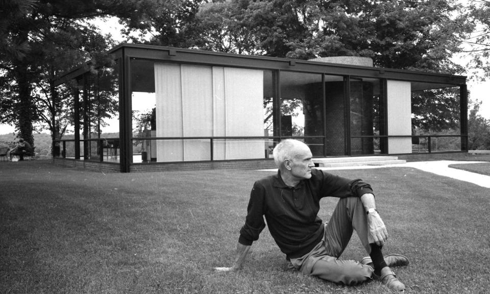
Johnson’s own Glass House, built in 1949 in New Canaan, Connecticut, might be patient zero of fancily empty architecture. There are no interior barriers, only four walls of floor-to-ceiling glass. The scant furniture is provided by Mies, along with a standing cabinet that hides the bed on one side of the rectangle. “Comfort is not one of my interests,” Johnson said later in life. “You can feel comfortable in any environment that's beautiful.” The line might as well apply to the superficial elegance of Kardashian’s mansion, which seems to have more places to take a selfie than sit down.
We call spaces like these “minimalist,” but the term minimalism was originally applied only to visual art. In 1960s Manhattan, artists adopted industrial materials and installed them in galleries as their work — like Donald Judd’s aluminum boxes or Dan Flavin’s fluorescent light fixtures. In order to accommodate these pieces, gallery spaces grew larger and emptier: the blank space was a symbolic reminder, like a 19th-century gilt frame, that these objects were art, not junk.
The artist and critic Brian O’Doherty called the gallery spaces out as “white cubes.” Over the following decades, the white-cube aesthetic made its way into urban lofts, upscale apartments, and now, finally, suburban mansions, thanks to the work of architects like Richard Meier, John Pawson, and Vervoordt. Our homes are art galleries, which might sound good, but ends up inhuman and uncomfortable.
It’s not as clean and pure as it looks. “The white wall’s apparent neutrality is an illusion,” O’Doherty wrote in 1976. It subsumes “commerce and esthetics, artist and audience, ethics and expediency. It is in the image of the society that supports it, so it is a perfect surface off which to bounce our paranoias.” In other words, minimalism presents the illusion of intellectual simplicity — morally good, anti-consumerist — while being just as complicit in the problems of capitalism as anything else. Empty interiors often end up only emphasizing what’s left over as more valuable, more desirable.
It’s easy to compare the Kardashian-West residence to another fan of interior decorating, Donald Trump. Trump’s gold-covered, all-over ornateness, the cliche of wealth since Versailles, looks like the exact opposite of minimalism. Yet when minimalism becomes as extreme as it is in the Kardashian-West case, it’s equally alienating because it’s equally ridiculous. And in my opinion, they’re both bad taste.
You Might Also Like

