Wait, people are only just discovering the FedEx logo design secret?
There are countless logos out there featuring hidden messages and design Easter eggs, from the Amazon 'smile' pointing from 'A to Z' to the London Symphony Orchestra's 'LSO' resembling a conductor. But one incredibly simple design 'secret' is arguably the most famous of them all.
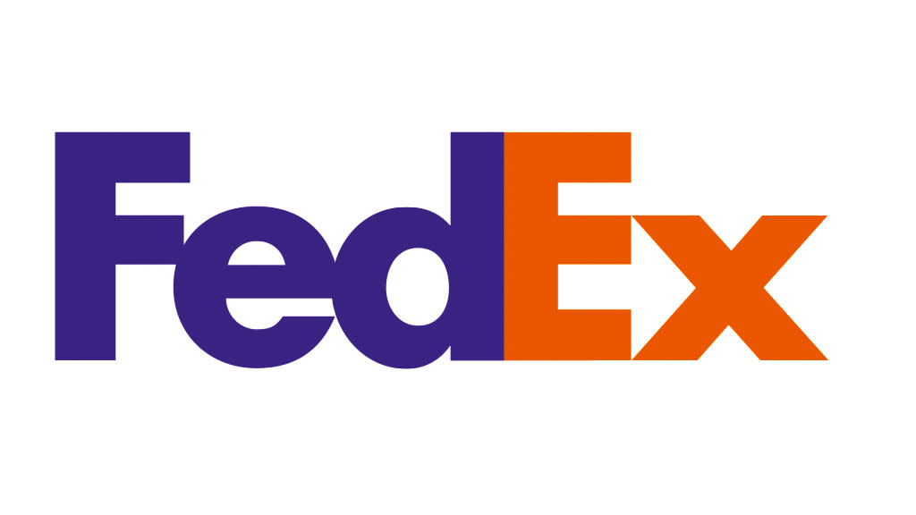
It's a common joke among graphic designers to act surprised on 'learning' that the FedEx logo contains a hidden arrow inside the negative space between the 'E' and 'X'. But it seems plenty of social media users are still only just discovering the genius of our number 1 best logo of all time. Indeed, Twitter users still break the 'news' to their followers pretty much every day.
I just realised there is an arrow in the FedEx logo ➡️ pic.twitter.com/8YZ1p42f3sJuly 10, 2023
I was today years old when I learned about the arrow in the FedEx logo 🤯 pic.twitter.com/wzkAWVA56YApril 4, 2023
did you ever notice the big arrow right in the middle of the fedex logo? I never did until now... brilliant marketing design... pic.twitter.com/0wzKK3wN3VJune 23, 2023
Created by Landor Associates in 1994, the FedEx logo has won over 40 design awards. Lindon Leader, who was senior design director at Landor at the time, explains that research had revealed customers knew the brand but were generally unaware of Federal Express' global scope and full-service capabilities.
"Customers had come to say 'FedEx a package' even when they were using other shippers," he recalls. "So the process of express shipping had become generic. We advised that the company needed to leverage its most valuable asset, and that is the FedEx brand."
The process involved a change of name. "On an international scale, 'federal' had some negative connotations in certain parts of the world – Federalists in Latin America; Federal Republic of Germany," Leader adds. "That was among the reasons why moving to the name FedEx was going to be so much more communicative for them."
But while it's arguably one of the logos we never want to change, a few intrepid designers have had a go at redesigning the FedEx logo over the years – some successfully, some less so.

