The Viral “Unexpected Red Theory” Is the Secret to Styling This Bold Color
If the “bow girl” decor aesthetic is any indication, interior trends often take cues from the fashion world — ribbon-adorned clothes and hair accessories first dominated the style scene before infiltrating living spaces everywhere. More recently, there’s another runway-worthy fixation that’s gaining traction across home design, and I’m so here for it: red.
That’s right: Rich cherry, crimson, and good-old fire truck-red accents are popping up all over my social media feeds and shopping wish lists (step aside, Barbiecore pink!). I’ve seen resurgences of red vintage chairs, punchy red mirrors, and maximalist red paint projects galore. It makes sense, as fiery pops of red have been making their fashion and beauty rounds over the past few months, but one TikToker has also coined a concept called “unexpected red theory” that explains why this vibrant shade has interior design staying power.
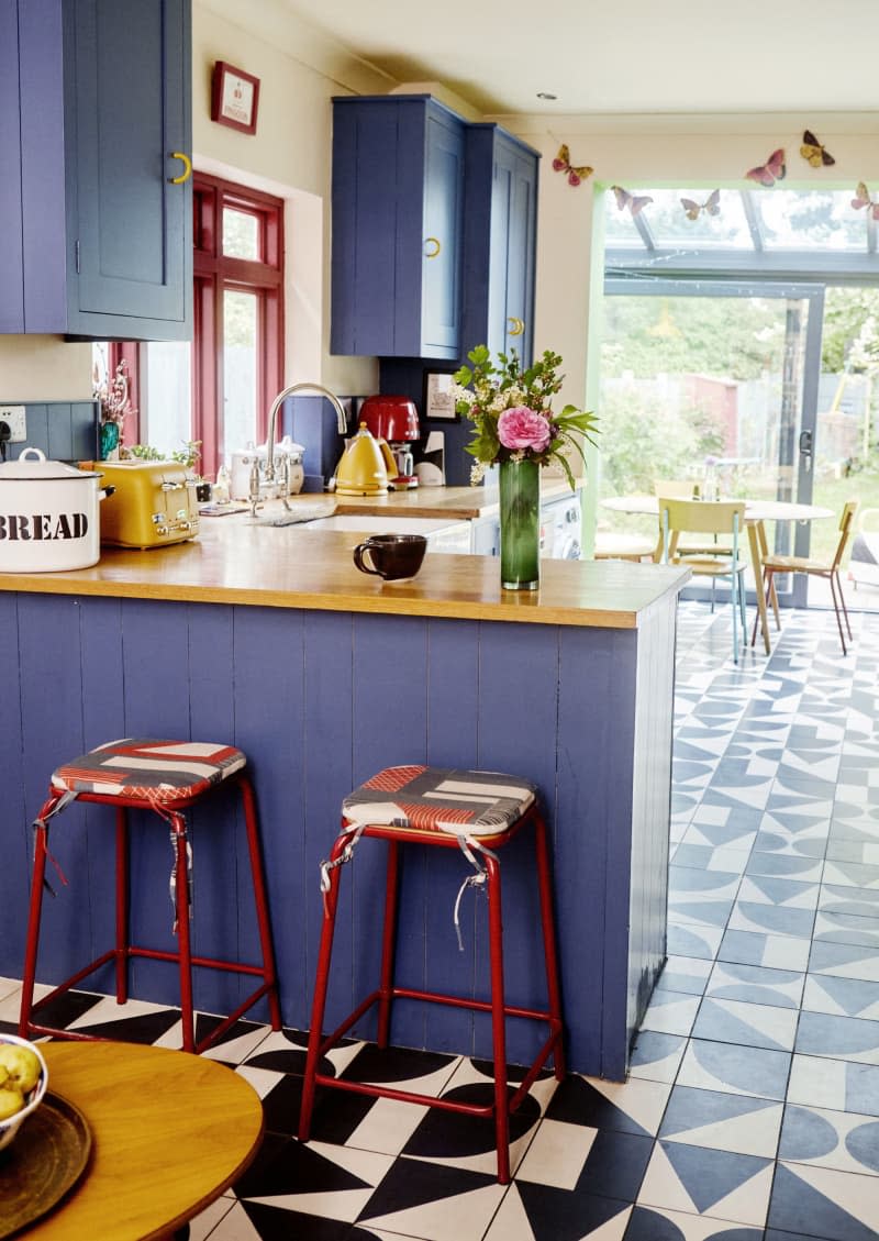
User Taylor Simon (@intayriors) recently shared a video detailing the unexpected red theory, which she defines as “adding anything that’s red, big or small, to a room where it doesn’t match at all — and it automatically looks better.” She references a variety of interior photos throughout the post (shown below), like bright-red pedestal sinks in a modern blue-hued bathroom and a Victorian-looking portrait styled with a contrasting red textured frame. “I’m petitioning for red to be a neutral color because it just looks good with everything,” Simon adds.
Think of this like wearing a red lip or crimson nail polish: It looks bold and bright on its own, yet still works with absolutely any outfit combo. Why, though? Simon mentioned in the comments that this styling trick provides “the perfect balance of saturated and muted color.” The unexpected red theory also encourages incorporating a few small, tasteful touches, like a tomato-red lamp shade or a wine-colored bar stool, rather than going all-in on every room of your house (it’s admittedly a tricky color to paint with, too).
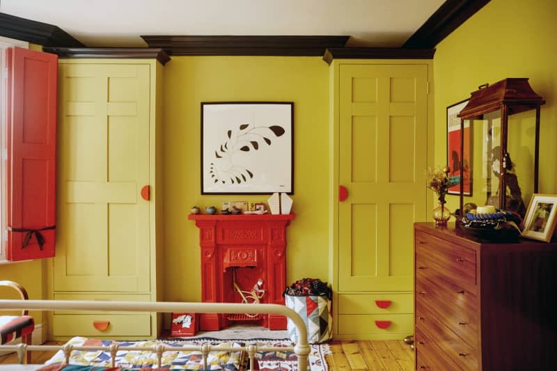
Commenters did point out that most of Simon’s reference images showed red alongside its complementary and analogous color pairings — green and purple, respectively — hence why the spaces look so well-appointed. That said, this unexpected red theory still applies to all red-centric combos across the color wheel, especially mixed with contrasting cool tones, like blue, for a more balanced effect. Or, get inspired by the yellow-and-red bedroom pictured above from the home of textile designer Tamasyn Gambell to really put the “unexpected” in this theory.
Fittingly, designers polled in Apartment Therapy’s State of Home Design survey predicted a subdued shade of red, burgundy, as a top 2024 color, which coincides with the moody English country aesthetic that’s also expected to take off. The beauty of this primary color, though, is that it’s timeless enough to outlive trend cycles — red arguably won’t ever go out of style, no matter how “unexpectedly” you tie it into your space.

