These unused Google logos are pure chaos
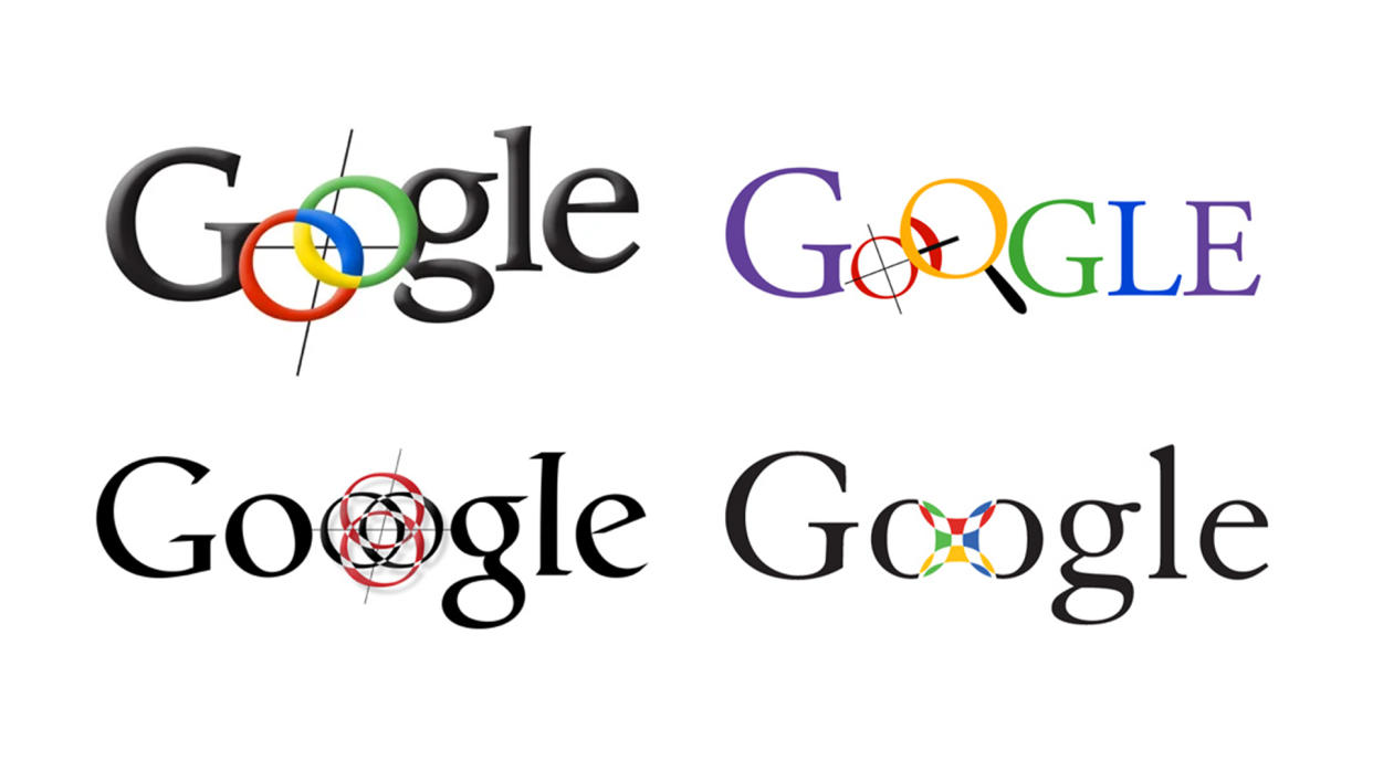
The Google logo has undergone a few subtle changes over the years, and even if it isn't one of the best logos of all time, it's certainly one of the most famous. But as some recently unearthed unused logo concepts have revealed, the iconic four-colour design could have looked a lot more... interesting.
After a couple of false starts, Google settled on the simple blue, red, yellow and green wordmark that hasn't changed a whole lot since 1999. But designer Ruth Kedar produced a bunch of prototypes at the time, and some of them are pretty wild:
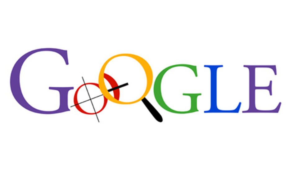
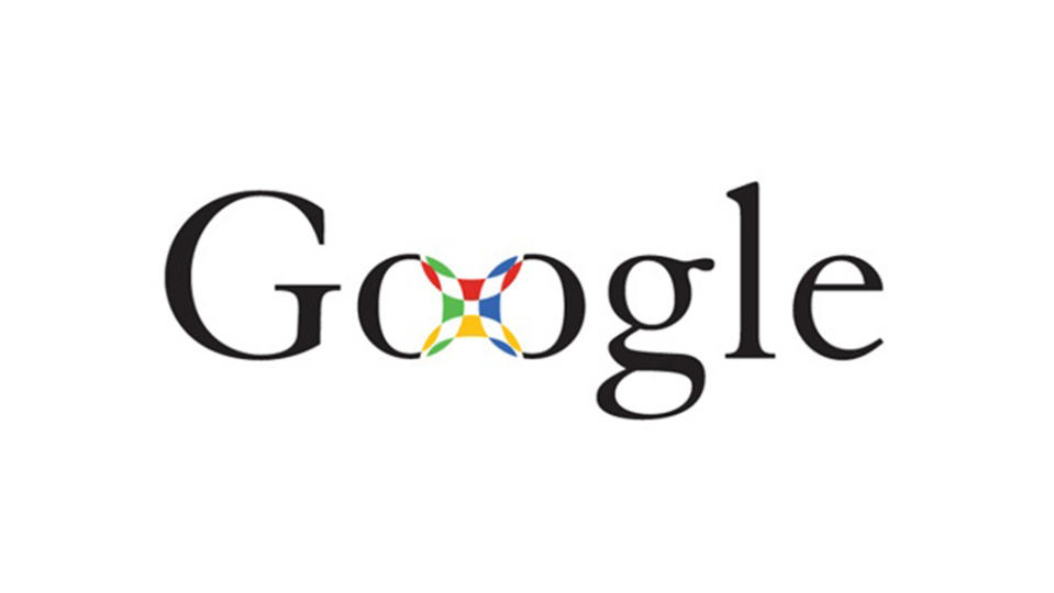
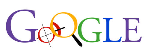
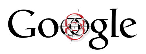
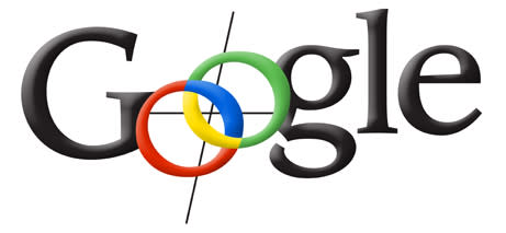
From the clip art magnifying glass to all sorts of weird and wonderful attempts to join together the two 'O's, Kedar's initial designs were much more playful – and chaotic – than the simple design the company eventually opted for. "I had no idea at the time that Google would become as ubiquitous as it is today, or that their success would be of such magnitude," Kedar told Wired in 2008. "The [eventual] idea was, ’Can we create the sense of playfulness without having recognisable or identifiable objects that are going to end up limiting us?"
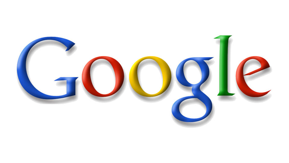
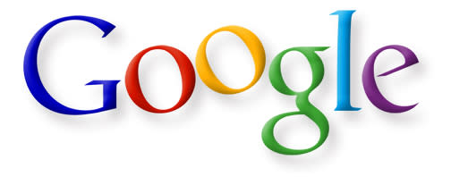
Kedar's final Google logo design from 1999, and the Google logo today
For more on logo design, see our pick of the best logos of all time and our guide to how to design a logo. And if you're starting out in logo design yourself, make sure you have the best graphic design software.

