Tropicana rejects 'AI' to become Tropcn
Tropicana is removing the letters "AI" from some of its packaging in a bid to highlight the all-natural ingredients – and make a cheeky statement about artificial intelligence in the process.
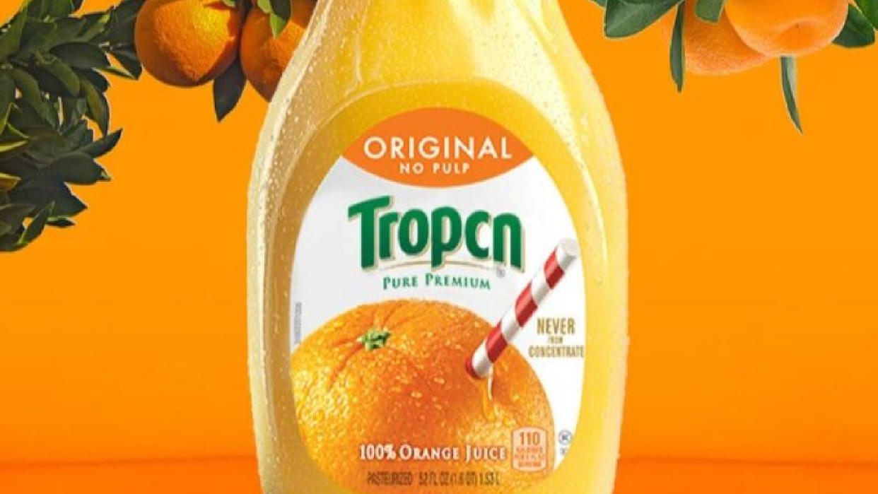
The beverage company, probably best known for its orange juice, announced in a press conference this week that some of its juice bottles will read “Tropcn” to “celebrate the leading orange juice brand's natural ingredients." It’s not a permanent move, and nor will all of the bottles be affected, but limited-edition versions of Tropcn Pure Premium orange juice are available at CES and have been dispersed at random into stores across the US.
"Each week, there seems to be a new development in artificial intelligence," Tropicana said. "Each new AI advancement seemingly brings us closer to the artificial world and further from the natural.”
Tropicana explained that its juice is “never artificial", hence it's decided to get rid of the "artificial" in in its name. It's a notion that feels like a bit of a leap. I can see what the company is trying to do here – especially as it markets itself as a natural brand – but I’m not sure it's up there with the best print ads.
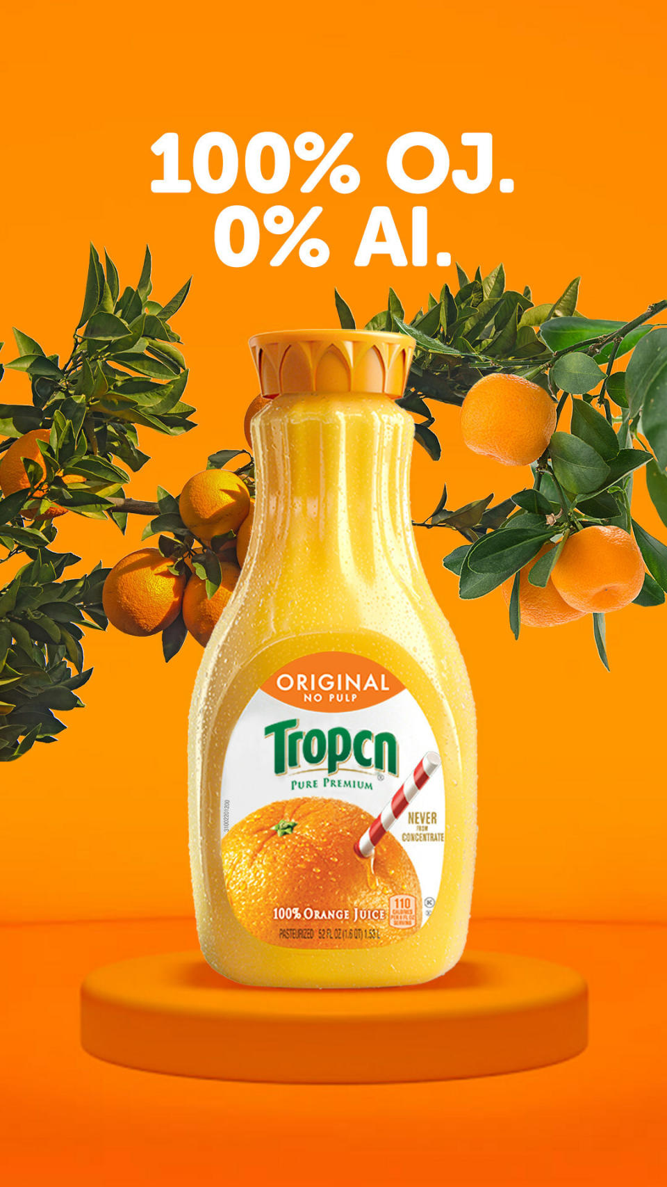
Monica McGurk, the CEO of Tropicana Brands Group’s North American business unit, said in a statement, “Artificial just isn't in our DNA.”
This is certainly an unconventional advertising campaign, and I can see where Tropicana is trying to go with it. But I'm not sure it makes too much sense. Does anyone actually think of AI when it comes to processed or "unnatural" drinks? Do other beverage brands utilise AI when it comes to finding ingredients for their drinks?
It feels somewhat gimmicky and while the company should be applauded for doing something different, it's all just a bit confusing. After all, artificial intelligence has little to do with juice... unless the brand is playing with 'artificial ingredients', which takes a second to work out, and feels a bit convoluted.
It's not the first time Tropicana has made an interesting marketing choice, either. Back in 2009, it changed its famous logo to one a lot more minimalist, and it abandoned the famous emblem of the orange being speared by the straw. Reception was so negative, with sales dropping by 20%, and Tropicana received so many complaints, that the company reverted back to the previous branding within just two months.
Something we do like at the moment, however, is Tesco’s tinned fish design, as it manages to look good but be functional too. And we quite enjoyed this new poster from Marvel, too.

