See This Dreamy San Antonio Before & After Transformation
When Texas interior designer Nicola McLaughlin and her husband, Michael, went hunting for their first home together in San Antonio, they wanted an old house—a project they could really "dig into," she says. Then they stumbled upon this sweet 1949 gem—a 2,900-square-foot house that had a great layout and was surrounded by oak trees, all within blocks of both of their parents' homes. Call it kismet. She says the structure mostly just needed a face-lift, not a full gut renovation. "It had good bones, and the exterior was charming," she recalls. See how they took on this transformation.
Before: Taking On A Project
The interior was dark, dated, and severely lacking in personality. So the couple dug in. Out went the clunky moldings, bleak color schemes, and oversize kitchen island. McLaughlin sought to fill their first house with pretty fabrics and airy design ideas, mixing high-end pieces with low-priced finds throughout to keep her budget in check.
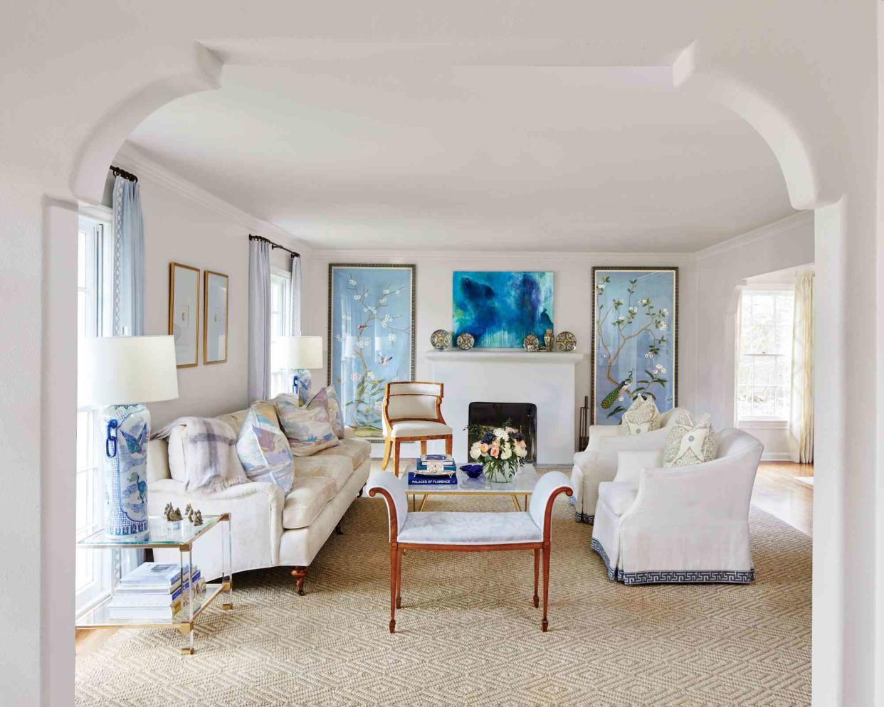
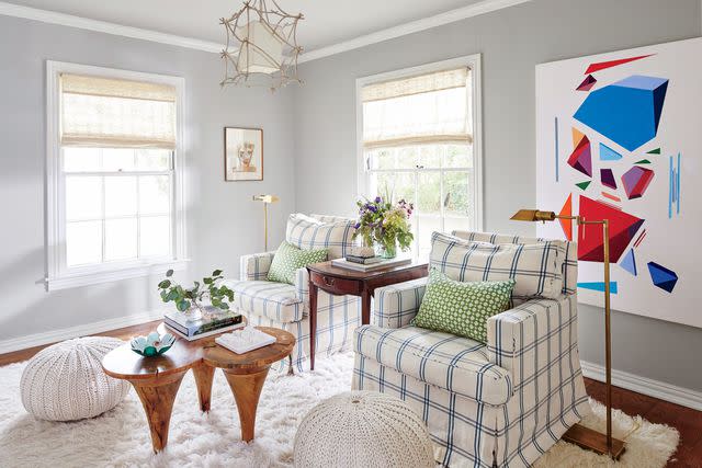
Design To Display
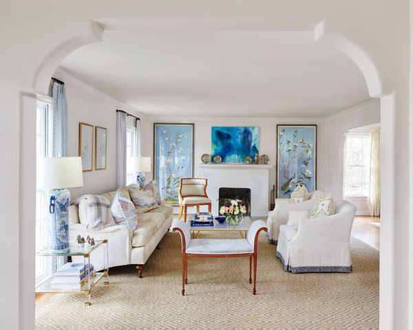
Situated right off the entry, the living room is where the designer wanted to create the most refined space. She had always admired the look of costly de Gournay wallpaper, so she framed panels of the Badminton pattern instead, which let her use it as a statement without committing to the price or permanence. Plus, the framed panels can be moved, if needed.
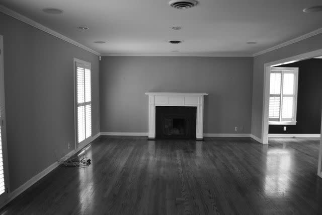
Before: Boxed In
The entry was supposed to be welcoming, but felt cluttered with 3 major openings and lots of molding.
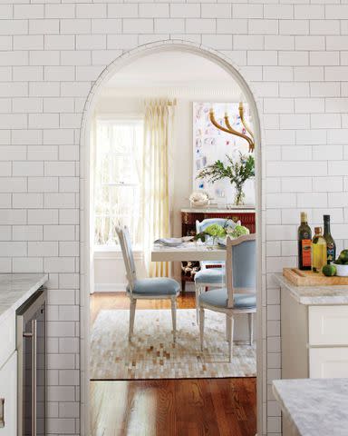
Establish A Tone
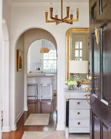
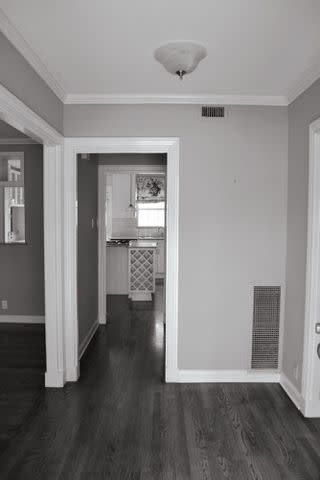
McLaughlin was inspired by the beautiful arches of mission-style homes she saw in her new neighborhood. To bring San Antonio flair inside, she removed the molding from the square doorways in the living room, entry, dining room, and kitchen and then reshaped them into clean archways. "Since the rooms are small, they don't need 8 to 10 inches of heavy molding around the cased openings," she says. "Now, the doorways all feel very fluid." The neutral palette also allows the space to transition seamlessly to the entryway's adjoining rooms. A single palette runs throughout the home: Sherwin-Williams' Marshmallow (SW 7001) on the walls and Farrow & Ball's Wimborne White (No. 239) on the trim.
Follow The Lines
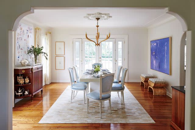
"I didn't want an intensely formal dining room, because I felt like it wouldn't flow with the rest of the house," McLaughlin explains. "So I aimed to combine old and new in here." Fancy pieces such as the antique sideboard and gilded light fixture (Ruhlmann Large Chandelier; circalighting.com) blend well with more practical picks like the simple table (made by her carpenter), thanks to the uniformity of the lines. "Older furnishings that have clean and basic designs blend a lot easier with new pieces," she says.
Before: Consider Downsizing
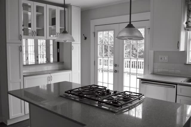
With lots of bulky storage and an oversized island, McLaughlin new she had some major work to do in the kitchen.
Rethink The Workspace
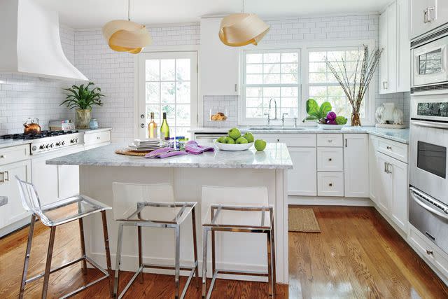
The designer created a better-functioning and tidier kitchen by moving the cooktop to the side wall, which expanded the surface area of the island. All the counters were replaced with Carrara marble. This material can seem formal, but McLaughlin says, "We kept our design fresh by finishing it off with a straight edge."
Throw In a Curve
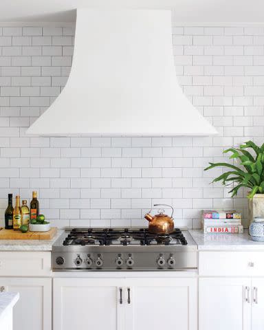
To contrast with the gridlike effect of the tiled walls, McLaughlin dreamed up this vent hood, which her contractor made from plywood covered with layers of plaster mesh and plaster. "Initially, I wanted to do a more triangular, straighter version," she says, "but it would have seemed too dramatic. The curve of this one softens the room and looks so nice next to the arch of the doorway."
Stick to the Basics
McLaughlin covered the walls in subway tile that's a win in every way. "It's cost-effective and clean," she notes. "And, depending on how it's done, it can also be timeless. You could see this style in a 200-year-old restaurant in Paris." To add dimension, she used tiles that have uneven surfaces and look handmade. "It's not just a monotonous wall of white. The tiles each shine in a different way," she says.
Give Yourself a Real Den
The couple wanted a space to watch TV without having to install electronics in the bedroom or formal living room, so they co-opted the bedroom closest to the front door. A few key touches, such as the slightly darker wall color (Sherwin Williams' Repose Gray, SW 7015) and Serena & Lily shag rug, transformed the extra bedroom into a hideaway. Woven poufs from CB2 plump up the cozy, textural scheme.
Amplify the Sun
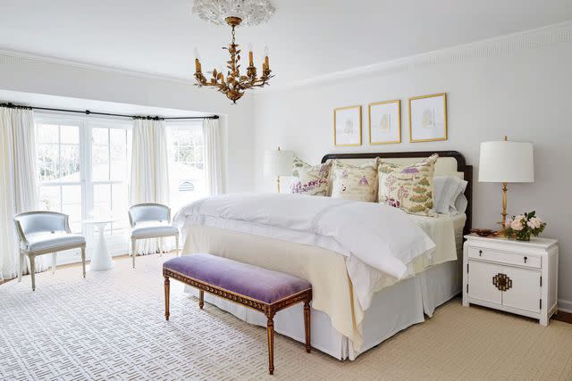
To make room for the large headboard, the designer applied drywall over a set of windows. But she kept the bedroom feeling bright and comfortable by opting for white linen curtains and selecting light, airy furnishings, such as a pair of chairs with open backs that let the sun shine through. "Without natural light, this space wouldn't look nearly as inviting," McLaughlin says.
Upgrade Selectively
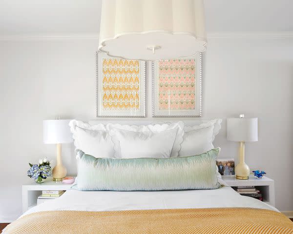
"Incorporating a few nice pieces ties the space together and makes it feel special," she says. The Serena & Lily white lacquered nightstands were a splurge to "bump up the room," but she framed two inexpensive prints purchased while studying abroad to hang over the bed. A scalloped hanging shade from Circa Lighting adds polish and plays up the Matouk shams.
Spend Where You'll See It
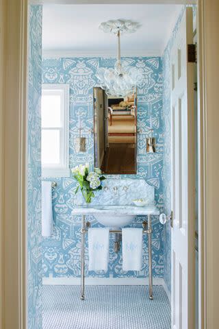
In this shared bath, McLaughlin covered the floor and shower in economical penny tile (Retro Rounds; daltile.com), choosing to have more fun with the light fixture and wallpaper. She says, "The penny tile is interesting, but it's not a main feature of the room." The designer splashed out on a punchy blue pattern (The Vase Wallpaper in Pale Blue; clarencehouse.com) and swapped out the original light for an eye-catching bubble chandelier from Pelle.
For more Southern Living news, make sure to sign up for our newsletter!
Read the original article on Southern Living.

