The 60 Most Beautiful Blue Paint Colors, According to Designers
"Hearst Magazines and Yahoo may earn commission or revenue on some items through these links."
Blue just may be the most versatile shade on the color wheel. With its diverse range of undertones and ability to pair seamlessly with other hues, this classic color proves why it is a standout among designers. A rich midnight blue evokes a moody, reflective feeling that's suitable for a home library, while a glossy aquamarine exudes just the right amount of energy within a living room. Delicate pastel blue walls can even transform modest bedrooms into peaceful and calming retreats that draw you in, and ocean-inspired blue hues are perfect for creating a spa-like bathroom.
Blue paint colors are both timeless and trendy. Multiple shades of blue have been crowned color of the year by esteemed color authorities and paint companies, such as Benjamin Moore, C2 Paints, Sherwin-Williams and Valspar. These hues range from mid-tone denim to an ethereal blue-violet on the color spectrum. Unsurprisingly, the allure of blue paint in its various forms has never been greater.
For inspiration on the best blue paint colors to choose, we reached out to top designers from all over the world. One of these sumptuous selections is sure to make it on your walls. Here, the blue paint colors the pros reach for over and over again.
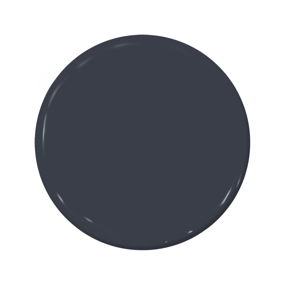
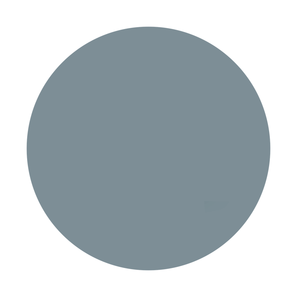
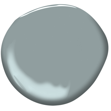
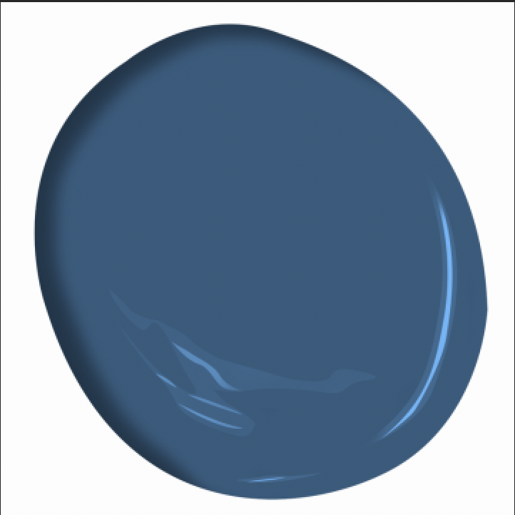
Inchyra Blue by Farrow & Ball
"Inchyra Blue by Farrow & Ball is one of my favorite blue paint colors that I reach for most often. It's deep and moody in darker rooms but can also be almost pastel and bright in sun-filled spaces. It also serves as a classic color that plays well with many different design styles and architecture." —Clara Jung, Banner Day Interiors
"Inchyra Blue by Farrow & Ball is wonderful for moody spaces like a library or butler’s pantry; it can be blue green or deep blue depending upon the light." —Lindsay Anyon Brier
New Providence Navy by Benjamin Moore
"I love New Providence Navy, Benjamin Moore 1651, in a high gloss for wood trim and walls in a library or bar. It's a dark, moody color, but when done in a high gloss, the reflective quality makes it quite bright and playful. I especially love how the color changes depending on the time of day and lighting." —Meridith Baer
Brigand by C2 Paints
"For the darker tones, I love Brigand by C2 Paints. Their colors always have a subtleness that I’m drawn to. This is a moody blue that has so much depth—it never reads flat like some dark blues." —Hillary Cohen
Selvedge by Farrow & Ball
"We love Selvedge from Farrow & Ball. A heavily pigmented gray-blue, it exudes elegance, timelessness, and freshness all at once." —Adam Hunter
In the Navy by Portola Paints
"We love Portola Paints' In the Navy because it has great color depth and reads organic instead of preppy, which is a feat for navy blue!" —Wendy Labrum
Van Deusen Blue by Benjamin Moore
"Van Deusen Blue from Benjamin Moore is one of our go-to blues because of its deep, rich hue, adding a beautiful sense of depth to both traditional and modern spaces." —Adam Hunter
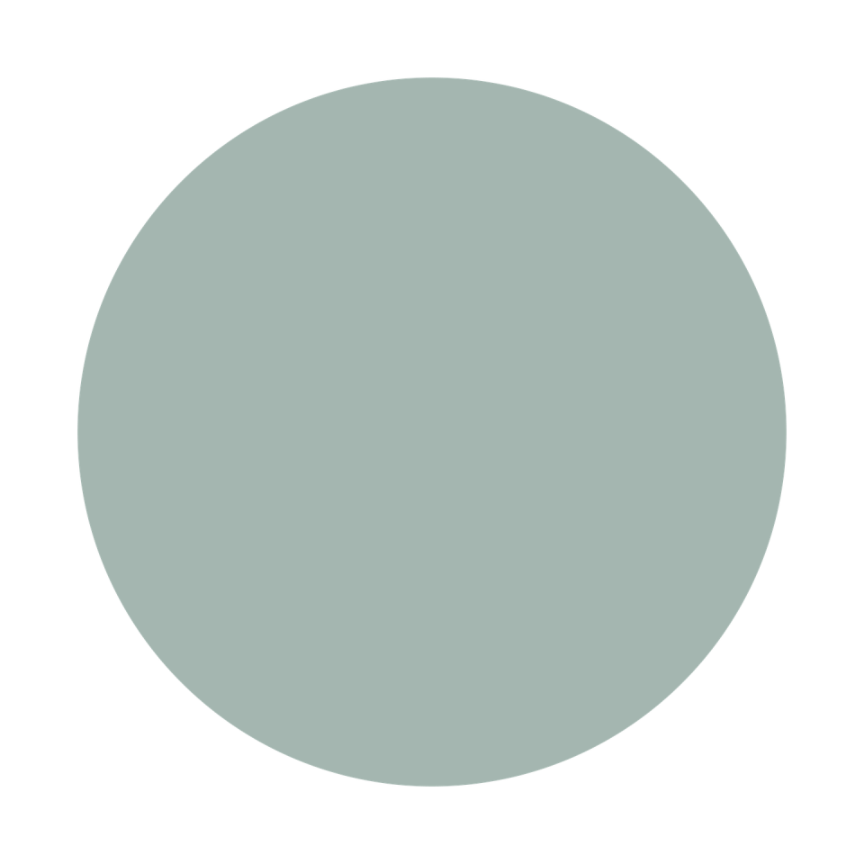
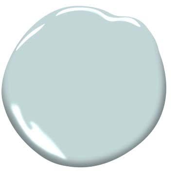
Palest Pistachio by Benjamin Moore
"We use this color on almost every ceiling. It has a subtle blue-green hue that adds a soft reflection to the surrounding space." —Studio SFW

Bermuda Blue by Benjamin Moore
"For a bolder, punchier blue that energizes a room with its vibrant presence, I turn to Benjamin Moore Bermuda Blue. This lively shade infuses a space with a burst of energy, creating a dynamic atmosphere that captivates the senses and invites exploration." —Mark Schubert, Phillip Harrison Interiors

Ethereal Blue by Edward Bulmer
"Blue can be warm, cold and even ethereal—and choosing the right blue is important. I always turn to Edward Bulmer’s paints for my blues and have often used Duck Egg for bathrooms and Ethereal Blue for halls teamed with Verdigris (the most green of blues) for woodwork. I love a blue that sits neither in the blue nor the green camp, and I love a blue to be interesting and difficult to define and as far from a royal blue as possible; I like my blues to feel uplifting, creative and diaphanous. I think that Edward Bulmer's Ethereal Blue might have to be my favorite blue." —Olivia Outred
Pacific Palisades by Benjamin Moore
"If you want a blue with flair, this is what you want to go with. It makes a statement with a melody! We just specified it in the dining room." —Vani Sayeed

Cheating Heart by Benjamin Moore
"We use this often on cabinetry and handrails—it's black with hints of blue, which gives it a deep tone, especially in a semi-gloss finish." —Studio SFW
Marine Layer by Dunn-Edwards
"This medium blue is a sophisticated color that can make any space, cabinetry or furniture feel elevated and modern, but not too immature. I used this color recently in a laundry room for cabinetry and it gave a look of modernism with character." —Linda Hayslett, LH.Designs
Surf Camp by Backdrop
"Blue is one of the most versatile colors and can act as a neutral in interior spaces. I prefer to use blues that are a bit more nuanced in tone and pull in greens and charcoal-gray for a richer hue. A few of my favorites in the green-blue and teal-blue hues include: Benjamin Moore Knoxville Gray, Benjamin Moore New Providence Navy and Backdrop Surf Camp. These colors work really well on cabinetry." —Leigh Jendrusina, SALTHOUSE Collective
White Satin by Benjamin Moore
"My favorite lighter shade of blue is Benjamin’s Moore’s White Satin. It’s got a touch of lavender which makes it very versatile. Even though blue can be masculine, this shade has a softness to it which I love." —Hillary Cohen

Whirlpool by Sherwin Williams
"This color is a 'true blue' with no green undertones. It is a deep and dusty blue that works well in an office or bedroom because of its calming nature." —Debbie Mathews
Gentleman's Gray by Benjamin Moore
"Benjamin Moore's Gentleman's Gray is a foolproof navy blue. The slight dustiness provides sophistication, and the drop of acid undertone differentiates it from standard cobalt-based navys. You can use Gentleman's Gray on an entire home exterior or on your lower kitchen cabinets, and be confident it will read classic and crisp in any light."—Emilie Munroe, Studio Munroe
"A blue that I’ve found myself recently gravitating towards is Benjamin Moore's Gentlemen's Gray. This rich jewel tone is everything I'm currently craving in interior design. It effortlessly infuses spaces with rich color and warmth, creating an inviting ambiance that feels luxurious and sophisticated while still keeping things cozy and intentional. This shade transforms bedrooms into sanctuaries and is also great for kitchen cabinetry to add interest and bold color without feeling trendy." —Kallie Geddie, designer and project manager at Dwellify

Railings by Farrow & Ball
"Absolutely adore Farrow & Ball's Railings for its dynamic interplay of hues, ranging from a deep blue to an almost black shade depending on the lighting." —Alissa Johnson

transparent Bliss by Benjamin Moore
"For a more soft, serene blue, I like transparent Bliss by Benjamin Moore. It's a perfect blue tone that serves as a neutral for both a boy or girls room. It's calming, cool, and makes you feel like you have walked into a clear blue sunny skied space." —Tova Kook, TK Design

Blue Verditer by Papers & Paints
"Papers & Paints' Blue Verditer is a firm favorite. It was my son’s bedroom color when we lived in London, and I reach for it time and again in projects too." —Kate Guinness

Blue Lace by Benjamin Moore
"This is a nice soft blue for if you want to use it in a room where you want it to feel sophisticated, but not like a little boy's room. I've used this color in a primary bedroom before, and it made the space feel inviting and happy once we added all the decor." —Linda Hayslett, LH.Designs
Silent Night by Benjamin Moore
"Benjamin Moore's Silent Night is a great neutral blue backdrop. It has enough gray in it to not look too sweet." —Wendy Labrum
Brewster Gray by Benjamin Moore
"I love Brewster Gray for the depth and touch of gray undertones. Doubling the formula for trim adds such a beautiful detail." —Maggie Griffin Design
Stone Blue by Farrow & Ball
"My favorite impactful blue would be Stone Blue by Farrow & Ball. Use this saturated tone of blue in your butler's pantry or in your library! Try a high-gloss lacquer for the full drama." —Tova Kook, TK Design
Ice Cap by Benjamin Moore
"I love this soft and gentle blue that’s just a bit bluer than white. It’s pretty for porch ceilings and nurseries." —Maggie Griffin Design
Van Courtland Blue by Benjamin Moore
"One of my favorite blues to use as an accent punch in an entry or powder room is Benjamin Moore Van Courtland Blue—it's a beautiful mid blue that works well with different wood tones as well as metal finishes. I love it as a welcoming color in an entry and how easily it transitions into a more neutral living room palette." —Meridith Baer

Harbor Home by Benjamin Moore
"Harbor Home is a classic blue that I consistently reach for. This shade strikes the perfect balance between blue and green, offering a refreshing and airy hue that's neither overwhelming nor juvenile. This versatile shade infuses spaces with a sense of tranquility and plays well with the current trend of vibrant pops of red or burgundy, effortlessly blending in while still making a statement. Whether it's covering entire walls or serving as a subtle accent, Harbor Haze brings a timeless elegance to any room." —Kallie Geddie, designer and project manager at Dwellify
Beach Glass by Benjamin Moore
"Benjamin Moore's Beach Glass and Quiet Moments stand out for their serene and calming qualities, making them perfect choices for creating relaxing bedroom spaces." —Alissa Johnson
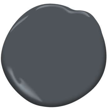
Midnight by Benjamin Moore
"I also love to use the charcoal gray-blue toned colors in kitchens because they’re a softer alternative to a black but bring in a nice contrast with lighter toned woods, whites and light greiges. Some of my favorite colors in this category are Benjamin Moore Flint, Benjamin Moore Midnight and Benjamin Moore Wrought Iron. They are super malleable colors that can read blue-toned in some lights and charcoal-black toned in others." —Leigh Jendrusina, SALTHOUSE Collective
Hale Navy by Benjamin Moore
"I love Benjamin Moore Hale Navy, I especially love it on painted cabinets because of its depth and sophistication. It is one of those colors that are timeless” —Caren Rideau, Kitchen Design Group
"What I love about this hue is the transparent versatility it brings to the mix. It can be played up as royally traditional or chilled out as laid-back modernity. It makes a powerful, contrasting backdrop for furnishings and accessorizing choices like salon-styled art hangings. Due to its romantic vibe, this rich color is perfect for master bedrooms. I've deployed it at least twice in this application." —Corey Damen Jenkins
“It may seem antithetical, but for a dark room, I actually prefer leaning into it and using a darker, more saturated color. Benjamin Moore’s Hale Navy is a favorite of mine. It creates a space that is cozy, moody, comfortable, and that has a touch of masculinity.” —Young Huh

Cloudy Skies by Benjamin Moore
"We love Benjamin Moore’s Cloudy Skies. It’s just the perfect shade of blue. With the most subtle hint of green this color is very versatile" —Kirsten Krason, House of Jade Interiors
"I have been using this color for years! It is truly a gray-blue color infused with green. I have used this color in a variety of ways but have used it repeatedly on multiple kitchen islands. It really pops when paired with a white marble countertop!" —Debbie Mathews of Debbie Mathews Antiques & Design
Blue Dragon by Benjamin Moore
"Benjamin Moore’s Blue Dragon is one of my favorites. It is a vibrant color that imbues a space with depth and warmth. I incorporated it into my Kips Bay Decorator Show House Palm Beach 2020 kitchen, as I felt it beautifully reflected the area's coastal environment while keeping it timeless." —Sarah Blank, Sarah Blank Design Studio

Dynamic Blue by Sherwin Williams
"Not for the faint of heart! This bold, bright, and happy blue is a great choice. In fact, I painted my own living room this color. Dynamic Blue manages to be a bold statement and a great backdrop to other bold colors." —Courtney McLeod, Right Meets Left Interior Design

Ultra Blue by Little Green Paints
"I love Little Green Paints's Ultra Blue because it's profoundly blue but less inky." —Kate Humes
Laguna by Sydney Harbour Paint Company
"One of our all-time favorite blues is Laguna from Sydney Harbour Paint Company. We used this hue in their Interno Lime Wash product in a space we recently designed, and it's blissfully ethereal. SHP's limewash is as easy to apply as paint—no joke—and replicates the soft, weathered patina of a traditional limewash. We literally can't get enough of how this product gently blooms over time, creating loads of depth and texture in any space. It's killer in Laguna, but available in any custom color your heart can dream of. Members of the trade can purchase all of SHP's no-VOC line through our showroom." —Krista Nicholas, Cloth and Kind

Water's Edge by Benjamin Moore
"One of my favorite blue hues is Water's Edge by Benjamin Moore. It is a beautiful shade of pale blue with dusty gray, watery undertones. I love it because it works just as well in traditional spaces as it does in more modern ones. It looks especially stunning executed in a lacquer finish." —Paloma Contreras

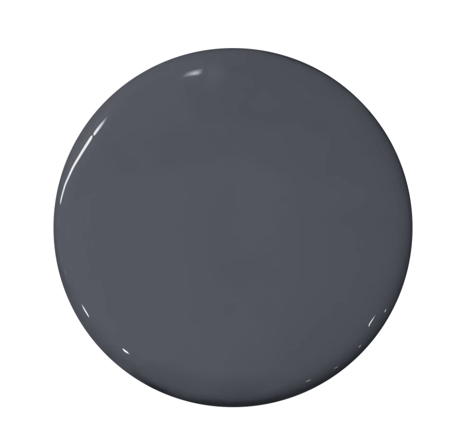
Mysterious by Benjamin Moore
"Blue is my go-to color and a personal favorite. It has become the new neutral due to its popularity. Like any color, blues have undertones and can travel the spectrum from warm to cool. We mostly use baby blues, gray blues, spa blues, indigos, and navy blues. Benjamin Moore's Mysterious is an almost-black blue—sophisticated and moody. Think about this color for a butler pantry, powder room, or island cabinets." —Karen B. Wolf

Skylight by Farrow & Ball
"Our favorite blue is Skylight from Farrow & Ball because this pigment says 'light blue' without being pastel, sweet, or too reflective. It’s dirty and completely gorgeous. It creates earthy, magnificent backdrops that work brilliantly with the textures and tones of a well-layered room." —Jeffry Weisman and Andrew Fisher, Fisher Weisman
"Skylight is a pale gray that works beautifully as an architectural neutral that evokes the natural light that pours in from a skylight. While a more traditional pale blue, it can subtly set off a space with modern furnishings and artwork lending it sophistication and depth. Because of the elegant grey tone to it, Sky light is a failsafe blue that never risks a baby blue effect." —Mindy O'Connor, Melinda Kelson O'Connor Design
Abysse by Ressource
"One of my favorite blues is Abysse by Ressource. I love the rich and warm tones that this color produces. Often times, navy blues can read too dark or just fall flat. Abysse is a true navy blue that warms any walls that it comes in contact with. Another benefit is its ability to stray away from making a room feel cave-like. If you’ve worked with blue paint before, you know that this is not an easy task!" —Mikel Welch
Iced Slate by Benjamin Moore
"This is my go-to serene blue. It is cool, crisp, and calm. Iced Slate is a perfect description for this shade. " —Courtney McLeod, Right Meets Left Interior Design
Deep Dive by Clare Paints
"I am absolutely in love with Deep Dive by Clare Paints. This color reminds me of the spunky and trendy cousin, who is not afraid to take risks. Deep Dive walks the line between blue and green hues. As someone who grew up in the '90s, this is a color that speaks to my soul! I can envision Deep Dive on kitchen cabinets or even a moody home office. Add a few brass light fixtures, and I’m sold." —Mikel Welch
Mediterranean Breeze by Benjamin Moore
"The color reminds me of the south of France and lazy summer days. If it weren’t blue, it would be sunflower yellow, another color that fills my life in summer." —Kathryn M. Ireland
Luxe Blue by Sherwin-Williams
"Since working in Mexico, Luxe Blue has become my go-to for our clients who want to mix timeless, coastal style with the 'Baja boho' vibe. The restrained, sophisticated hue is reminiscent of the Sea of Cortez in the morning and creates a perfect backdrop for layering textured neutrals, rattan, and sea grass. My clients love that the end result gives them a touch of the Hamptons but in the desert of Mexico." —Anna Ruby, design director at Twin Dolphin Los Cabos

New York State of Mind by Benjamin Moore
"Benjamin Moore’s New York State of Mind is a lovely shade between a cobalt and marine blue that is universally appealing. The purity of the color allows it to work as an accent color or as a backdrop to showcase other design elements. It looks fabulous with other blues and can hold its own with bolder colors such as orange and green." —Catherine Austin

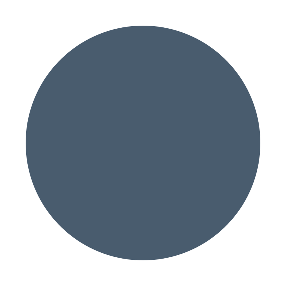
Rhine River by Benjamin Moore
“I love working with blues as they bring the color of sky and ocean into indoor living spaces. Benjamin Moore's Rhine River is one of my favorite colors. It is soft and relaxing yet sophisticated. It is a perfect backdrop for mahogany and teak furniture in a midcentury modern house, as well as against painted trims in a Cape Cod or Shingle-style home. The most versatile shade of blue paint.” —Goli Karimi, director of design at Home Front Build

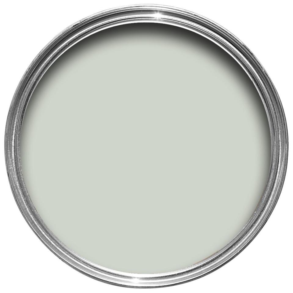
Light Blue by Farrow & Ball
"This shade is a true light blue without being baby blue. It has hints of a warm gray, soothing and soft, perfect for bedrooms. Farrow & Ball does a great job of having these beautiful pigments that have many layers to them. Our bedroom is getting this color makeover as soon as my painter can find time for me. Again, paint the doors and molding if you can. It really brings a current feel." —Sarah Winchester

Hague Blue by Farrow & Ball
"This sophisticated blue has incredible depth. With strong green undertones, I find it transitions quite well to both masculine and feminine spaces." —Courtney McLeod, Right Meets Left Interior Design
"One of my favorite blues is Hague Blue by Farrow & Ball. I have used it in a few of my projects. It’s a strong and dramatic blue but has a bit of a green undertone to it. It reads a little unexpected." —Laurie Blumenfeld-Russo
"Farrow & Ball's Hague Blue is a deep, moody blue that exudes an air of elegance and depth, making spaces feel more intimate and luxurious. Its richness works well in a variety of lighting conditions, adding character and sophistication to any room while serving as a stunning backdrop for art and furnishings." —Sarah Stacey
Prussian Blue by Benjamin Moore
"Benjamin Moore's Prussian Blue somehow always manages to look bright without being garish. It has an old-world look and yet is fresh and modern. We are using it right now in a high gloss to repaint a white four-poster bed that will look so much richer and more unique sporting this striking shade. It also plays well with others, like the blues in popular Canton China and Delft." —Rela Gleason
Fantasy Blue by Benjamin Moore
"We recently used Benjamin Moore Fantasy Blue for a bedroom. It's light and a little icy with a hint of green to keep it from feeling cold. We also painted the trim the same color to match so the walls fade away to the sky beyond. It has an ethereal quality that I really love." —William Cullum, Jayne Design Studio
Poolside by Benjamin Moore
"Blue is such a beautiful and functional color in the design industry, as it runs the gamut from blue-green to blue-gray. There are so many blue tones to choose from when designing our varied projects. Lately, I am loving Benjamin Moore’s Poolside for its rich saturation of color. I can fold it into a classic traditional room and pair it with plaids, paisleys, and wood tones, or let it stand alone in a sleek, modern space with white, silver, and Lucite." —Joe Berkowitz, founder of JAB Design Group

Borrowed Light by Farrow & Ball
"We use this regularly on ceilings, especially in rooms overlooking water or in bathrooms, because of the way it can have a slight shimmer in a satin finish. We always cut it back with at least 50 percent white, then we put up samples to see if it needs further lightening as it dries. It must be barely blue and barely there! It will change depending on the light in the room." —Rela Gleason
"A go-to blue for us is Borrowed Light by Farrow & Ball. The subtlety of the blue makes it one that we never tire of, whether it be for a serene bedroom or an airy kitchen. We love the way art and furniture hold contrast against it and the quiet wash of color it brings to our rooms." —Caroline Brackett

Palladian Blue by Benjamin Moore
"I just painted my kid's room, as well as a formal living room for a client, Benjamin Moore Palladian Blue, which goes to show how versatile it is. A warm and energetic blue with a hint of green, it pairs well with a wide variety of colors: from red and pink to purple and green. Youthful yet sophisticated, the color is timeless, yet fresh and new." —Marea Clark
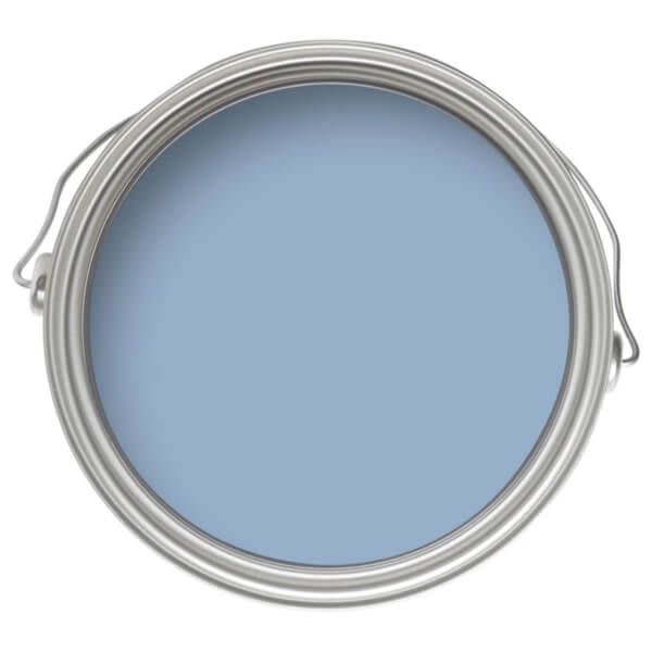
Riverway by Sherwin-Williams
"I am loving warmer blues right now, like Riverway by Sherwin-Williams because their color wraps around you with a calming softness that still makes a statement. Whether on walls or millwork, [this color is] sure to have people asking, 'What paint color is that? I love it!' " —Nancy Charbonneau, Charbonneau Interiors

HGTV Home's Debonair by Sherwin-Williams
"Debonair by HGTV Home with Sherwin-Williams certainly lives up to its name. This shade of blue evokes a feeling of casual luxury. The color is subdued, yet very confident. The great thing about this blue hue is it falls into a neutral blueish-gray category that tends to works with most colors in any room. I wouldn’t be surprised if Debonair soon becomes a color of the year in the near future."—Mikel Welch
Westcott Navy by Benjamin Moore
"Benjamin Moore's Westcott Navy is a wonderful go-to dark blue when you need a neutral backdrop for an accent of color or layered textures to pop in a room. It is a classic yet fresh color that works with many color schemes and palettes."—Dana Wolter
Pale Powder by Farrow & Ball
"Farrow & Ball's Skylight and Pale Powder are colors that show off artwork very well; I have both in my Museum Street showroom." —Robert Kime
Pigeon by Farrow & Ball
"It is beautiful and a more bold color that can blend into any of its surroundings like a chameleon. " —Melanie Pounds, Patina
Lulworth Blue by Farrow & Ball
"I love Lulworth Blue from Farrow & Ball. It’s a beautiful mid-blue that pairs beautifully with white for a fresh, crisp palette. " —Caroline Gidiere
De Nimes by Farrow and Ball
"This color is described as a down to Earth blue, like blue jeans. A brilliant idea if you think about it. Denim is classic and goes with everything. You can use it in any space as muted version of a classic navy."—Park and Oak
Naval by Sherwin-Williams
"You can never go wrong with Naval by Sherwin Williams! I love to use it in secondary bathrooms, on vanities, for an unexpected pop of color through the house." —Tiffany Smith, JL Design

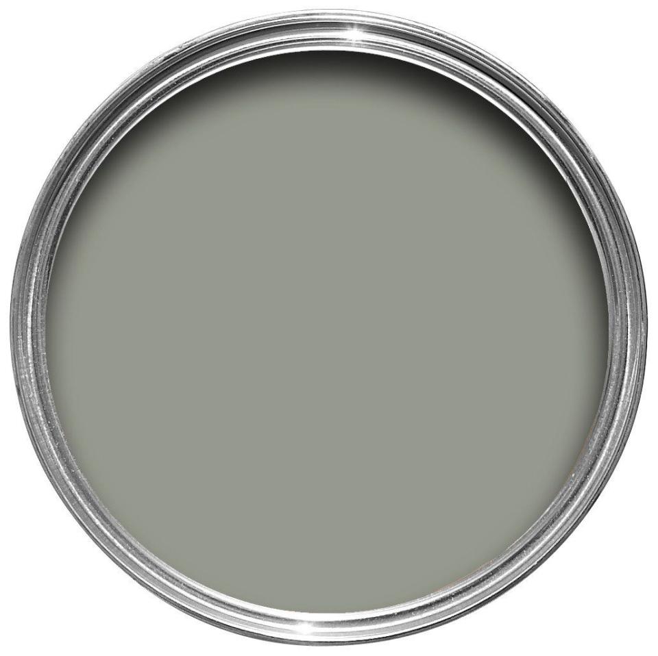
Blue Gray by Farrow & Ball
"Blue Gray by Farrow & Ball is a soft Blue with just enough of an undertone of green in it to blend into any landscape."—Melanie Pounds, Patina
You Might Also Like

