Time to Repaint? These 5 Colors Are So Outdated, Designers Say
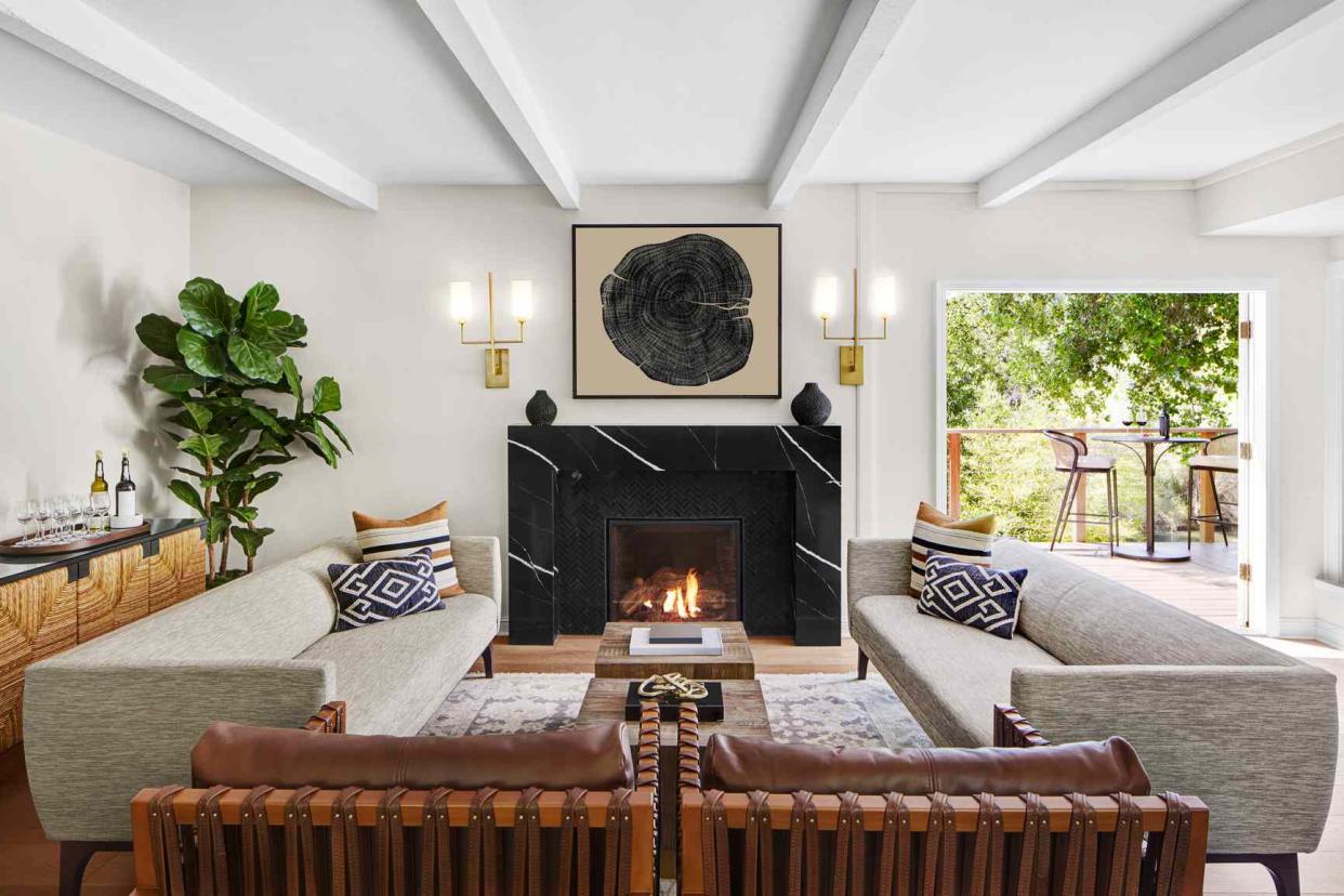
Trinette Reed / Stocksy
We’re not shy when it comes to predicting design trends of all kinds, from popular patterns to the kitchens and living room trends that will be everywhere. Our forecasting doesn’t stop there, though. We tapped a few interior designers to spill on a particularly important topic: which paint colors they think are overdone and outdated.
Say "so long" to the shade that defined a generation and goodbye to the neutrals that come straight from cookie-cutter renovations—it's time for a refresh. Read on for five colors it’s time to paint over, and some alternative shades that’ll feel oh-so-2023.
Millennial Pink
We’ll always have a soft place in our hearts for millennial pink—the dusty rose shade that became synonymous with an entire nostalgia-loving generation—but Palm Beach-based interior designer Shani Core says it's time to say goodbye to the years-long paint trend. Everything from furniture to book covers to rosé represent this beloved color, but it may be worth reconsidering using the shade on the walls of your house.
That doesn’t mean you should steer away from pink altogether though. Core offers this paint color alternative.
“A softer, more elegant update to this color is Benjamin Moore’s Organdy,” she says. “A pale shade of blush with an undertone of violet brings a sophisticated and updated touch to all those Barbie pink rooms of the past."
Gray (That Isn't Even Gray)
While looking for a go-with-everything neutral, it’s natural to be drawn to gray paint. That isn’t a bad idea—just be weary of the shade. There’s one popular gray paint color in particular that Core says needs to be put on the back burner.
“Edgecomb Gray by Benjamin Moore has been overdone,” Core says. “And it is not even actually gray—the misnomer is more of a deep beige, with the slightest hint of gray."
There’s an easy alternative though. If you're looking for a beautiful goes-with-everything paint color to complement both beige and gray tones, Core prefers Benjamin Moore’s Seapearl, which is still neutral but subtle and fresh feeling.
Morgan Blinn, an interior designer at Rumor Designs, says to be careful with grays since they can easily give off a bland feel. When asked what she considered to be the most overused paint color, Blinn didn’t hesitate in her reply.
“Agreeable Gray by Sherwin-Williams is the first thing that came to mind, and other grays like it,” she says. Why? “Grays like this are used as a neutral, are very builder-grade, and overused in remodels.”
emmaduckworth / Getty Images
Blinding White
While white paint will always be a classic, it’s important to consider the undertone of the specific white you’re considering, as well as how it looks in various lights. Not sure? Paint test spots on your wall, so you can see how the shade of white transforms throughout the day.
Allison Garrison, principal designer of Allito Space, recommends avoiding cold, blinding shades of white paint, like Sherwin-Williams Extra White. Instead, opt for a warmer, more versatile shade of white, like one with the slightest bit of yellow undertones.
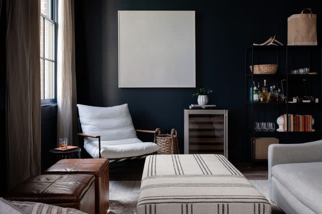
Deep Navy
Even interior designers have to step away from their favorite paint colors from time to time. “Maybe it’s time to hit the pause button on an old favorite of mine, Hale Navy by Benjamin Moore,” interior designer Elizabeth Drake says.
But that doesn’t mean you should skip deep dark blues altogether; Drake suggests a tone with more gray undertones to feel fresh. Night Train by Benjamin Moore is her current favorite, since it's still rich, but doesn't have the saturated intensity of dark navy blue.
Ali Harper / Stocksy
Muted Sage Green
Drake suggests stepping away from Sherwin-Williams Sea Salt, a soft green with blue undertones, which she describes as “Pottery Barn worn.” To step up the sophisticated level in a similar tone, opt for a warmer green that feels fresh and new.
"Opt for a green that is well pigmented but nicely balanced, creating a very soft pale green that feels like a spring breeze,” she says.
Read Next:The 10 Best Taupe Paint Colors, According to Design Experts

