"I thought 'what nerve!'" Paula Scher reveals how The Beatles' album artwork inspired her
- Oops!Something went wrong.Please try again later.
Recently, I interviewed influential graphic designer Paula Scher. Our conversation was wide-ranging and she was every bit as interesting as I'd hoped. She has a wry sense of humour, and an openness about her, meaning she didn't shy away from my questions, often pausing before adding an extra nugget of information or an anecdote.
We spoke about her logo creation process, her sketches and her new BBC Maestro course. But although I had planned for us to talk about the iconic album artwork she created in her career, there was one subject I didn't expect us to get onto, and that was the Beatles albums. They came up when I asked her what she was into as a teenager...
What were you into as a teenager?
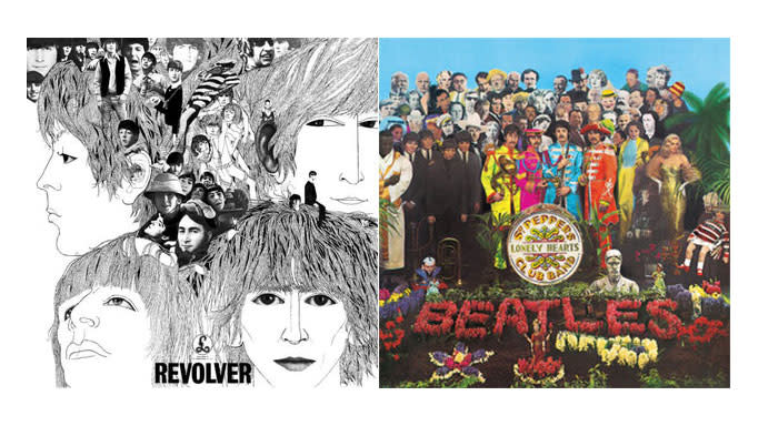
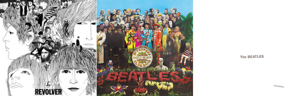
Like everybody my age, in my late teens I liked the things that were popular at the time. For me the most moving and inspiring thing were the three Beatles albums when they came out. [The first was] Revolver, it had these incredible complicated drawings that I looked at for hours, I imitated that stuff... I just stared at that cover forever and thought, 'wow, look at this thing'.
It was a year later that Sgt. Pepper came out and Sgt. Pepper was a montage. The Beatles were in band uniforms and there was a cast of characters around them – some of them were famous icons like Marilyn Monroe and Bob Dylan... I would look at the picture and find something different in it every single time and it was just phenomenal to me.
And then the last one, which had no image on it at all, was The White Album. And I thought 'what nerve!' It felt like they had all these complicated gorgeous covers, and they were doing a progression, then all of a sudden they smacked us in the face with this White Album. And you know, it was another lesson, they were all lessons.
What were the lessons?
Well, the first lesson showed you the power of the line and drawing. The second one showed how understanding culture and what was significant and the way you used the images of culture together created a form of irony and mystery, and that was an incredible communication tool.
Both Revolver and the Sgt. Pepper cover were both illuminating and enriching as forms. The third one was so cheeky. I mean because they came out with nothing. It said the Beatles raised on the cover, and that was it. And no one else had done that yet – it was so arrogant. They were the only ones who could do that.
Record covers were a very important part of the commerce of the music business and to have the arrogance to say, 'we're the Beatles, we don't even need a cover.' And 'screw you' is sort of what they were saying in a way. I just laughed I just thought 'oh my god, look at these guys'.
It was the progression of it, because you couldn't say, 'they just don't care about their album art'. They definitely cared about their album art, they were fine artists. Peter Blake did Sergeant Pepper. I forgot the name of the guy who did Revolver but he was a famous painter... they were very sophisticated.
Later on when you were designing album artwork, were you aiming for that same illuminating and enriching impact?
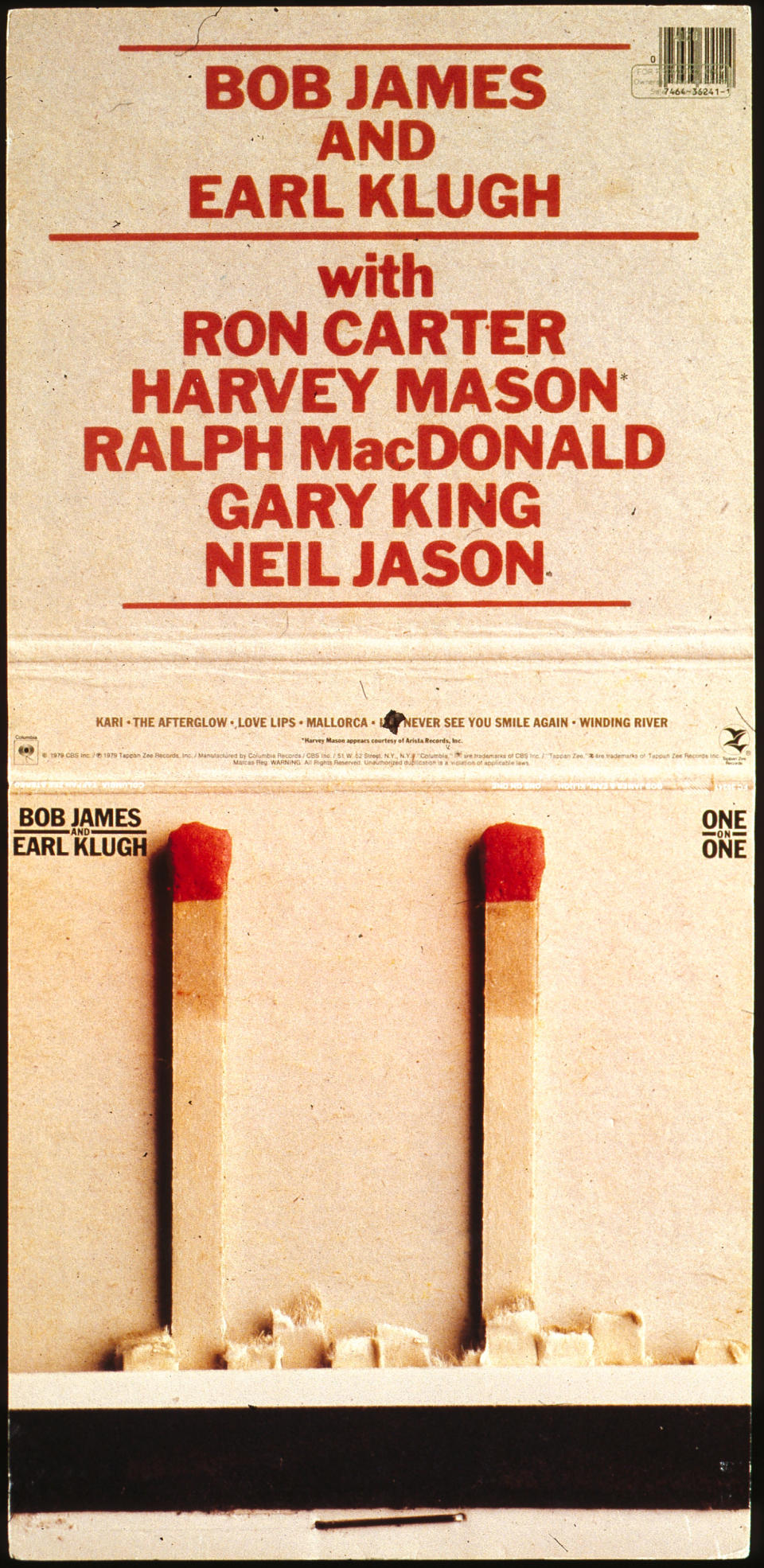
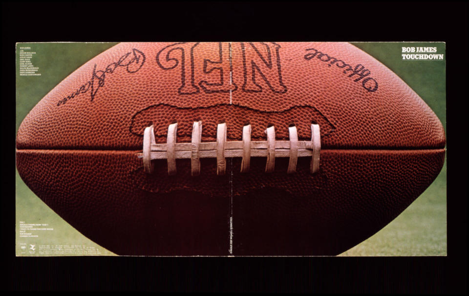
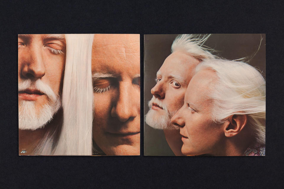
Absolutely. It was hard because the bands had contractural cover control and approval... It was difficult... except I would say with a couple of blues musicians like Johnny and Edgar Winter, who were who were very creative... I did some beautiful photographic covers for them. And also Bob James, who was a jazz musician – those things are classics now. There was a cover that was a matchbook and there was a cover that was a nickel and a football – there are 19 of those.
Is album artwork still relevant in a world of streaming?
I was very turned off way before Spotify because I just couldn't even stand CDs. I worked on 12 by 12 album covers, some of them opened up and had gatefolds and were quite wonderful. CDs for me had no appeal. So I just stopped paying attention.
And then the minute I could download my record collection on my iPod, that was fantastic because I had what I had, and then if I wanted to buy a record I'd just buy through Apple and it would be on my iPhone. I didn't buy an album that had graphics on it after that. And I love it when when I play my my gadget in the car because the record covers come up on the screen. It's so nice when I'm driving along and I see a cover I did pop up.
For more from Paula Scher, sign up to her BBC Maestro course.

