What Color Is Taupe? How to Decorate with This Classic Neutral
This soft shade of brownish gray goes with practically everything.
What color is taupe? It's a neutral shade that falls somewhere between brown and gray. The elegant color is comforting in its simplicity and reliability. Taupes with a red, pink, or yellow undertone have a warm, cozy effect, while taupes with a green or blue undertone convey a cooler, more contemporary aesthetic. Either way, taupe is a timeless and versatile hue that pairs with almost any color and serves as an ideal backdrop to a wide variety of decorating styles. We spoke to color experts and interior designers to learn the best ways to decorate with different taupe colors.
Related: 16 Expert Design Tips for Decorating a Room You'll Love Being In

1. Consider Room Size and Natural Light
The size, natural light, and direction of the room determine the right shade of taupe. A light taupe will make small, dark rooms feel brighter and more spacious, while a dark taupe creates a sense of intimacy and makes a large space feel smaller.
North-facing rooms don't get much sun exposure and tend to feel cooler and darker, so a taupe with a warm undertone will give your walls a warm glow. Melanie Hay of Melanie Hay Design Studio recommends Mouse's Back by Farrow & Ball for north-facing rooms. "It's a beautiful rich mix of deep brown and gray, and it changes in mood throughout the day and depending on the light exposure," she says.
South-facing rooms enjoy plenty of natural light, so you can use any shade of taupe, though a cool undertone will balance out the sun's warmth and achieve a tranquil, breezy atmosphere. Arianna Cesa, associate manager and color marketing and development specialist at Benjamin Moore, recommends trying taupe paint colors like Waynesboro Taupe and Plymouth Rock.
For east and west-facing rooms, the best way to choose the right shade is to "study the overall lighting at the time of day you spend most in the space and see if it leans warmer or cooler and narrow your options from there" says Cesa.
Related: These Cozy, Organic Paint Colors Are Everywhere

2. Master a Monochromatic Color Scheme
A monochromatic color scheme creates an elegant, timeless, and tranquil environment. Explore the shades of taupe, from darkest to lightest, and combine them to create the perfect balance. Cesa suggests using the same taupe paint color on multiple surfaces for a uniform, uninterrupted design for a dramatic yet effortless look. "Using different sheens, like matte on walls and satin on trim and cabinets, can help create a subtle contrast in your space," she says. The key to a successful neutral scheme is to layer different textures. This adds depth and prevents the understated decor from falling flat.
Related: 5 Tips for Pulling Off Monochromatic Designs in Your Home

3. Combine Taupe with Lively Accents
Don't misjudge taupe as dull. The effortless neutral shade pairs well with nearly every color, making it a great choice for bold interior designs. What color is taupe best with? Taupe works brilliantly with intense hues like turquoise, fuchsia, and emerald green or with soft pastels. "Rich wood tones, patina raw brass, and creamy neutrals are a gorgeous pair, as are mossy green, terracotta, and blush pastel," says Hay.
As its complementary color, blue is a classic, sophisticated match for taupe in both its lightest and darkest forms. Cesa recommends bringing in optimal contrast with charcoals, navy blues, forest greens, and deep burgundies, like Stormy Sky, Charcoal Slate, Narragansett Green, and New London Burgundy. Make sure the colors share a similar undertone for a harmonious color pairing.
Related: 27 Neutral Paint Colors and Tips from Experts On How to Use Them
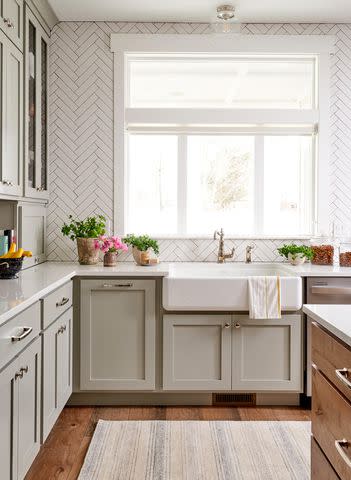
4. Create a Cozy Kitchen
Taupe is a popular color for kitchen cabinets because of its warm and comforting connotations. It's the perfect choice if you want a hint of color to add depth and interest to kitchen cabinets but don't want to regret your pick later.
Taupe is a safe shade that works just as well in a modern kitchen design as in a traditional English country kitchen. Opt for a warm hue with the same comfort level as a home-cooked meal. Hay recommends Upper West Side from Benjamin Moore. "It is a great mid-tone neutral taupe that will add richness to any room without being too dark," she says. Highlight the gray-brown tones with a stone countertop and contrast with a white subway tile backsplash for a contemporary look.
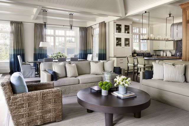
5. Paint Your Living Room for a Timeless Elegance
Taupe is a versatile foundation that makes it the perfect neutral backdrop for any home, particularly if you intend on leasing it. A light taupe is far more comforting and sophisticated than standard white walls, yet it still appears clean and bright. It also easily accommodates different colors and styles of furniture and accessories. Warm wood and brass or gold accents look particularly refined and elegant in rooms where taupe is the dominant color.
Sara McLean, color expert and stylist at Dunn-Edwards, says using taupe in a living room creates a sophisticated, versatile base within your home. "For a vintage eclectic aesthetic complementary to the hue, mix old-world decor with contemporary art pieces," she says. "For a rustic living room, paint your trim in taupe and keep your walls a light neutral or off-white for an elegant, monochromatic look."
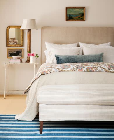
6. Turn Your Bedroom into a Dreamy Oasis
Taupe is a natural, earthy shade that evokes a sense of calm and security. These qualities make it an ideal color for places intended for relaxation, like a bedroom. Use a dark shade of taupe on the walls for a cozy, enveloping effect, or lace the color into the scheme with elegant pleated curtains and a matching upholstered armchair or tufted headboard.
If using a dark taupe, consider going all in and painting the trim, baseboard, crown, and ceiling. "It sounds counterintuitive, but painting the space out in all one deeper color will make the walls recede and make the furnishings and decor really pop," says Hay. "It will also highlight any architectural details in the molding or windows." Contrast the calming hue with soft white linen bedding and whitewashed wooden furniture to achieve the understated casual elegance of French country style.

7. Transform Your Bathroom into a Sanctuary of Calm
The bathroom is another place where we retreat for peace, tranquility, and solitude. Emulate a spa-like environment's restorative, calming atmosphere in your home with a taupe bathroom design. Offset the organic neutral with crisp white for a refreshing feel. "A crisp white paint color like Chantilly Lace or Super White are go-to pairings for me," says Cesa. "For a softer white paint color, Cloud White or White Down is a calmer, more subtle option." Add texture with large taupe ceramic tiles paired with white furnishings or a taupe vanity with white marble countertops.
"Taupe is a soothing hue that evokes tranquility and balance," says McLean. "Using taupe in a bathroom creates an oasis-like, nature-influenced sanctuary. To create a sense of tactile comfort, use lower sheens outside the water area and materials such as grass cloth, sisal, warm, raw woods, and plants to bring nature in."
Related: 28 Neutral Bathroom Ideas That Are Far From Boring

8. Showcase Dark Taupe as an Accent
Although taupe is commonly used as a foundation, a dark taupe can be just as effective as an accent color. Cool color palettes benefit from dashes of the earthy hue as they add warmth and ground the scheme. Likewise, dark taupe accents prevent crisp white interiors from looking too clinical.
Some ideas to incorporate the gray-brown shade into your home include a rug under a coffee table, textured woven blankets or throw pillows, upholstered furniture, artwork, or a painted accent wall. McLean also suggests dark taupe as trim work (crown molding, baseboards, beadboard, window trim, wainscoting), kitchen and bath cabinetry, interior and front doors, built-ins, and ceilings.
Frequently Asked Questions
How do you pronounce taupe?
Taupe is pronounced "tohp," or "toe" with a p on the end of the word.
Why is taupe so popular?
Like white, taupe is a versatile color with warm or cool undertones. While white can be bright or stark, taupe stays more calming due to its brown or gray base. It's a great neutral that works with almost any color, depending on the shade of taupe used.
Which is darker, beige or taupe?
Generally, taupe, which is gray-brown, is darker than beige, which is yellow-brown. Still, there are many different versions of both colors, so there's no definite answer to which is darker.
For more Better Homes & Gardens news, make sure to sign up for our newsletter!
Read the original article on Better Homes & Gardens.

