New study reveals how fonts make people feel in different parts of the world
We know that choosing the right typography is important and that fonts can convey different emotions. This can have a massive impact on how a project or a brand is seen. But new research suggests that the emotions that different typefaces convey can vary in different parts of the world.
The digital typesetting company Monotype has drawn on neuroscience to study how different font styles evoke different emotional responses depending on the country. It surveyed people in eight countries to see how they ranked different fonts for particular associations (see our pick of the best free fonts to expand your own library).
A post shared by Monotype (@bymonotype)
A photo posted by on
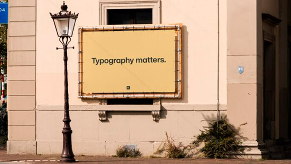
Monotype's study, entitled Typography Matters: How to Leverage Neuroscience to Build a Memorable Brand, focused on Australia, France, Germany, Japan, Portugal, Spain, the UK and the US. Some of these countries may appear to be relatively close in terms of culture, but the preferences and the emotions associated with different typefaces varied.
The were some general findings. Serif typefaces like Cotford were found to convey honesty and quality while humanist sans serifs like FS Jack were found to convery innovation and distinction and geometric Sans Serifs like Gilroy Bold were associated with honesty and clarity.
However, the research found that respondents in English-speaking countries (Australia, UK and US) Showed a preference for distinctive characteristics in typefaces. France, Portugal, and Spain showed a significant preference for "Cotford's soulful, classic serif style".
While FS Jack Regular scored highest for conveying trust in seven of the eight countries, Cotford performed best in Germany. Gothic, low-contrast, humanistic typefaces were found to do very well to convey innovation in Japan, where high-contrast typefaces that preserve a traditional brushstroke feel were considered trustworthy.
Damien Collot, Monotype's Creative Type Director in France, said: "The differences in the UK and France results show us how much two geographically close cultures can have varied reactions to typography and language. For brands creating advertising campaigns and organizations running public information campaigns, having a research-based understanding of how responses to font choice vary across different regions and languages is a key to potentially unlocking deeper, more meaningful engagement with audiences."
Executive Creative Director Phil Garnham said: "Everyone brings their own history and personal perceptions to a typeface. But what's fascinating about our research is that it reveals those perceptions are, at least in part, influenced by where we live and the history of our culture and language. Our research is not exhaustive (to date, we've studied eight countries around the world) and as we continue to expand and diversify our research program with Neurons, we expect to uncover more insights on the complex, nuanced, and infinitely fascinating interplay between type and emotion."
The research was carried out in collaboration with the applied neuroscience company Neurons. The data was gathered through surveys of 1,957 participants. In countries using Latin typefaces, FS Jack, Gilroy and Cotford were the fonts tested. In Japan, the tested fonts were DNP Shuei Mincho, Shorai Sans and Tazugane Gothic.
The survey used three types of stimuli: single words, sentences using these words, and sentences incorporating a mock brand. Respondents evaluated these combinations, considering a range of emotional metrics: sincerity, memorability, trustworthiness, and confidence.
It provides interesting insights for marketers, creatives, and public bodies developing information campaigns, confirming that the ideal choice in one country won't necessarily be the best in another. This is particularly worth keeping in mind in light of the increasing trend to launch global rather than local campaigns.
For more insight into font preferences around the world, see the intriguing maps of tourism logo fonts.

