How Steel Doors Totally Transformed This NYC Apartment
If you've ever taken a look at New York real estate, you know it very often involves design choices that are... questionable. In an effort to maximize precious square footage, builders often rely on extreme open floor plans or odd layouts.
"Being a designer, you see pre-war, architect-designed apartments where every inch is used and thought about, and you go into new construction and there are powder rooms the size of living rooms," quips designer Nina Carbone. So, when clients of hers bought in a new construction building in Manhattan's Gramercy neighborhood, she set about to impart that same thoughtfulness without drastically changing the architecture.
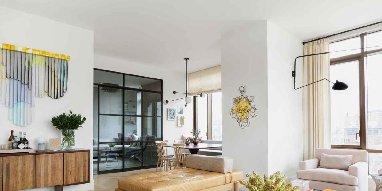
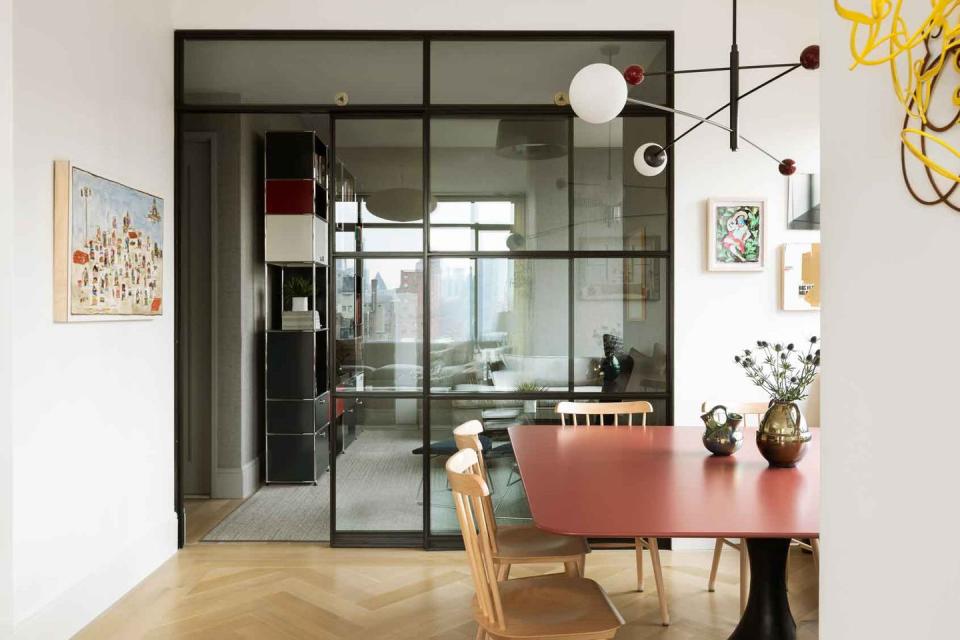
"We used steel casement doors to kind of delineate the space," explains Carbone. The result, unlike a standard wall, still allows for light to filter through, Plus, unlike a hinged door, they roll, saving space.
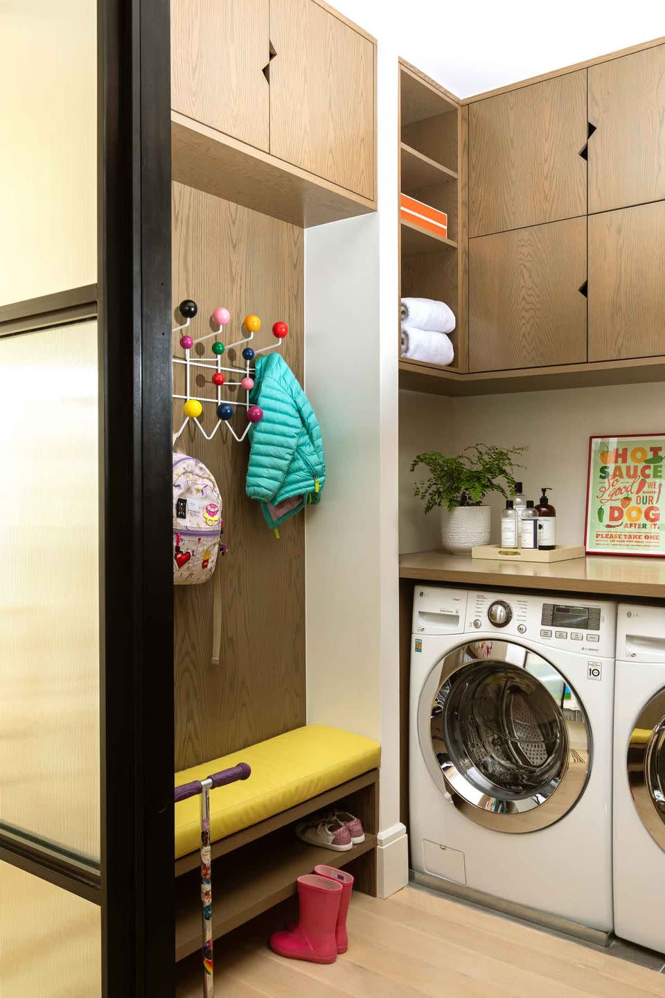
This is just one example of the way Carbone cleverly shifted the flow of the house, turning it from a fairly bland four-bedroom apartment into a three-bedroom family home complete with an entryway, den, and "urban mudroom" ("I swear this is starting to become a thing," Carbone promises).
"We tried to basically rethink, in an intelligent way, some of the really builder-grade aspects of the apartment so it would really function for them." The result is a comfortable, modern family home whose style belies its extreme functionality. Take a tour below.
Palette
"The great thing about these clients is they had a really strong design aesthetic," says Carbone. "They knew they loved midcentury modern and they had actually started collecting small pieces here and there, which had traveled with each apartment."
They are also big collectors of art, which played into Carbone's plans both in terms of layout and color scheme. "From the beginning, I wanted it to feel more neutral to be more of a backdrop for their art," says Carbone. "But the clients really wanted there to be a color scheme. So what we ended up doing was injecting color into kind of slightly more offbeat things," like the pops of burgundy in the den or the pink Italian dining table.
Entry
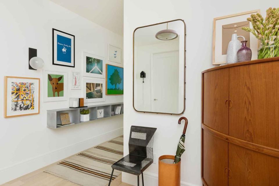
"They have a giant entryway with a giant hallway, and, while you're not living in those spaces, you're still paying for the square footage," says Carbone. So, she wanted to make them as functional as possible. She fitted a midcentury corner cabinet the couple already owned beside the door, then created a custom shelving system that provided storage without distracting from the hallway gallery wall, which visually guides people into the home.
Living Room
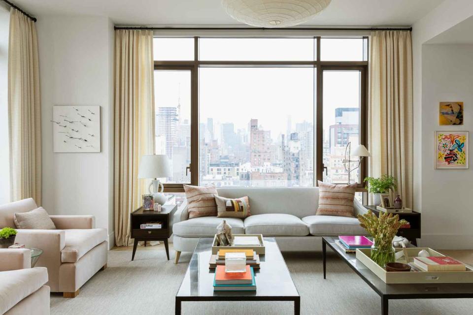
In an apartment with these kinds of floor-to-ceiling windows, the views take center stage no matter what. So Carbone designed a room that didn't distract form them, but still felt inviting. "If I'm going into that room, where do I want to sit? In one of those windows to be completely honest," she says. "So we tried to keep everything pretty low profile, and we kept with pretty clean lines."
Carbone looked to French modernism as her stylistic inspiration, eschewing drapey ornamentation in favor of pretty profiles and enticing, subtle color combinations.
Kitchen
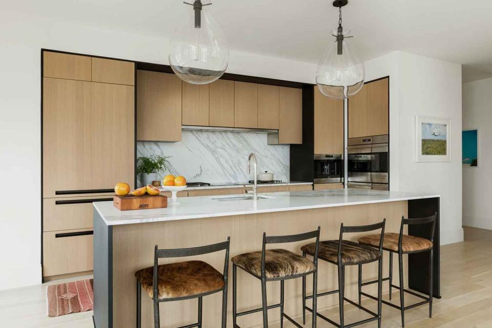
"You would obviously think that the dining table would be next to the kitchen," says Carbone, but she instead decided it to place it on the other side of the main room in an effort to use the apartment's most valuable space.
"The main part of the apartment you want to be enjoying is the corner where the windows meet," says the designer. "You don't want to stick a dining table there unless they're huge chefs who are constantly entertaining. The square footage was just too precious to have a dining table there." So she built in a banquette ("Which I use all the time in New York City apartments") with durable faux leather that can serve a variety of purposes.
Den
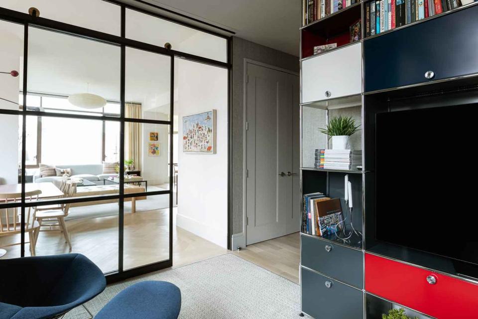
"They were very concerned with storage because they like it to look super clean," says Carbone, meaning clutter was a no-no. To corral it—and provide a strong, modern focal point—Carbone added a custom USM Modular unit, which incorporates color in a simple way. Plus, its graphic design reflects the casement doors.
Master Bedroom
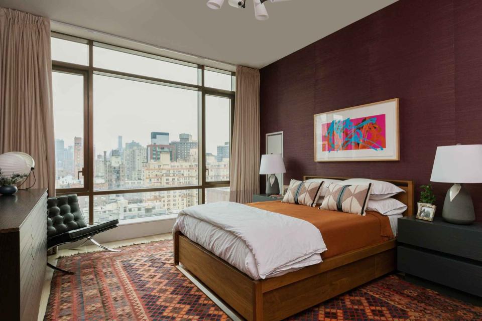
"We felt like if there was a place to go dark in this apartment, it's in here, because you have this huge window," says the designer. "So it was never going to feel super dark." The textured walls and vintage carpet (sourced on Etsy!) add warmth.
Kid's Room
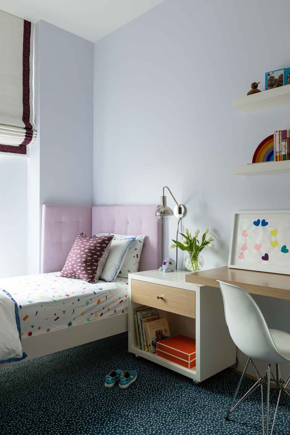
"This was the smallest bedroom in the apartment, and it was really awkward," Carbone recalls. To make the most of the space, she designed a custom corner headboard and put a trundle under the bed to pull out for sleepovers. She also designed a desk that serves double duty as workspace and storage.
"That custom desk is on casters so it can go smack into the corner, and it has a lot of storage," says the designer. Smart, functional, and super chic—even the family's youngest member gets a room that embodies the home's ethos.
Follow House Beautiful on Instagram.
You Might Also Like

