The Starbucks logo: a history
The Starbucks logo has become synonymous with hot, fresh coffee to go. The chain is the dominant coffee shop across the globe, driving a huge, multi-decade shift in our relationship with the beverage and the culture surrounding coffee more generally. Starbucks may not be your favourite cup of coffee – it certainly isn’t mine. But it’s affordable, ubiquitous and always there, and if you live and work in a city, you’ve probably picked up a cup with that siren logo on the side not too long ago.
Starbucks was founded by three coffee lovers in Seattle in 1971 – Gordon Bowker, Jerry Baldwin and Zev Siegel. At first, the company didn’t even sell coffee by the cup, but was in the business of selling coffee beans and related paraphernalia for home coffee brewing. Its journey from a humble spot in Pike Place Market to reaching practically every corner of the globe has been one of the business’ great success stories – and with it every step of the way has been that iconic siren.
The Starbucks logo has certainly earned its reputation as one of the best logos of all time, so it’s worth looking at how it came to be what it is today. Join us on a journey that spans more than half a century – and don’t forget to check out our guide to the best logo designers if it gets you inspired to do some design work of your own.
1971: Siren songs low key kinda slap

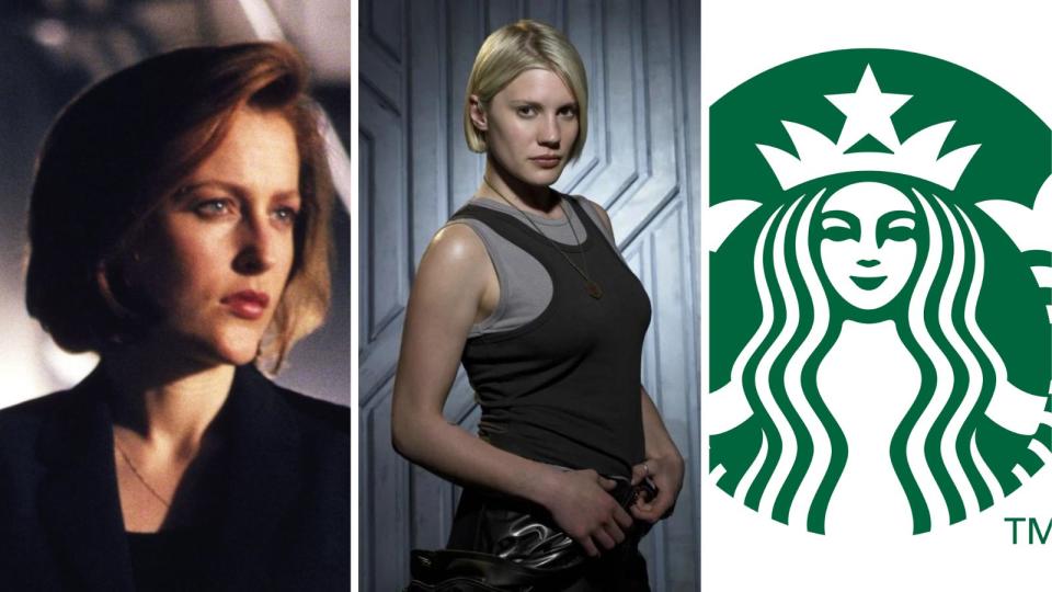
Pop quiz – what do Dana Scully from The X-Files, Battlestar Galactica’s top-gun Viper pilot, and the world’s most famous coffee chain all have in common? Answer: they all take their names (or nicknames) from Moby-Dick, Herman Melville’s seminal tale of revenge, obsession and whale biology.
Specifically, they’re named after Starbuck, Captain Ahab’s long-suffering first-mate, who spends most of the novel worrying that Ahab’s beef with the titular big lad is going to get everyone on the ship killed, then spends the final few chapters being proven mostly correct. His moniker has since been adopted as Dana Scully’s childhood nickname from her father, BSG pilot Kara Thrace’s call-sign, and of course, the name of a coffee chain on practically every high street.
For the coffee shop, this name was a second draft. Co-founder Gordon Bowker was the writer of the trio, and he had wanted to give the company a Moby-Dick inspired name. however, he had pitched ‘Pequod’, which was the name of Ahab’s ship in the novel. Thankfully, the trio had by this point brought on branding guru Terry Heckler, who correctly pointed out that this was a rather unappealing name. (As a rule, if you’re selling anything drink-related, you should probably try not to have ‘pee’ in your company name. That’s some free branding advice from your friends at Creative Bloq).
Looking for other ideas, Heckler researched landmarks near Seattle, and came across an old mountain camp near Mt. Rainier called ‘Starbo’. The phonetic similarity with the Pequod’s unlucky first mate led the group back to Moby-Dick, and ultimately, the coffee shop that opened its doors in downtown Seattle’s Pike Place Market in 1971 was named ‘Starbucks’.
Heckler was also tasked with coming up with a logo. Sticking with the nautical theme, he started looking through old seafaring books for inspiration, and hit upon an image of a siren. Sirens are monsters from Greek mythology, most famously appearing in The Odyssey. They’re twin-tailed mermaids whose beguiling songs would lure sailors to their doom. Heckler felt this was, "the perfect metaphor for the siren song of coffee that lures us cupside".
The illustration itself is striking, and once you look closer it’s more than a little unsettling – quite a bit more gothic than the sweeter siren Starbucks uses nowadays. Heckler chose to render the logo in coffee-bean brown. He used the circular design to wrap words around the emblem, listing the company’s main products in addition to its name, and using simple white wordmarks with a firm emphasis on legibility.
Like all the best logos, this is a classic case of getting a lot right the first time – even without the words, if someone asked you which company’s first logo this was, you’d probably guess correctly. Though the siren has undergone some redesigns – as we’ll see – she remains an indelible part of the Starbucks brand today.
1987: Seeing green
In the early 1980s, the fast-growing Starbucks company was employing a young go-getter named Howard Schultz as its director of operations and marketing. Inspired by the coffee-bar culture he’d encountered while travelling in Italy, and particularly Milan, Schultz wanted Starbucks to start selling an interesting short coffee drink he’d encountered called ‘espresso’.
The founders, however, didn’t want to distract from their core business of selling coffee beans. So, in 1985, Schultz left the company to start his own chain of coffee shops, which he named Il Giornale. The split was amicable – Starbucks both invested in Il Giornale and supplied it with beans – and the cafes proved to be successful, spawning more locations around Seattle. Starbucks was even inspired to start selling espresso itself.
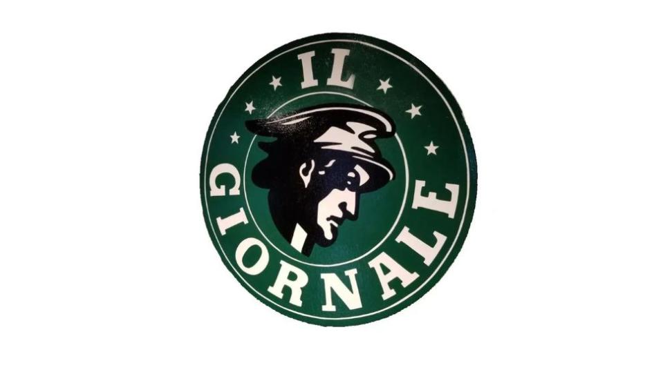
By 1987, the Starbucks founders had decided it was time to move on. They sold their company to Schultz, their former employee, who took possession of Starbucks’ roasting plant and six Seattle stores, as well as its name. He decided to bring his Il Giornale cafes under the Starbucks brand, but he wanted to keep a little something of his successful venture as the chain moved forward.
Once again, the top team at Starbucks turned to Terry Heckler, this time briefing him to elegantly combine the logos of Starbucks and Il Giornale. Heckler kept the basic format of the original Starbucks logo, but borrowed Il Giornale’s distinctive green for the colouring. He also took the opportunity to redesign the siren, who has a much softer and simpler look than she did before. She’s had a bit of a modesty makeover too, her formerly bare breasts now covered by her hair.
1992: Zooming in
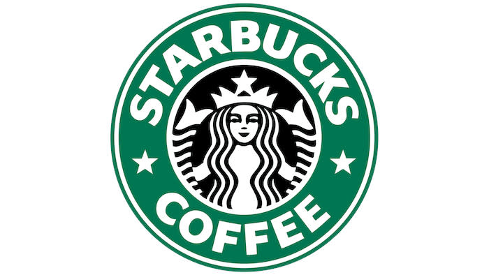
A rather small update to the Starbucks logo came along in 1992. At first glance it looks practically identical, however we are now viewing the siren from much longer, and can no longer see her entire body. The navel is gone, with a much tighter crop on just her face and the tips of her twin tails either side.
Otherwise, elements from the 1987 redesign have mostly been kept. We’ve still got stars instead of dots separating the words ‘Starbucks’ and ‘coffee’, the only two words on the logo (the days of ‘tea’ and ‘spices’ having long since passed).
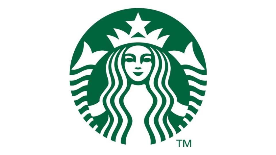
2011: Wordless wonder
By 2011, Starbucks had been running for forty years, and was an unqualified success story. Its ubiquity was so entrenched that it had been used as a gag on The Simpsons more than a decade prior, and the chain had come out of the economic downturn of 2008 bruised and battered, but still standing.
At the forty-year mark, it was time for a refresh. Starbucks global creative director Connie Birdsall worked with branding company Lippincott to create a new look for the coffee chain, and the solution they came up with was simple, but radical in its own way. They removed all words from the logo, freeing the siren to stand alone. Not many brands have a logo iconic and distinctive and well-established enough to pull this off. Starbucks, recognising its siren had the potential to be in the company of marks like the Nike tick and the McDonald’s arches, went for it.
It took some time to get it right. Initially, Birdsall and the team at Lippincott had overhauled Heckler’s siren design, trying to simplify it. But as much as they tried, something just wasn’t working – the siren had taken on an unsettling, off-putting quality that they just couldn’t quite shake. It was that classic uncanny valley effect, where something is made more unsettling by how close it looks to being human.
‘As a team we were like, “There’s something not working here, what is it?”’ Birdsall recalled in an interview with Fast Company. ‘It was like, “Oh, we need to step back and put some of that humanity back in.”’
Returning to Heckler’s work, they discovered the answer: asymmetry. If you look carefully at the siren design from 1987, she seems symmetrical, but she’s not. On the right-hand side of her nose, there’s a longer and a deeper shadow than there is on the left. It isn’t much, but it’s noticeable, and it proved to be key to shaking off that uncanny valley effect and making the siren feel a bit more welcoming – a bit more human. ‘The imperfection was important to making her really successful as a mark,’ Birdsall said.
The imperfection in the mark, and the removal of the words, also made the Starbucks brand much harder to imitate. Knock-offs had become a global problem for Starbucks, with cheeky coffee shops around the world borrowing the green-and-black colours and giving themselves clever names like ‘Buckstar’. By making the distinctive, imperfect siren the star of the show, and taking away that legible but replicable font, Starbucks made itself a singular sensation once again.
To explore the stories behind other famous logos, see our logo histories posts.

