Soft orange decor – 3 ways to embrace this on-trend color for a warm interior aesthetic
Soft orange is a color that's taking over our interiors. If your experience is anything like ours, every modern home you've stepped in lately has had flashes of burnt orange, rich saffron, and smoky cayenne pepper worked into the color scheme (and no, we're not talking about literal spices).
Pinterest searches for a soft orange aesthetic have risen by nearly 200 percent in the last year, according to research by Mojo Mortgages. The home decor trend is all about embracing comforting, warm tones like apricot and peach through your design ideas.
Designers are loving it too. From 70s-inspired orange and brown patterns to earthy orange rustic tiles, gentler hues of this typically bright color are absolutely everywhere right now.
While anyone can appreciate its beauty, incorporating a soft orange into your existing color scheme is easier said than done. For advice on how to embrace the latest interior design trend, we asked the experts for their advice on using it within a color palette.

Lilith Hudson
Junior Writer
Lilith is an expert at following news and trends across the world of interior design. She regularly shares color stories with readers to help them keep up-to-date with ever-changing trends that promise to add personality into the home. For this piece, she spoke with leading designers to hear their advice on what to pair soft orange with for the perfect color palette.
1. Go bold and color drench your room
To truly embrace a color trend, color drenching is the way to go. Nothing says bold like a monochromatic color scheme, and orange's plethora of nuanced shades lend themselves beautifully to this trend.
Use a soft orange paint color like Andrew Martins' Cayenne Pepper on all four walls, adding splashes of other shades of orange throughout the rest of the room. This will also have the perfect warming effect in your home as the cooler months set in. 'Add burnt oranges and deep red tones into rugs and cushions,' says Martin Waller, Founder of Andrew Martin. 'Think of a scattering of fall leaves.'
To really play up this idea, try tonal layering with different shades of orange. Use a richer burnt orange on your woodwork and try a lighter orange shade on the ceiling to really reap the benefits of this versatile color.
2. Pair with pink for a softer edge
Thought to clash by some, the vibrant color combination of orange and pink can actually be extremely complimentary thanks to their close positions on the color wheel. A soft orange marries beautifully with pale pink for a more playful approach to this color trend.
When it comes to how to create a color palette using orange and pink, consider the depth and richness of the shades as well as the tones themselves. Head of Design at Christy Lucy Ackroyd explains: 'The deeper and more opulent the shade you choose, the more of a cocoon-like effect it will create.'
She continues: 'Terracotta can bring this sense of depth and is perfectly paired with softer colors like soft pinks to create a cohesive color palette, promoting comfort and warmth.'
For a cozy boho bedroom idea, Martin suggests introducing pink and orange through patterns. 'Throw caution to the wind and choose brightly colored patterned wallpaper in vivid orange and pink hues,' he suggests. 'Accessorise with ikat and kilim printed cushions and lampshades to complete the look.'
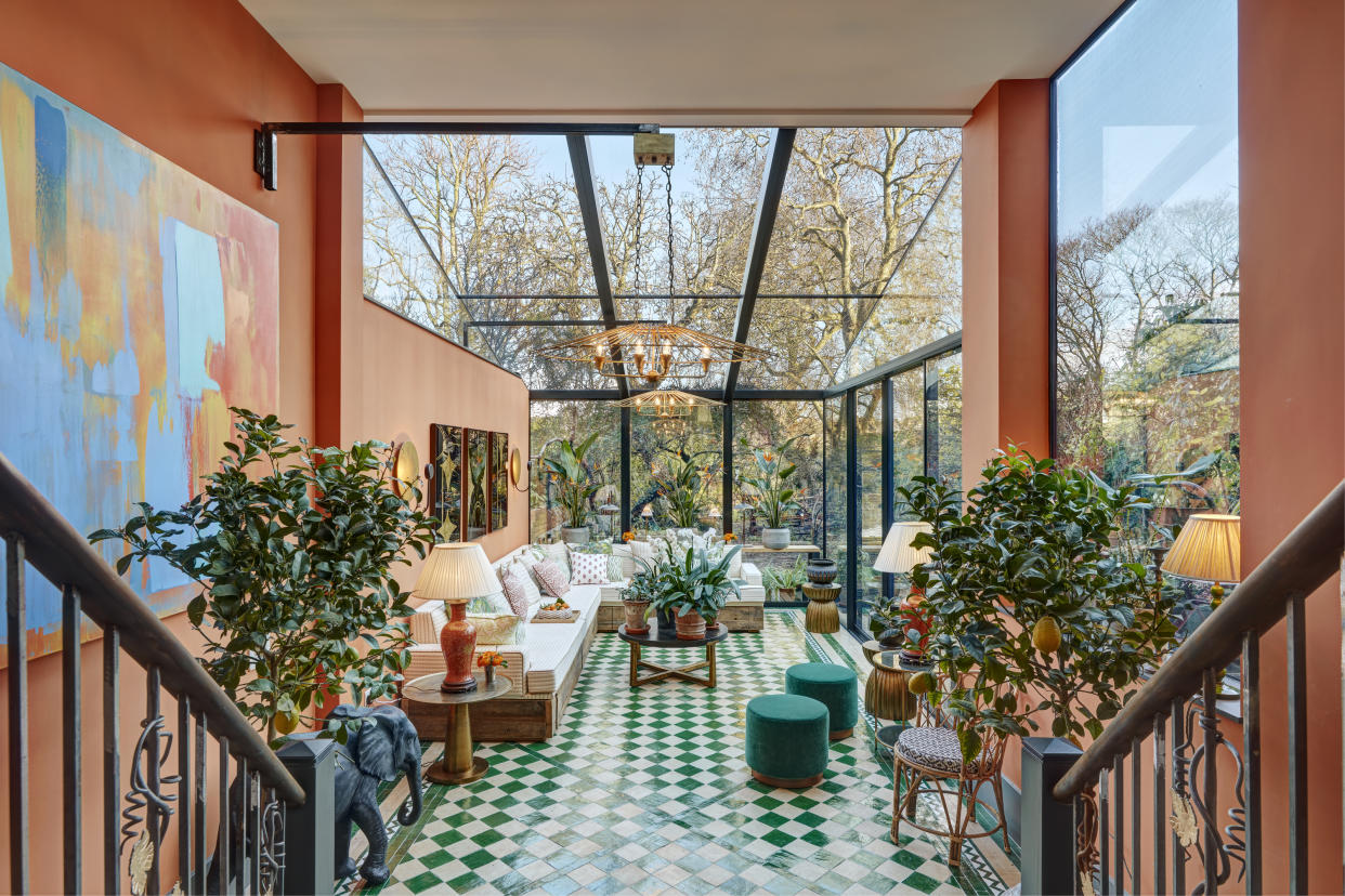
3. Layer with green for a calming contrast
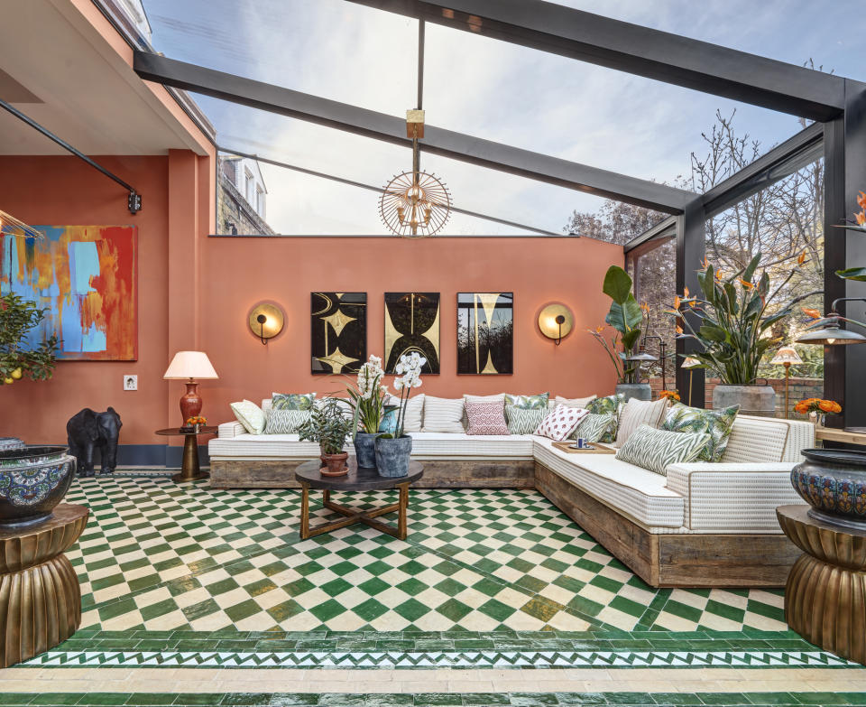
Take inspiration from the outdoors by adding natural greens to your orange interior. Despite being stark contrasts, a soft orange can really accentuate a rich forest green, helping to create a fresh and modern look.
Of course, there's no better place to embrace orange and green than within an orangery, as seen in above in the design by Max Buston. The floor design was the springboard for this soft orange aesthetic, made from Moroccan hand-glazed tiles.
'I was then thrilled to find Malahide from Edward Bulmer,' explains Max. 'It's a color bringing so much joy and depth to the space. It feels completely calm and in harmony with the room and the outside, and yet, it's after all a bright bold orange!'
When it comes to pairing a soft orange with green, Max suggests experimenting with different green shades throughout the space. 'A layering of greens go so perfectly with orange tones,' he says. 'There are so many greens in nature and you can carefully use several in a room. Either the forest and olive greens, or the emerald and turquoise - both go equally well and yet create a very different feeling.'

