Sherwin-Williams just released its 2024 color palettes – these trend predictions are how we'll be decorating next year
It's that time of year again - color forecasting season. This time in the design calendar is like Christmas for us. With new paint predictions cropping up on the daily, we're like kids in a candy shop as we marvel at all of the shades anticipated to shape the year ahead. And of course, when it comes to a curated color palette, we can always count on Sherwin-Williams to have us covered.
The iconic paint brand has earned itself a prestigious name in the world of color trends with its Colormix Forecast, but for 2024 they're taking a brand new approach. Dubbed Anthology: Volume One, this year's collection of four palettes marks the start of a fresh biennial approach to the brand's color trend report that puts a bigger emphasis on the colors themselves, rather than any associated themes or names.
Comprising 48 hues, the collection will explore four palettes set to define the year ahead organized by color family: blues and greens, reds and purples, deeps and darks, and delicate tints. 'This year we're launching an approach that strips out the stories,' explains Sue Wadden, director of color marketing at Sherwin-Williams. 'We were finding there was a lot of noise in the trends space that was less about the color, so we're giving each palette a number instead.'
Here we take a look at each of them so you can take a glimpse at the future color trends set to take over our homes, alongside Sue's expert decorating tips on how to incorporate them into your space.
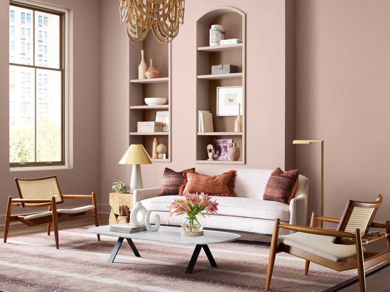
Palette 1 - Greens and Blues

The first palette in Sherwin-Williams's latest Colormix Forecast is a fresh take on the most enduring shades of recent years: green. Beyond the earthy forest and sage shades of recent years, however, Sherwin-Williams is looking ahead to a brighter future with a range of blues. 'It made sense to combine blues into a nature-inspired palette,' says Sue. 'It's the expression of a green forest converging with watery tones, but it's also a guidepost for what's to come in 2024 as we see a shift towards indigo, denim, and ethereal blues.'
It's a trend that signifies a marked departure from the warmer tones that infiltrated our homes post-pandemic. As Sue explains: 'We've all been talking about warmth, but we're also seeing peekaboos of these silvery tones which suggests a new color evolution.'
A shade that embodies this is Stardew, shown above. The cool, pastel tone is one Sue suggests on kitchen cabinets for a tuxedo look (a trick that makes use of a light shade on top cabinets and a darker one on the bottom) but it works equally well in a bathroom or for a blue bedroom. 'Blues are traditionally very successful in those types of respite rooms,' she says. 'The great thing about Stardew is it looks great virtually anywhere you put it because it's such a muted undertone that it almost acts as a neutral.'
If you're looking for a more invigorating shade, Aquastone is a cosmic, almost neon-inspired shade perfect for color blocking. 'Compared to Stardew, this is a color I'd recommend using sparingly,' says Sue. 'It's a color that has a lot of energy so I wouldn't use it in a bedroom where it would look too vibrant. Instead, use it as an accent in sunrooms or spaces with a lot of light.'
Palette 2 - Reds and Purples
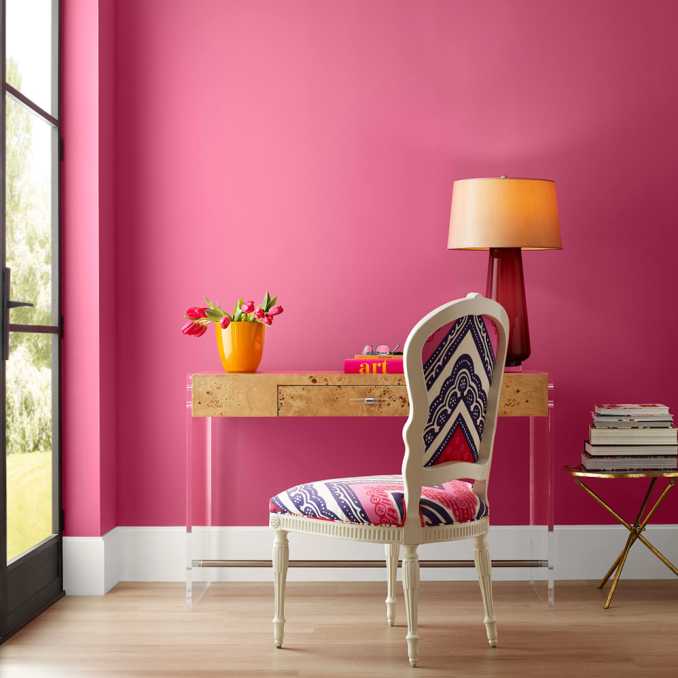
A display of dynamic and nostalgic pops, the second palette ranges from warm red tones to soft and cheerful pinks and purples. Balanced by natural earthy pigments that have maintained popularity this year, the palette offers muted and expressive hues to uplift any space alongside more playful shades perfect for injecting personality into the home.
When it comes to the latter, what better way to do that than with your own take on Barbiecore? Spurred by the recent movie starring Margo Robbie, pink is having a serious moment, and Sherwin-Williams's shade Dragonfruit, pictured above, is the closest hot pink to Barbie's genuine dream-house you're likely to find. Use it in small spaces like a powder room to test the water, or go bold and color-drench your entryway with this energetic shade if you really want to channel your inner Barbie.
Beyond playful pinks, however, Sue is keen to highlight the resurgence of reds. 'We haven't talked about reds for a long time,' she notes. 'It's a shade that has a lot of energy so it's going to be interesting to see how people use it now in 2024.'
How should we be using this warm, timeless, and at times tricky shade, we hear you ask? 'I love it in office spaces, dining rooms, and as an accent in the kitchen,' says Sue. 'That extends to the baked tones, beiges, and warm browns in the palette which are really high energy despite being rooted in the elemental, helping to bring lots of warmth and security.'
Palette 3 - Deeps and Darks
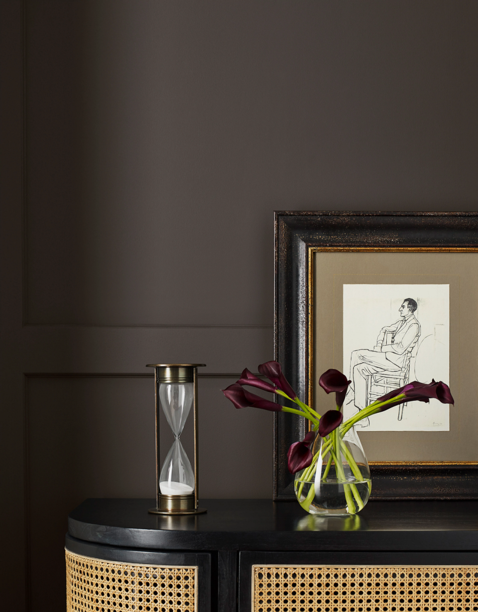
For a daring and powerful atmosphere, this range of dark and dramatic hues makes a wonderful moody contrast to bright whites and creams or gilded metallic accents. While the deeply saturated dark tones can be used to invite mystery and intrigue, they can also create a restful retreat that exudes quiet luxury.
As a whole, this third palette with its moody, atmospheric shades contrasts dramatically with the more cosmic, jewel-toned brights of earlier palettes. 'The world is full of duality and contrasts, and we wanted to get that across,' says Sue. 'This idea of dark tones breaking through the noise of color is also important. There's definitely an expression of a little bit of chaos linked to the mood of uncertainty we're currently experiencing in the world.'
A favorite of ours in this palette is Sealskin shown above, a cocooning color with a timeless, traditional feel. 'I love it best in a dining room,' Sue notes. 'It's brown-black with a rich brown undertone which means it looks spectacular with candlelight or moody ambient lighting.'
Palette 4 - Delicate Tints
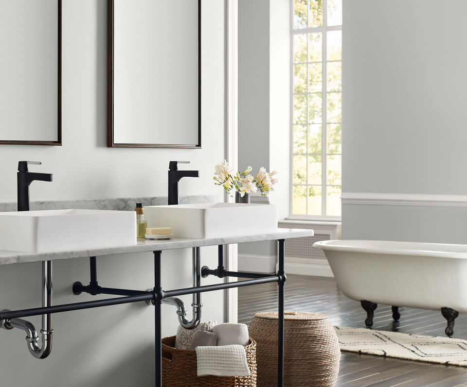
Last up is a delicate range of off-whites and neutrals that offer an escape from the constant distractions and demands on the senses. This palette of hushed and airy hues is perfect for mastering a signature minimaluxe look, the soft tints balanced by warm and cool undertones creating a sense of sophistication.
When it comes to choosing the best white for your walls, Sue stresses the importance of considering a room's natural light conditions. 'Whites are difficult - they're the hardest color for people to work with - so I always start with a neutral white as an anchor,' she says. 'Weave in a bit of a tinted white with a pink undertone or a yellow if you want to warm your space up, or opt for a blue undertone for a fresh, airy feel (but avoid this in dark, north-facing spaces that are already cooler).' She also recommends using these whites as super light pinks or blues and alternative to pastels.
If you're not sure where to start, a versatile shade Sue predicts could be the new magnolia is Fleur de Sel. 'This color almost has a green undertone with a little blue,' she says. 'While not warm like magnolia, it acts as a chameleon white that looks great with everything.'
Itching to decorate yet? We know we are. Only time will tell which of these shades is most likely to take off, but if you ask us, 2024 is shaping up to be a pretty exciting year for decorating...
Where to shop for paint online

Farrow and Ball
The beloved paint brand can be shopped direct from the Farrow and Ball website. Look out for a range of new colors, just launched, for new inspiration for your home

Lick
Lick is a relatively new upstart in the world of paint, but has a range of beautiful colors and collaborations with top names in the world of design, including previously with Livingetc.

Backdrop
We love the color curation of Backdrop for a fun, modern take on decorating. They recently launched an official Barbie color palette, which is feeding into our love of the Barbiecore aesthetic.

