Sherwin-Williams’ 2024 Color of the Year Is Cool, Calm, and Collected
This breezy blue shade will invite plenty of serenity into your home.
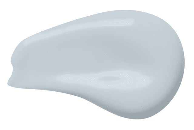
It’s that very special time in early fall when brands are announcing their trendiest paint colors, and one of the heavy hitters we were so excited to hear from was Sherwin-Williams, which just revealed that their 2024 Color of the Year is Upward. It’s a very pale, dreamy blue with soothing gray undertones; it’s crisp, clean, and timeless. (Very Real Simple!) Consider it a color that really enhances your mental wellbeing—it imparts a sense of tranquility so many of us seek in our homes, a respite from the frenetic energy in the world.

Sherwin-Williams
The color was so eagerly anticipated that even the food industry wanted to participate in sharing the happy news—Sherwin-Williams partnered with the iconic pastry chef Dominique Ansel to create his first-ever vegan Cronut inspired by Upward. The croissant-doughnut hybrid has a filling and fondant topping that’s naturally tinted with Butterfly Pea Flower Tea (no fake dyes here!), but it’s limited-edition so if you’re in New York City, definitely grab it ASAP by September 24! (Various members of the Real Simple team had a taste, and we can confirm it’s delicious.)
Related: 7 Timeless Paint Colors You Will Never Regret

Sherwin-Williams
To explain why Sherwin-Williams opted for this cool hue, Sue Wadden, the brand’s director of color marketing, says it “represents the gentle forward momentum in all of our lives. It brings to life that carefree, sunny day energy that elicits a notion of contentment and peace.” That’s actually a pretty apt description, and we didn’t even think it was possible to capture that in a color—but Sherwin-Williams was able to!
Plus, with all of the warm shades popping up right now in design, especially as we enter cozy season, Upward is a refreshingly different choice. Sherwin-Williams acknowledges it’s a departure from last year’s earthy, clay-like color, Redend Point, stating that it’s “an invitation to open minds to a color of ethereal calm that is ever-present—if we remember to keep looking up.”

Sherwin-Williams
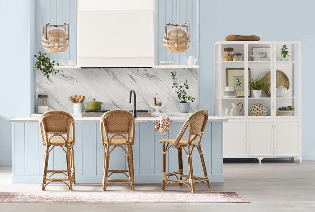
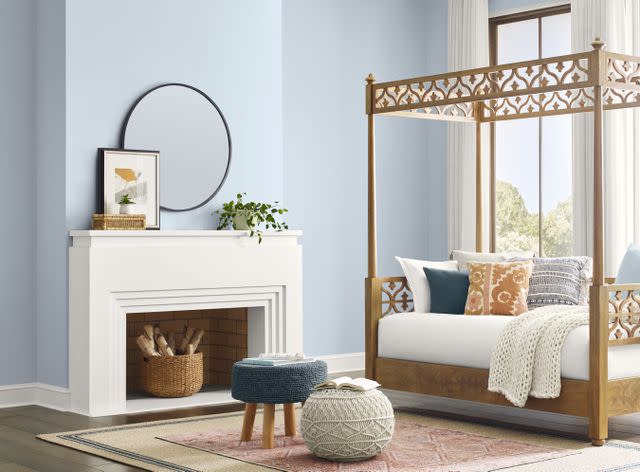
Pair this slightly frosty shade with cream or pastel soft goods, along with lighter wood tones like oak, for an open, airy vibe. The versatile shade works well in a bedroom (think meditative spaces!) but translates nicely in other spaces like dining rooms and common areas. Essentially, Upward is incredibly versatile and functions beautifully as a transitional shade, an accent color, on exteriors or interiors—even across multiple design styles like coastal and Nordic.
Related: Top 5 Paint Colors for Fall 2023
For more Real Simple news, make sure to sign up for our newsletter!
Read the original article on Real Simple.

