See Why This Charming San Francisco Home's Designers Call It a "Cottage Mullet"
"Hearst Magazines and Yahoo may earn commission or revenue on some items through these links."
While some interior designers approach a blank slate with a vague inspiration in mind to guide their process, others have a very specific vision. For a four-bedroom residence in San Francisco, Redmond Aldrich Design's Taylor Shanahan and Chloe Warner opted for the latter. "Our design concept for the home was a modern cottage complete with British-inspired floral prints, antique rugs, and a faded, comfortable vibe," Warner says. "In other words, Edwardian in the front and glass box in the back. Like a cottage mullet." As the design duo quickly learned, the clients, a young family with two children, weren't afraid to have some fun with their new home.
The pair didn't simply add a few colorful details to the clients' inherited collection of antiques to make the space feel eclectic; they transformed every inch of the home, infusing it with highly personal touches. "Before we got our paws on this house, it felt dark and dated," Shanahan says. "We loved all of their antique furniture that had been passed down to them, but it needed a mix of modern pieces to add interest." They also had a clever solution to infuse the dark walnut casework on many of the walls with some playfulness. "We deployed wallpaper, tile, and color everywhere we could," she adds.
One area where their creativity really came into play was the living room, where the walls are coated in a pale shade of pink. Warner says, "The clients were trusting enough to let us paint the walls and casework in our favorite neutral paint color, Glidden Water Chestnut, which is a dusty pink and creates a nice ground for the mix of floral and geometric patterns in the room." One such geometric feature is the large-scale artwork by Ethan Cook that hangs on the wall behind a vintage daybed the client had found years earlier.
Though most home's rooms show off Shanahan's and Warner's clever use of color and pattern, the designers took a different approach in the primary bedroom. They used the most serene palette of all there to make it the most calming sanctuary possible. The primary bathroom feels like a natural extension of it, with the same refined elegance. Shanahan says, "We wanted it to be a good friend to the bedroom, so we extended our relaxed palette."
The biggest transformation took place on the ground floor, which served no real purpose—neither functionally nor aesthetically—before the house got its face-lift. Martinkovic Milford Architects reworked its layout and the entire rear facade. "The overall goal was to connect the ground floor with the main level because there was so much opportunity there—it just hadn't been built out properly," Warner explains. "The result is the ground floor that now houses a full-size guest bedroom, bathroom, family room, mudroom, and a two-car garage."
After nearly four years under the proverbial design knife, the home is finally living up to its potential, the designers say. "Once you enter, everything just seems to open and lighten up," Warner adds.
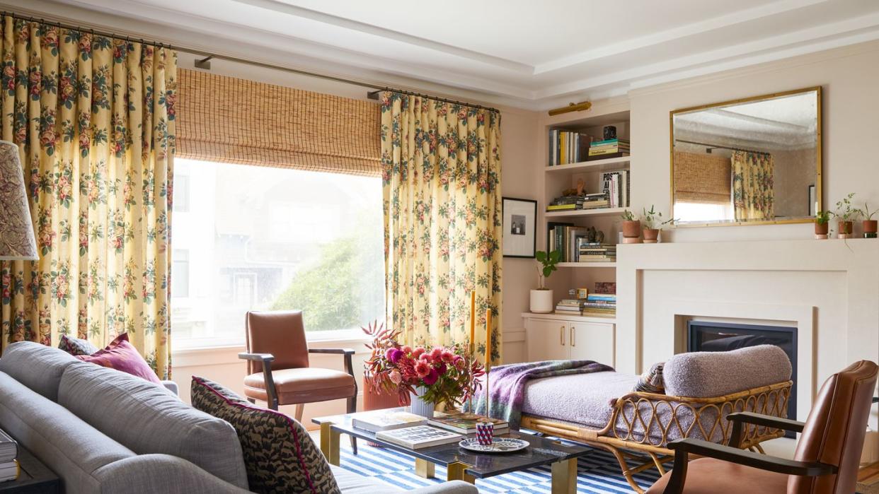
Living Room
Pictured above.
"Here, we mixed the clients' heirloom furniture with new pieces that help make the room such a charming and interesting space," Shanahan explains. "I think this image best represents our client. They are fans of pattern, and they are collectors." Drapes: Jasper. Vintage armchairs: clients' own. Area rug: Safavieh.
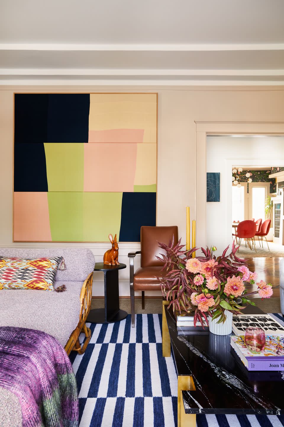
"Caroline Brinckerhoff was the art consultant," says Shanahan. "We feel the art brings the space to life, and we are so in awe of her contributions." Artwork: Ethan Cook. Coffee table: CB2. Rattan daybed: vintage.
Family Room
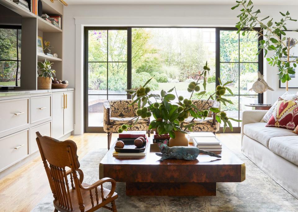
"This is the view of their backyard from the family room. The backyard was phase two of this project, but during design development for phase one, we knew we wanted there to be connection between these two multilevel spaces," says Shanahan. Vintage coffee table: Willy Rizzo. Area rug: Fort Street Studio. Wooden armchair: clients' own.
Kitchen
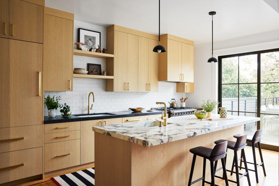
"During design development, we knew we wanted the kitchen island counters to be the star and to serve as a nice complement to our the rest of the soapstone counters," Shanahan explains. "We had this Viola marble sample from the beginning of the project, and when it came time to secure a slab we had already found the perfect Viola match." Stools: Muuto. Pendants: Lambert & Fils.
Breakfast Area
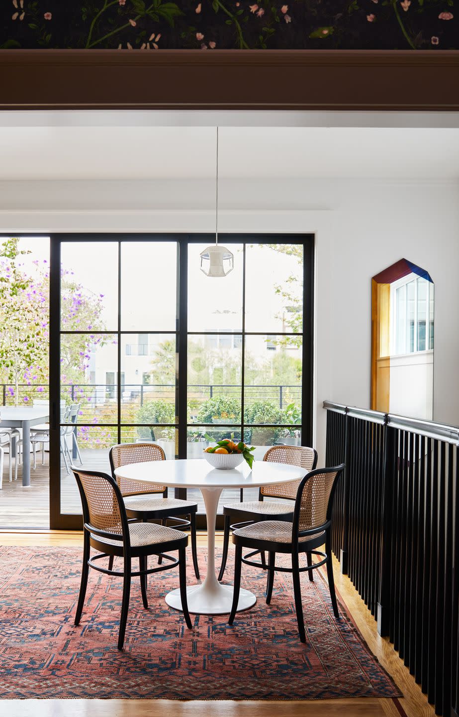
"This is the breakfast nook behind the kitchen on the main level," Warner says. "The stair rail leads you to the downstairs family room, guest bath, and mudroom." Saarinen table: DWR. Chairs: clients' own.
Dining Room
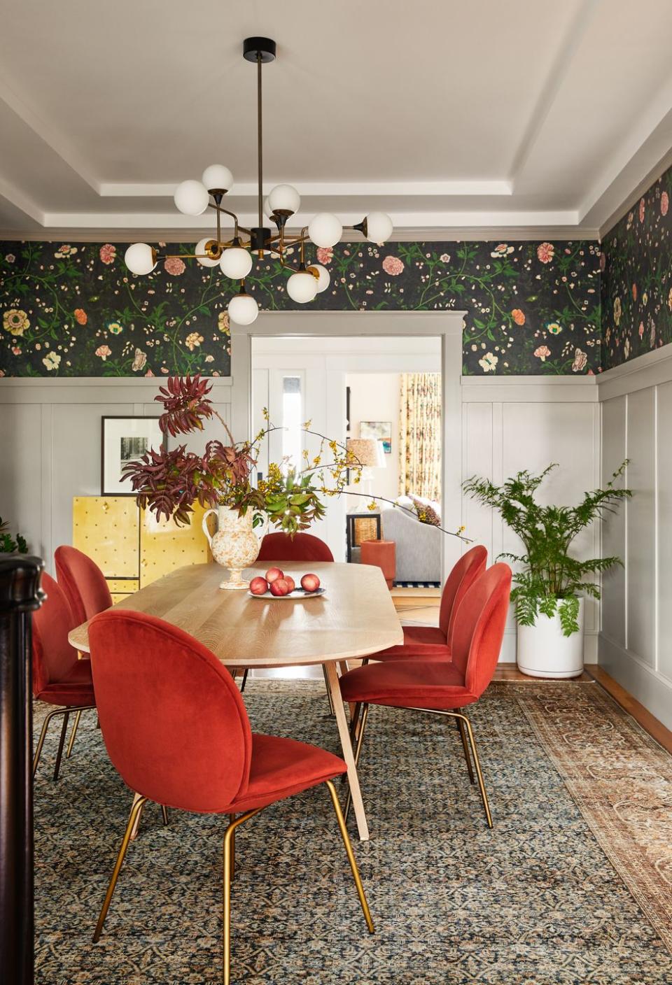
"One of our favorite finds in this project is the set of dining chairs. We came across them at World Market of all places. They were sold as a pair, and we may have bought the rest of them because I haven't seen them sincea—and I've been looking!" Warner says. Wallpaper: Pierre Frey. Vintage chandelier: Stilnovo. Table: Studio Ilse.
Primary Bedroom
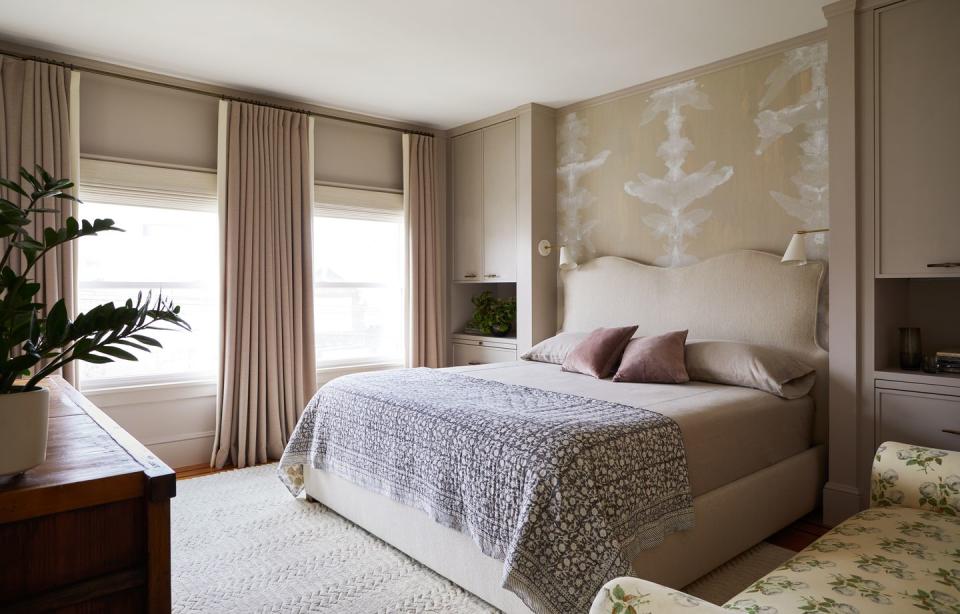
"The inset bed wall was a way to work around the venting behind the wall. We came up with this fun idea to give each client their own personal bedside table with upper and lower storage, creating a little nook for the bed. It worked out nicely!" Shanahan says. Wallpaper: Porter Teleo. Drapes: Sandra Jordan. Bed: custom.
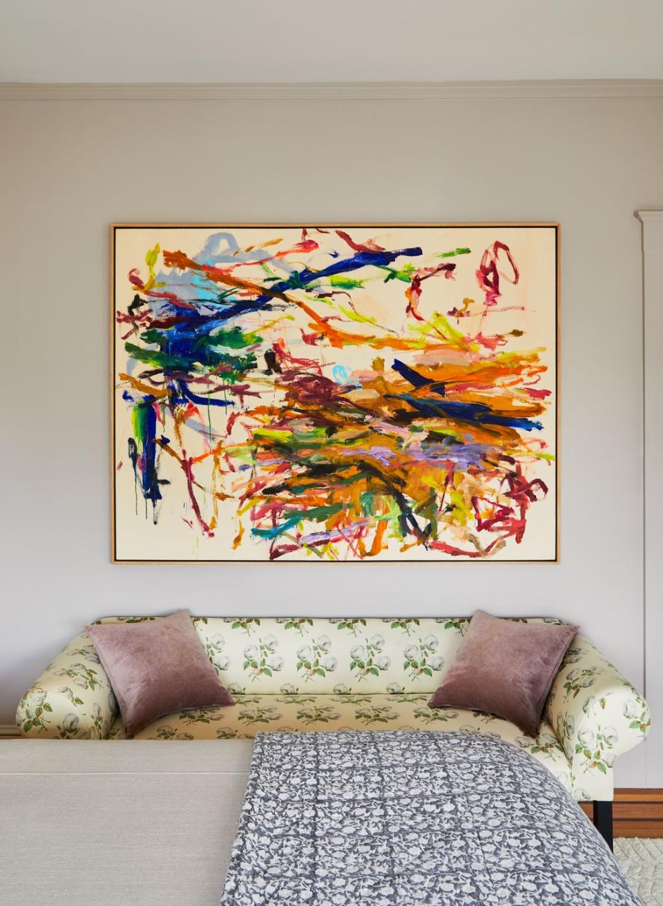
Sofa: John Derian. Art: Kikuo Saito.
Daughter's Room
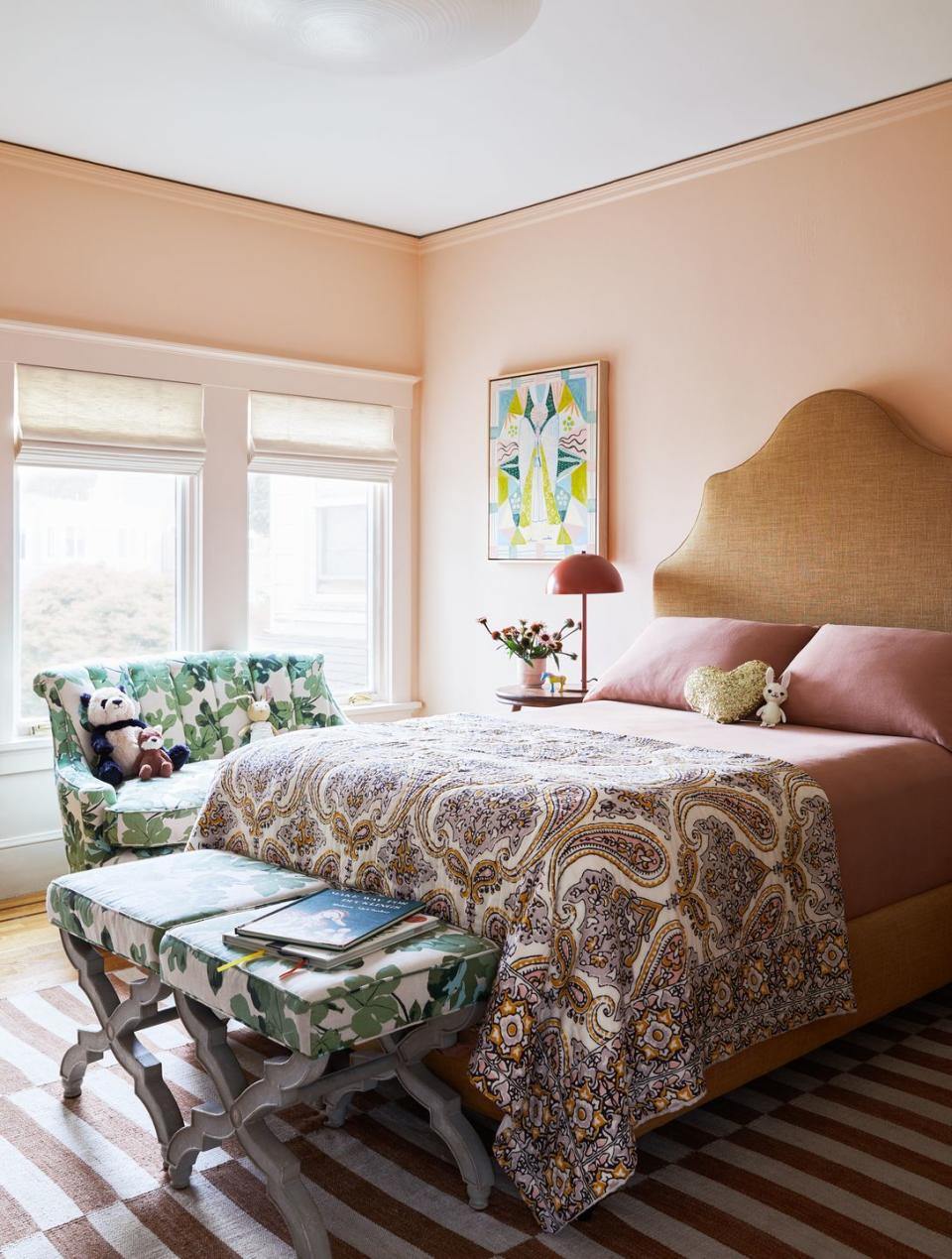
"We didn't want this room to feel too juvenile. In fact, we sought to create something their daughter could grow into, so we combined greens with pinks, adding some depth and taking out some of the girliness," Warner says. Paint: Tissue Pink by Benjamin Moore. Settee and X-base stools: designers' own from a former project. Headboard: Serena & Lily.
Son's Room
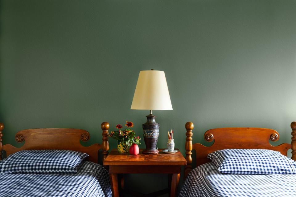
"The twin beds, table lamp, and side table are our clients' pieces. I think we used every last one of their heirloom pieces," Warner says. "We painted the walls in Farrow & Ball Card Room green, a lovely color that makes the space feel moody and simple."
Primary Bathroom
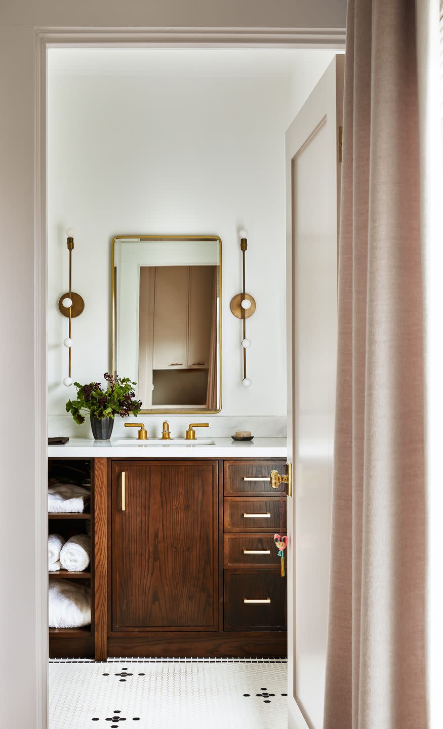
"We designed the floor tile layout that included black hex floral details throughout the space," Shanahan says. "It breaks up the paleness of the space in the perfect way." Sconces: Apparatus. Mirror: Pottery Barn.
Q&A
House Beautiful: How did you save money/DIY/get crafty? Please detail as many of these as you can!
Taylor Shanahan: We leaned on several of the client's existing pieces. They had such great taste, so it was easy! They had a variety of heirlooms that had been handed down to them such as the entryway console and the brown leather lounge chairs. We just found a new way to highlight them in the space.
HB: How extensive was the project?
Chloe Warner: This project was a full remodel but approached in a very civilized way. We came on after Martinkovic Milford Architects and took our time designing each space. The house had good bones but needed to be more accommodating for their family.
HB: How did this project come about?
CW: The client was walking by one of our projects and admired our job-site sign, actually. She and I overlap almost completely on most aesthetic things: fonts, graphics, music, cocktails, food, architecture, and interiors. It's been one of the most organic and lovely projects our firm has worked on. Almost instantly after she reached out, we were off to the races.
Follow House Beautiful on Instagram and TikTok.
You Might Also Like

