See The Renovation That Convinced This Couple Not To Sell Their Home of 30 Years
"It was what I call a Frank Lloyd Wrong," says designer Carolyn Miller of her latest project, a 1930s Pacific Palisades farmhouse that had fallen victim to a series of bad renovations in the 30 years since its owners moved in. Once quaint and charming, the home had devolved into a fragmented maze as the owners attempted to personalize it. "A lot of the house felt disjointed," says Miller. "The ceilings had different elevations and the stairwell was this awkward space that bisected the house," she recalls. "Everything had its own idea."
The clients, who are longtime friends of Miller's, were just about ready to sell the house and start over. "They were hesitant to put good work on top of bad work," explains Miller. But after some gentle convincing, the couple finally agreed to one last renovation. "They wanted to bring the house into its best possible state. And they trusted me to do it."
Getting it right meant embracing the home's original craftsmanship and removing remnants of past remodels to achieve the practical, yet elegant aesthetic the clients had been seeking all along. "We always wanted to keep the charm," says Miller. "But there were multiple areas that just didn't communicate with each other. So opening all of that up and making it all useful was their main goal.
To do that, Miller sought symmetry between preservation and renovation. "The goal was to maintain some of the farm, cottage feel with authentic, natural finishes while giving the client modern conveniences, an expanded footprint, and a more sophisticated, forward palette," says the designer.
Structural changes—like releveling the ceilings and refiguring the kitchen layout—offer the sort of continuous flow that had been missing from the initial floorplan, while adding materials original to the home recall its history. To balance olfd and new, industrial materials—like steel doors and beams—are juxtaposed with a teeming collection of art and antiques. "We did a few really special touches. But I don't consider them luxurious. I consider them going back to the original craftsmanship," says Miller.
Tour the home below.
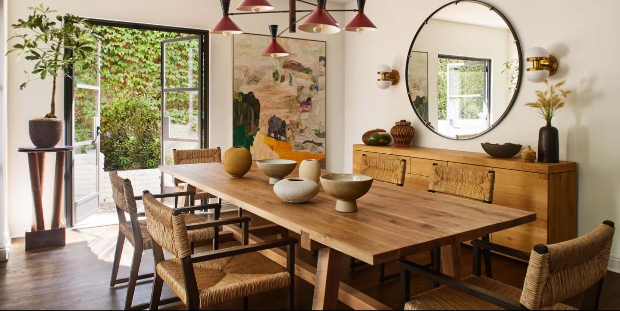
Dining Room
"The dining room is really the lifeblood of the house," says Miller. Situated next to an outdoor hangout, the space room serves as a de facto main entrance. "It has the most access to the indoors and outdoors," explains Miller. "And, you know, it's where the doggy door is," she laughs. "It was also one of the main areas where we cleaned everything up," says Miller, referring to the ceilings. "We wanted everything to be at just one height."
The focal point of the room is an oversized painting by Swedish artist Andreas Erickson. "I used that painting as the foundational piece for this space," explains Miller. "I played off the colors, so there are little touches of red and green. And all of the warm tones in the painting are reflected in the oak furniture."
Dining Table: Custom. Dining Chairs: Harbour. Light Fixture: Muselli.
Living Room
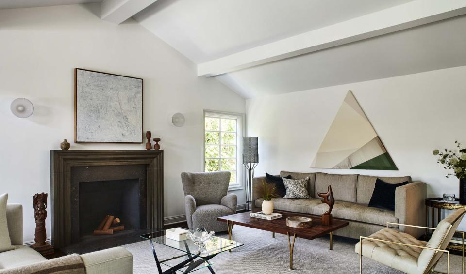
"The goal for this space was to have a sort of a palette cleanser when you enter in the house," says Miller. The restrained background serves as the perfect canvas for the clients' art collection, which "always felt like such a hodgepodge" against the old scheme.
Mantel: Francois & Co. Art: Rebecca Ward, Mckenzie Dove. Cocktail Table: Lawson Fenning. Coffee Table: Angelo Ostuni. Lamp: Vintage, Arthur Umanoff. Sconces: Allied Maker.
Kitchen
The bulk of the structural work is reflected in the kitchen, which needed a higher ceiling and a new layout. "It took the most amount of time," Miller says of the process, which included leveling the backyard and installing new structural beams that support the new kitchen as well as the rest of the house.
"The goal was to reorient the kitchen to be as open and as communicative with the dining room as possible," says Miller. Several windows were removed to fit a wall of appliances behind a larger, outward-facing island that houses the sink. "We reoriented the sink to be in the island so that it would be perfectly lined up with the opening towards the dining area," explains the designer. "Before, the faucet was where the oven is now, so she was just staring at a wall," Miller explains.
With the kitchen more open, it was important to Miller that clutter be tucked away. "I wanted it to be really easy for them," she says of her decision to add a hidden appliance garage. "Yes, they like it to be elegant. But in their day-to-day life, they don't want anything to be complicated."
Range: Fisher Pykell. Dishwasher: Miele. Light Fixtures: Early Electrics. Hardware: Rocky Mountain Hardware. Stools: Ethnicraft. Artwork: Jonas Wood, Grace Weaver.
Den
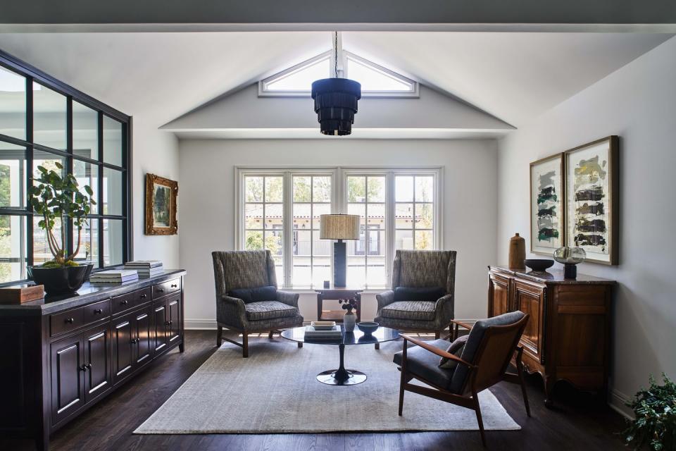
"This was another hodgepodge room where there wasn't really a proper entry hallway," says Miller. To create a distinction between the front door and the adjacent den, she installed a steel interior window to visually separate either space. "It looks like it was always meant to be this way," the designer says.
Main Bedroom
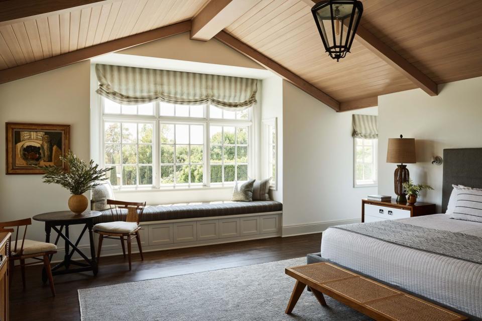
"The major thing that we did was refinish the ceilings," says Miller. "It had been a dark, over-stained pine. So we basically bleached it and then whitewashed it with custom glazing to give it this beautiful, warm tone." The designer removed wall-to-wall carpeting and replaced it with red oak flooring to match the rest of the home (and recall a look that matched the home's original era). "I wanted to unify the house with just one floor," emphasizes the designer.
Rug: Armadillo. Bed: Maiden Home. Sconces: RBW. Wall Paint: Benjamin Moore, Decorator’s White. Trim Paint: Portola, Stone.
Backyard
"We always wanted to keep the farmhouse aspect," says Miller, who replaced kitschier red siding with white board and batten for a more refreshed look. "Even though the Sonoma farmhouse look is so ubiquitous now, it was actually appropriate for this home. We weren't forcing it, you know, it was always a barn."
Follow House Beautiful on Instagram.
You Might Also Like

