What’s the secret to great video game box art?

- Oops!Something went wrong.Please try again later.
What’s the secret to good video game box art? I think it can be boiled down into a few key ingredients: memorability, readability and beauty. Naturally video games have an innate emotional factor too; can you really dissasociate a love of a game from its box art?
It almost goes without saying that a good cover should stand out. If you want someone to pick up your game in a shop – or more likely these days, click on your game in an online store – then it has to look a little bit different to everything else. So it has to be novel, but that’s not enough – you need people to remember it weeks or months later, the gap between, say, a game’s announcement and the time it finally goes on sale.
Then there’s readability: does the cover tell you what you need to know about the game? I’m not just talking about the legibility of the text (is that a ‘6’ on the Resident Evil cover, or is it a giraffe?), I also mean whether the box art clearly shows the intent of the game. What will this game be like? Is it scary? Lonely? Funny? The cover art should evoke the spirit of the game, its emotions and themes, even if it doesn’t show the game itself.
Over the past four decades, box art has changed dramatically, moving from hand-painted art to the now-ubiquitous CG renders
Finally, there’s beauty. Does it actually look good? Would you want to put this box art on your wall? While the best movie posters have been talked about in revered tones for decades, video game box is just now catching up. And this despite some incredibly talented artists working on classic game art, including Cliff Spohn who worked on Atari carts, Roger Dean who painted for Psygnosis and Stephen Bliss who created the look of Grand Theft Auto.
Over the past four decades, box art has changed dramatically, moving from hand-painted art to the now-ubiquitous CG renders. And as the games industry has grown, there has been a trend towards homogenisation, a basic template for covers that you can see repeated endlessly. With so many millions of dollars at stake on each big AAA release, it’s perhaps little wonder that publishers want to play it safe.
But the very best box art breaks out of the mould, offering something that sticks in the mind years, even decades later. Below I’ve picked out five such unforgettable covers, my personal favourites.
Centipede (Atari 2600, 1982)
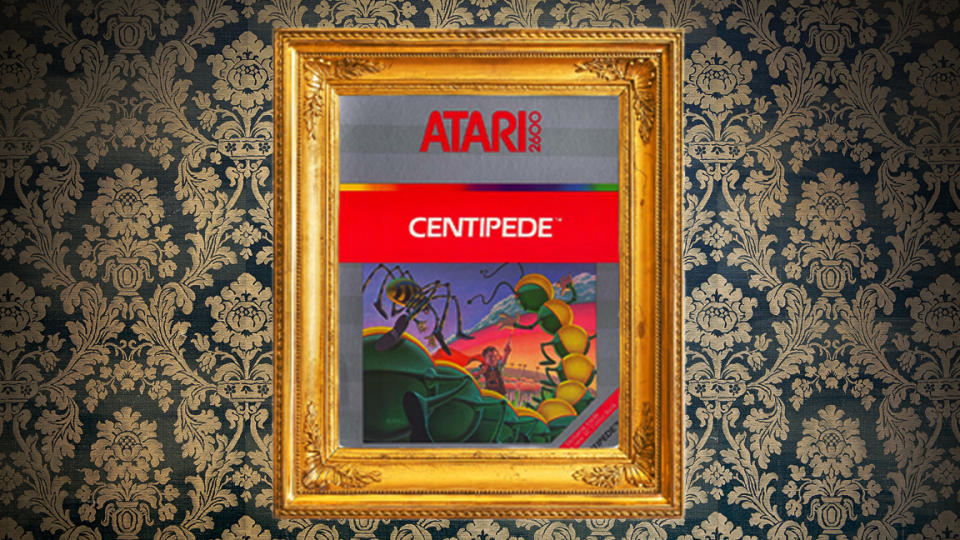
I chose Centipede to represent the startling and often beautiful artwork that graced the covers of many Atari 2600 titles. Atari's first graphic artist, George Opperman, who also created the iconic Atari logo, was charged with establishing a team of artists - that included Rick Guidice, Hiro Kimura and Susan Jaekel - to create cover art that ignite the imagination and interpret coloured 8-bit blobs into something, well… amazing.
Centipede is arguably one of the lesser, more restrained, examples. The eerie cover of Defender, showing civilians panicking at the threat of alien abduction, is perhaps a better showcase of evocative Atari 2600 art, along with titles like Haunted House and Basic Programming.
I chose Centipede because of my personal memories of how the box art affected my enjoyment of the game itself
But I chose Centipede because of my personal memories of how the box art affected my enjoyment of the game itself. It’s a good example of how an evocative cover can not only affect your decision about whether to purchase a game in a shop, but also how it can colour your perception of the game’s world.
Gamers had little to go on back in the early 1980s. The various blocks and blobs that populated the screen could well have been anything. But by looking at the cover, I knew that the blob I was controlling was actually a determined, pointy-haired wizard fellow with a wand, fighting giant-sized insects in a mushroom forest. I carried that image with me while playing the game, transforming the simple, pixellated blobs into towering monsters in my mind.
As graphics improved, the role of box art became less and less about firing players’ imaginations to fill in the blanks left by crude pixels. But I’d argue that even now, we still take perceptions from a game’s cover art into the game itself.
Prince of Persia (Apple II, 1989)

In a blog post earlier this year, Prince of Persia creator Jordan Mechner explained how he had to fight for the iconic cover to his 1989 game, the original artwork for which sold for $55,000 at auction in January.
Mechner’s idea was to look back to the "old-school Hollywood swashbuckling film posters" of the 1930s, as well as to Raiders of the Lost Ark (1981), which was itself inspired by 1930s movie serials like The Adventures of Robin Hood. He explains that the marketing team at Broderbund were nonplussed by the idea, especially when the cost of Robert Florczak’s artwork came in $5,500. But Mechner had a supporter in product manager Brian Eheler, and lobbied hard for the cover, eventually winning out – even if management insisted on the sultan’s daughter’s décolletage being partially covered up.
The Prince of Persia cover is a great example of how a high-quality piece of artwork can really elevate a game. But it also does a superlative job of evoking the spirit of the experience, immediately selling the idea of an old-school swashbuckling hero out to thwart a dastardly villain. And the fact it evokes classic movie posters is a nod to the cinematic quality of the game, which used actual film – via the process of rotoscoping - to create some of the silkiest, dramatic animation yet seen.
Above all, the Prince of Persia cover is a reminder that sometimes looking to the past can be just as effective as searching for something new. In an industry as future-focused as gaming, that’s easy to forget.
Wizkid (Amiga, 1992)

Bob Wakelin was a prolific cover-art designer back in the 1980s and 1990s. He worked on dozens of games published by Ocean and Imagine, including Where Time Stood Still, The New Zealand Story, Renegade, Rainbow Islands, Chase H.Q., and many more. (Read our guide, 'The best video games of 80s' for an idea of why this decade is so fondly remembered.)
Wakelin’s artwork, alongside that of his contemporaries such as Oli Frey, epitomised the era. Back in the 80s and early 90s, before the rise of the computer-generated cover, box art was often a lavish affair, hand-painted and meticulously detailed, frequently showing action heroes locked in battle.
But my favourite of Wakelin’s covers is for Wizkid, a now barely remembered game from Sensible Software. The game’s creator, Jon Hare, has likened it to experimental jazz music, a surreal flight of fancy in between more traditional titles like Mega-lo-Mania and Sensible Soccer.
Wakelin brilliantly reflected the offbeat nature of the game by drawing inspiration for the cover from the subversive cartoonist Robert Crumb, delivering a perfect imitation of Crumb’s style. It’s an astonishing reflection of Wakelin’s incredible range, so different from his artwork for titles such as Renegade that it’s hard to imagine they’re by the same artist.
What’s so impressive about the artwork is how it superbly captures the essence of the game – like Crumb’s comics, Wizkid constantly surprises and subverts, and the cover expertly references some of the game’s more esoteric moments, such as the newspaper-reading cat seated on its porcelain throne.
Wipeout (PlayStation, 1995)

By the mid-1990s, we began to see the rise of the CG cover. As computer graphics improved, it reached the point where a high-quality 3D render of the game’s characters or vehicles could feasibly be used as box art. The disparity between what was shown on the cover and what was actually depicted in the game had begun to narrow significantly.
A positive step, perhaps. But at the same time it led to a standardisation of box art, with industry practice quickly centring around slapping a CG render of the main character on the front, while the tradition of hand-painted box art went into rapid decline. The CG-character cover is still standard practice today, seen in everything from Star Wars Jedi: Survivor to God of War: Ragnarok.
But Wipeout (see our Best videos games of the 90s guide) took a different approach in 1995. Rather than attempt to depict the game itself, it instead depicted the essence of the game. Created by Sheffield-based graphic design studio The Designers Republic, who had previously created album covers for artists like Pop Will Eat Itself and Aphex Twin, the Wipeout cover exudes clubbing cool, reflecting the game’s inclusion of dance music from acts including The Chemical Brothers and Leftfield. It’s playful, intense and above all intriguing, strewn with arcane symbols and Japanese lettering (which actually spells out ‘Designers Republic’).
It feels sophisticated, expensive, and the reflective metallic sheen of the paper only adds to the allure. In short, it was quite unlike anything else before it. As a way to sell the futuristic, groundbreaking 3D racing of Wipeout – and by extension the coolness of the PlayStation brand – it was unparalleled.
Ico (PS2, 2001)

The story of Ico’s box art is really the story of two covers: the generic North American one and the startlingly minimalistic Japanese and European cover. It’s often held up in online debates as an example of how North American games have often been saddled with subpar box art as a result of marketing executives second-guessing the tastes of consumers.
The creative director behind the North American cover, Brian Balisteri, has explained that "companies really wanted the computer-generated look" at the time, which by now had become standard practice for box art. But when Ico debuted in Japan a few months after its US release, it came with a cover that has since gone down as an all-time classic.
The Japanese box art for Ico was painted by the game’s director Fumito Ueda himself, and it evokes the work of Italian painter Giorgio de Chirico, particularly The Nostalgia of the Infinite, which features two small, shadowy figures against the backdrop of a looming tower cast in evening light.
First, the cover does a phenomenal job of expressing the atmosphere of the game itself, which consists of a lonely yet beautiful world in which the protagonists are dwarfed by the enormous architecture that surrounds and imprisons them. And second, it unashamedly positions this game as an artform, coming at a time when the debate about whether games could constitute art was only just gearing up.
It was a startling cover at the time, and even two and a bit decades later, it still retains its impact. Covers as good and as memorable as this are few and far between.
Game art, covered
These five covers are rare examples of box art that nails each category of memorability, readability and beauty. There are more: the UK cover for Resident Evil 4 sticks in the mind, for example, with its minimalist forest and lurking chainsaw maniac. But the key thing that ties them all together is how they strive to be different, to stand out from everything else. To evoke the spirit of the game without necessarily showing it.
If you enjoyed this trip down box art memory lane, then read our feature '15 best video game cover artwork' for more. I also heartfully recommend a visit to Bitmap Books, which has published compendiums of classic cover art for the Game Boy, Super Famicom and PC Engine, as well as the upcoming book The Art of the Box, which takes a look at iconic cover designs and the people who made them.
There’s also this interesting look at the psychology of cover art and the clichés that you can see crop up time and time again, as well as this rundown of seminal moments in video game box art from Cook and Becker.
Are you inspired to create game art, or perhaps you're working on your own indie game and want to craft a unique cover image, then hopefully my personal walk down memory lane has helped. In summery: be different, and make beautiful things.

