Residents criticise Californian city's minimalist new logo

Visalia isn't exactly the best known city in California. Located in the San Joaquin Valley, it's the state's 40th largest in terms of population size. But the city's new logo design already appears to be working to put it on the map, if only due to the controversy that it's provoking.
It's another case of a quite elaborate logo being dramatically simplified to create a flatter design with fewer elements (see our guide to how to design a logo). The aim was to make it more modern and identifiable, but many residents are upset over what they see as a major downgrade.
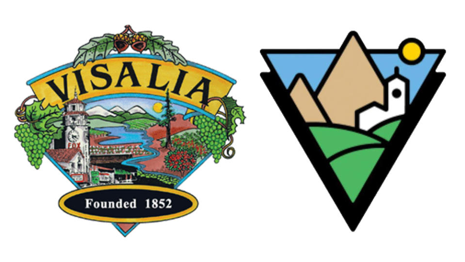
The previous Visalia logo was chosen 20 years ago in a public vote. It features a detailed illustration showing the clock tower of the Fox Theater along, snow-capped hills, vines, fruit trees, acorns and more. The new design is a lot more minimalist, reducing the elements of the design to a more abstract white tower, green pastures and two triangles for mountains, all "breaking out of a bold V".
The new logo design was part of a $150,000 rebranding project carried out to mark Visalia's 150th anniversary and with the aim of attracting more people to the city. We the Creative (WTC) won the contract for the project through a competitive bid process and, according to the city council, was given a brief to "update the City’s identity, image, and brand to market the positive aspects of working for and living in the City of Visalia, as well as create a cohesive, modern, identifiable look to be used throughout the organization."
A post shared by City Of Visalia (@cityofvisalia)
A photo posted by on
But many residents don't appreciate the change. "I can't imagine anything less representative, uglier, sparse, more expensive, and wasteful than this," one person wrote on Facebook. "Ah yes, the Great Pyramids of Visalia," another person joked. "Ouch! It looks like a child drew it. I have embroidered their old logo and there was a lot going on there, but this is almost simpleton to me," someone else added.
The most frequent criticism is that the new logo looks too vague and generic, but some people say everything about it is wrong. One person wrote: "It's awful in so many ways. The art style is so oversimplified it's comedic. The landmarks they're trying to represent are borderline unrecognizable. The asymmetrical shape is not going to lend itself well to compositions with other elements. And most of all it completely sterilizes all semblance of the culture and personality Visalia actually has."
Over on X, people were no more enthusiastic, voicing many of the same opinions. A Change.org petition calling for the previous logo design to be restored had 1,600 signatures at the time of writing.
There's always a certain amount of resistance to change when new logos are revealed, but the Visalia logo controversy joins a long list of cases that appear to show that people are growing tired of the tendency to simplify identities. Strangely, many graphic designers also cite minimalism as one of the most annoying design trends, which raises the question of whether it's the clients who are pushing such designs.
For more logo design news, see the new Puig logo. Meanwhile, it's (almost) the end of an era for Apple logo stickers.

