How recognisable are the most famous car logos?

Car logos are among some of the most recognisable brand assets globally. We've written extensively about them over the years, including the many recent rebrands. So it's interesting to see the results of a study that aimed to measure just how recognisable the designs are.
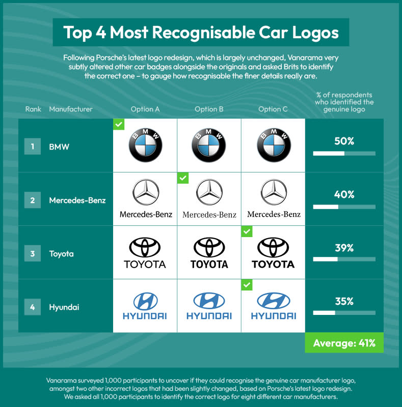
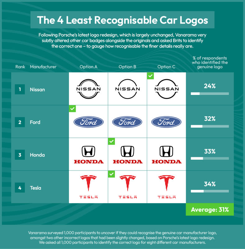
Participants were shown the logos of eight major car brands. For each brand they were shown three designs: the real logo alongside two slightly doctored versions. Their challenge was to choose which was official design. The results appear to back up our own less scientific but expertly advised pick of the best car logos around.
We've seen various studies attempt to measure people's recall of car logo designs before, including an amusing project that asked people to draw car logos from memory. This latest survey from UK car leasing company Vanarama didn't put participants' artistic skills to the test, but it did test how much detail they could recall from famous brands' identities.
The brands that saw a higher percentage of correct choices were BMW and Mercedes Benz, with 50% and 40% of participants choosing the correct logos respectively. At the bottom of the list was Nissan (24%). Ford, Honda and Tesla all came fairly close with between 32% and 34%.
The results confirm what many might already conclude: that BMW and Mercedes are more recognised brands than say Honda or Nissan. But the results also seem to back up the belief that simpler logos are easier to recall, since BMW and Mercedes both have very simple designs, especially when compared to the Ford script logo. BMW and Mercedes have first and second place respectively in our own list of the best car logos.
However, it's hard to be very scientific in such an experiment and ensure that the tweaks made to the doctored logos are of comparable size. And the study didn't use the current BMW logo, which is even simpler than the old design used in the project. As of this week, there's also now a new Ford logo, although the difference with the old design is so light that hardly anybody noticed.

