The Philadelphia Eagles logo: a history
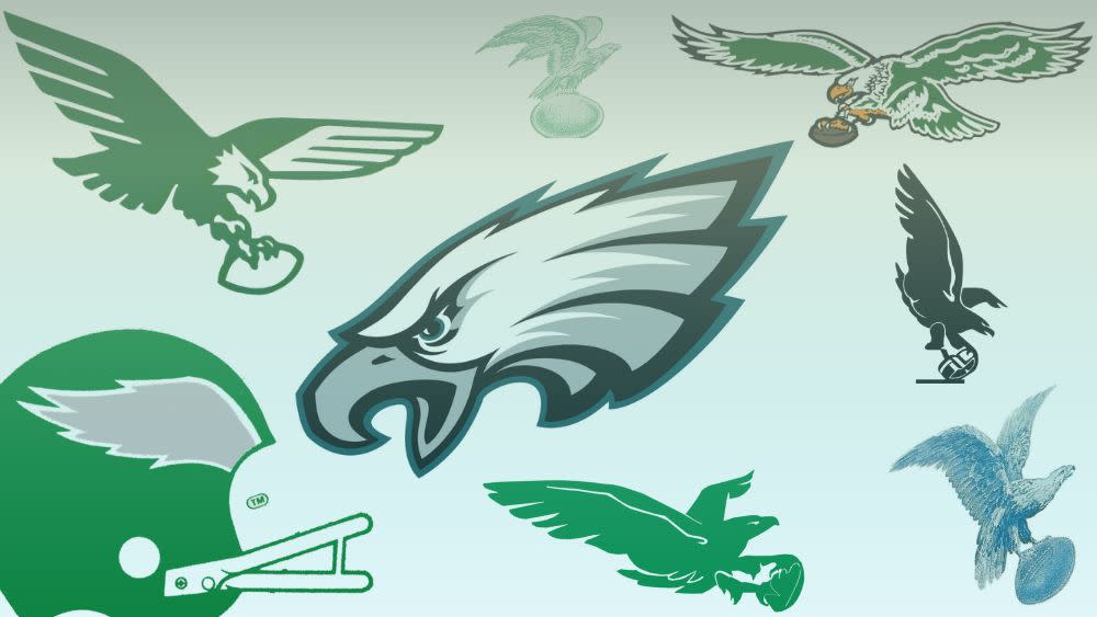
The current Philadelphia Eagles logo will be familiar to anyone who grew up following the NFL over the past few decades. The instantly recognisable sigil of Swoop the eagle, the team’s mascot, has been in place since 1996. For a whole generation of fans, this will be the only Eagles logo they’ve ever known.
However, the Eagles are one of the oldest franchises in NFL history, having been around since the early 1930s. And as such, the logo has gone through a lot of changes over the many decades (not far off a century) that the team has existed. As trends evolved in design, so did the iconic eagle – see our rundown of the best logos if you want more great examples of logo design throughout the 20th century.
For many fans, a trip through the history of the Philadelphia Eagles logo will be a chance to see their team in a whole new light. So, we’re taking it all the way back to the beginning and charting every evolution of the Eagles’ logo, right up until the present day. If this gets you inspired to do some designing of your own, don’t forget to check out our guide to the best logo designers.
The first Philadelphia Eagles logo: 1933-1935
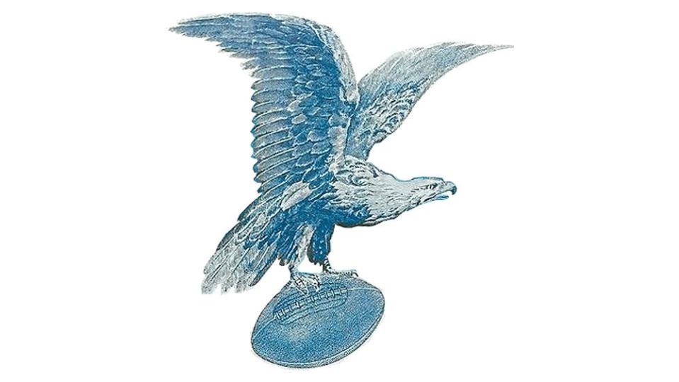
In 1933, when Bert Bell and Lud Wray were granted a franchise in Philadelphia to replace the defunct, financially straitened Yellow Jackets, they mulled for a while over what to name their new team. They settled eventually on the Eagles, drawing inspiration from the distinctive blue eagle logo of the National Recovery Administration (known as the NRA, no relation to that NRA), an industry agency that was in many ways the beating heart of President Franklin D. Roosevelt’s New Deal policies.
As such, while the Philadelphia eagle has been green for most of its lifespan, it started out blue. More realistically executed than many subsequent iterations would be, the basic concept of this logo – an eagle holding a football – would endure for more than sixty years.
Seeing green: 1936-1942
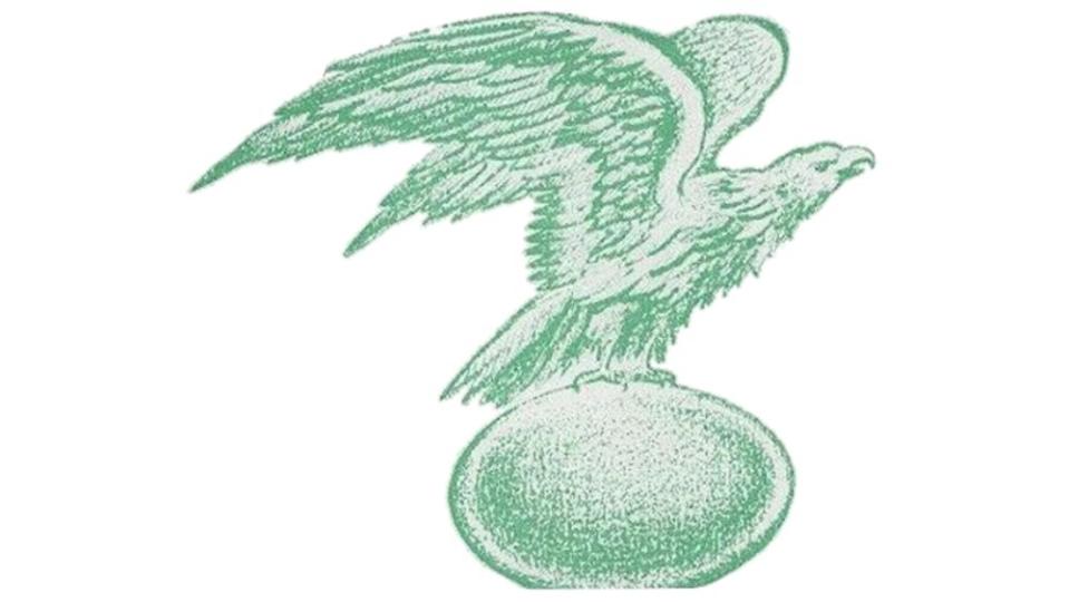
The Eagles had had a rocky start as a professional team to say the least, losing their first ever game 56-0 at the hands of the New York Giants. A miserable win/loss record and financial troubles continued to plague the team throughout the 1930s. However, in 1936, as the Eagles moved to Municipal Stadium in South Philadelphia, Bert Bell (by this point sole owner) did take the opportunity to refresh the logo.
While it’s more or less in the same style as the original version, the NRA-inspired blue is gone, replaced by a green that hews closer to the shade the team would become known for. The football in the eagle’s talons is also considerably larger, and the bird itself looks a little sleeker – perhaps a little more ready for action.
Steaglemania: 1943
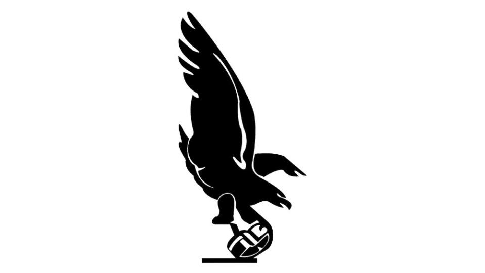
Now this is quite a departure, isn’t it? There’s a good reason for that, and also for why this version of the logo only lasted a year – in 1943, the Eagles weren’t the Eagles at all. America had finally entered World War II by this point, following the Japanese attack on Pearl Harbor, and many young men had been called up to fight. Both the Philadelphia Eagles and the Pittsburgh Steelers were faced with a shortage of players, and thus, a temporary merger of the two teams was formed to allow a full team to be fielded.
The merged team was officially entered into the record book as the ‘Phil-Pitt Combine’, though the fan nickname ‘Steagles’ would be the one that really stuck. The resulting logo is rather harsher and more austere, coloured in Steeler black. Note also that the eagle is no longer holding a ball in his talons, but what appears to be some kind of helmet.
Verticality and abstraction: 1944-1947

Once the Eagles became the Eagles again the distinctive green returned, but otherwise many elements of the Steagles rebrand were retained. The lifelike feather detailing is gone, never to return, and the orientation of the eagle still has a verticality that suggests it is landing – or perhaps snatching up prey, which in this case once again is a football in the talons. The ball is also a solid block now, lacking the shading it had in the 1930s versions.
Spread those wings: 1948-1968
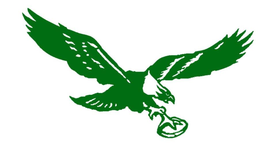
After the 1940s switch to a more vertical look, the next Eagles logo went in the opposite direction and pulled out a more horizontal approach than had ever been taken before. This version of the eagle is neither up nor down – he simply glides, though of course, he still has the football safely ensconced in his talons. He’s perhaps feeling more confident, as he holds it in one claw rather than two.
While the green colour palette remains, a little more detail has crept back into the eagle’s feathers – though of course nowhere near as much as the 1930s versions. The ball is also now a simple outline rather than a solid colour block. This would be one of the longest-serving versions of the Eagles logo until the current one, remaining in post for twenty years.
Straight-edge style: 1969-1972
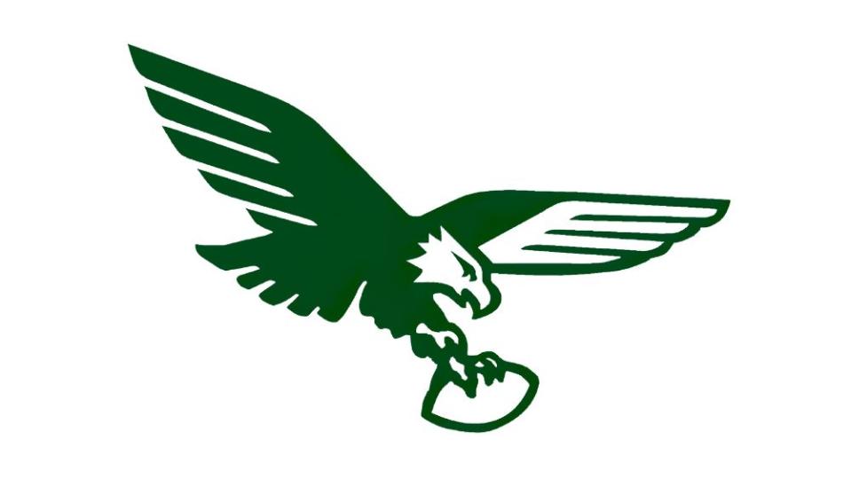
While this version of the Eagles logo didn’t last too long, it has remained a favourite among more than a few fans, and it’s not hard to see why. The logo is much more stylised than previous versions, with the wings given a geometric, regimented look that recalls the rise of modernism in logos and advertising, which had kicked into gear in the 1950s.
The basic outline of the eagle is the same as it was throughout the 50s and 60s, but now it has much more of a contemporary edge. It’s also notable that the football is enlarged and much more prominent than it was before.
All change: 1973-1986
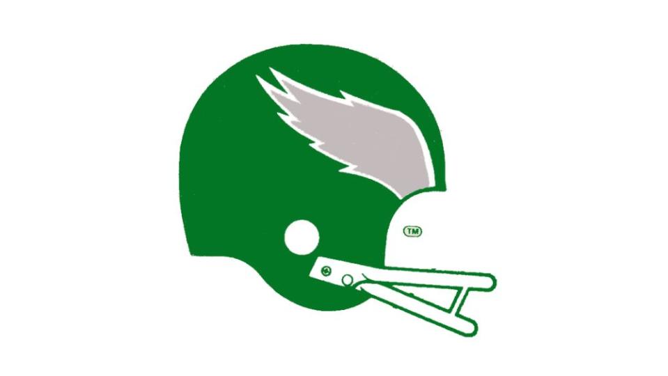
The thirteen-year period from 1973 to 1986 represented probably the most significant departure for the Eagles’ logo, and sticks out in a line-up even more than the post-1996 version (which we’ll get to).
Swoop the eagle is no more. In his place is a bold, striking football helmet design in Philadelphia Eagles green, with only a grey wing emblem on the side to acknowledge he ever existed. The wing is outlined in white to make it more distinctive, and below, it is mirrored by the grille of the helmet.
Reject modernity, embrace tradition: 1987-1995
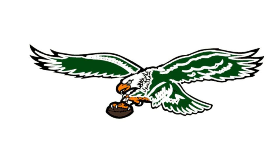
Even though the Eagles went on to have a pretty great run from the late 1970s through the early to mid 1980s, it was decided that the experiment with a non-eagle logo had run its course. Swoop made his triumphant return in 1987 – and this time, he was facing to the left. He was also much more detailed than he had been in decades, and for the first time, his claws and feet were rendered in orange. The ball clutched in his claw was coloured in dark brown, contrasting well with the striking white of the eagle’s sharp talons.
To the left, to the left: 1996-present
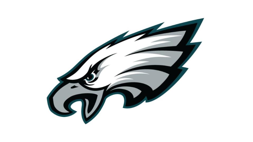
Finally, in the mid 1990s, the Eagles landed on the logo that is still in use today – another one that is an obvious visual departure from the rest. The eagle’s body is consigned to history; his wings are missing; and the ball he faithfully carried for decades is nowhere to be seen. All that’s left is the head, rendered in a vivid, comic-esque profile with bold outlines and a near monochromatic colour palette – it may take a moment for the casual viewer to notice the blue-green shade running around the outer edge. This use of blue calls to mind the very first Eagles logo, inspired by New Deal optimism back in 1933.
Like its direct predecessor, this eagle too is facing left. Interestingly, he’s the only NFL team logo to do so. The other animal mascots – ravens, broncos, bills, panthers, et al – overwhelmingly face to the right. Facing right makes a lot of sense for an NFL mascot logo; Americans read left to right, and therefore facing a logo towards the right associates it in the viewer’s mind with forward momentum. So why is Swoop different?
Answer: look carefully at the feathers that make up the plumage in the eagle’s neck, and you can see that they form a capital ‘E’. A clever hidden detail that is just one of the reasons why this logo has proven so iconic and effective for almost three decades.
For more logo histories, see the NFL logo history as well as the best NFL logos and the best sports logos.

