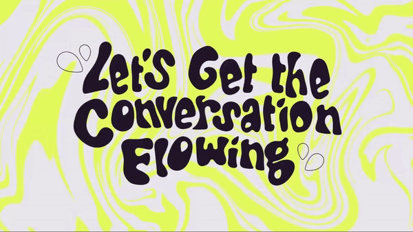
The Period Conversation embraces organic design to get the dialogue flowing
Periods have been a huge taboo in the workplace for, well, always. And while we're (slowly) getting better at talking about them, it's still an uncomfortable topic for many. To get the dialogue flowing, The Period Conversation is a project that aims to help us open up about menstruation and get real about reality.
As we've seen with period product branding, menstruation has typically been treated as a topic shrouded in discretion and shame. With a delightfully contemporary and interactive campaign website design, The Period Conversation marks a new era of understanding – empowering and educating in style.
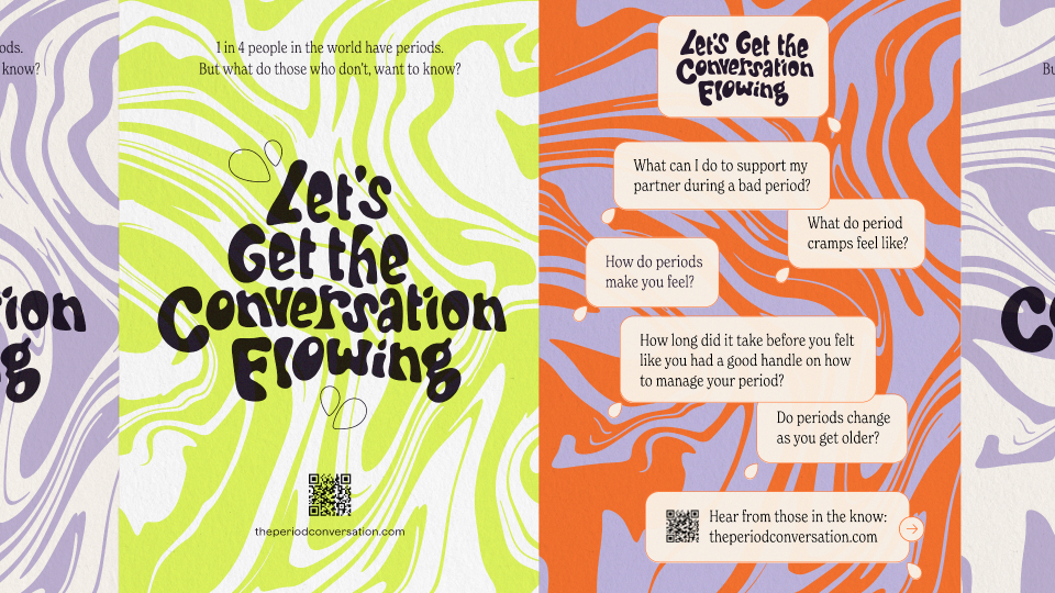
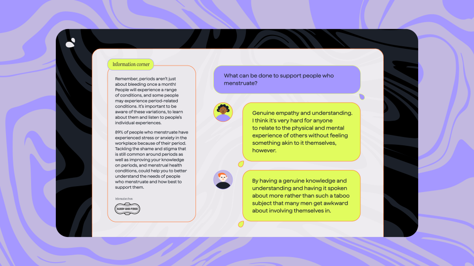
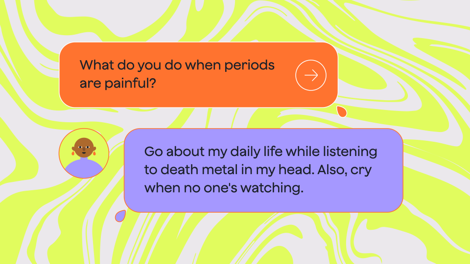
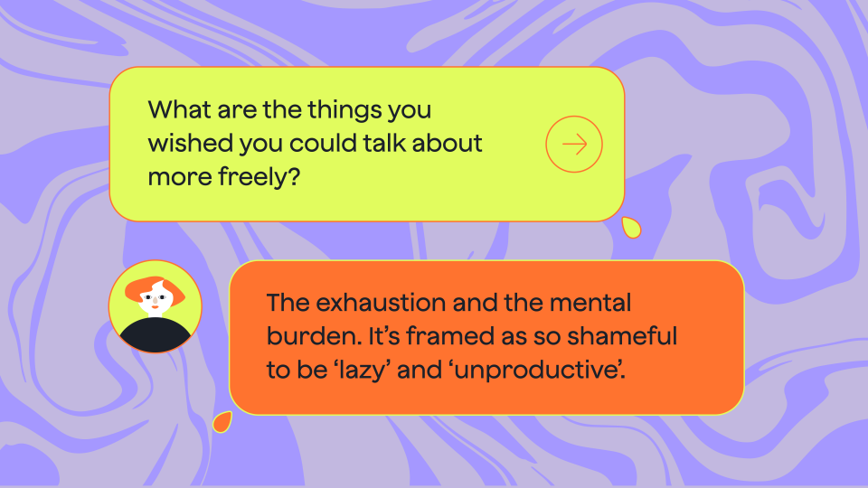
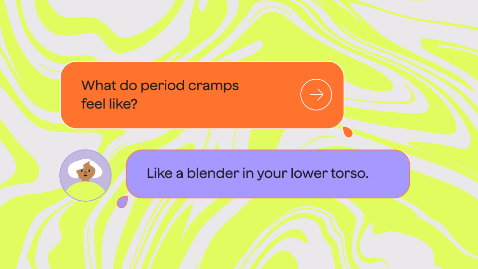
The Period Conversation is a project by design agency Nice and Serious as part of its 'Nice Works' initiative – encouraging the team to pursue creative projects around issues that are important to them. Supported by the charity Bloody Good Period, the interactive website features crowdsourced questions from people who don't menstruate. Answers are provided by those who do – with contextual additions from the charity – creating a visually digestible dialogue to inform without the taboo barrier.
"The Period Conversation started, well, with a conversation," says Sadie Devane, Senior Art Director at Nice and Serious. "We spoke at length about the ways in which our menstrual cycles impact our creative output, and the difficulties we’d had navigating this throughout our working lives," she adds. This became the project's catalyst, inspiring the team to create a resource that could open conversations with their colleagues and become a tool for other workplaces.
The visuals purposefully echo a gender-neutral tone, with a colour palette that strays from the typical pinks and reds of period branding. "Tonally, we wanted the designs to strike a balance of being bright and inviting, whilst also being soft and serious, to mirror the range of conversations featured," says Senior Designer Anna Barton.
"Our chosen colour palette is inspired instead by how the four phases of the menstrual cycle feel, with bright and illuminating tones to reflect conversation about each," says Anna. The graphic language and "bubble-style type" are directly inspired by period blood, replicating the marbling shapes of its viscous movement, while the fluidity of the design gestures to the "project’s aim for organic, flowing conversation."
It wasn't a seamless project, as the team had to work hard to make the campaign feel accessible to a diverse audience. "In order to ensure the campaign was inclusive – and in particular that it would appeal to men – we went through rounds of testing within our team in terms of the language, visuals, and tone of voice used," Sadie says.
On what she's most proud of throughout the process, Anna says: "This is the most personal project I’ve ever worked on, and I’m proud that speaking up has gone on to create something so impactful. My period has felt like an obstacle to be creative, so to have used a negative experience to create something this inventive feels like a real achievement. "
"I hope The Period Conversation can inspire other companies to start conversations, develop inclusive policies, and empower and support employees to ensure no one’s put at a disadvantage because of their period," says Sadie. "By providing this wider knowledge, and reducing period stigma we are actively working towards our goal of menstrual equity!” adds Rachel Grocott, CEO at Bloody Good Period.
For more design inspiration from Nice and Serious, check out the stunning rebrand for National Landscapes. If you're after some brilliant branding, check out the adorable milk carton designs that are a masterclass in stylish packaging design.

