People think this bizarre optical illusion logo should be X-rated
Optical illusions can be great fun, and we love clever hidden secrets in logo designs. But sometimes trying to combine the two things doesn't turn out as planned.
The latest example causing a debate online is a logo design that's intended to have two possible readings. But people are seeing a lot more than that. Some people even have a rather X-rated interpretation that the designer almost certainly didn't intend (see our guide to how to design a logo for some pointers).
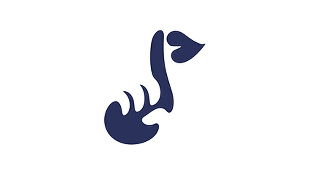
This logo of a note combined with a hushing finger for a music group "StopTalking" from r/DesignPorn
The optical illusion logo design shared on Reddit is intended to resemble somebody putting a finger on their lips as a gesture to be quiet but also somebody holding a musical note. As one does. While that sounds clever as an optical illusion, its execution as a logo design is proving to be more problematic.
As well as being confusing and difficult to see the intended meaning, it's provoking all kinds of other readings. Some people think the design looks menacing, as if the hand is "strangling" the musical note. Others have even wilder interpretations, seeing a fish carcass, an "Alien Shark" or even someone performing oral sex.
"Took me a minute, I thought it was strangling a goose," one person wrote. "I only see lips and a fish skeleton," someone else commented. "Looks all over the place to me. Very hard to focus on anything," was another opinion.
Some logos have accidental optical illusions (see the Sonic X logo), while many have intended hidden secrets that don't necessarily need to be seen to understand the design (see the clever Minnesota Wild logo). But this is another optical illusion logo that shows that going for a visual pun can be a risky approach to logo design.

